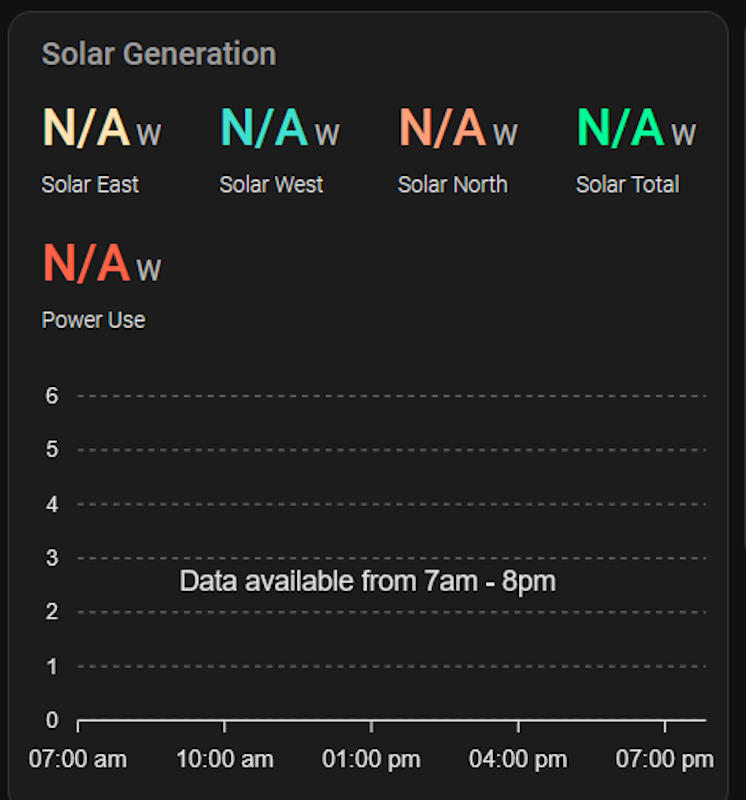
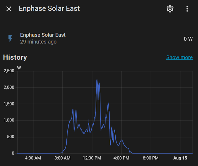
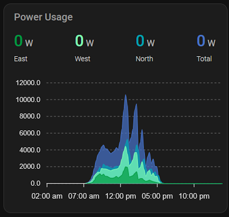
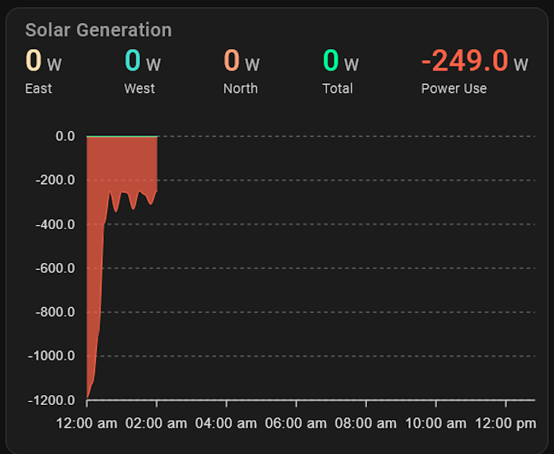
So it’s taking the current values and extending them out for the rest of the day. I think a better option would be to run it like a chart recorder, so it doesn’t display anything beyond the point where there’s data available. However I’m not sure whether the underlying ApexCharts engine supports that.
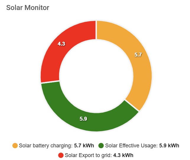
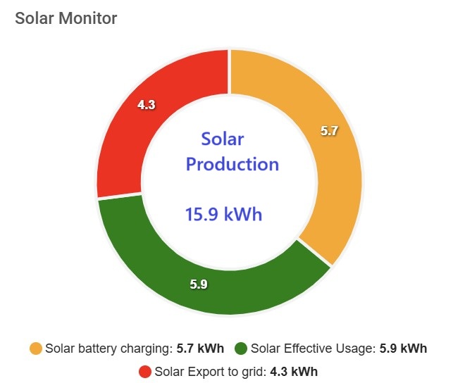
Hi, Created a donut graph with 3 sensors but I would like to have the total of these 3 sensors in the middle of the donut.
I have separate sensor for the total.
How to do this?
Thanks! For anyone else running into this, it goes into the apex_config section. Also from further experimentation it’s not just before data is available for the day, it’s also after that. So if you’re displaying a graph with data only during the hours of daylight:
graph_span: 13h
span:
  start: day
  offset: +7h
then you’ll get the “Loading…” before sunrise and after sunset. This kind of limits the usefulness of the span options because not displaying a graph at all is worse than displaying a flat line pegged at zero during non-daylight hours.
@ vingerha, this seems to be a bug to me, or at least incorrect behaviour… is it worth opening an issue on Github?
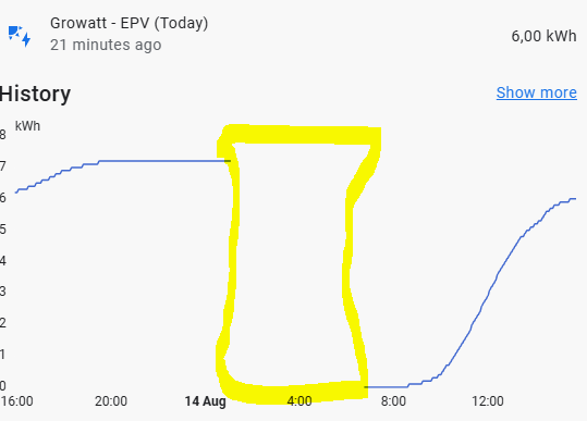
I have no clue if this is unexpected behavior… when developing I also have loads of data gaps in my db/source but never seen this though…could be a combination of things.
Since RomRider seems return shortly, in his repo please and do add a simple example which one can test, not having the same data makes it often hard to reproduce and without reproduction: no repair. Maybe the issue will allow others to add similar cases.
Yeah, that’s why I thought I’d ask first :-). If someone else is graphing data that’s only available at certain times, solar power is a good example, can you see what happens when you set something like:
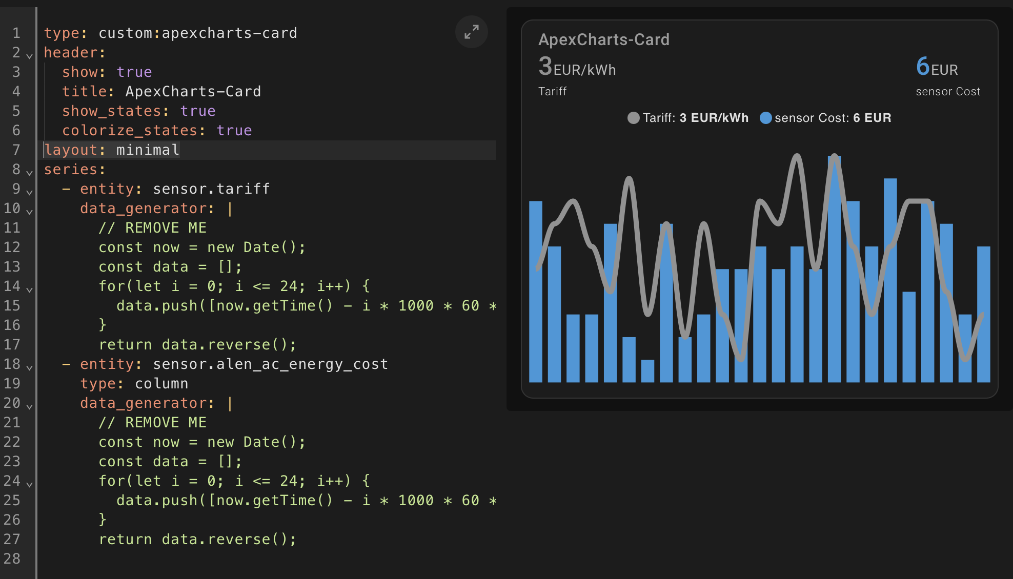
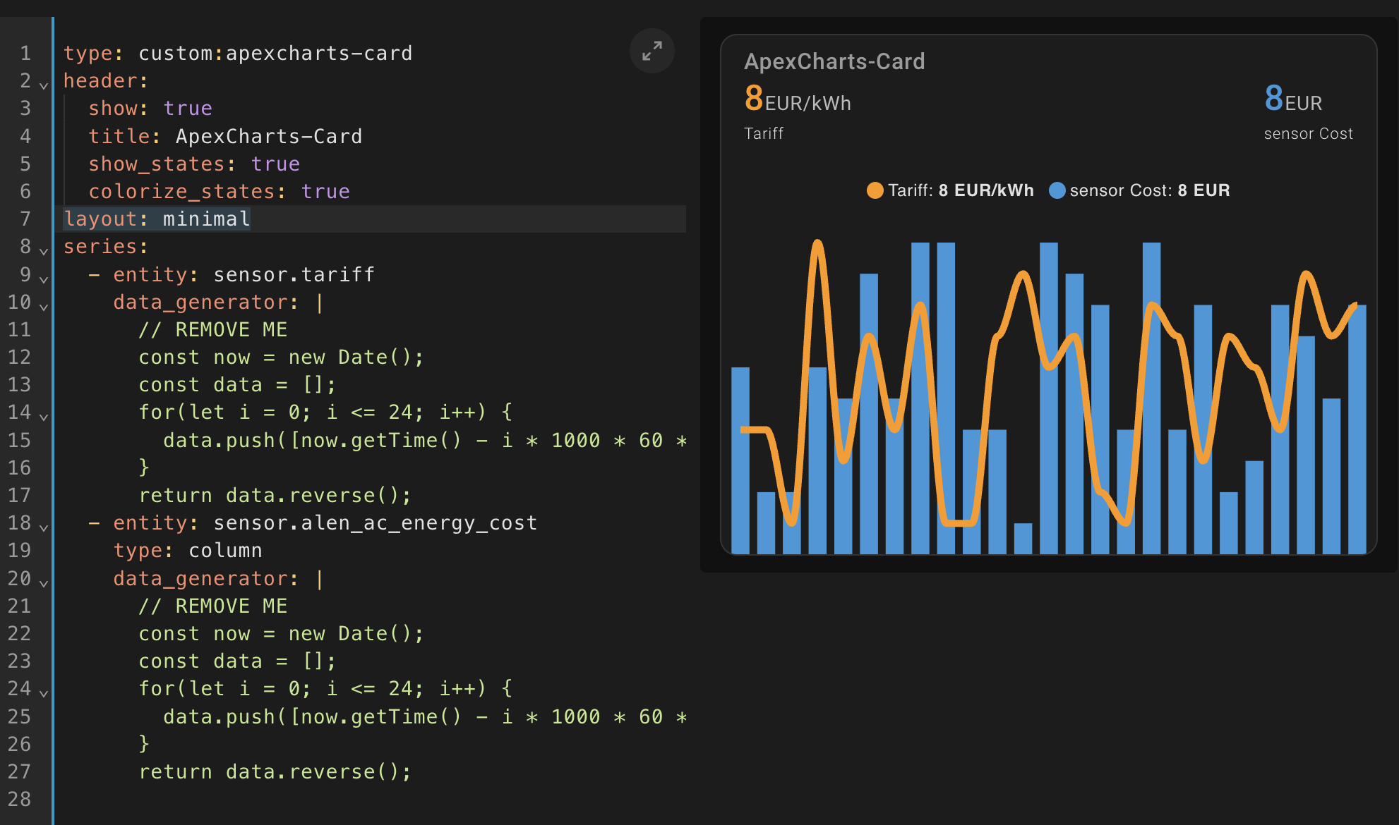
Hello! I’ve noticed when using minimal layout, it is displayed differently on Safari compared to Chrome. On Safari, there is a bit of padding at the bottom, so the bars aren’t touching the border of the card. Any suggestions how to fix this?
I got just an empty screen, what does your data contain when it is between midnight and 7? Null values or are the entities unavailable …the latter would explain a lot
Once I add the offset value I get “Loading…”. I’ll repeat the tests after the span interval has passed, but will have to wait another 22 hours for that to happen.
I’ve now waited until after the graph span interval… and it’s displaying the data as expected, so with the time currently a bit after 11pm (outside the 7am-8pm interval) it shows data from the interval 7am-8pm without the “Loading…” issue. And the config is the same as yesterday, I haven’t changed anything. The only thing I can imagine is that shutting down the browser cleared out some cached data that was causing a problem.
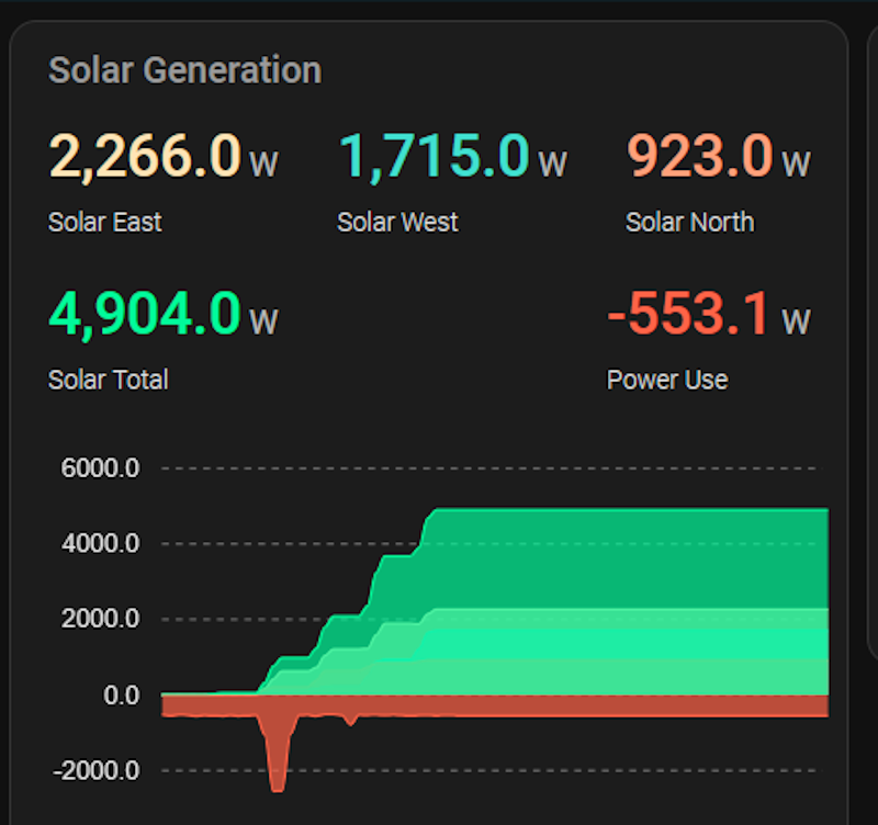
Hi all, I’m trying to recreate the standard Energy Consumption dashboard, so a stacked bar with solar production and grid import above zero and grid export below zero. Per hour, in one single bar per hour.
Already tried quite some things, but the results are still individual bars, side by side. And all above zero.
 Card-mod - Add css styles to any lovelace card - Share your Projects! / Dashboards & Frontend - Home Assistant Community