Some interesting options to overlay multiple periods of data on same chart coming in 1.3.0, thanks @RomRider ! You are writing some really great and useful code for Home Assistant!
Very very powerfull card.
I tried to play with it and I would just report a strange situation.
Ok on PC (firefox) ok on Andoird phone (Chrome) KO on iPhone (Safari and Chrome)
PC

Android
iPhone

Bye
Sandro
Apple sucks  One day they will learn how to make a browser or just use chromium as their engine… even Microsoft went this way with Edge Chromium…
That seems like an upstream bug unfortunately in the ApexCharts.js library that I use.
I’ll have a look but I have little faith about this.
4 Likes
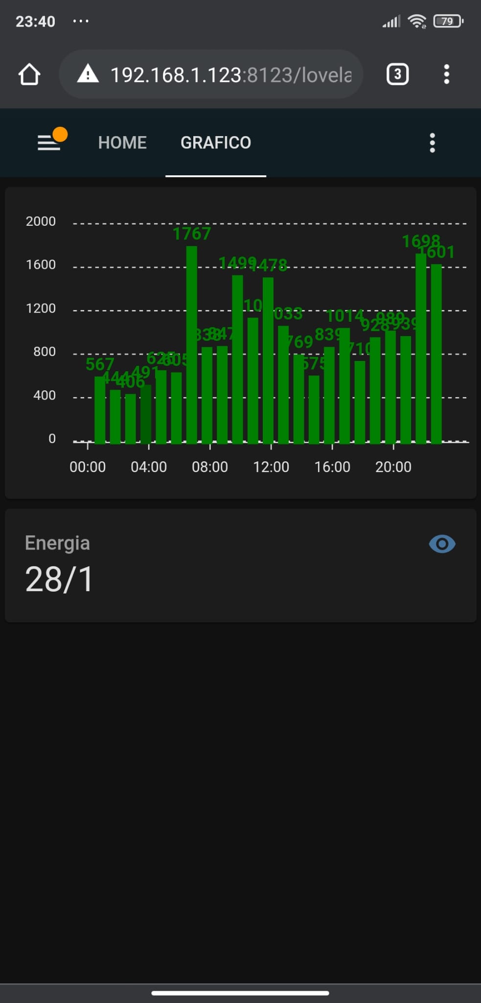
So on my ipad in any browser and the app, It doesn’t display very well… the legend down the bottom will expand to accomodate all entities and the graph shrinks…
Not sure what you’d expect? It tries to fit everything in a small space
If you force a height (like 200px) in apex_config.chart.height, that would solve the issue.
1 Like
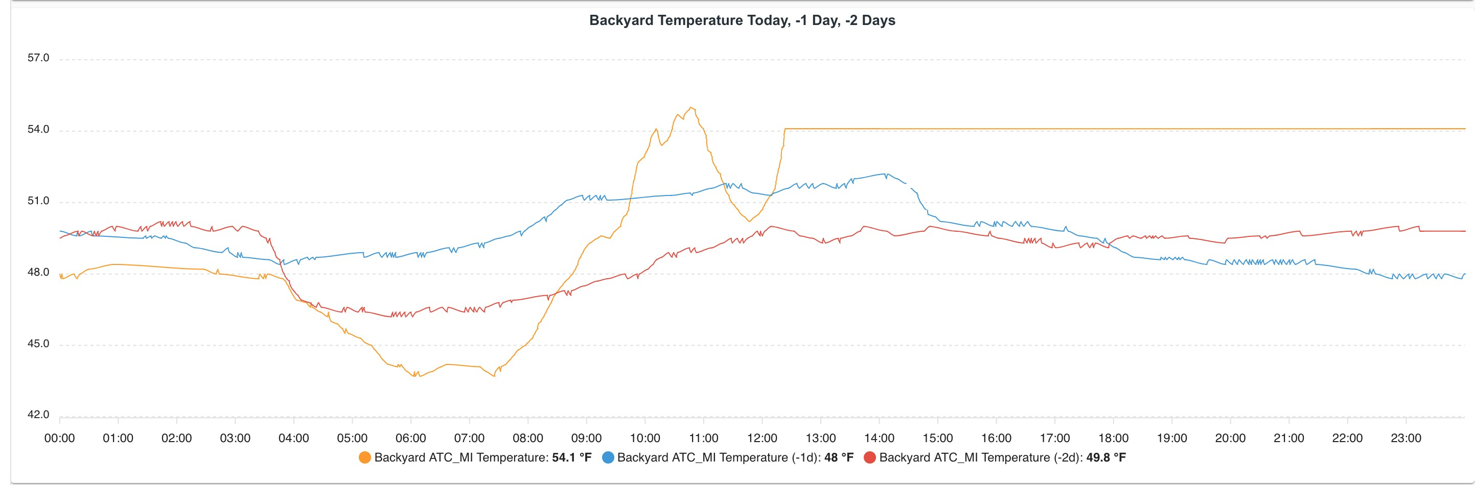
Continuing to explore ways to use @RomRider 's interesting ApexCharts Lovelace Card, lots of possibilities:
1 Like
 New Release
1.3.0 (2021-01-30)
Features
- series: Display values as a duration (#21) (227f0ea)
- series: Hide the value of a serie in the legend (#22) (1e8f748), closes #20
- series.offset: Compare data from another timeframe with the current timeframe (#19) (af8ba81), closes #18
Bug Fixes
3 Likes
By the way, I just figured there is a responsive option possible which would help you redefine parameters (like height) based on the viewport size. So you can redefine the height based on the screen size used, dynamically.
Full doc: responsive – ApexCharts.js
for eg:
        apex_config:
          responsive:
            - breakpoint: 421  # strictly inferior to 421px screen width, height will be 500px
              options:
                chart:
                  height: 500px

              # Since there is a bug in apexcharts.js, you have to redefine
              # the default value so we put a really big number here
              # which acts as an "else"
            - breakpoint: 10000
              options:
                chart:
                  height: auto
The commonly considered breakpoints are:
- 420px maximum width: cover all smartphones in portrait mode
- 421px to 767px width: most smartphones in landscape mode
- 768px to 1023px: most Android tablets and iPads in portrait mode
- 1024px to 1365px: most Android tablets and iPads in landscape mode, older desktop/laptop monitors
- 1366px and above: iPad PRO, HDready and FullHD desktop laptop monitors
2 Likes
Are there any guideline to get a sense of what will and will not work with Home Assistant? I always try to look inward first for mistakes as a majority of the time it is a PEBCAK. However there are things that either you have on your todo list, is a bug, will not be possible due to limits with HA, or is an error in AjaxCharts. Interested in some of the ‘function’ functions and javascript that is shown.
Simple example, For a scatter chart, I’m trying:
      markers:
        radius: 3
        shape: 'square'
Nothing but circle and circles in cricles 
Hard to tell with the thousands of options there is, let’s discover it while we use it and I’m going to make a section in the Readme for things which do not work if any.
That should work though unless it’s a bug with ApexCharts. I’ll check tomorrow.
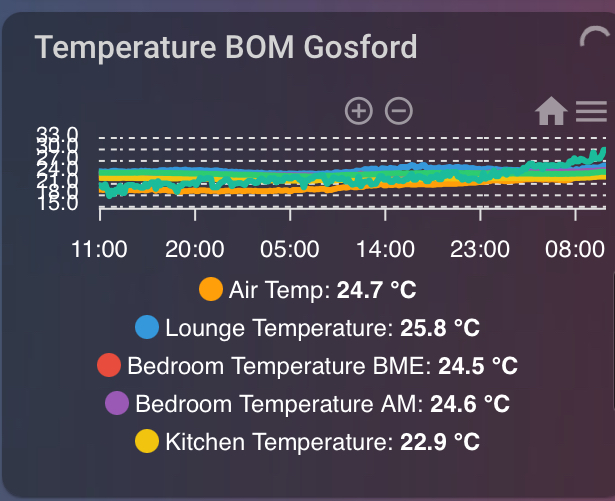
Did you also see that the selection zoom and pan icon are missing? Again only on ipad… not on my PC…
Seems unchanged… ipad in landscape mode. (tried 421 as well no change)
Did I screw up the code?
          - type: custom:apexcharts-card
            graph_span: 48h
            header:
              show: true
              title: Temperature BOM Gosford
            apex_config:
              responsive:
                - breakpoint: 1024
                  options:
                    chart:
                      height: 500px
                - breakpoint: 10000
                  options:
                    chart:
                      height: auto
              stroke:
                width: 3
                curve: smooth
              chart:
                zoom:
                  enabled: true
                toolbar:
                  show: true
                  tools:
                    zoom: true
                    zoomin: true
                    zoomout: true
                    pan: true
                    reset: true
            series:
Yes many options. Don’t worry about the square, circles are just fine. No need to waste a gram on it. My question was just trying to get your sense from a top down what to not bother with. It is feature rich, but clearly some of the stuff is hard and obtuse.
I’m gonna have a glass of  or 2 and try and think up a use case for that
  chart in home automation so I can test it
Thanks again for your work!
What exact iPad model is it?
ApexCharts doesn’t support pan selection on mobile unfortunately, that’s why it’s not displaying.
IPad Air 2 with latest iOS as well
1 Like
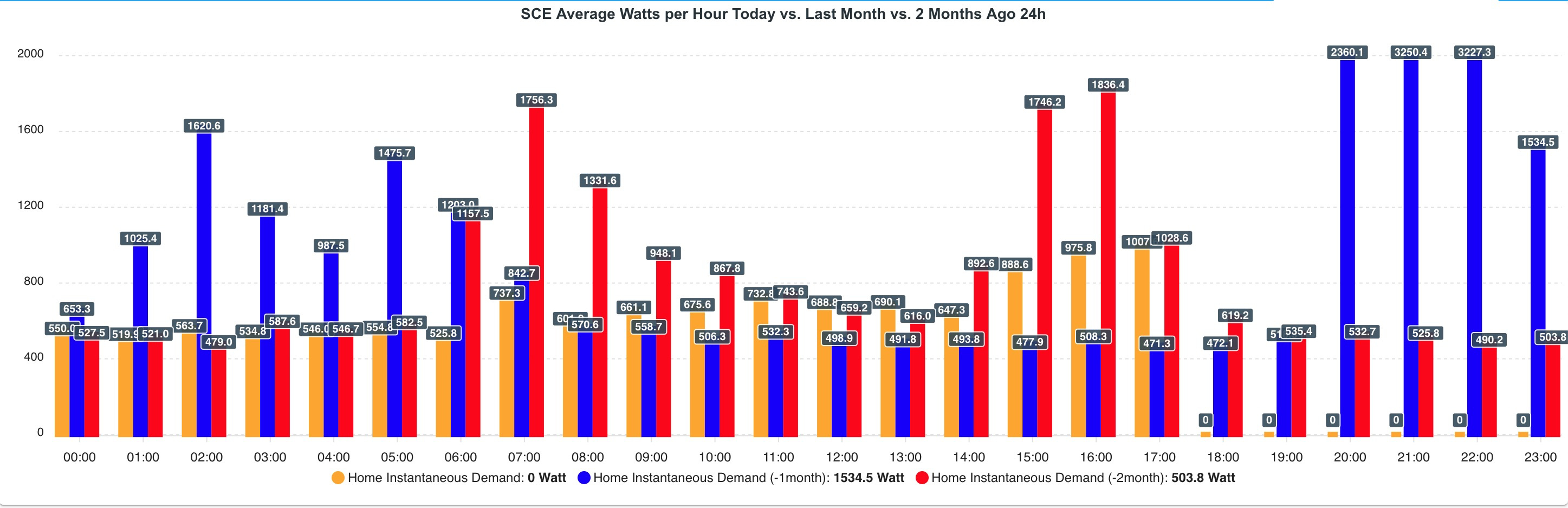
I think the best simple use case is free vs used RAM or disk on a system for eg.
iPad 2 Air’s vw resolution is 1024x768. So:
              responsive:
                - breakpoint: 769  # This will be applied in portrait (<= 768)
                  options:
                    chart:
                      height: 500px
                - breakpoint: 1025  # This will be applied in landspace (<= 1024)
                  options:
                    chart:
                      height: 400px
                - breakpoint: 10000 # viewport width from 1025 to 10000
                  options:
                    chart:
                      height: auto
Genius! That is oh so much better! Thanks.
Love this card. I really hope we don’t burn you out so you tire of all this! I’ll sling you some cash tomorrow as I use this card and your button card and you are just so responsive to us all. Thanks for your great efforts.
Thanks for your appreciation, but no need for that or give it to charities instead ![]() I’m doing this for fun!
I’m doing this for fun!
8 Likes
Love your work maybe and I just went looking on your repos and didn’t find a donate button. I don’t take donations either for my card but I have for a few devs given donations as I really appreciate their effort and dedication. I really do appreciate your work. It makes HA so much better.
4 Likes
Until now, I had not registered in the community because I did not consider it necessary (and I am short on time).
Today I have signed up just to thank you for this work that I consider fundamental for HA.
Donations for charity have killed me with love.
Thank you!!!
*** The card is fully usable in its current state, I am already changing my entire system, which is simple, to this card.
3 Likes