ApexCharts card - A highly customizable graph card

I don’t suppose someone could give me a hand getting a power usage donut working?
I have a good chuck working easily enough but now I’m trying to achieve the following…

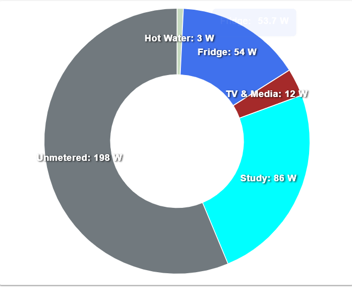
I don’t have every device monitored in my house so Ideally I need the donut to represent everything as a fraction of the current total home power usage. So if my total usage is currently 2 kwatts and my fridge is 150w I’d like the fridge to be shown as (150/2000) percent so actually just 7.5% of the donut.
I suspect I need to calculate some kind of “Other” amount which is everything that does not have a power meter on it to report it’s usage.

And ideally any device using 0w should not show in the legend at the bottom.
I tried “showForZeroSeries: false” but maybe it’s not supported cause my entire chart vanishes?

image

type: custom:apexcharts-card
chart_type: donut
update_interval: 15s
header:
  show: true
  title: Power Usage
  show_states: true
  colorize_states: true
series:
  - entity: sensor.electricity_usage
    show:
      in_chart: false
      in_header: true
  - entity: sensor.athom_plug_v2_01_energy_power
    show:
      in_header: false
  - entity: sensor.athom_plug_v2_02_energy_power
    show:
      in_header: false
  - entity: sensor.athom_plug_v2_03_energy_power
    show:
      in_header: false
  - entity: sensor.athom_plug_v2_04_energy_power
    show:
      in_header: false
  - entity: sensor.athom_plug_v2_05_energy_power
    show:
      in_header: false
  - entity: sensor.athom_plug_v2_06_energy_power
    show:
      in_header: false

I try to align the xaxis ticks with the values. How is this possible?
And how can I start the diagram more to the left, at the yaxis instead of in the middle of the chart?
(Now is only there for reference, to make clear it is a forecast. I dont need that in the final version)

grafik

This is the config for this card:

type: custom:apexcharts-card
graph_span: 6d
span:
  start: hour
  offset: '-0h'
apex_config:
  xaxis:
    labels:
      format: ddd
  tooltip:
    x:
      format: ddd dd. MMM.
now:
  show: true
  label: now
yaxis:
  - id: temp
    min: ~0
    max: ~30
    decimals: 0
series:
  - entity: weather.home
    name: max.
    yaxis_id: temp
    unit: °C
    type: line
    color: red
    data_generator: |
      return entity.attributes.forecast.map((entry) => 
      {
        var date = new Date(entry.datetime);
        return [date, entry.temperature];
      });
  - entity: weather.home
    name: Regen
    yaxis_id: mm
    unit: mm
    type: column
    color: blue
    data_generator: |
      return entity.attributes.forecast.map((entry) => 
      {
        var date = new Date(entry.datetime);
        return [date, entry.precipitation];
      });
    show:
      datalabels: true

Can anyone shed some light on why stacked: true isn’t doing what is expected?
I’ve stripped my code down to basics to try and pinpoint this behaviour.
It should be possible with area, as shown here: https://apexcharts.com/javascript-chart-demos/area-charts/stacked/

My code:

type: custom:apexcharts-card
graph_span: 24h
stacked: true
all_series_config:
  stroke_width: 1
  type: area
  fill_raw: last
  curve: stepline
span:
  end: minute
series:
  - entity: sensor.twc_charger_load_always_w
    name: EV Charger
  - entity: sensor.hot_water_system_supply_switch_0_power
    name: Hot Water
  - entity: sensor.arlec_sw_washer_power
    name: Washer
  - entity: sensor.arlec_sw_dryer_power
    name: Dryer
  - entity: sensor.eko_sw_dishwasher_power
    name: Dishwasher
  - entity: sensor.sw2_tvmedia_power
    name: Media

Screenshots, first with stacked: false, second identical but with stacked: true.
As you can see, the entities aren’t stacked and the values are also all wrong.


I’m having some trouble understanding how to set up this card.

My first attempt of adding the card to a dashboard:

type: custom:apexcharts-card
series:
  - entity: sensor.garden_temperature_sensor_temperature
    name: Outside
    unit: °C
header:
  show: true
  show_states: true
graph_span: 24h

Result:

I don’t quite understand why the chart only shows a flat line at 21.1C.

Clicking on the header shows the more-info card of the sensor, which reveals the actual (expected) course of the sensor over the last 24hrs:

How can I make the card show the actual data?

Hi together,

i played the last days with my Shelly 3EM and wanted to create a few graphs with ApexCharts.
I dont unterstand why the date (x-axes) are wrong in my opinion and all values are on the same day.

type: custom:apexcharts-card
graph_span: 1d
span:
  start: day
header:
  show: true
series:
  - entity: sensor.phase_1_energy
    type: column
    transform: return x / 1000;
    group_by:
      duration: 24h
      func: sum
  - entity: sensor.phase_1_energy
    type: column
    transform: return x / 1000;
    offset: '-1d'
    group_by:
      duration: 24h
      func: sum
  - entity: sensor.phase_1_energy
    type: column
    transform: return x / 1000;
    offset: '-2d'
    group_by:
      duration: 24h
      func: sum

can me perhaps someone help why he doesnt fill the space between?

my code:

- type: custom:apexcharts-card
        experimental:
          color_threshold: true
        header:
          show: true
          show_states: true
          colorize_states: true
          title: Verbrauch
        graph_span: 1d
        span:
          start: day
        apex_config:
          chart:
            type: area
          stroke:
            show: true
          dataLabels:
            enabled: true
          legend:
            show: false
          fill:
            type: gradient
            gradient:
              inverseColors: true
              type: vertical
              shadeIntensity: 0.7
              opacityFrom: 0.7
              opacityTo: 0.3
          grid:
            show: false
        all_series_config:
          stroke_width: 1
          group_by:
            func: last
            duration: 1d
          curve: smooth
          type: area
        series:
          - entity: sensor.blitzwolf_shp6_15a_energy_total
            name: Kwh Total
            color: red
            extend_to_end: true
            unit: kWh
            float_precision: 2
            group_by:
              func: raw
              duration: 1d

I wanted to give the toolbar a try and copied your code but I only see zoomin and zoomout buttons (plus reset and download).
I then found that currently this is not supported on mobile devices.

Would it be possible to make this feature available instead of tooltips in your apexcharts card adaptation? It seems this was requested a long time ago for the original apexcharts, but never happened.
Maybe make tooltips disable-able and then allow paning?

And I have a second question :slight_smile:
When I select a span and then zoom out, there is no data added. So essentially the current span is the maximum that can be shown. Is this a bug? I would have thought that the span is adjusted both on zoomin and zoomout. But on zoomout the max is limited by the inital span.

@neliss

Here is mine:

type: custom:mini-graph-card
entities:
  - sensor.openweathermap_temperature
name: Hauxton Outside Temp
show:
  labels: true
  average: true
  extrema: false
color_thresholds:
  - value: 26
    color: green
  - value: 26.8
    color: green
  - value: 27.3
    color: blue
  - value: 27.9
    color: red
hours_to_show: 48
points_per_hour: 4
update_interval: 30
line_width: 3
font_size: 100

Hi All, I’m looking to make a category (not time span) stacked column chart. ApexCharts does appear to support this in their examples, but I’m not sure if the implementation for this card does. Please let me know if I’m trying to do something unsupported, and any advice on an alternative if I am. Thanks!

I’ve given some simple code below of a datasource and an attempt at the card code to give a clearer picture of what I’m trying to do.

Data Source

service: python_script.set_state
data_template:
  entity_id: sensor.chargesourcegraph
  allow_create: true
  state: OK
  test:
    - condition: actual
      category: France
      solar: 7
      grid: 2
      away: 1
    - condition: actual
      category: Germany
      solar: 9
      grid: 5
      away: 3

Card code (stuck endlessly on ‘loading’)

type: custom:apexcharts-card
apex_config:
  chart:
    height: 211px
  yaxis:
    tickAmount: 4
    show: true
    min: 0
  xaxis:
    tooltip:
      enabled: false
header:
  show: true
  floating: false
  title: Last Month Charge Source (kWh)
  show_states: false
stacked: true
series:
  - entity: sensor.chargesourcegraph
    name: Solar (kWh)
    type: column
    show:
      legend_value: false
      datalabels: total
    data_generator: |
      return entity.attributes.test.map((entry) => {
                return [new entry.category, entry.solar];
              });
  - entity: sensor.chargesourcegraph
    name: Grid (kWh)
    type: column
    color: rgb(255, 199, 88)
    show:
      legend_value: false
      datalabels: total
    data_generator: |
      return entity.attributes.test.map((entry) => {
                return [new entry.category, entry.grid];
              });

The card code has removed references to graph_span, span and xaxis labels (as compared to a previous ApexCharts card I’ve got working on a time based data set - see attached image). The other change is the data_generator doesn’t try to make a date out of the xaxis variable - that is something like Date(entry.datetime) has been replaced with entry.category.

I’m trying to plot a graph of wind speed values - the past 24 hrs and future 48 hrs using openweathermap.

Using the template editor, “weather.openweathermap” gives me the following attributes:

{‘temperature’: 85, ‘temperature_unit’: ‘°F’, ‘humidity’: 45, ‘pressure’: 30.0, ‘pressure_unit’: ‘inHg’, ‘wind_bearing’: 43, ‘wind_speed’: 8.99, ‘wind_speed_unit’: ‘mph’, ‘visibility_unit’: ‘mi’, ‘precipitation_unit’: ‘in’, ‘forecast’: [{‘condition’: ‘partlycloudy’, ‘precipitation_probability’: 24, ‘datetime’: ‘2022-08-14T23:00:00+00:00’, ‘wind_bearing’: 314, ‘temperature’: 84, ‘wind_speed’: 8.46, ‘precipitation’: 0.0}, {‘condition’: ‘partlycloudy’, ‘precipitation_probability’: 24, ‘datetime’: ‘2022-08-15T00:00:00+00:00’, ‘wind_bearing’: 313, ‘temperature’: 85, ‘wind_speed’: 5.01, ‘precipitation’: 0.0}, {‘condition’: ‘partlycloudy’, ‘precipitation_probability’: 11, ‘datetime’: ‘2022-08-15T01:00:00+00:00’, ‘wind_bearing’: 288, ‘temperature’: 84, ‘wind_speed’: 4.0, ‘precipitation’: 0.0}, {‘condition’: ‘partlycloudy’, ‘precipitation_probability’: 15, ‘datetime’: ‘2022-08-15T02:00:00+00:00’, ‘wind_bearing’: 296, ‘temperature’: 81, ‘wind_speed’: 4.61, ‘precipitation’: 0.0},

In the template editor, I can use:
{{ state_attr(‘weather.openweathermap’, ‘forecast’)[0].wind_speed }}
{{ state_attr(‘weather.openweathermap’, ‘forecast’)[1].wind_speed }}
… and so on… to get hourly values in the future

How can I pull that data onto the graph for just wind speed? past 24 hrs and future 48 hrs

** EDIT** I figured it out:

  - entity: weather.openweathermap
    data_generator: |
      return entity.attributes.forecast.map((entry) => {
        return [new Date(entry.datetime), entry.wind_speed];
      });

Sounds fun - I like that donut idea so will add it to my set up.

That’s what I’ve done.

template:
  sensor:
    - name: unmonitored power
      unit_of_measurement: 'W'
      device_class: power
      state: >
        {% set cons = states('sensor.mqtt_consumption') | int(default=0) %}
        {% set twc = states('sensor.twc_charger_load_always_w') | float(default=0) %}
        {% set hws = states('sensor.hot_water_system_supply_switch_0_power') | float(default=0) %}
        {% set wash = states('sensor.arlec_sw_washer_power') | float(default=0) %}
        {% set dry = states('sensor.arlec_sw_dryer_power') | float(default=0) %}
        {% set tv = states('sensor.sw2_tvmedia_power') | float(default=0) %}
        {% set dish = states('sensor.eko_sw_dishwasher_power') | float(default=0) %}
        {% set study = states('sensor.eko_sw_study_power') | float(default=0) %}
        {% set fridge = states('sensor.fridge_current_consumption') | float(default=0) %}
        {% set all = (twc + hws + wash + dry + tv + dish + study + fridge) | int %}
        {{ cons - all }}

You’ve then for an ‘other’ entity that you can add in to your donut to fill out the space.
Looks good at my end :slight_smile:

Haven’t yet looked in to removing 0W entries from the legend.

2 Likes

Thanks!!! I have not yet tried to create a Template sensor before so I appreciate you posting your config :slight_smile:

No probs, the template is very simple, I’ve just used ‘set’ a lot so that it’s easy and clear to add more power entities as needed.

I gave this a good go and got the same thing - what I thought would work makes the whole chart disappear. I’ve also been trying to figure out how how to add units after the datalabels on the donut plot, but couldn’t figure it out.

I didn’t work out how to delete 0W entries from the legend, but I did figure out how to edit the labels so you can remove the legend all together.

apex_config:
  stroke:
    width: 1
  legend:
    show: false
  plotOptions:
    pie:
      dataLabels:
        minAngleToShowLabel: 1
  dataLabels:
    enabled: true
    formatter: >
      EVAL: function (value, opt) {
        if (opt.w.config.series[opt.seriesIndex] >= 1000) {
          return opt.w.config.labels[opt.seriesIndex] + ": " + (opt.w.config.series[opt.seriesIndex] / 1000).toFixed(2) + " " + " kW" ;
        } else if (opt.w.config.series[opt.seriesIndex] < 1000) {
          return opt.w.config.labels[opt.seriesIndex] + ": " + opt.w.config.series[opt.seriesIndex].toFixed(0) + " " + " W" ;
        }
      }

edit: I’ve got it so it shows kW for 1000W and above. Much tidier.
Not knowing javascript at all, this was pushing it for me!

3 Likes

Looks great! Could you share the code for the right radial?

Sure, here it is :slight_smile:

type: custom:apexcharts-card
chart_type: radialBar
header:
  title: ''
  show: true
  show_states: true
apex_config:
  plotOptions:
    radialBar:
      offsetY: 0
      startAngle: -130
      endAngle: 130
  legend:
    show: false
  chart:
    height: 200px
  stroke:
    lineCap: round
  fill:
    type: gradient
    gradient:
      type: vertical
      shadeIntensity: 0
      inverseColors: false
      opacityFrom: 0.9
      opacityTo: 0.7
      shade: dark
      stops:
        - 10
        - 100
series:
  - entity: sensor.current_l1_gv
    name: Fas 1
    color: 2eb9ff
    show:
      in_header: false
    min: 0
    max: 20
  - entity: sensor.current_l2_gv
    name: Fas 2
    color: orange
    show:
      in_header: false
    min: 0
    max: 20
  - entity: sensor.current_l3_gv
    name: Fas 3
    color: 3ca358
    show:
      in_header: false
    min: 0
    max: 20
style: |
  ha-card {
     --ha-card-background: rgba(0, 0, 0, 0);
     box-shadow: none;
     margin: 0px 0px 0px 0px;
     font-size: 15px;
     font-family: 'Segoe UI Light";
     text-align: center
   }
   div#header__title {
     font-size: 20px;
     font-weight: 300;
     font-family: 'Segoe UI Light";
     font-color: #ff0000
   }

Is it possible to transform one yaxis, so i can change the winddirection (0-360) to:
0 = N, 90 = E, 180 = S etc?
wind

Dear,

I’m trying to fix decimal place of the " Total " value to 1 on my donut chart. Unfortunately after so many testing hours I did not reach any success that’s why I’m now writing there ! I hope somebody will tell me “Hey, try that it will works !” :slight_smile:

Behavior of my donut card (too much decimal) :

My current code corresponding to the above picture :

type: custom:apexcharts-card
chart_type: donut
header:
  show: true
  title: Répartition énergétique journalière
  show_states: true
  colorize_states: true
apex_config:
  dataLabels:
    formatter: |
      EVAL:function(value) {
        return value.toFixed(0) + " %";
      }
  plotOptions:
    pie:
      donut:
        labels:
          show: true
          total:
            show: true
            label: Total kWh
series:
  - entity: sensor.bilan_autoconso_gain_3000wc_now
    name: Prod. solaire
    float_precision: 1
    color: '#2ECC71'
  - entity: sensor.daily_lg_chem_total_energy_saved
    name: Fourn. batteries
    float_precision: 1
    color: '#3498DB'
  - entity: sensor.daily_lg_chem_simulated_grid_export_after_battery_charging
    name: Réinj. ENEDIS
    float_precision: 1
    color: '#8E44AD'
  - entity: sensor.daily_lg_chem_simulated_grid_import_after_battery_discharging
    name: Conso ENEDIS
    float_precision: 1
    color: '#E74C3C'

Below one of my test => shows “462” value :

type: custom:apexcharts-card
chart_type: donut
header:
  show: true
  title: Répartition énergétique journalière
  show_states: true
  colorize_states: true
apex_config:
  dataLabels:
    formatter: |
      EVAL:function(value) {
        return value.toFixed(0) + " %";
      }
  plotOptions:
    pie:
      donut:
        labels:
          show: true
          total:
            show: true
            label: Total kWh
            formatter: |
              EVAL:function(value) {
                return "462";
              }
series:
  - entity: sensor.bilan_autoconso_gain_3000wc_now
    name: Prod. solaire
    float_precision: 1
    color: '#2ECC71'
  - entity: sensor.daily_lg_chem_total_energy_saved
    name: Fourn. batteries
    float_precision: 1
    color: '#3498DB'
  - entity: sensor.daily_lg_chem_simulated_grid_export_after_battery_charging
    name: Réinj. ENEDIS
    float_precision: 1
    color: '#8E44AD'
  - entity: sensor.daily_lg_chem_simulated_grid_import_after_battery_discharging
    name: Conso ENEDIS
    float_precision: 1
    color: '#E74C3C'

Below a second test with total.formatter => show object object

type: custom:apexcharts-card
chart_type: donut
header:
  show: true
  title: Répartition énergétique journalière
  show_states: true
  colorize_states: true
apex_config:
  dataLabels:
    formatter: |
      EVAL:function(value) {
        return value.toFixed(0) + " %";
      }
  plotOptions:
    pie:
      donut:
        labels:
          show: true
          total:
            show: true
            label: Total kWh
            formatter: |
              EVAL:function(dd) {
                return dd;
              }
series:
  - entity: sensor.bilan_autoconso_gain_3000wc_now
    name: Prod. solaire
    float_precision: 1
    color: '#2ECC71'
  - entity: sensor.daily_lg_chem_total_energy_saved
    name: Fourn. batteries
    float_precision: 1
    color: '#3498DB'
  - entity: sensor.daily_lg_chem_simulated_grid_export_after_battery_charging
    name: Réinj. ENEDIS
    float_precision: 1
    color: '#8E44AD'
  - entity: sensor.daily_lg_chem_simulated_grid_import_after_battery_discharging
    name: Conso ENEDIS
    float_precision: 1
    color: '#E74C3C'

Below another test with total.formatter => not working…

type: custom:apexcharts-card
chart_type: donut
header:
  show: true
  title: Répartition énergétique journalière
  show_states: true
  colorize_states: true
apex_config:
  dataLabels:
    formatter: |
      EVAL:function(value) {
        return value.toFixed(0) + " %";
      }
  plotOptions:
    pie:
      donut:
        labels:
          show: true
          total:
            show: true
            label: Total kWh
            formatter: |
              EVAL:function(dd) {
                return dd.toFixed(0) + " %";
              }
series:
  - entity: sensor.bilan_autoconso_gain_3000wc_now
    name: Prod. solaire
    float_precision: 1
    color: '#2ECC71'
  - entity: sensor.daily_lg_chem_total_energy_saved
    name: Fourn. batteries
    float_precision: 1
    color: '#3498DB'
  - entity: sensor.daily_lg_chem_simulated_grid_export_after_battery_charging
    name: Réinj. ENEDIS
    float_precision: 1
    color: '#8E44AD'
  - entity: sensor.daily_lg_chem_simulated_grid_import_after_battery_discharging
    name: Conso ENEDIS
    float_precision: 1
    color: '#E74C3C'

I found a more promissing done, I suceed to display the total with the “formatter” option active.

Now I just need to find how to use the toFixed(1) function combined with the below code… I still need support for that.

type: custom:apexcharts-card
chart_type: donut
header:
  show: true
  title: Répartition énergétique journalière
  show_states: true
  colorize_states: true
apex_config:
  dataLabels:
    formatter: |
      EVAL:function(value) {
        return value.toFixed(3) + " %";
      }
  plotOptions:
    pie:
      donut:
        labels:
          show: true
          total:
            show: true
            label: Total kWh
            formatter: |
              EVAL:function(w) {
                return w.globals.seriesTotals.reduce((a, b) => {return (a + b)} , 0)
                }
series:
  - entity: sensor.bilan_autoconso_gain_3000wc_now
    name: Prod. solaire
    float_precision: 3
    color: '#2ECC71'
  - entity: sensor.daily_lg_chem_total_energy_saved
    name: Fourn. batteries
    float_precision: 3
    color: '#3498DB'
  - entity: sensor.daily_lg_chem_simulated_grid_export_after_battery_charging
    name: Réinj. ENEDIS
    float_precision: 3
    color: '#8E44AD'
  - entity: sensor.daily_lg_chem_simulated_grid_import_after_battery_discharging
    name: Conso ENEDIS
    float_precision: 3
    color: '#E74C3C'
1 Like

Do you think that the toFixed could be used to make sure there is always one decimal for the extremas?