Thanks a lot! I will try it out later today.
I see that you have a sensor called sensor.unknown_energy_hourly. How have you defined this one?
Thanks a lot! I will try it out later today.
I see that you have a sensor called sensor.unknown_energy_hourly. How have you defined this one?
This is almost spot on my usecase!
How can i replicate this for forecasting rain, using the precipitation forecast from the met.no integration ( weather.home_hourly)
I’m not really skilled enough to set up the data_generator code
The data from the integration looks like this:
I created template sensors for hourly and daily unknown energy, just substracting the known energy entities from my total house consumption (using a Frient pulse conter), Electricity Meter Interface - smart Zigbee meter for home electricity monitoring - frient).
I also created utility meters for every known energy sensor (daily and hourly) that I use in my example above, ie not using the energy usage readings directly from the plug sensors.
Utility sensor example:
utility_meter:
  washing_machine_hourly_energy:
    source: sensor.washing_machine_energy
    name: Washing machine Hourly Energy
    cycle: hourly
  washing_machine_daily_energy:
    source: sensor.washing_machine_energy
    name: Washing machine Daily Energy
    cycle: daily
Unknown hourly energy template example:
template:
  - sensor:
    - name: "Unknown Energy Hourly"
      unit_of_measurement: "kWh"
      state: >
        {% set house = states('sensor.hourly_energy') | float %}
        {% set computer_desk = states('sensor.computer_desk_hourly_energy') | float(default=0.000) %}
        {% set dishwasher = states('sensor.dishwasher_hourly_energy') | float(default=0.000) %}
        {% set fridgefreeze = states('sensor.fridge_and_freezer_hourly_energy') | float(default=0.000) %}
        {% set heatpump_hallway = states('sensor.heatpump_hallway_hourly_energy') | float(default=0.000) %}
        {% set heatpump_livingroom = states('sensor.heatpump_livingroom_hourly_energy') | float(default=0.000) %}
        {% set itnetwork = states('sensor.it_network_hourly_energy') | float(default=0.000) %}
        {% set kitchenmedia = states('sensor.kitchen_media_hourly_energy') | float(default=0.000) %}
        {% set mediabench = states('sensor.media_bench_hourly_energy') | float(default=0.000) %}
        {% set ps4setup = states('sensor.ps4_setup_hourly_energy') | float(default=0.000) %}
        {% set washingmachine = states('sensor.washing_machine_hourly_energy') | float(default=0.000) %}
        {% set dryer = states('sensor.drying_machine_hourly_energy') | float(default=0.000) %}
        {% set kitchen_radiator = states('sensor.kitchen_radiator_hourly_energy') | float(default=0.000) %}
        {% set known_energy = kitchen_radiator + computer_desk + dishwasher + fridgefreeze + heatpump_hallway + heatpump_livingroom + itnetwork + kitchenmedia + mediabench + ps4setup + washingmachine + dryer| float %}
        {% set u_energy = (house - known_energy) | round(2, default=0) %}
        {% if u_energy < 0 %} 0
        {% else %} {{ u_energy }}
        {% endif %}
I have missing sensor data points displayed differently on column vs other (line/area) modes:
fill_raw: last does not fix it in column mode. Code is as follows:
      - type: 'custom:apexcharts-card'
        graph_span: 72h
        header:
          show_states: false
          colorize_states: true
        span:
          start: day
          offset: -1day
        now:
          show: true
          label: NOW
        series:
          - entity: sensor.nordpool_kwh_fi_eur
            fill_raw: last
            name: eilen
            yaxis_id: price
            stroke_width: 3
            type: column
        apex_config:
          yaxis:
            - id: price
              min: 0
              max: 0.3
              decimalsInFloat: 2
              show: true
          legend:
            show: false
          tooltip:
            enabled: true

      - type: 'custom:apexcharts-card'
        graph_span: 72h
        header:
          show_states: false
          colorize_states: true
        span:
          start: day
          offset: -1day
        now:
          show: true
          label: NOW
        series:
          - entity: sensor.nordpool_kwh_fi_eur
            name: eilen
            yaxis_id: price
            stroke_width: 1
            type: area
            curve: stepline
            extend_to: false
        apex_config:
          yaxis:
            - id: price
              min: 0
              max: 0.3
              decimalsInFloat: 2
              show: true
          legend:
            show: false
          tooltip:
            enabled: true
Any thoughts?
Hello
I’m running into a problem, that after looking it up, can’t find any solution
I’m trying to do what energy dashboard can’t : setting a specific date for my billing.
I have utility meter running fine with an offset for that.
The problem lies in showing the data.
My monthly utility meter reset on the 9th of the month
And i would like to show the daily value over a month period with a starting point different from the begining of the month.
Currently, my billing of october will end on the 9th of november
so in my chart, I would like that 1 month to be equal from the 9th of october to the 9th of november
I tried with the offset option in span :
type: custom:apexcharts-card
graph_span: 1month
span:
  start: month
  offset: +8d
stacked: true
header:
  show: true
  title: Consommation journalière
  show_states: true
  colorize_states: true
series:
  - entity: sensor.cumulgazeur_daily
    type: column
    color: '#1781d8'
    name: Tarif unique
    group_by:
      duration: 24h
      func: max
but the graph shows only novembre, and start on the 9th, as we are the 3rd, I don’t have any data

I want 1 month to be from the 9th to the 9th, and daily bar for each day between those 2 dates
Same problem for the monthly graph, which shows 1 bar per month over 12 months
as we are now in november, a new month as started, and the cost value stop recording in october and switched in november.
type: custom:apexcharts-card
graph_span: 1year
span:
  start: year
  offset: +8month
#(here I just wanted to start the year in september because I don't have any data before that)
stacked: true
header:
  show: true
  title: Consommation mensuelle
  show_states: true
  colorize_states: true
series:
  - entity: sensor.cumulgazeur_monthly
    type: column
    color: '#1781d8'
    name: Tarif unique
    group_by:
      duration: 1month
      func: max
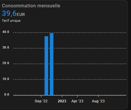
I want 1 bar to be from the 9th to the 9th
Is there a way to do this ?
thyx a lot for your help 
Maybe I am too think, but why can’t you just define the 9th as start date instead of starting with month + offset?
Question and hopefully someone can help me here as I have not found any help anywhere else 
Does anybody know why ‘this.entity_id’ is not being accepted by the apexcharts-card?
type: custom:config-template-card
entities:
- input_datetime.start_datetime
- input_datetime.end_datetime
- input_select.dropdown_wildcards
- input_select.dropdown_entities
card:
type: custom:auto-entities
sort:
method: state
numeric: true
reverse: true
filter:
include:
- name: >-
${ states['input_select.dropdown_entities'].state == '-- - --' ?
states['input_select.dropdown_wildcards'].state + '*' :
states['input_select.dropdown_entities'].state }
# working, so Javascript is working
options:
yaxis_id: first
stroke_width: 2
group_by:
func: raw
type: line
opacity: 1
curve: smooth
fill_raw: last
show:
extremas: true
datalabels: false
name: >-
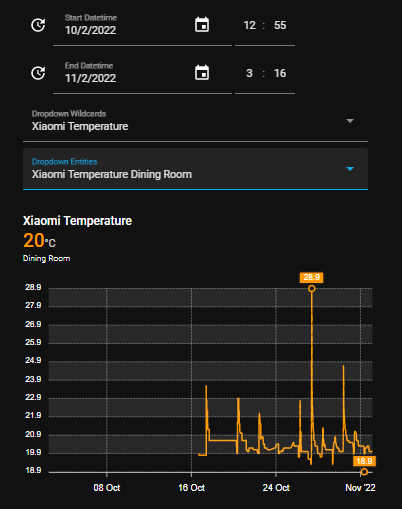
${
states['this.entity_id'].attributes.friendly_name.replace("Xiaomi
Humidity", "") }
# not working
card:
If I replace the this.entity_id with the name of a sensor, it works. So the syntax itself seems to be okay.
But this.entity_id is not being accepted here
Thx for your reply,
I have no idea how do to that nor how do you achieve this view ^^
but that seems to be what I need
Could you explain it please ?
Thx a lot
EDIT : I guess you are using the integration config-template-card ? I’ll look into it
You are correct.
And you need input_datetime.
Go ahead and give it a shot.
And when you feel stuck, below is the relevant code you need ![]()
But no peeking until you get stuck ![]()
input_datetime:
  start_datetime:
    name: Start Datetime
    has_date: true
    has_time: true
  end_datetime:
    name: End Datetime
    has_date: true
    has_time: true
    graph_span: >-
      ${
      ((states['input_datetime.end_datetime'].attributes.timestamp-states['input_datetime.start_datetime'].attributes.timestamp)/60/60).toFixed(2)+'h'
      }
    span:
      offset: >-
        ${
        (-(states['sensor.timestamp'].state-states['input_datetime.end_datetime'].attributes.timestamp)/60/60).toFixed(2)+'h'
        }
thx a lot,
I found your post on the other thread, which gives me more example ^^
Right now the custom card is not showing up … ressource problem I guess.
Thx again
I thought I had this sorted but it seems not. I’m still struggling to get the x-axis of a column chart to display all labels.
My current example is showing the total energy usage per day for 5x days. It looks like the x-axis labels have shifted so the very first one is blank and I now have an additional one for tomorrow that obviously has no data in it because I’m only looking for the last/max value of my sensor for each day.
Any ideas how I can sort this out? I’ve also tried the same thing using group_by and get similar results however I’m just missing the first label and don’t have an extra label at the end
type: custom:apexcharts-card
apex_config:
  xaxis:
    labels:
      format: ddd
      hideOverlappingLabels: false
      showDuplicatges: true
      show: true
experimental:
  color_threshold: true
graph_span: 5d
span:
  end: day
show:
  last_updated: true
header:
  show: true
  show_states: true
  colorize_states: true
yaxis:
  - min: 0
    max: ~12
    decimals: 0
    apex_config:
      tickAmount: 6
series:
  - entity: sensor.server_room_electric_consumption_today
    show:
      header_color_threshold: true
      datalabels: true
    type: column
    statistics:
      type: state
      period: day
      align: start
    color_threshold:
      - value: 7
        color: '#99c140'
      - value: 10
        color: '#e7b416'
      - value: 12
        color: '#cc3232'
Should also add that if I set the align to end rather than start, the columns shift and don’t match the days and I still end up with a large gap at the beginning of the chart
ho i’m peeking and stuck ahah
I don’t get it how to create the card that call for the datetime
for the rest I think i got it
You mean the timestamp?
sensor:
  - platform: time_date
    display_options:
      - 'time'
      - 'date'
      - 'date_time'
      - 'date_time_utc'
      - 'date_time_iso'
      - 'time_date'
      - 'time_utc'
      - 'beat'

template:
  - sensor:
    - name: timestamp
      state: "{{ as_timestamp(states('sensor.date_time_iso')) }}"
      icon: "mdi:calendar-clock"
Got it
I’m still strugling with YAML for cards configuration sometime, but it works very fine
That solves the first part of the daily consumption over a month,
Now i need to figure out the 1 bar over 9th to 9th, and be able to display 1 bar for each “month” over a year
Which leads to another question, which maybe does not belong here
Why apex-charts or History for my sensor does not display values past a couple of days ? maybe I did something wrong, because the data is here !!

nothing before the 24th of october
while, statistics shows data on the 9th for example, i don’t understand this behavior ?

The situation is the same for several sensors, same date, almost the same hour
Recorder purges after 10 days by default.
If I am not mistaken you have to explicitly tell apexcharts-card to use statistics.
So, if you purge, then the only source of data is statistics, which apexcharts-card does not read by default.
I don’t understand what you mean with one bar per month. Sounds like you want the sum of all data or a mean value or something. Or is it one value or month that is being stored?
Check out the statistics part on the apexcharts-card github. Maybe the mean of month is what you are looking for?
Can anybody think of a way to make the source of data statistics in an apexcharts-card when the charted time is more than 2 weeks without breaking the card when it is less than two weeks?
          statistics:
            type: mean
            period: hour
            align: middle
I have not found a way to disable it by setting them to [] or null without breaking the card.
I dug a bit yesterday, my knowledge on this subject was none.
And I don’t inderstand something.
Thanks to you I understand that apexchart do not use statistic that’s why I can’t see the daa befor 10 days, but as I understand by reading the dev page for the long term statistics, the history graph from HA should show the data, as my sensor have a state_class compatible with long term stat (total_increasing)
And I check in the database, data is present
Or am i missing something ?
Regarding the other question.
I want to be able to compare monthly gaz comsumption in a graph based on my billing period (the 9th of every month)
So I want a graph that shows 1 bar per billing period, from the 9th to the 8th of the next month, using my monthly utility meter
Is that clearer ?
Would be much easier if we could set a start date for the energy dashboard.
I will have a look at the statistic option, in fact I don’t think I would need short and long term at the same time.
You can use apexcharts-card with statistics also. For that you simply specify the statistics option per series.
e.g.
type: custom:apexcharts-card
header:
  show: true
  title: Statistics Test Card
  show_states: true
  colorize_states: true
series:
  - entity: sensor.sony_kd_75xf9005_naim_audio_av_energy_power_0
    stroke_width: 2
    statistics:
      type: max
      period: 5minute
      align: middle
    curve: stepline
  - entity: sensor.sony_kd_75xf9005_naim_audio_av_energy_power_0
    curve: stepline
    stroke_width: 2
In that example one line is the data from the “normal” database and one line is plotted from the statistics data.
I am working on a way to have the chart select which to use. The code itself is simple, but I have not yet found out how to “disable” statistics because it does not accept [] or null.
Anyway, no need to switch cards, you just need to specify the use of statistics (I recommend to plot both lines like I did and then play with the values for type, period and align to see which gives the most accurate representation.
I think the problem with your monthly value is that the monthly value is written to the database with a given date. So for HA this value is one single value in time.
But if you plot that value and e.g. plot 3 months, you should see 3 bars, each one month wide.
Problem, however, could be the date that value is stored.
So if your system writes the monthly value every month on the 9th, then you are golden. If it writes that value every month on e.g. the 15th, then your chart will need to be plotted 15 to 15, other wise you will have a value change/step/bar in between.
Are you plotting a chart_type: line or bar or what? I would think that a line/area with curve: stepline and might look more like what you are looking for.
I hope you understand what I mean.
curve: stepline
type: area       #or line
chart_type: line
Careful, those are not the same indentation when you use them. I am just listing them.
I just tried it.
Like you said the value is monthly stored.
And i use bar.
So the graph is wrong
I need my october bar to increase until the 8th of november !!!
Wich i don’t think is possible, unless making some dev and maybe use variable store them in an alternate database ?
I will have the same problem with curve lines I think.
I will try more this afternoon
Thx for help ( a lot !!!)