Apollo AIR-1 Dashboard

I recently bought Apollo AIR sensors, but didn’t find great examples on how to display all the data they show in a compact way. I have a 3D printer and various devices in my techroom, which is why I want to monitor the air there, and in the office I want to know the level of CO2, mostly.

Here’s what I came up with, using ApexCharts Card:

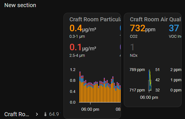
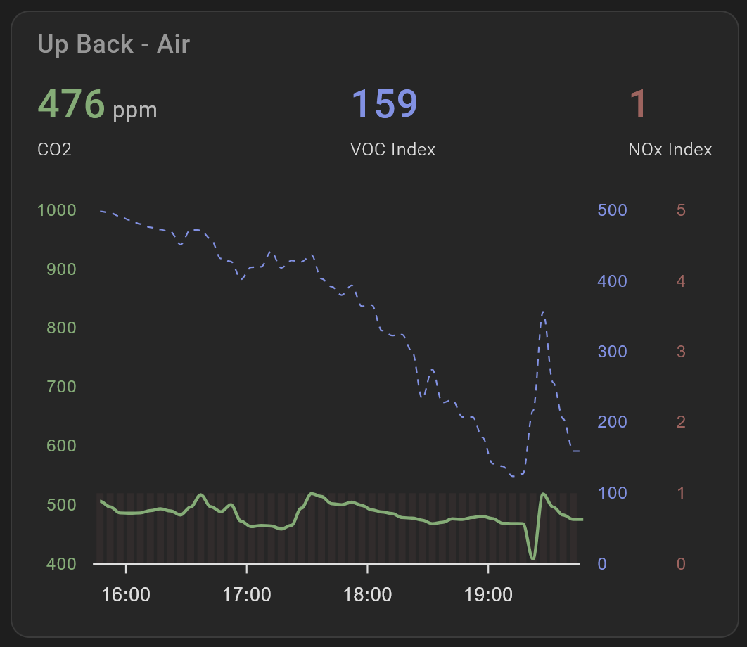
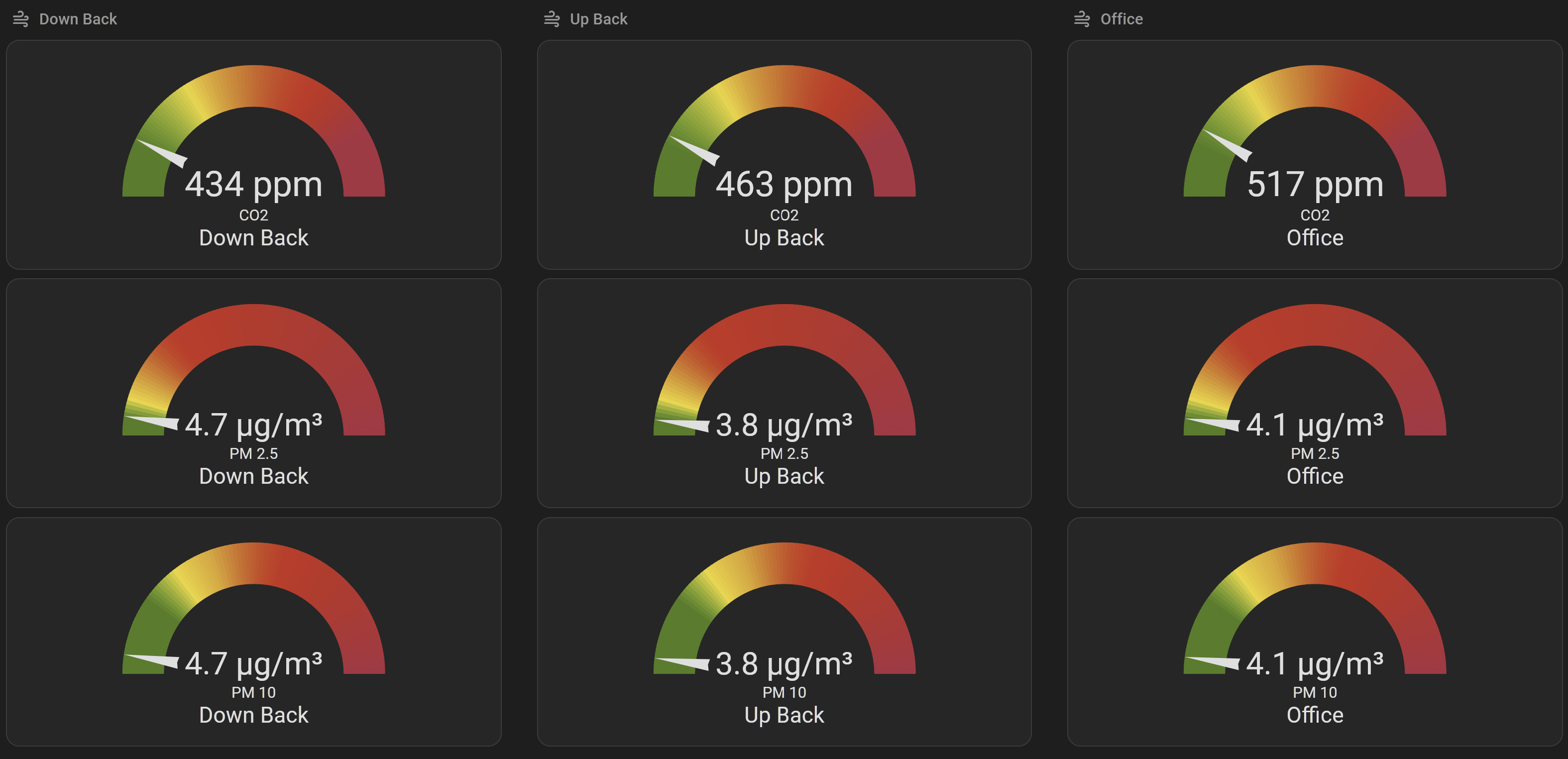
Note that you’ll have to enable the PM sensors (e.g. sensor.office_air_pm_0_3_to_1_m that are disabled by default in HA. I use these for the stacked chart, as I think it gives a good representation of what particulates are in the air, as opposed to charting the inclusive “<x μm” weight concentration metrics.

I’m not 100% happy with the color gradient of the charts at the bottom, as it makes it harder to identify which line represents what, but at the same time I want to know a qualitative assessment as well, which colors achieve quite well.

I’m also using the recently introduced Sections type dashboard, which works really well for this use-case. I especially like the small badges in the heading that allow to show the temperature and humidity in a really compact way. Also I’ve configured the tap_action to navigate to the device’s URL, so that I can see all the raw numbers and configure the sensor if needed.

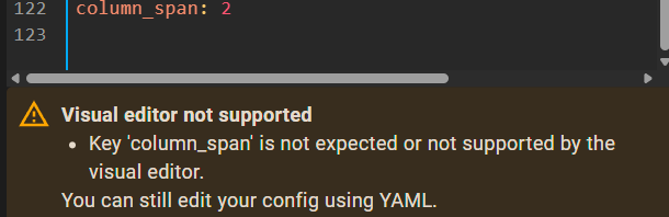
The YAML entry is for the whole dashboard view, so if you want to copy-paste directly (after replacing sensor names, of course), then you’ll have to use the raw configuration editor. Or you can just pick and choose different sections to just get parts of the YAML.

 - title: Air
    path: air
    icon: mdi:air-filter
    type: sections
    max_columns: 2
    sections:
      - type: grid
        cards:
          - type: heading
            heading_style: title
            heading: Office
            badges:
              - type: entity
                show_state: true
                show_icon: true
                entity: sensor.office_air_sen55_temperature
              - type: entity
                entity: sensor.office_air_sen55_humidity
            tap_action:
              action: navigate
              navigation_path: /config/devices/device/a5c8e2af41ddc9a6981f4789912c646c
          - type: custom:apexcharts-card
            header:
              show: true
              title: Office Particulate Matter
              show_states: true
              colorize_states: true
            apex_config:
              grid:
                show: false
              legend:
                show: false
              tooltip:
                shared: true
                marker:
                  show: true
            graph_span: 4h
            stacked: true
            series:
              - entity: sensor.office_air_pm_0_3_to_1_m
                name: 0.3-1 µm
              - entity: sensor.office_air_pm_1_to_2_5_m
                name: 1-2.5 µm
              - entity: sensor.office_air_pm_2_5_to_4_m
                name: 2.5-4 µm
              - entity: sensor.office_air_pm_4_to_10_m
                name: 4-10 µm
            all_series_config:
              stroke_width: 2
              type: column
              group_by:
                func: avg
                duration: 5m
          - type: custom:apexcharts-card
            graph_span: 4h
            experimental:
              color_threshold: true
            header:
              show: true
              title: Office Air Quality
              show_states: true
              colorize_states: true
            all_series_config:
              stroke_width: 2
              float_precision: 0
              group_by:
                func: avg
                duration: 5m
            apex_config:
              grid:
                show: false
              legend:
                show: false
              tooltip:
                shared: true
                marker:
                  show: true
            yaxis:
              - id: co2
                apex_config:
                  labels:
                    formatter: |
                      EVAL:v => `${v.toFixed(0)} ppm`
              - id: voc
                opposite: true
                apex_config:
                  tickAmount: 2
                  labels:
                    formatter: |
                      EVAL:v => `${v.toFixed(0)}`
              - id: nox
                opposite: true
                apex_config:
                  tickAmount: 2
                  labels:
                    formatter: |
                      EVAL:v => `${v.toFixed(0)} ppm`
            series:
              - entity: sensor.office_air_co2
                name: CO2
                yaxis_id: co2
                color_threshold:
                  - value: 0
                    color: green
                  - value: 1000
                    color: yellow
                  - value: 2000
                    color: red
              - entity: sensor.office_air_sen55_voc
                name: VOC Index
                yaxis_id: voc
                color_threshold:
                  - value: 0
                    color: green
                  - value: 80
                    color: blue
                  - value: 120
                    color: orange
                  - value: 200
                    color: red
                  - value: 300
                    color: purple
              - entity: sensor.office_air_sen55_nox
                name: NOx
                yaxis_id: nox
                type: column
                color: rgb(75,75,75)
      - type: grid
        cards:
          - type: heading
            heading_style: title
            heading: Techroom
            badges:
              - type: entity
                show_state: true
                show_icon: true
                entity: sensor.techroom_air_sen55_temperature
              - type: entity
                entity: sensor.techroom_air_sen55_humidity
            tap_action:
              action: navigate
              navigation_path: /config/devices/device/155f7aeef44e6419a8dc3c991cc3e686
          - type: custom:apexcharts-card
            header:
              show: true
              title: Techroom Particulate Matter
              show_states: true
              colorize_states: true
            apex_config:
              grid:
                show: false
              legend:
                show: false
              tooltip:
                shared: true
                marker:
                  show: true
            graph_span: 4h
            stacked: true
            series:
              - entity: sensor.techroom_air_pm_0_3_to_1_m
                name: 0.3-1 µm
              - entity: sensor.techroom_air_pm_1_to_2_5_m
                name: 1-2.5 µm
              - entity: sensor.techroom_air_pm_2_5_to_4_m
                name: 2.5-4 µm
              - entity: sensor.techroom_air_pm_4_to_10_m
                name: 4-10 µm
            all_series_config:
              stroke_width: 2
              type: column
              group_by:
                func: avg
                duration: 5m
          - type: custom:apexcharts-card
            graph_span: 4h
            experimental:
              color_threshold: true
            header:
              show: true
              title: Techroom Air Quality
              show_states: true
              colorize_states: true
            all_series_config:
              stroke_width: 2
              float_precision: 0
              group_by:
                func: avg
                duration: 5m
            apex_config:
              grid:
                show: false
              legend:
                show: false
              tooltip:
                shared: true
                marker:
                  show: true
            yaxis:
              - id: co2
                apex_config:
                  labels:
                    formatter: |
                      EVAL:v => `${v.toFixed(0)} ppm`
              - id: voc
                opposite: true
                apex_config:
                  tickAmount: 2
                  labels:
                    formatter: |
                      EVAL:v => `${v.toFixed(0)}`
              - id: nox
                opposite: true
                apex_config:
                  tickAmount: 2
                  labels:
                    formatter: |
                      EVAL:v => `${v.toFixed(0)} ppm`
            series:
              - entity: sensor.techroom_air_co2
                name: CO2
                yaxis_id: co2
                color_threshold:
                  - value: 0
                    color: green
                  - value: 1000
                    color: yellow
                  - value: 2000
                    color: red
              - entity: sensor.techroom_air_sen55_voc
                name: VOC Index
                yaxis_id: voc
                color_threshold:
                  - value: 0
                    color: green
                  - value: 80
                    color: blue
                  - value: 120
                    color: orange
                  - value: 200
                    color: red
                  - value: 300
                    color: purple
              - entity: sensor.techroom_air_sen55_nox
                name: NOx
                yaxis_id: nox
                type: column
                color: rgb(75,75,75)
    cards: []

I’ll be updating the main post if I come up with something better, so feel free to leave your comments and suggestions :slight_smile:

5 Likes

Also, how do I change the navigation path of the device URL? entering the IP address doesn’t work and I don’t know how to figure out the device path

Thanks a lot! Just powered up the AIR-1 and created a new dashboard using your YAML.

P.S - It wouldn’t save the YAML (after changing entity names) and kept giving an error. ChatGPT helped fix the syntax error

1 Like

In your browser, open your Home Assistant interface, go to Settings → Devices & Services → Devices → Find your Apollo Air device. Now copy this portion of the URL from your browser: /config/devices/device/a5c8e2af41.... and replace it in the file.

1 Like

Feel free to share with the community what you ended up with :slight_smile:

Keep in mind that this is the code for the entire dashboard section, and it’s meant to be inserted using the Raw Configuration Editor, or you could pick sections or cards and insert them separately.

type: grid
cards:
  - type: heading
    heading_style: title
    heading: Master Bedroom
    badges:
      - type: entity
        show_state: true
        show_icon: true
        entity: sensor.apollo_master_bedroom_air_quality_87f9d8_sen55_temperature
      - type: entity
        entity: sensor.apollo_master_bedroom_air_quality_87f9d8_sen55_humidity
    tap_action:
      action: navigate
      navigation_path: /config/devices/device/7835b787a1e257081a94af65be742096
  - type: custom:apexcharts-card
    header:
      show: true
      title: Master Bed Particulate Matter
      show_states: true
      colorize_states: true
    apex_config:
      grid:
        show: false
      legend:
        show: false
      tooltip:
        shared: true
        marker:
          show: true
    graph_span: 4h
    stacked: true
    series:
      - entity: sensor.apollo_master_bedroom_air_quality_87f9d8_pm_0_3_to_1_m
        name: 0.3-1 µm
      - entity: sensor.apollo_master_bedroom_air_quality_87f9d8_pm_1_to_2_5_m
        name: 1-2.5 µm
      - entity: sensor.apollo_master_bedroom_air_quality_87f9d8_pm_2_5_to_4_m
        name: 2.5-4 µm
      - entity: sensor.apollo_master_bedroom_air_quality_87f9d8_pm_4_to_10_m
        name: 4-10 µm
    all_series_config:
      stroke_width: 2
      type: column
      group_by:
        func: avg
        duration: 5m
  - type: custom:apexcharts-card
    graph_span: 4h
    experimental:
      color_threshold: true
    header:
      show: true
      title: Master Bed Air Quality
      show_states: true
      colorize_states: true
    all_series_config:
      stroke_width: 2
      float_precision: 0
      group_by:
        func: avg
        duration: 5m
    apex_config:
      grid:
        show: false
      legend:
        show: false
      tooltip:
        shared: true
        marker:
          show: true
    yaxis:
      - id: co2
        apex_config:
          labels:
            formatter: |
              EVAL:v => `${v.toFixed(0)} ppm`
      - id: voc
        opposite: true
        apex_config:
          tickAmount: 2
          labels:
            formatter: |
              EVAL:v => `${v.toFixed(0)}`
      - id: nox
        opposite: true
        apex_config:
          tickAmount: 2
          labels:
            formatter: |
              EVAL:v => `${v.toFixed(0)} ppm`
    series:
      - entity: sensor.apollo_master_bedroom_air_quality_87f9d8_co2
        name: CO2
        yaxis_id: co2
        color_threshold:
          - value: 0
            color: green
          - value: 1000
            color: yellow
          - value: 2000
            color: red
      - entity: sensor.apollo_master_bedroom_air_quality_87f9d8_sen55_voc
        name: VOC Index
        yaxis_id: voc
        color_threshold:
          - value: 0
            color: green
          - value: 80
            color: blue
          - value: 120
            color: orange
          - value: 200
            color: red
          - value: 300
            color: purple
      - entity: sensor.apollo_master_bedroom_air_quality_87f9d8_sen55_nox
        name: NOx
        yaxis_id: nox
        type: column
        color: rgb(75,75,75)
column_span: 2

This is the YAML for one section showing 2 graphs. I have one AIR-1 sensor so just the two graphs instead of 4 like the original example by keex. Eventually I might try tweaking it to personal preference but it’s already fantastic.

2 Likes

I think I’m missing something obvious, but don’t know what. I’ve copied @SG9 since I only had one sensor. For some reason, it has placed the header as a separate column and cramped the other two.

Additionally, it seems somewhat upset by the column argument at the bottom?

SG9’s example uses the grid card. The column_span: 2 applies to the grid card. The error is hinting that you’re using a different type of card. If I copy the code (hopefully) as intended and go to Raw Configuration editor on the dashboard, this is what I have, without errors.

Edit: I’ve moved the column_span: 2 attribute closer to the type and card attributes for clarity:

      - type: grid
        column_span: 2
        cards:
          - type: heading
            heading_style: title
            heading: Master Bedroom
            badges:
              - type: entity
                show_state: true
                show_icon: true
                entity: >-
                  sensor.apollo_master_bedroom_air_quality_87f9d8_sen55_temperature
              - type: entity
                entity: sensor.apollo_master_bedroom_air_quality_87f9d8_sen55_humidity
            tap_action:
              action: navigate
              navigation_path: /config/devices/device/7835b787a1e257081a94af65be742096
          - type: custom:apexcharts-card
            header:
              show: true
              title: Master Bed Particulate Matter
              show_states: true
              colorize_states: true
            apex_config:
              grid:
                show: false
              legend:
                show: false
              tooltip:
                shared: true
                marker:
                  show: true
            graph_span: 4h
            stacked: true
            series:
              - entity: sensor.apollo_master_bedroom_air_quality_87f9d8_pm_0_3_to_1_m
                name: 0.3-1 µm
              - entity: sensor.apollo_master_bedroom_air_quality_87f9d8_pm_1_to_2_5_m
                name: 1-2.5 µm
              - entity: sensor.apollo_master_bedroom_air_quality_87f9d8_pm_2_5_to_4_m
                name: 2.5-4 µm
              - entity: sensor.apollo_master_bedroom_air_quality_87f9d8_pm_4_to_10_m
                name: 4-10 µm
            all_series_config:
              stroke_width: 2
              type: column
              group_by:
                func: avg
                duration: 5m
          - type: custom:apexcharts-card
            graph_span: 4h
            experimental:
              color_threshold: true
            header:
              show: true
              title: Master Bed Air Quality
              show_states: true
              colorize_states: true
            all_series_config:
              stroke_width: 2
              float_precision: 0
              group_by:
                func: avg
                duration: 5m
            apex_config:
              grid:
                show: false
              legend:
                show: false
              tooltip:
                shared: true
                marker:
                  show: true
            yaxis:
              - id: co2
                apex_config:
                  labels:
                    formatter: |
                      EVAL:v => `${v.toFixed(0)} ppm`
              - id: voc
                opposite: true
                apex_config:
                  tickAmount: 2
                  labels:
                    formatter: |
                      EVAL:v => `${v.toFixed(0)}`
              - id: nox
                opposite: true
                apex_config:
                  tickAmount: 2
                  labels:
                    formatter: |
                      EVAL:v => `${v.toFixed(0)} ppm`
            series:
              - entity: sensor.apollo_master_bedroom_air_quality_87f9d8_co2
                name: CO2
                yaxis_id: co2
                color_threshold:
                  - value: 0
                    color: green
                  - value: 1000
                    color: yellow
                  - value: 2000
                    color: red
              - entity: sensor.apollo_master_bedroom_air_quality_87f9d8_sen55_voc
                name: VOC Index
                yaxis_id: voc
                color_threshold:
                  - value: 0
                    color: green
                  - value: 80
                    color: blue
                  - value: 120
                    color: orange
                  - value: 200
                    color: red
                  - value: 300
                    color: purple
              - entity: sensor.apollo_master_bedroom_air_quality_87f9d8_sen55_nox
                name: NOx
                yaxis_id: nox
                type: column
                color: rgb(75,75,75)

Just recently got the AIR-1, and found this thread through the Apollo Automations Wiki. Great graphs and ideas! Thanks. I’ve tweaked the colours PM graph so they are a bit less vid, but the biggest changes are to the Air Quality graph; it’s still basically the same as yours but I’ve tailored it to suit what’s important to me. I’ve colour-coded the y-axis for each graph, removed the “PPM” text and tweaked the colours, etc.

type: custom:apexcharts-card
graph_span: 4h
experimental:
  color_threshold: true
header:
  show: true
  title: Up Back - Air
  show_states: true
  colorize_states: true
all_series_config:
  float_precision: 0
  group_by:
    func: avg
    duration: 5m
apex_config:
  grid:
    show: false
  legend:
    show: false
  tooltip:
    shared: true
    marker:
      show: true
yaxis:
  - id: co2
    min: 400
    max: ~1000
    apex_config:
      labels:
        style:
          colors: MediumSeaGreen
        formatter: |
          EVAL:v => `${v.toFixed(0)}`
  - id: voc
    opposite: true
    min: 0
    max: ~500
    apex_config:
      tickAmount: 5
      labels:
        style:
          colors: CornflowerBlue
        formatter: |
          EVAL:v => `${v.toFixed(0)}`
  - id: nox
    min: 0
    max: ~5
    opposite: true
    apex_config:
      tickAmount: 5
      labels:
        style:
          colors: IndianRed
        formatter: |
          EVAL:v => `${v.toFixed(0)}`
series:
  - entity: sensor.apollo_air_1_4bb78c_co2
    name: CO2
    yaxis_id: co2
    color: MediumSeaGreen
    stroke_width: 2
  - entity: sensor.apollo_air_1_4bb78c_sen55_voc
    name: VOC Index
    yaxis_id: voc
    color: CornflowerBlue
    stroke_width: 1
    stroke_dash: 4
  - entity: sensor.apollo_air_1_4bb78c_sen55_nox
    name: NOx Index
    yaxis_id: nox
    type: column
    color: Indianred
    stroke_width: 0
    opacity: 0.1

I should have added that I’ve created a dashboard with two views which I’m still experimenting with. Mostly, though, I’ve created automations to turn on fans, flash lights, and send notifications. And then I can use the dashboards to investigate further following those notifications and indications.

and

For the particulate matter code, if you have more than two graphs or if you entend the time scale to, say, 8 hours or more then some HA system may get bogged down. It happens on my Yellow with a CM4 module. There is a way to make the code more performant and that is to use HA’s stats in the Apex charts. Just replace this code:

group_by:
  func: avg
  duration: 5m

with this code:

statistics:
  period: 5minute
  type: mean

Here the complete code from mine:

type: custom:apexcharts-card
header:
  show: true
  title: Office - Particulate Matter
  show_states: true
  colorize_states: true
apex_config:
  grid:
    show: false
  legend:
    show: false
  tooltip:
    shared: true
    marker:
      show: true
  annotations:
    yaxis:
      - "y": 15
        borderColor: "#FF0000"
        strokeDashArray: 4
        label:
          borderColor: "#FF0000"
          style:
            color: "#fff"
            background: "#FF0000"
          text: ""
graph_span: 4h
stacked: true
series:
  - entity: sensor.apollo_air_1_08453c_pm_0_3_to_1_mm
    name: 0.3-1 µm
    color: DarkGoldenrod
  - entity: sensor.apollo_air_1_08453c_pm_1_to_2_5_mm
    name: 1-2.5 µm
  - entity: sensor.apollo_air_1_08453c_pm_2_5_to_4_mm
    name: 2.5-4 µm
  - entity: sensor.apollo_air_1_08453c_pm_4_to_10_mm
    name: 4-10 µm
all_series_config:
  stroke_width: 2
  type: column
  statistics:
    period: 5minute
    type: mean

With that change, my sysytem is no longer sluggish when displaying thos graphs. Almost feels snappy.