Havent seen this anywhere (but could not noticed); in energy dashboard we have a very nice bar chart, that seems to be quite capable to display different data. Why isn’t it available as general purpose lovelace card, so we can use it fo consistant look and feel?
Which bar chart?
They are all available for use in your dashboards.
@tom_l I know about these, but they are exactly what name suggests - just energy card. Perhaps I was not specific enough; I was thinking about possibility to use these as general purpose graphsto display any type of data as, for example, in history card. Immediate example to comes to my mind is to use vertical stack bars to display historical value of my shares portfolio. Or long horizontal stacked bar as representation of network storage consumption by different folders, etc…
My mistake. I missed the importance of the “general purpose” bit of your question. Sorry.
(emphasis mine)
Possible via dedicated graph card, needs to be integrated first though:
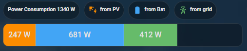
I in that case also used it for the energy stuff, but it can do that with any datasource that is structured in a similar way.
It would be useful if we could use these graphical components for our data source. E.g. to plot real-time energy consumption on a multi-segment bar chart.