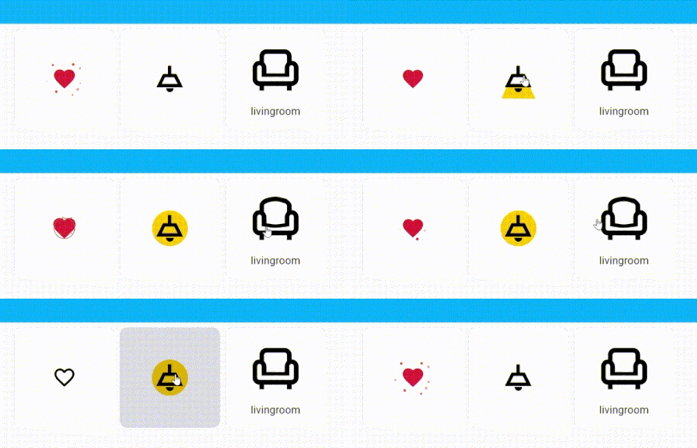
Dear all,
It’s time to bring some animation and movement to our home-assistant dashboards!
Lottie animations are SVG based and can handle way more complex transformations compared to CSS.

It is not possible to replace the default icons with Lottie animations just yet, and patching the core is not something I would consider…
But luckily we have the beautiful button-card of @RomRider, which we all already use anyway.
The button-card can render cards-in-cards, so I made a Lottie animation card!
When the studio-icons-card is loaded it will replace the default icon, but the default remains as a fallback.
The config for the cards shown above:
type: grid
square: true
columns: 3
cards:
  - type: custom:button-card
    icon: mdi:heart-outline
    custom_fields:
      icon:
        card:
          type: custom:studio-icons-card
          icon: lot:heart
          animate: loop
  - type: custom:button-card
    entity: light.zithoek
    icon: ceiling-light-outline
    show_name: false
    state:
      - value: 'on'
        custom_fields:
          icon:
            card:
              type: custom:studio-icons-card
              icon: lot:ceiling-light-outline_state
              animate: loop
    aspect_ratio: 1/1
    custom_fields:
      icon:
        card:
          type: custom:studio-icons-card
          icon: lot:ceiling-light-outline
          animate: enter
  - type: custom:button-card
    icon: mdi:sofa-single-outline
    entity: binary_sensor.livingroom_occupancy
    aspect_ratio: 1/1
    tap_action:
      action: navigate
      navigation_path: /dashboard-thuis/livingroom
    hold_action:
      action: more-info
    name: livingroom
    styles:
      icon:
        - width: 100%
      grid:
        - grid-template-areas: '"t" "i" "n"'
        - grid-template-columns: 1fr
        - grid-template-rows: 10% 60% 30%
      name:
        - font-size: 100%
    custom_fields:
      icon:
        card:
          type: custom:studio-icons-card
          icon: lot:sofa-single-outline
          animate: enter
I’m looking for animators and collaborators to help with the project!
Be a part of this classic ‘took-way-too-many-hours-but-looks-really-nice’ activity, kind regards,
– Ingrid