Markus1995
December 22, 2024, 7:28am
2136
I found the error:
Here is the working code:
type: vertical-stack
cards:
  - type: custom:bubble-card
    card_type: button
    button_type: name
    card_layout: large
    name: Badezimmer
    icon: mdi:bathtub
    show_state: false
    button_action:
      action: navigate
      navigation_path: Badezimmer
      tap_action:
        action: navigate
        navigation_path: Badezimmer
    sub_button:
      - entity: sensor.raumklima_bad_co2
        show_background: false
        show_state: true
        icon: mdi:molecule-co2
        tap_action: more-info
        hold_action:
          action: more-info
      - entity: sensor.raumklima_bad_luftfeuchtigkeit
        show_background: false
        show_state: true
        tap_action: more-info
        hold_action:
          action: more-info
      - entity: sensor.raumklima_bad_temperatur
        show_background: false
        show_state: true
        tap_action: more-info
        hold_action:
          action: more-info
    styles: |
      .bubble-button-card-container,
      .bubble-button-card {
        height: 80px !important;
        background: transparent !important;
        font-size: 15px !important;
      }
      .bubble-icon-container,
      .bubble-name-container {
        top: -25px;
      }
      .bubble-sub-button-container {
         position: absolute !important;
         bottom: 0px !important;
         justify-content: left !important;
         width: calc(100% - 20px) !important;
         right: inherit !important;
         margin: 10px !important;
         height: 30px !important;
}
      .bubble-feedback-element {
         height: 200% !important;
      }
      .bubble-name {
         font-size: 15px !important;
      }
      .bubble-sub-button-1 {
        background-color: ${hass.states['sensor.raumklima_bad_co2'].state >= 1250 ? 'tomato' :
                          hass.states['sensor.raumklima_bad_co2'].state >= 750 ? '#FFB347' :
                          hass.states['sensor.raumklima_bad_co2'].state >= 100 ? 'transparent' :
                          'transparent'} !important;
      }
      .bubble-sub-button-2 {
        background-color: ${hass.states['sensor.raumklima_bad_luftfeuchtigkeit'].state >= 80 ? 'tomato' :
                          hass.states['sensor.raumklima_bad_luftfeuchtigkeit'].state >= 60 ? '#FFB347' :
                          'transparent'} !important;
        color: ${hass.states['sensor.raumklima_bad_luftfeuchtigkeit'].state >= 60 && hass.states['sensor.raumklima_bad_luftfeuchtigkeit'].state <= 80 ? '#383838' : 'inherit'} !important;
      }
      .bubble-sub-button-3 {
        background-color: ${hass.states['sensor.raumklima_bad_temperatur'].state >= 28 ? 'tomato' :
                          hass.states['sensor.raumklima_bad_temperatur'].state >= 23 ? '#FFB347' :
                          hass.states['sensor.raumklima_bad_temperatur'].state >= 17 ? 'transparent' :
                          'LightSkyBlue'} !important;
        color: ${hass.states['sensor.raumklima_bad_temperatur'].state < 17 ? '#383838' : 'inherit'} !important;
      }
    tap_action:
      action: navigate
      navigation_path: Badezimmer
    show_icon: false
    force_icon: false
    scrolling_effect: false
will7
December 22, 2024, 8:26am
2137
Hello, serched this thread, but with no luck and decided to ask.
stefan1982
December 22, 2024, 9:03am
2138
What are you looking for? A progress bar button card like this?
4 Likes
benm7
December 22, 2024, 9:52am
2139
Any chance of sharing the code for these? Look great!
will7
December 22, 2024, 10:40am
2140
That progress bar (timer for switch) is in totaly different card, but i want add the thin light golden border line/frame around that card to Bubble card so both cards look the same.
When you look on turned off switch, there is just dark background, and i want to add that bordel line around button.
skavan
December 23, 2024, 10:52am
2141
Check out my version
Hi,
I’m new to all this so go easy on me. I just created a replacement for the ha-text-editor (it uses ha-text-editor under the hood). I wanted real-time updates and more.
1 Like
Morcegolas
December 23, 2024, 5:40pm
2142
How can I change a sub-icon colour based on a sensor value? I want to change the battery color based on the battery percentage, green until 50 %, yellow between 25 and 50%, and red bellow 25%.
I used to have like this on mushroom template:
color: >
  {% set battery = states('sensor.maximinos_battery') | int %} {% if battery >
  50 %}
    green
  {% elif battery > 25 %}
    yellow
  {% else %}
    red
  {% endif %}
With bubble card I’m trying to get there, but I’m getting nowhere.
.bubble-sub-button-1 > ha-icon {
  color: ${hass.states['sensor.maximinos_battery'].state === '45' ? 'green' : 'red'} !important;
}
Hope that anyone can help me with this, I looked in the documentation but didn’t found for this case.
Menelao
December 23, 2024, 5:50pm
2143
Try like this
.bubble-sub-button-1 > ha-icon {
    color: ${
      hass.states['sensor.maximinos_battery'].state > '50' ? 'green' :
      hass.states['sensor.maximinos_battery'].state > '25' ? 'yellow' :
      'red'} !important;
  }
1 Like
Morcegolas
December 23, 2024, 6:09pm
2144
I’m not getting any error but the icon stay white.
Menelao
December 23, 2024, 8:11pm
2145
Could you paste the entire card code?
Morcegolas
December 23, 2024, 11:38pm
2146
I just needed to remove the ‘’ from ‘50’ and ‘25’ and it worked.
Thanks.
flrnwrzl
December 24, 2024, 10:03pm
2147
Maybe this was already discussed but i have two questions:
1: how can i get this
2: how can i get rid of this
davidnestico
December 24, 2024, 10:14pm
2148
Use kiosk-mode to get rid of the header (2nd image)
jmrplens
December 25, 2024, 1:43am
2149
1 Like
Nooton
December 25, 2024, 2:58am
2150
I love these cards. However, I have hit an issue that I’m sure is a simple fix that I’m missing.
I tend to build elements of my dashboard outside of my main dashboard and then transfer them when they are ready for the family to use.
I did just that for some reason numbers for our solar installation tracking how much we have saved and an estimate for when it has paid for itself. Need a full year of data before it is accurate but that is not the issue.
Everything looks fine in my test dashboard. As soon as I put it in a popup my individual cards have gaps in them. See images and code below.
type: custom:stack-in-card
mode: vertical
card_mod:
  style: |
    ha-card{
      border: 6px double green !important;
      --stack-card-gap: 0 !important;
    }
cards:
  - type: custom:stack-in-card
    mode: horizontal
    card_mod:
      style: |
        ha-card{
          border-radius: 0px;
        }
    cards:
      - type: custom:mushroom-template-card
        primary: System Cost
        card_mod:
          style: |
            ha-card {
              border-right: 2px solid green !important;
              border-bottom: 2px solid green !important;
              background-color: rgba(41,45,94,1) !important;
            }
        secondary: ${{ states ('input_number.amount_remaining')  }}
        entity: input_number.amount_remaining
        hold_action:
          action: none
        double_tap_action:
          action: none
        tap_action:
          action: more-info
        layout: vertical
      - type: custom:mushroom-template-card
        primary: Total Saved
        card_mod:
          style: |
            ha-card {
              border-bottom: 2px solid green !important;
              background-color: rgba(41,45,94,1) !important;
            }
        secondary: ${{ states ('input_number.total_saved')  }}
        hold_action:
          action: none
        double_tap_action:
          action: none
        tap_action:
          action: more-info
        entity: input_number.total_saved
        layout: vertical
      - type: custom:mushroom-template-card
        primary: Remaining
        card_mod:
          style: |
            ha-card {
              border-left: 2px solid green !important;
              border-bottom: 2px solid green !important;
              background-color: rgba(41,45,94,1) !important;
            }
        secondary: ${{ states ('sensor.break_even_amount')  }}
        entity: sensor.break_even_amount
        hold_action:
          action: none
        double_tap_action:
          action: none
        tap_action:
          action: more-info
        layout: vertical
  - type: custom:stack-in-card
    mode: horizontal
    card_mod:
      style: |
        ha-card{
          border-radius: 0px
        }
    cards:
      - type: custom:mushroom-template-card
        primary: Avg Saved/Day
        card_mod:
          style: |
            ha-card {
              border-right: 2px solid green !important;
              border-bottom: 2px solid green !important;
              background-color: rgba(41,45,94,1) !important;
            }
        secondary: ${{ states ('sensor.average_saved_day')  }}
        entity: sensor.average_saved_day
        hold_action:
          action: none
        double_tap_action:
          action: none
        tap_action:
          action: more-info
        layout: vertical
        fill_container: true
        multiline_secondary: false
      - type: custom:mushroom-template-card
        primary: Saved Today
        card_mod:
          style: |
            ha-card {
              border-bottom: 2px solid green !important;
              background-color: rgba(41,45,94,1) !important;
            }
        secondary: ${{ states ('sensor.daily_saved')  }}
        entity: sensor.daily_saved
        hold_action:
          action: none
        double_tap_action:
          action: none
        tap_action:
          action: more-info
        layout: vertical
      - type: custom:mushroom-template-card
        primary: Daily Credits
        card_mod:
          style: |
            ha-card {
              border-left: 2px solid green !important;
              border-bottom: 2px solid green !important;
              background-color: rgba(41,45,94,1) !important;
            }
        secondary: >-
          ${{ states
          ('sensor.esphome_web_b79230_total_daily_energy_return_compensation')
          }}
        entity: sensor.esphome_web_b79230_total_daily_energy_return_compensation
        hold_action:
          action: none
        double_tap_action:
          action: none
        tap_action:
          action: more-info
        layout: vertical
  - type: custom:stack-in-card
    mode: horizontal
    card_mod:
      style: |
        ha-card{
          border-radius: 0px
        }
    cards:
      - type: custom:mushroom-template-card
        primary: Time Remaining
        card_mod:
          style: |
            ha-card {
              border-right: 2px solid green !important;
              background-color: rgba(41,45,94,1) !important;
            }
        secondary: >-
          {{ states ('sensor.time_remaining_years')  }} Yrs & {{ states
          ('sensor.time_remaining_days') }} Days
        entity: sensor.time_remaining_days
        hold_action:
          action: none
        double_tap_action:
          action: none
        tap_action:
          action: more-info
        layout: vertical
      - type: custom:mushroom-template-card
        primary: Days Tracked
        card_mod:
          style: |
            ha-card {
              background-color: rgba(41,45,94,1) !important;
            }
        secondary: "{{ states ('counter.days_tracked')  }}"
        hold_action:
          action: none
        double_tap_action:
          action: none
        tap_action:
          action: more-info
        entity: counter.days_tracked
        layout: vertical
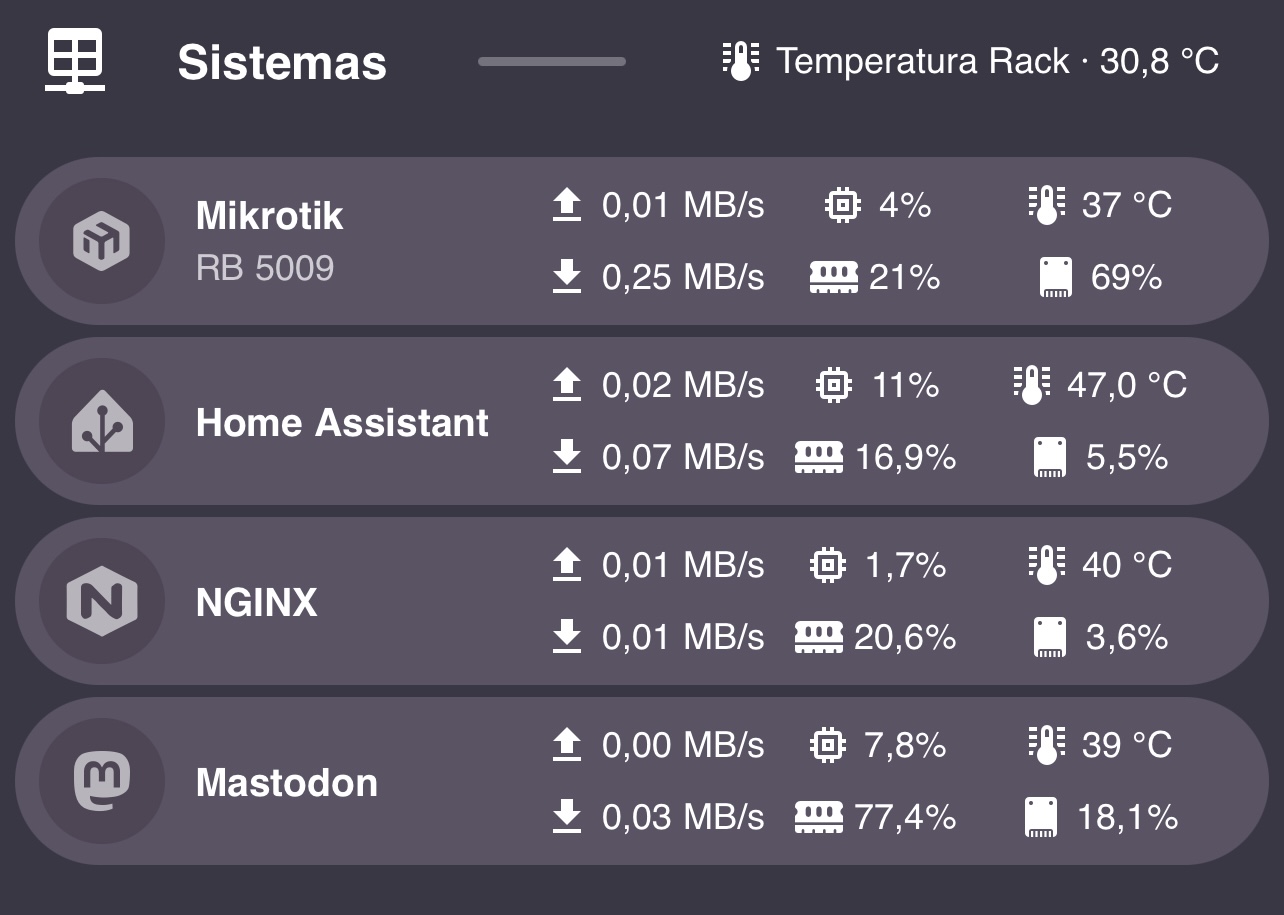
jmrplens
December 26, 2024, 9:41am
2151
I don’t have a computer today and I can only edit with my mobile, so I can’t inspect the CSS. I have made these cards but I do not know how to align the content of each sub button to the left (it is now centered).
Any ideas?
Bubble Style: Bubble-Card/src/cards/button/styles.ts at 28c5037cc065a64faea3cd9bebec7f3d621104b6 · Clooos/Bubble-Card · GitHub
View Dashboard code
title: Despacho
cards: []
icon: mdi:desk
subview: false
type: sections
theme: Bubble_With_Colors
max_columns: 1
sections:
  - type: grid
    cards:
      - type: custom:bubble-card
        card_type: separator
        name: Sistemas
        icon: mdi:table-network
        card_layout: large
        styles: |-
          .bubble-separator {

          }
          .bubble-line {
            background: var(--primary-text-color);
            opacity: 0.3;
            height: 3px;
          }
        sub_button:
          - entity: sensor.ht_rack_temperature
            name: Temperatura Rack
            icon: mdi:thermometer-lines
            state_background: true
            show_background: false
            show_state: true
            show_name: true
      - type: custom:bubble-card
        card_type: button
        button_type: state
        icon: phu:mikrotik
        sub_button:
          - entity: sensor.mk_rb5009_pppoe_digi_tx
            name: Upload
            show_background: false
            icon: mdi:upload
            show_state: true
          - entity: sensor.mk_rb5009_pppoe_digi_rx
            name: Download
            icon: mdi:download
            show_background: false
            show_state: true
          - name: CPU
            entity: sensor.mk_rb5009_rb5009ug_s_cpu_load
            show_state: true
            show_name: false
            show_icon: true
            show_background: false
            icon: mdi:memory
          - entity: sensor.mk_rb5009_rb5009ug_s_memory_usage
            name: RAM
            show_name: false
            show_icon: true
            show_state: true
            show_background: false
            icon: fas:memory
          - entity: sensor.mk_rb5009_rb5009ug_s_cpu_temperature
            name: Temp
            show_icon: true
            show_name: false
            show_state: true
            show_background: false
            icon: mdi:thermometer-lines
          - entity: sensor.mk_rb5009_rb5009ug_s_hdd_usage
            show_icon: true
            show_name: false
            show_background: false
            show_state: true
            name: SSD
            icon: cil:imac-ssd
        card_layout: large-2-rows
        name: Mikrotik
        styles: |-
          .bubble-sub-button {
            width: 70px!important;
          }

          ${card.querySelector('.bubble-state').innerText = 'RB 5009' }
        entity: sensor.mk_rb5009_rb5009ug_s_uptime
        show_state: false
        show_attribute: true
        show_icon: true
        scrolling_effect: false
      - type: custom:bubble-card
        card_type: button
        button_type: state
        icon: mdi:home-assistant
        sub_button:
          - name: Upload
            show_background: false
            icon: mdi:upload
            show_state: true
            entity: sensor.system_monitor_trafico_de_red_de_salida_de_eno1
          - entity: sensor.system_monitor_trafico_de_red_de_entrada_de_eno1
            name: Download
            icon: mdi:download
            show_background: false
            show_state: true
          - name: CPU
            show_state: true
            show_name: false
            show_icon: true
            show_background: false
            icon: mdi:memory
            entity: sensor.system_monitor_uso_del_procesador
          - name: RAM
            show_name: false
            show_icon: true
            show_state: true
            show_background: false
            icon: fas:memory
            entity: sensor.system_monitor_uso_de_memoria_2
          - name: Temp
            show_icon: true
            show_name: false
            show_state: true
            show_background: false
            icon: mdi:thermometer-lines
            entity: sensor.system_monitor_temperatura_del_procesador
          - show_icon: true
            show_name: false
            show_background: false
            show_state: true
            name: SSD
            icon: cil:imac-ssd
            entity: sensor.system_monitor_uso_del_disco_de_2
        card_layout: large-2-rows
        name: Home Assistant
        styles: |-
          .bubble-sub-button {
            width: 70px!important;
          }

          ${card.querySelector('.bubble-state').innerText = 'RB 5009' }
        show_state: false
        show_attribute: false
        show_icon: true
        scrolling_effect: false
        entity: sensor.system_monitor_ultimo_arranque
      - type: custom:bubble-card
        card_type: button
        button_type: state
        icon: phu:nginx
        sub_button:
          - name: Upload
            show_background: false
            icon: mdi:upload
            show_state: true
            entity: sensor.nginx_enp2s0_tx
          - entity: sensor.nginx_enp2s0_rx
            name: Download
            icon: mdi:download
            show_background: false
            show_state: true
          - name: CPU
            show_state: true
            show_name: false
            show_icon: true
            show_background: false
            icon: mdi:memory
            entity: sensor.nginx_uso_de_cpu
          - name: RAM
            show_name: false
            show_icon: true
            show_state: true
            show_background: false
            icon: fas:memory
            entity: sensor.nginx_uso_de_memoria
          - name: Temp
            show_icon: true
            show_name: false
            show_state: true
            show_background: false
            icon: mdi:thermometer-lines
            entity: sensor.nginx_temperatura_de_package_id_0
          - show_icon: true
            show_name: false
            show_background: false
            show_state: true
            name: SSD
            icon: cil:imac-ssd
            entity: sensor.nginx_uso_de_disco_de
        card_layout: large-2-rows
        name: NGINX
        styles: |
          .bubble-sub-button {
            width: 70px!important;
          }

          ${card.querySelector('.bubble-state').innerText = 'RB 5009' }
        show_state: false
        show_attribute: false
        show_icon: true
        scrolling_effect: false
        entity: sensor.nginx_tiempo_de_funcionamiento
      - type: custom:bubble-card
        card_type: button
        button_type: state
        icon: mdi:mastodon
        sub_button:
          - name: Upload
            show_background: false
            icon: mdi:upload
            show_state: true
            entity: sensor.mastodon_server_enp3s0_tx
          - name: Download
            icon: mdi:download
            show_background: false
            show_state: true
            entity: sensor.mastodon_server_enp3s0_rx
          - name: CPU
            show_state: true
            show_name: false
            show_icon: true
            show_background: false
            icon: mdi:memory
            entity: sensor.mastodon_server_uso_de_cpu
          - name: RAM
            show_name: false
            show_icon: true
            show_state: true
            show_background: false
            icon: fas:memory
            entity: sensor.mastodon_server_uso_de_memoria
          - name: Temp
            show_icon: true
            show_name: false
            show_state: true
            show_background: false
            icon: mdi:thermometer-lines
            entity: sensor.mastodon_server_temperatura_de_composite
          - show_icon: true
            show_name: false
            show_background: false
            show_state: true
            name: SSD
            icon: cil:imac-ssd
            entity: sensor.mastodon_server_uso_de_disco_de
        card_layout: large-2-rows
        name: Mastodon
        styles: |
          .bubble-sub-button {
            width: 70px!important;
          }

          ${card.querySelector('.bubble-state').innerText = 'RB 5009' }
        show_state: false
        show_attribute: false
        show_icon: true
        scrolling_effect: false
        entity: sensor.mastodon_server_tiempo_de_funcionamiento
path: despacho-rack
1 Like
Thyraz
December 26, 2024, 7:41pm
2152
Is it possible to add the current weekday to a displayed string?
I know the examples from Github to use Javascript inside the CSS section for using computed text.
edit:Advanced example: Templating a separator name based on a state translated to your language ” here:
Is the whole card updated because of the temperature-subicon and the idea behind this example is, that the icon and condition won’t change as long as the temperature hasn’t changed?
In this case, I could add a time-based helper that switches on at midnight and off a minute later (and then hide the sub-button using CSS).
edit2:
- type: custom:bubble-card
    card_type: separator
    name: Name
    sub_button:
      - entity: binary_sensor.midnighthelper
        name: Midnight-Helper
        show_name: true
        show_icon: false
    styles: >-
      .bubble-name:before {
        color: red;
        content: attr(data-before);
        padding-right: 0.5em
      }
      .bubble-sub-button-container {
        display: none;
      }
      ${card.querySelector('.bubble-name').setAttribute('data-before', new
      Date().toLocaleDateString('de-DE', {weekday: 'long'}).toUpperCase())};
      ${card.querySelector('.bubble-name').innerText = new
      Date().toLocaleDateString('de-DE', {day: 'numeric', month:
      'long'}).toUpperCase()};
Morcegolas
December 26, 2024, 9:12pm
2153
Hello! How can I remove the decimals in a sub-button? This is the Custom Style/Template code I’m using:
.bubble-sub-button-1 > ha-icon {
    color: ${
      hass.states['sensor.quarto_p_temperature'].state > 20 ? 'green' :
      hass.states['sensor.quarto_p_temperature'].state > 25 ? 'red' :
      'blue'} !important;
}
.bubble-sub-button-2 > ha-icon {
    color: #4c4cff !important;
}

${subButtonIcon[0].setAttribute("icon", hass.states['sensor.quarto_p_temperature'].state >= '20' ? 'fas:temperature-half' : hass.states['sensor.sonoff_snzb_02d_quarto_kika_temperatura'].state >= '25' ? 'fas:temperature-full' : 'fas:temperature-empty') } !important;
EDIT:
Another question I have, how can I remove the background of a state button. I’m trying to just leave the pictures of the persons at home, when someone is at home, it shows the image, that part I know how to do, but I want to show only the round pictures and not the rectangle button, is it possible?
Hope anyone can help me!
Check the entity, it should allow you to remove the extra decimal.
gcor71
December 27, 2024, 11:44am
2155
I am using the pop-up card to display a map, however the map in the pop-up doesn’t apply any of the intended attributes (focus etc). It works fine when not included within the pop-up vertical stack.
Any suggestions please?
my card:
type: vertical-stack
cards:
  - hash: "#findmy"
    type: custom:bubble-card
    card_type: pop-up
    button_type: name
    name: FindMy
    icon: mdi:radar
    auto_close: "45000"
    scrolling_effect: false
    width_desktop: 75%
    close_on_click: false
    styles: |-
      .bubble-button-card-container {
              background: rgba(12,120,50,0.5) !important;
            }
  - type: map
    entities:
      - device_tracker.r_iphone
      - device_tracker.g_iphone
      - device_tracker.m_iphone
      - device_tracker.i_iphone
      - device_tracker.k_location
      - entity: zone.home
        focus: true
    theme_mode: auto
    default_zoom: 14
    auto_fit: false
    fit_zones: false
view_layout:
  grid-area: F7
This is the pop-up it creates. The map attributes SHOULD focus the map on the home zone - but that doesn’t work in the pop-up.


