⚪ Bubble Card - A minimalist card collection for Home Assistant with a nice pop-up touch

The header stopped working after the update… “you need to define a entity”
i just copied pasted your settins from above…

My popups doesnt work aswell anymore… My buttons in vertical stack doesnt work aswell… There are alot of things broken now…

The buttons dont got any tap actions anymore

Very nice to finally have the possibility to update sub_button background ! Thanks !

1 Like

Can you provide more details? I don’t have any of your issues.

Fixed those issues… For some reason it didnt download beta .10… But iv got one more issue to show you!
26-05-2024 09h-13m-33s

Those cards are exactly the same! But the button_type: switch adjust the style correctly and the button_type: state doesnt ( Its about the background color. )
Also the button_type: state tap_action on button doesnt work correctly.

square: false
type: grid
cards:
  - type: custom:bubble-card
    card_type: button
    button_type: state
    entity: sensor.woonkamer_temperature
    name: Woonkamer
    scrolling_effect: false
    tap_action:
      action: call-service
      service: light.toggle
      target:
        entity_id: light.woonkamer_all
    button_action:
      tap_action:
        action: navigate
        navigation_path: '#woonkamer'
    card_layout: large
    styles: |-
      .bubble-button-card-container {
        background: rgba(0,190,240,0.6);
      }
      .bubble-icon {
        opacity: 1;
        color: ${hass.states['light.woonkamer'].state === 'on' ? 'orange' : 'grey'} !important;
      }
    show_state: true
    icon: mdi:sofa
    show_name: true
  - type: custom:bubble-card
    card_type: button
    button_type: switch
    entity: sensor.woonkamer_temperature
    name: Woonkamer
    scrolling_effect: false
    tap_action:
      action: call-service
      service: light.toggle
      target:
        entity_id: light.woonkamer_all
    button_action:
      tap_action:
        action: navigate
        navigation_path: '#woonkamer'
    card_layout: large
    styles: |-
      .bubble-button-card-container {
        background: rgba(0,190,240,0.6);
      }
      .bubble-icon {
        opacity: 1;
        color: ${hass.states['light.woonkamer'].state === 'on' ? 'orange' : 'grey'} !important;
      }
    show_state: true
    icon: mdi:sofa
    show_name: true
columns: 2

1 Like

I’m glad that your other issues are fixed, and indeed the button actions are not working for a state button, I will take a look at that and also at the color issue.

Could someone help me with the following.
Id like to have the entity use a color when the state is on for the lights & plex.

type: custom:bubble-card
card_type: button
card_layout: large
button_type: name
show_icon: false
name: ''
sub_button:
  - name: Lampen
    icon: mdi:lightbulb-group
    tap_action:
      action: navigate
      service: input_boolean.toggle
      navigation_path: '#lampen'
    entity: light.all
    show_background: false
    show_state: false
    show_icon: true
  - name: Covers
    icon: ''
    show_background: false
    tap_action:
      action: navigate
      navigation_path: '#volets'
    entity: cover.piece_principale
  - name: Shopping list
    icon: mdi:cart-outline
    show_background: false
    tap_action:
      action: navigate
      navigation_path: '#liste'
  - icon: mdi:video-outline
    name: Security
    show_background: false
    tap_action:
      action: navigate
      navigation_path: '#securite'
  - name: plex
    icon: mdi:plex
    show_background: false
    tap_action:
      action: navigate
      navigation_path: '#plex'
    entity: sensor.tautulli_watching
    show_attribute: false
    attribute: friendly_name
    show_state: false
styles: |
  .card-content {
    width: 100%;
    margin: 0 !important;
  }
  .bubble-button-card-container {
    background: none;
  }
  .bubble-sub-button {
    height: 46px !important;
    width: 46px !important;
  }
  .bubble-sub-button-container {
    width: 100%;
    justify-content: space-between !important;
  }
  .bubble-sub-button-icon {
    --mdc-icon-size: inherit !important;
  }
  .bubble-name-container {
    margin-right: 0px !important;
  }
show_attribute: false
tap_action:
  action: navigate
  navigation_path: '#lampen'
show_state: false

Hi,
does anybody know how to change the sub-button-icon in the header of a popup depending on the state of the entity?

Thanks for any help in advance!

Bubble Card 2 - The Closest One? :crossed_fingers:

If you missed it, you can take a look at the 2.0.0-beta.1 (huge) full changelog here.

Version 2.0.0-beta.11

Hi! Here’s another new beta. I’ve said this a lot, but this one should be really close to the stable version!

There are still some known compatibility issues with some cards and with the Fully Kiosk Browser, but aside from that, everything should now work as expected!

:heavy_check_mark: Bug fixes and optimizations

  • Fixed the state button background color, which was different from other buttons when a custom style was defined
  • The button actions are now working for state buttons
  • The sub-buttons are now displaying the correct icon in all cases

These features were added in beta 9, but I forgot to mention them:

  • You can now scroll inside a button if the content overflows
  • I’ve moved all settings related to the pop-up header button to the “Header settings” section in the editor

As always, I can’t wait for your feedback!

Enjoy! :beers:

4 Likes

First of all a note of thanks to @Cloos. Bubble cards are rapidly replacing many other custom cards for my dashboard.

Some feedback and a request to try and help the project…

Feedback
Perhaps stupidly I was struggling for ages to get the pop-ups to work. I assumed they had to be in their own dashboard. Making it clearer in the documentation that the vertical stack and pop up card go on the same dashboard from which they are triggered would help.

Request
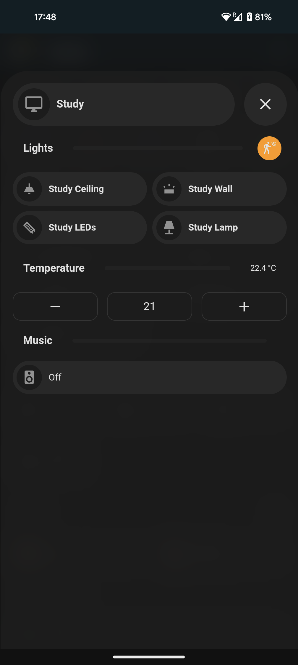
Home assistant lacks a simple, space efficient thermostat. A thermostat card in the bubble card style would be great. I don’t think it needs to be more than this functionality wise…

You have to tell me how to do that!

Indeed you are not the first to try that, I will indeed add some words about that!

And for your thermostat card you can now do it yourself easily with the sub-buttons, for example one for showing the temperature and two others for the - and +. I don’t have a smart thermostat myself so I don’t have any YAML example to show you.

Beta 11 functions nearly perfect on everything but android. IOS and desktop browsers are lightening fast, but anything, including the home assistant app, on android is very slow. It takes 15 seconds for pop ups to load and respond to input. I have cleared cache and reinstalled the app. It also doesn’t work on fullly kiosk browser.

So about the sub-buttons for thermostat, there’s no relevant service call. The only way I could figure out how to do it was through custom button cards as they support JS…

type: custom:button-card
aspect_ratio: 3/1
icon: mdi:minus
tap_action:
  action: call-service
  service: climate.set_temperature
  service_data:
    entity_id: climate.study
    temperature: |
      [[[ var temp = ((states['climate.study'].attributes.temperature) - 0.5);
         return temp; ]]]

Would this also work with sub buttons please?

Well indeed… I guess that I will need to add a new card type for that then :grin:

This is weird, can you take a look for any related logs? I’m using it on Android without issues.

And also can you tell me if it was working correctly before beta 11?

There’s a difference in bg colour between the two buttons. Could we get both to match each other?

(L)Slider, (R) Switch (v2-beta.11)

Better yet, I think a gradual gradient effect will look nice on both:

Screenshot 2024-05-26 at 19.45.52

Thanks

I will take a look at this for the next beta, but I will not add a gradient, I like to keep it flat :slightly_smiling_face:

Edit: I’ve just tried and they are no difference between them on my setup, are you sure that you don’t have any custom styles on it?

2 Likes

Weird, I have no custom styles applied at all

So I think it can be done without JS by making two scripts for each climate device (one to lower and one to increase temp), then making a service call to each script. However, this seems like a tiring solution.

A new card type making life simple would be much appreciated by noobs like me.

1 Like

I totally agree! I will work on that for the v2.0.1!