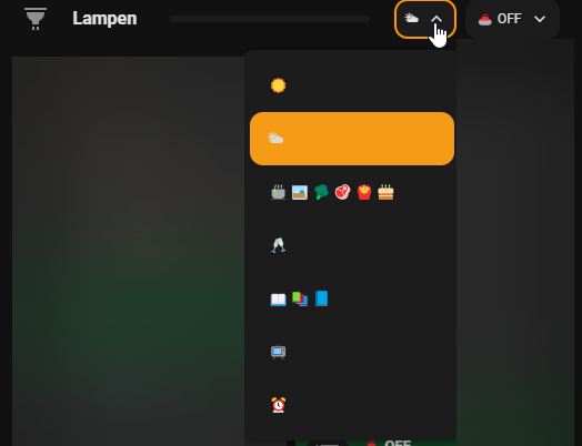
My open and close icons for the window are not working…for your blinds…is that the open icon?
I used the same for my open window but what I showed from the pics is that @Cloos default open and close icons work showing the state of the window/cover/blinds as fill and unfill icon, while my optional icons of closed and open are not working.
How did you manage to display the list as friendly names as well…for me the entire select list shows all names as discharge.Dishwasher.xx instead of Normal 45, Intensive 60

This is the cover card. And you see in the screenshot that the upwards icon is greyed out, as the cover is already open. This also works with the custom buttons that I have defined, which you can also see in the screenshot.
I’m not referring to up down icons…instead the cover state icons. They are supposed to be what I have specified in open and close states.
I have duplicated the instance, the default window coverings icons work fine for open and closed states but not the optional ones as I have set in UI editor. It appears to me a code bug.


The question came here (and on Github) already to have a dropdown for scenes.
Here I wrote down a system that achieves this.
2 Likes
Ok, but also the custom icon changes for me:

Here it is closed, see my posting from this morning, there it is open and has a different icon.
Ive been struggling with this too. I tried to re-size the card but didnt seem to work. The separator seems to be aligned with the top of the card container.
My guess is you have to resize both the card, and the card container.
Settings > Devices & Services > Helpers
- Create Helper, Then select Group > Light Group
1 Like
Going round in circles here and was hoping could point me in the right direction, so have a pop up in a media bubble and would like to change the background based on the state of the switch (on/off). I’ve tried the following code but can’t get the “off “ colour to match the rest of my dash.
 .bubble-button-background {
      background-color: ${state === 'on' ? 'rgba(63,91,102,0.75)' : 'rgba(0,0,0,0.75)'} !important;
    }

So the offending switch button is the top “tv on/off”
The lower two are how I would like the top one to look off and on
Hoping someone can guide me on n resolving this
Many thanks
I use an edited version of the Bubble theme by Cloos:

I forked it and edited it here on GitHub:
Some more colors I used on the custom CSS of the cards:
green:
.bubble-button-card-container {
  --bubble-main-background-color: #244e3f;
  --bubble-button-icon-background-color: #23302d;
}

.bubble-range-fill {
  --bubble-accent-color: #009e73;
}

.bubble-icon {
  color: white;
  opacity: 0.8 !important;
}
red:
.bubble-button-card-container {
  --bubble-main-background-color: #b32e4a;
  --bubble-button-icon-background-color: #412329;
}

.bubble-icon {
  color: white;
  opacity: 0.8 !important;
}
purple:
.bubble-button-card-container {
  --bubble-main-background-color: #765fbb;
  --bubble-button-icon-background-color: #30274c;
}

.bubble-icon {
  color: white;
  opacity: 0.8 !important;
}
6 Likes
Hoping I’ve sorted,
Changed opacity of on colour to 1
-button-background {
    opacity: 1 !important;
    background-color: ${state === 'on' ? 'rgba(63,91,102,1.0)' : 'black'} !important;
  }
Next mystery hoping someone can help with 
I have a bubble card embedded in a picture elements card to use as a room card. The issue I have is that the states of the sub buttons aren’t updating in real time for some reason when they are in the picture elements card, unless I refresh the page. They update fine on their own but when I add it as an element it doesn’t update. Looks like the main entity for the bubble card does however, which is the temperature.
I could probably solve this using a button card instead of a picture elements but the picture elements card is much more straightforward to configure.
Any ideas what might be causing this to not update?

type: picture-elements
card_mod:
  style: |
    ha-card {
      border-radius: 36px;
    }
image: /local/Rumpus.png
aspect_ratio: "16:9"
elements:
  - type: custom:mod-card
    style:
      top: 13%
      left: 91%
      width: 10%
    card_mod:
      style: |
        ha-card {
          -webkit-backdrop-filter: blur(4px) !important;
          backdrop-filter: blur(4px) !important;
        }
    card:
      type: custom:button-card
      style: |
        ha-card {
          -webkit-backdrop-filter: blur(4px) !important;
          backdrop-filter: blur(4px) !important;
        }
      entity: {}
      icon: mdi:arrow-top-right
      color: rgba(0,0,0,0.8)
      color_type: card
      tap_action:
        action: navigate
        navigation_path: "#rumpus"
      styles:
        card:
          - height: 45px
          - width: 45px
          - border-radius: 80px
  - type: custom:mod-card
    style:
      top: 85%
      left: 50%
      width: 96%
    card_mod:
      style: |
        ha-card {
          border-radius: 36px;
          -webkit-backdrop-filter: blur(4px) !important;
          backdrop-filter: blur(4px) !important;
        }
    card:
      type: custom:bubble-card
      card_type: button
      button_type: state
      entity: sensor.rumpus_sensor_temperature
      name: Rumpus
      icon: mdi:desk
      show_state: true
      tap_action:
        action: navigate
        navigation_path: "#rumpus"
      button_action:
        tap_action:
          action: navigate
          navigation_path: "#rumpus"
      styles: |-
        .bubble-button-card {
          opacity: 1.0;
          background: rgba(0,0,0,0.1) !important;
          -webkit-backdrop-filter: blur(2px) !important;
          backdrop-filter: blur(2px) !important;
        }
        .bubble-button-card-container {
          background-color: rgba(0,0,0,0) !important;
          -webkit-backdrop-filter: blur(2px) !important;
          backdrop-filter: blur(2px) !important;
          filter: blur(50%) !important;
        }
        .bubble-button-background {
          background-color: var(--card-background-color) !important;
          filter: blur(50%) !important;
        }
        .bubble-icon {
          color: var(--google-teal) !important;
          opacity: 1.0 !important;
        }
        .bubble-icon-container {
          background-color: rgba(0,0,0,0) !important;
          border-style: solid !important;
          border-width: 2px;
          color: var(--google-teal) !important;
        }
        .bubble-name {
          font-size: auto !important;
        }

        .bubble-sub-button-1{
          background-color: ${hass.states['light.lounge_lamp'].state === 'on' ? 'var(--google-yellow)' : ''} !important;
          -webkit-backdrop-filter: blur(2px) !important;
          backdrop-filter: blur(2px) !important;
          opacity: ${hass.states['light.lounge_lamp'].state === 'on' ? '1.0' : '0.6'} !important;
        }
        .bubble-sub-button-2{
          background-color: ${hass.states['light.lounge_downlights'].state === 'on' ? 'var(--google-yellow)' : ''} !important;
          -webkit-backdrop-filter: blur(2px) !important;
          backdrop-filter: blur(2px) !important;
          opacity: ${hass.states['light.lounge_downlights'].state === 'on' ? '1.0' : '0.6'} !important;
        }
        .bubble-sub-button-3{
          background-color: ${hass.states['binary_sensor.rumpus_sliding_door'].state === 'on' ? 'var(--google-violet)' : ''} !important;
          -webkit-backdrop-filter: blur(2px) !important;
          backdrop-filter: blur(2px) !important;
          opacity: ${hass.states['binary_sensor.rumpus_sliding_door'].state === 'on' ? '1.0' : '0.6'} !important;
        }
        .bubble-sub-button-4{
          background-color: ${hass.states['cover.lounge_blind'].state === 'open' ? 'var(--google-violet)' : ''} !important;
          -webkit-backdrop-filter: blur(2px) !important;
          backdrop-filter: blur(2px) !important;
          opacity: ${hass.states['cover.lounge_blind'].state === 'open' ? '1.0' : '0.6'} !important;
        }
      sub_button:
        - entity: light.lounge_lamp
          icon: mdi:floor-lamp
          state_background: false
          show_background: false
          tap_action:
            action: toggle
        - entity: light.lounge_downlights
          state_background: false
          show_background: true
          tap_action:
            action: toggle
        - entity: binary_sensor.rumpus_sliding_door
          state_background: false
          tap_action:
            action: more-info
        - entity: button.go_to_preset_1
          state_background: false
          icon: mdi:desk
          tap_action:
            action: toggle
6 Likes
Wow! Thank you very much! 
Where can I get Bubble Card Theme (the same as is used by @Cloos ) ?
1 Like
Hello,
I am looking for ideas on how to control the colors of a HUE lamp within a card using the Button Card. How do you implement this?
I am imagining something like this.

knows someone why my bubble card popup always popup automatically when i startup the side, on them the popup is?
type: vertical-stack
cards:
  - type: custom:bubble-card
    card_type: pop-up
    hash: "#Licht"
    trigger_entity: light.mqtt_licht_buero
    trigger_close: true
    trigger_state: "on"
    button_type: name
    entity: person.penthouse
    slide_to_close_distance: "400"
    show_header: true
    card_layout: large-2-rows
    width_desktop: 80%
    hide_backdrop: false
    close_by_clicking_outside: true
    name: Lichter
    icon: mdi:lightbulb-on
    show_icon: true
    scrolling_effect: true
    show_name: true
    sub_button: []
  - type: custom:auto-entities
    card:
      square: false
      type: grid
      columns: 2
    card_param: cards
    filter:
      include:
        - domain: light
          options:
            type: custom:mushroom-light-card
            icon: mdi:lightbulb-on
      exclude:
        - entity_id: light.lichter
    show_empty: true
    sort:
      method: friendly_name
      numeric: false
      reverse: false
      ignore_case: false
      ip: false
@Cloos thank you for a great work on making it easy for us to have beautiful dashboards.
I want to have selector card for my hue lights and be able to select the scene as selectors for that light, however I have not been able to find a way to do that since I use Hue Hub in addition to my HA, so the lights and the scenes are setup in the Hue and are just available in HA.
I have been trying for few days and searched this topic as well as others, but I wonder has anyone been able to use bubble cards with Hue hub in HA.
Thank you all in advance.
Cheers,
Armen

How would I add icon here for motion? Next to the temperature under the title
I have tried so many different ways but cant work it out
Thanks!
It would also be helpful if it cant be done that someone tell me
type: custom:bubble-card
card_type: button
button_type: state
name: Den Music Room
sub_button:
  - entity: light.den_lights_group_z2m
    show_last_changed: false
    show_attribute: false
    show_state: false
    tap_action:
      action: toggle
    show_background: true
  - entity: media_player.den_speaker_ma
    show_last_changed: false
    show_state: false
    show_name: false
    tap_action:
      action: toggle
  - entity: vacuum.ragamuffin
    tap_action:
      action: toggle
    double_tap_action:
      action: more-info
    hold_action:
      action: more-info
card_layout: large-2-rows
button_action:
  tap_action:
    action: navigate
    navigation_path: "#den2025"
tap_action:
  action: navigate
  navigation_path: "#den2025"
styles: >
  .card-content {
    width: 100%;
    margin: 0 !important;
  }


  .large .bubble-button-card-container {
    height: 175px !important;
    overflow: hidden !important;
    color: #261f06
  }


  .bubble-button-card {
    display: grid;
    grid-template-areas:
      'n n n b'
      'l l l b'
      'i i . b'
      'i i . b';
    grid-template-columns: 1fr 1fr 1fr 1fr;
    grid-template-rows: 1.5fr 0.5fr 1fr 1fr;
    justify-items: center;
    background-color: #dce9f5
  }


  .bubble-icon-container {
    grid-area: i;
    border-radius: 50% !important;
    width: 150% !important;
    height: 150% !important;
    max-width: none !important;
    max-height: none !important;
    position: absolute !important;
    # left: -33% !important;
    # top: -33% !important;
    # transform: translate(-50%, -50%) !important;
    # margin-top: 25% !important;
    # margin-left: -25% !important;
    place-self: center !important;
    margin: 0px 0px 0px 0px !important;
    padding: 0px, 0px, 0px, 0px !important;
    background-color: rgba(var(--color-jojoba), 0.75) !important;

  }

   .bubble-entity-picture {
    background-image: url("/local/icons/den.png")  !important;
    display: block !important;
    background-position: center center;
    background-size: 40%;
    background-repeat: no-repeat;
    }

  .bubble-icon {
    width: 40%;
    position: relative !important;
    --mdc-icon-size: 100px !important;
    opacity: 0.5 !important;
  }


  .bubble-name-container {
    # width: 100%;
    grid-area: n;
    justify-self: start;
    margin-left: 20px;
    max-width: calc(100% -(12px + 0px));
  }


  .bubble-name {
    font-weight: bold;
    font-size: 16px;
  }


  .bubble-state {
    font-weight: bold;
    font-size: 14px;
  }


  .rows-2 .bubble-sub-button-container {
    grid-area: b;
    display: flex !important;
    flex-wrap: wrap;
    flex-direction: column;
    justify-content: flex-start;
    # width: 40px;
    # grid-template-columns: min-content;
    # grid-template-rows: repeat(5, 1fr);
    width: auto !important;
    padding-right: 0px;
    height: 100% !important;
    margin-top: 25px;
  }


  .bubble-sub-button {
    min-width: 36px !important;
  }

  .bubble-sub-button-1 {
    # color: rgba(var(${hass.states['light.den_lights_group_z2m'].state === 'on' ? '--color-yellow' : ''}), 1) !important;
    # background-color: rgba(var(${hass.states['light.den_lights_group_z2m'].state === 'on' ? '--color-yellow' : ''}), 0.3) !important;
  }

  .bubble-sub-button-2 {
    color: rgba(var(${hass.states['media_player.den_speaker_ma'].state != 'playing' ? '' : '--color-green'}), 1) !important;
    background-color: rgba(var(${hass.states['media_player.den_speaker_ma'].state != 'playing' ? '' : '--color-green'}), 0.3) !important;
  }

  .bubble-sub-button-3 {
    color: rgba(var(${hass.states['vacuum.ragamuffin'].state === 'cleaning' ? '--color-purple' : ''}), 1) !important;
    background-color: rgba(var(${hass.states['vacuum.ragamuffin'].state === 'cleaning' ? '--color-purple' : ''}), 0.3) !important;
  }

  .rows-2 .bubble-sub-button {
    height: 36px !important;
  }


  ${subButtonIcon[0].setAttribute("icon",
  hass.states['light.den_lights_group_z2m'].state === 'on' ?
  'mdi:lightbulb-group' : 'mdi:lightbulb-off')}


  ${subButtonIcon[1].setAttribute("icon",
  hass.states['media_player.den_speaker_ma'].state === 'playing' ? 'mdi:speaker'
  : 'mdi:speaker-off')}

  ${subButtonIcon[2].setAttribute("icon", hass.states['vacuum.ragamuffin'].state
  === 'cleaning' ? 'mdi:robot-vacuum' : 'mdi:robot-vacuum-off')}
layout_options:
  grid_columns: 2
  grid_rows: 3
entity: sensor.den_current_temperature_helper
show_attribute: false
show_name: true
show_icon: true
scrolling_effect: true
show_state: true
hold_action:
  action: navigate
  navigation_path: family-room
icon: none
2 Likes
add following styling:
    styles: |2-
            .bubble-close-button {
                background: #922724 !important;
              }