Yes, I’ve seen that…
But I would like to keep using bubble-card, but without the need for the declutter-card.
So wondering if there is anyone, who is going to post this over without the need for just-another-card to install.
Would like to keep my install as lean as possible, using only core cards and the bubble card and perhaps something like card_mod. No more…
Think I may have found a bug. If I add the code below to styles:
- For a bubble button card: state - it works (transparent)
- For a bubble button card: switch - it does not (orange color).
I don’t have any themes active on the card, although I have been playing with themes. This is a newly created bubble card too.
  .bubble-button-card-container {
    background: transparent;
  }
It seems to me as if the button card (switch) is taking the color from the theme with no way to turn it off???
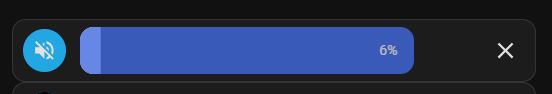
I’ve made a media-player bubble-card. Is it possible to change the mute icon. It is now always icon mdi:volume-off, but I want it mdi:volume-high if mute is disabled.
Thank you
Love the Bubble Card. I was just wondering if there is a way to remove the title and/or icon from the covers? Not it takes up two spaces, but I’d like it to be more like the other slider. Is it possible to do this without making a new entity that will copy the slider status?
1 Like
Bubble Card 2
v2.5.0-beta.9
If you missed the previous beta releases, please check this changelog. Then please read this:
Hi again everyone!
This update focuses on fixing issues reported from v2.5.0-beta.8 while also improving compatibility (a lot) with older custom styles and modules! If you had issues since v2.5.0-beta.6 and even more in the latest beta, this version should resolve them! Some custom styles in the cover card might still be broken, as this card has changed significantly.
If you still experience issues with some custom styles, modules or everything else that previously worked, feel free to open an issue. I can’t promise I will be able to fix every custom style issues directly in Bubble Card, but I will at least try to help you understand what needs to be changed. Of course, if I receive 100 new issues in one day, keeping up will be quite difficult! 
That said, I truly believe this release will improve everything!
Thank you all once again for all your feedback, you’re helping me a lot, as always! 
 New features and enhancements
-
CHANGE: New card layout for sub-buttons in multi-row cards:
To avoid breaking too many custom styles, sub-button reordering in cards with at least two rows is now optional. A new card layout has been added: “Large with sub-buttons in a grid (Layout: min. 2 rows)”. In YAML:card_layout: large-sub-buttons-grid. This change should greatly improve compatibility with older custom styles and modules! #1350 -
Added visual feedback on icon tap:
The main icon now shows visual feedback when clicked or tapped. -
Sliders now always display correct values and units:
Ensures that the unit of measurement is correctly displayed, not only percentage.

 Bug fixes and optimizations
-
Added missing vibration feedback:
Now applied to all elements where it was missing, like the main icon. #1354 -
Improved slider responsiveness:
Sliders are now smoother and more reliable. -
Fixed empty states/attributes in “Get state/attribute from other entities” module:
Empty values are now correctly removed. -
Fixed pop-up scrolling issue:
Opening a pop-up no longer forces the page to scroll back to the top. -
Fixed “tap to slide” sliders with sub-buttons:
Tap actions on sliders with the “tap to slide” option now work correctly. #1358 -
Fixed slider tap actions:
Tap actions on sliders were not always triggered. #1348 -
Fixed sub-button alignment in media player cards:
Sub-buttons are now correctly aligned when all media player buttons are hidden. #1347 -
Fixed dropdown z-index issue:
The dropdown is now always in front of other elements. #1344 #1349 -
Fixed icon issue in select sub-buttons:
Icons in select sub-buttons now update correctly (e.g., in climate cards). #1339 -
Fixed the button editor:
The button editor, broken in v2.5.0-beta.8, is now working again. #1342 -
Fixed play button size in media player cards:
The play button now has the correct size when the card layout is set to “Normal.” -
Removed sub-button icon and label auto-coloring:
This feature has been temporarily removed for better contrast and readability. It will be re-added in a future release if needed. #1343
Enjoy testing this beta, and thank you for being part of this awesome community! 
How to test this beta?
The easiest way is to click on the button below, or go to HACS, search for Bubble Card, and click on it. Then, click the three dots icon in the top-right corner and select “Redownload”. You’ll be able to choose the beta version under “Need a different version?”. You can then change back to your previous version if needed.
 Bubble Card news
I’ve been wanting to start my own YouTube channel for a while, focusing on tutorials around Home Assistant and Bubble Card. There are two videos so far, an introduction explaining the project and a first tutorial on how to create your first pop-up. I really hope you will enjoy them. Don’t hesitate to subscribe to help give my channel more visibility. Thank you in advance!
The next video will cover the new global variables, as well as custom styles and templates, since I’ve noticed more and more questions on these topics.
Over the past year, I’ve been working almost everyday on Bubble Card to make it the best it can be, and I still don’t believe how much it have grown in popularity. Watching the community getting this big and seeing so many people using my work has been incredibly rewarding.
I have another announcement to you all, I decided to create a Patreon as a way to offer something more for those who want to support me. On my Patreon, I share advanced YAML configurations, custom styles, and templates. For example, I’ve added one (my favorite) that allows up to four conditional badges placed around the card’s icons. It’s also a great way to learn about all the possibilities of Bubble Card custom styles and templates!

If you like my project and want to support its development, subscribing to my Patreon is probably the best way to help me keep the project going.
Also, let me know if you have any suggestions or feedback on this. Trying to find a way to monetize my work was not something I ever imagined doing, but I really hope you see it as a way to keep improving the project, and not as a negative step.
Thank you so much for being part of this amazing community, your support will always makes a huge difference!
I want to highlight that on the GitHub page, in the Discussions section, you can share and discover some amazing YAML examples from the community. Go check it out! Some of the creations are absolutely incredible!
And if you are interested I’ve opened a Subreddit for Bubble Card where I post my progress on the project. Here it is:
6 Likes
Thanks a lot for the improvements in the last betas.
Especially the new slider behavior is amazing.
We had a few accidentally triggered devices when closing the HA app with the dashboard open using the swipe-up gesture on iPhones.
Didn’t happen often, but could be problematic when you e.g. open the awning while it’s raining and you don’t notice it. 
1 Like
That cover cards doesn’t look like Bubble Card at all to me.
Cover should look like any other slider based card, just with some extra buttons:

3 Likes
How do I conditionally set the color if the last_changed is greater than X seconds ago?
Relevant template:
{{as_timestamp(now()) - as_timestamp(states['device_tracker.wife_phone'].last_changed) > 60 }}
You are right. Wrong card… Stupid. What would be the way to make a slider control the tilt position?
Hello, first of all thank you for your awesome work, bubble card is just great!
An issue I noticed is Bubble card doesn’t seem to have the border around it, when using the default styling module, like standard cards do (see select card in screenshot). Also, the background color doesn’t change on hover.
Anyone already upgraded to the beta release of HA? I have an issue with attributes:
type: custom:bubble-card
card_type: button
card_layout: large
button_type: name
show_icon: false
show_name: false
sub_button:
  - name: Vandaag
    entity: sensor.weather_forecast_daily_combined
    show_background: false
    show_name: false
    show_last_changed: false
    show_state: false
    show_attribute: true
    attribute: forecast[1]?.temperature
    tap_action:
      action: navigate
      navigation_path: weer
  - name: Morgen
    entity: sensor.weather_forecast_daily_combined
    show_background: false
    show_attribute: true
    attribute: forecast[2]?.temperature
    tap_action:
      action: navigate
      navigation_path: weer
  - name: Overmorgen
    entity: sensor.weather_forecast_daily_combined
    show_background: false
    show_state: false
    show_attribute: true
    attribute: forecast[3]?.temperature
    tap_action:
      action: navigate
      navigation_path: weer
  - name: OverOvermorgen
    entity: sensor.weather_forecast_daily_combined
    show_background: false
    show_state: false
    show_attribute: true
    attribute: forecast[4]?.temperature
    tap_action:
      action: navigate
      navigation_path: weer
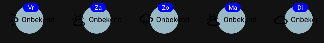
The forecast[1]?.temperature doesn’t work in the 2025.4.0bX releases. Maybe someone else also notices something like that?
Is there a way to set a bubble card for a cover entity to call cover.set_cover_tilt_position instead of cover.set_cover_position?
My cover entity doesn’t support cover.set_cover_position
is there a template for color for the card just like color for the icon?
Looking for this too
Check out the module repository. Specifically, look for one called izequbes custom colours.
Is there a way to lock the header into place so it doesn’t stay if scrolling down?
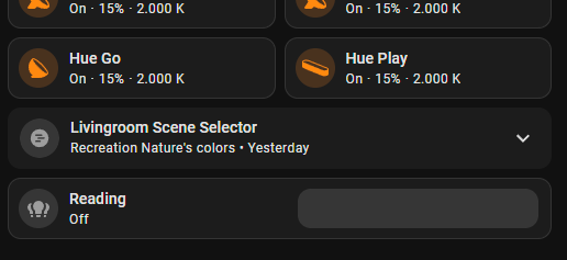
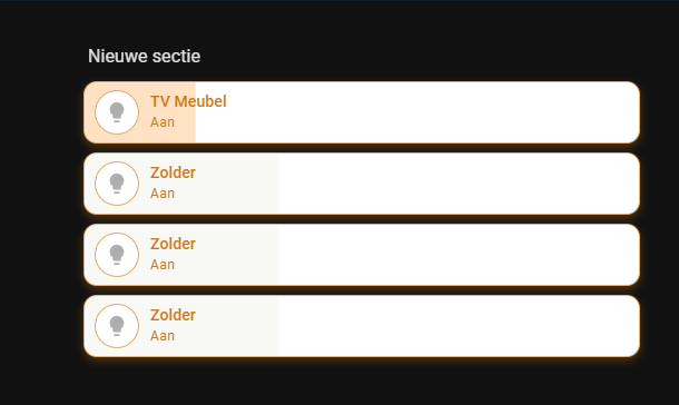
See the photo (the top one is the RGB bulb, and the bottom one is a light switch). As you can see, the background color of the non-RGB bulb is barely visible. On a black background, the color appears gray. Is it possible to adjust this with Bubble as the default setting? I can’t change it right now because I’m also using a module
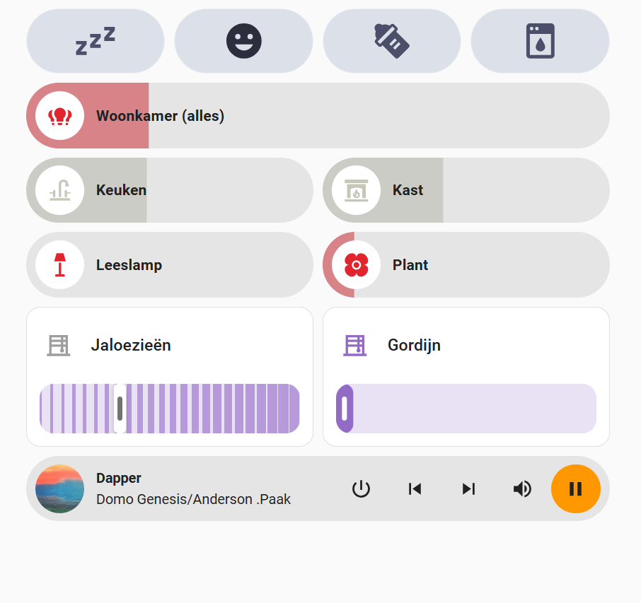
I promised in the thread linked below, to share the YAML for my bubble card based room header here:

So here you go:
type: custom:bubble-card
card_type: button
button_type: state
# We only use the sub buttons, so this dummy entity is just to avoid card errors
entity: sun.sun
show_icon: false
show_state: false
show_name: false
# Use grid layout with full width for sub-buttons
card_layout: large-sub-buttons-grid
grid_options:
  columns: 48
  rows: 3
# No actions for the card itself
tap_action:
  action: none
double_tap_action:
  action: none
hold_action:
  action: none
button_action:
  tap_action:
    action: none
  double_tap_action:
    action: none
  hold_action:
    action: none
# Sub buttons are entered in the correct order here. Alignment is impacted by the custom CSS below
sub_button:
  - entity: input_number.offene_fenster
    icon: mdi:lock
    state_background: false
    show_state: true
  - entity: input_number.eingeschaltete_lampen
    icon: mdi:lightbulb
    state_background: false
    show_state: true
  - entity: sun.sun # Dummy as I don't use a third icon in the first column so far
    icon: ""
    state_background: false
    show_state: true
    show_background: false
    show_icon: false
    show_attribute: false
    tap_action:
      action: none
  - entity: sensor.total_dc_power
    icon: m3rf:solar-power
    show_icon: true
    state_background: false
    show_background: true
    show_last_changed: false
    show_state: true
  - entity: sensor.battery_level
    state_background: false
    show_state: true
  - entity: sensor.energy_production_today_remaining # This one is spanned over 2 columns in the CSS below
    icon: mdi:calendar-month-outline
    state_background: false
    show_state: true
  - entity: sensor.load_power
    icon: mdi:home-lightning-bolt
    show_background: true
    state_background: false
    show_state: true
  - entity: sensor.meter_active_power_raw
    icon: mdi:transmission-tower
    state_background: false
    show_state: true
styles: >-
  ha-card {
    --bubble-sub-button-background-color: rgba(46, 43, 56, 0.7); # Add transparency
  }

  .bubble-button-card-container {
    background-image: url("/local/image/dashboard/essbereich.jpg");
    background-size: cover;
    border-radius: 28px;
    background-position: center;
  }

  .bubble-sub-button-container {
    width: 100%; # Span the container over the full width
  }

  .bubble-sub-button-1 ha-icon {
    color: #06d8d0;
  }

  .bubble-sub-button-2 ha-icon {
    color: #fcc93d;
  }

  .bubble-sub-button-3 {
    opacity: 0.0; # Hide unused button
  }

  .bubble-sub-button-6 {
    grid-column: span 2; # Larger button over 2 columns
  }

  # Format text for large sub-button
  ${card.querySelector('.bubble-sub-button-6 .bubble-sub-button-name-container').innerText = "~" + Math.round(subButtonState[5]*10)/10 + "kWh Solarertrag verbleibend"}
I added some comments to make it easier to understand.
You might have to remove them in case they cause some parsing errors when pasting in your dashboard.
16 Likes
Thanks, would be cool if you put it here under “Share your custom styles, templates and dashboards”:
1 Like
done 