This warning can be ignored, the recorder is just not keeping its history, so it’s just like it is deactivated in it.
But if you want to not have this warning, check this:
This warning can be ignored, the recorder is just not keeping its history, so it’s just like it is deactivated in it.
But if you want to not have this warning, check this:
To fix this, you can check the solutions in this post:
When I set ha-card-backdrop-filter: blur(20px) in the theme file, the select menu ended up being overlapped by other bubble cards.
:host {
  --ha-card-backdrop-filter: none !important;
}
This temporarily solves the issue.
May I ask if there is a better solution?
can you share the full code and Version of bubble card?
Thank’s a lot.
Can you share that Code?
Hi! I just checked and in v3.0.0 the background color is now in .bubble-background in all cards, so in your case just replace .bubble-climate with .bubble-background 
Replaced it, works fine.
Thanks a lot 
Is there a visual lay-out styling guide for all these bubble-cards, which includes the layering and all used id’s/classes?
I need help, the background disappeared and is no longer showing up
.bubble-button-card {
    display: grid;
    grid-template-areas:
      'n n n n'
      'l l l b'
      'i i . b'
      'i i . b';
    grid-template-columns: 1fr 1fr 1fr 1fr;
    grid-template-rows: 2fr 1fr 1fr 1fr;
    justify-items: center;
    background-image: url("/local/room-cards/office555.png");
    background-size: cover;
    background-position: center;
    background-repeat: no-repeat;
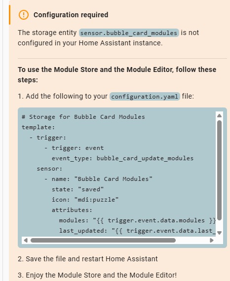
Hi, I need some help. I cannot get the module store to work.
I have paste the yaml code in the configuration.yaml restart, but nothing happens
Hello!
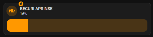
I need inspiration for displaying the number of lights currently on!
I am now using this option.
But I want to do it with bubble card!
Thanks
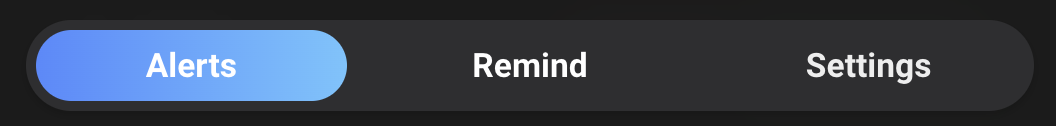
Hey, do you mind sharing your code/setup for those Zones/Controles/Infos tabs please. They look lovely!
Edit… It’s pretty amazing what chatgpt can do with just a screenshot these days! Just one more problem to solve which is there’s a rendering delay when showing in a bubble card popup which means the latest isn’t highlighted at the time.
type: custom:stack-in-card
mode: horizontal
cards:
  - type: custom:button-card
    name: Alerts
    tap_action:
      action: call-service
      service: input_select.select_option
      service_data:
        entity_id: input_select.alerts_tabs
        option: Alerts
    styles:
      card:
        - border-radius: 999px
        - font-weight: bold
        - padding: 8px 20px
        - background: |
            [[[ return states['input_select.alerts_tabs'].state === 'Alerts'
              ? 'linear-gradient(90deg, #ffb6c1, #f6c7db)'
              : '#efefef'; ]]]
        - color: |
            [[[ return states['input_select.alerts_tabs'].state === 'Alerts'
              ? 'white'
              : 'black'; ]]]
        - box-shadow: none
  - type: custom:button-card
    name: Remind
    tap_action:
      action: call-service
      service: input_select.select_option
      service_data:
        entity_id: input_select.alerts_tabs
        option: Remind
    styles:
      card:
        - border-radius: 999px
        - font-weight: bold
        - padding: 8px 20px
        - background: |
            [[[ return states['input_select.alerts_tabs'].state === 'Remind'
              ? 'linear-gradient(90deg, #ffb6c1, #f6c7db)'
              : '#efefef'; ]]]
        - color: |
            [[[ return states['input_select.alerts_tabs'].state === 'Remind'
              ? 'white'
              : 'black'; ]]]
        - box-shadow: none
  - type: custom:button-card
    name: Settings
    tap_action:
      action: call-service
      service: input_select.select_option
      service_data:
        entity_id: input_select.alerts_tabs
        option: Settings
    styles:
      card:
        - border-radius: 999px
        - font-weight: bold
        - padding: 8px 20px
        - background: |
            [[[ return states['input_select.alerts_tabs'].state === 'Settings'
              ? 'linear-gradient(90deg, #ffb6c1, #f6c7db)'
              : '#efefef'; ]]]
        - color: |
            [[[ return states['input_select.alerts_tabs'].state === 'Settings'
              ? 'white'
              : 'black'; ]]]
        - box-shadow: none
card_mod:
  style: |
    ha-card {
      background-color: #efefef;
      border-radius: 24px;
      padding: 5px;
    }
good morning is it possible to insert this card in a popup bubble card??? can you help me understand how to insert it if possible???
thanks
type: custom:mushroom-climate-card
entity: climate.cucina_ac
name: Climatizzatore Cucina
show_temperature_control: true
hvac_modes:
  - heat_cool
  - auto
  - "off"
  - heat
  - cool
  - dry
  - fan_only
layout: horizontal
fill_container: false
icon: mdi:air-conditioner
state_icons:
  - state: "on"
    icon: mdi:fan
  - state: "off"
    icon: mdi:power
  - state: cool
    icon: mdi:snowflake
  - state: heat
    icon: mdi:fire
  - state: auto
    icon: mdi:autorenew
Hi @Cloos, any plans to incorporate expand and collapse functionality as this would add a great addition to your card:
If you missed the previous beta releases, please check this changelog (and earlier ones) to discover all the new features and fixes added so far.
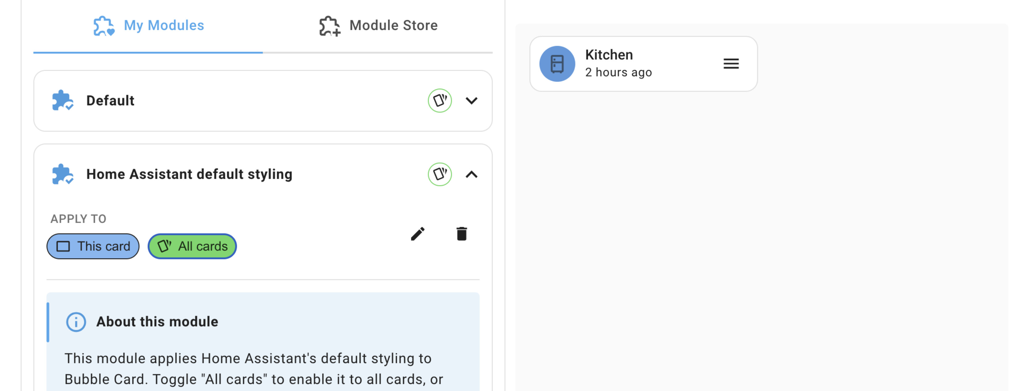
Hi everyone!
This beta is a big one, you can now activate any styling module globally across all your cards with a single click. Whether you’re using the visual editor or YAML, it’s now super easy to apply a module everywhere without repeating yourself, just like in the Default module! Nobody even asked for this, it just made sense and really fits the module vibe!
This is perfect for theming modules like my “Home Assistant default styling” one!
One more thing, this version should fixes every single remaining issue from my v3.0.0 list! Yes, all of them. If you’ve been waiting on a fix or experiencing strange behavior, there’s a very good chance it’s resolved in this update. Some very specific issues might still be open, but I’ll do my best to fix those after the stable release!
If everything goes well, this might even be the last beta before the stable release! 
As always, thank you for your amazing feedback, support, and ideas!
Cheers everyone! 
 New features and enhancements
Global modules support
You can now enable a styling module for all cards directly from the editor using the “All cards” button. This is not available for modules with an editor, as those require a specific configuration to work. For YAML only users, just add is_global: true to a module in your bubble-modules.yaml. You can still exclude it from specific cards by disabling the “This card” button, or with the "!module-id" syntax in YAML. A huge improvement to reusability! #1510
Tap actions for the calendar card
New options allow defining tap actions on both days and events in the calendar card. PR #1512 thanks to @brunosabot
Display event location in the calendar card
You can now show the event’s location directly in the calendar card. show_place in YAML. PR #1512 thanks to @brunosabot
Chinese translation added to the calendar card
Thank you @fineemb for contributing this! PR #1465
Updated module export message
Exporting a module to GitHub now explain how to download it from the Module Store.
 Bug fixes and improvements
Calendar card was showing incorrect dates
This issue is now resolved and the correct date should be displayed consistently. #1447 - PR #1512 thanks to @brunosabot
Tap actions were not working correctly on iOS and older devices
This has now been fixed so tap actions behave correctly across all platforms and browsers. #1439
“Cancel” and “Save” buttons sometimes didn’t return after editing a module
A rare bug prevented these buttons from reappearing, this should now be fully resolved.
Pop-ups were auto-scrolling to the top
Opening a pop-up no longer forces the view to jump to the top. #1495
Unwanted scroll behavior in large-2-row layout
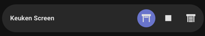
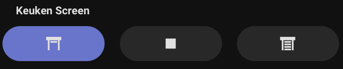
Some cards were scrollable when they shouldn’t be, especially with dropdown sub-buttons. This is now fixed! #1513
Adjusting the separator rows was not working
The rows field in the editor now works correctly. #1475
In some cases, 0°C temperatures were hidden
A bug caused zero degrees to disappear, this should now works in all cases. #1213
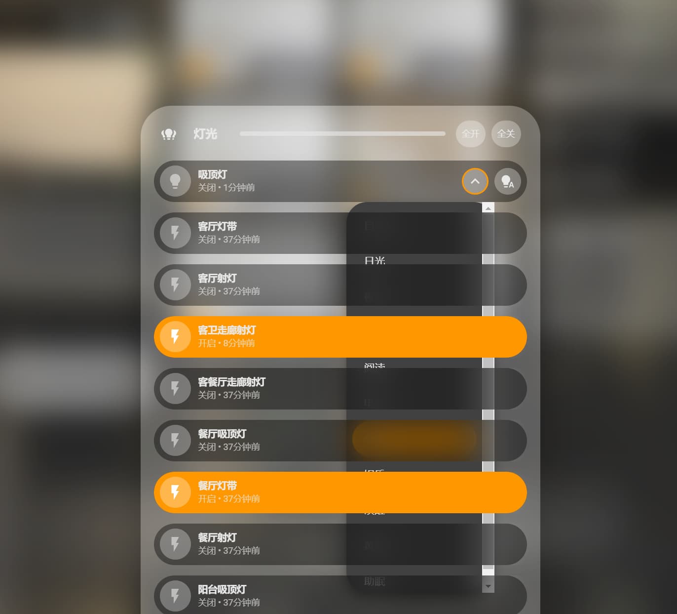
Select card wasn’t reflecting state changes correctly
The selected option should now properly matches the entity’s current state. #1501
Backdrop customization from custom styles
This was just working from a theme file, but you can now individually change the backdrop of a pop-up in the custom styles. You can do that by adding:
* {
  --bubble-backdrop-background-color: rgb(0, 0, 0, 0.5);
}
CSS using universal selectors was leaking outside pop-ups
Custom styles in a pop-up using * { … } were unintentionally affecting other elements, this will not happen anymore! Sorry, this was not a feature 
Editor now displays JS template errors properly
The box showing template errors has been fixed and improved.
Module Store refresh button needed multiple clicks
The refresh button now reloads the cache reliably on the first press.
Various style tweaks and minor UI fixes
Several small inconsistencies and polish improvements across different cards and views. Especially in the select card.
Some more various fixes and changes
How to test this beta?
Go to HACS, search for Bubble Card, and click on it. Then, click the three dots icon in the top-right corner and select “Redownload”. You’ll be able to choose the beta version under “Need a different version?”. You can then change back to your previous version if needed.
Also, make sure to clear your browser or app cache, you can also check this if the new version doesn’t load properly.
I downloaded the latest beta 8 and it destroyed my dash. It completely removed bubble card even after a restart and cache clear.
I reverted to beta 7 and all is well.
Are you sure it installed beta 8? Or did you get the “custom-bubble-card not found” message?
If so, see my comment about updating to another beta here
Good Morning! I just came across the bubblecard and the popup option but i have problems with it working. When leaving the editor mode in lovelace i shouldnt see the vertical stack i created, but for some reason i am still seeing it. I tried clearing my cache, restarted Homeassistant…still doesnt work. Can someone helpe me with this?
My Code is very easy at the moment:
type: custom:vertical-stack-in-card
cards:
  - type: custom:bubble-card
    card_type: pop-up
    entity: switch.test
    hash: "#lights"
    button_type: switch
    name: ""
    use_accent_color: true
    show_state: true
    show_last_changed: true
    show_attribute: true
    show_header: true
  - type: custom:bubble-card
    card_type: button
    entity: light.ecke_1
  - type: custom:bubble-card
    card_type: button
    entity: light.ecke_2
