Hei,
I use scrollable vertical layout inside some of my pop ups - but after last update I can only scroll if I touch a button. Before I could touch wherever on the screen. May it be a side effect of the new slider csrd?
From day one, I have been trying to implement custom color for my lights. @Cloos gave me a hint to define it in theme which has been working:
custom-light-color: "rgba(254, 193, 9, 100)"

  # Light color
  bubble-accent-color: "var(--accent-color)"
  bubble-light-color: "var(--custom-light-color)"
However, the issue arises for RGB lights as they share the same light domain and get the custom color as defined above. However, I want all the standard on/off lights to have the color of my choice but the slider for RGB light to get color as selected from the RGB selection.
Even with new modules there is no solution as once you apply it to all cards it will apply to all including the RGB specific one too.
Is there any solution not to overwrite the RGB lights or excluded them from applying the custom color ?
Anyone found a way to break the yaml code into smaller parts and use !includes?
In 3.0 RC1 the calendar card has broken with (I assume) the last update of the home assistant front end. It shows as a grey box. The core home assistant calendar view loads fine.
The scrolling text above also often jumps to a larger font size (this has always happened for me using bubble card regardless of version)
Bubble Card 3
v3.0.0-rc.3
IMPORTANT
Home Assistant versions 2025.6.0 to 2025.6.2 were causing slowness and flashing issues with some Bubble Card setups, but it’s all fixed in 2025.6.3! I spent two whole afternoons trying to solve this (with no success), so I’m really relieved they took care of it!
This release is the third v3.0.0 release candidate (the second was a mistake), and should be the latest version before the stable release… finally! A few minor issues were still reported, and they should all be fixed now! Here’s the changelog for those updating from v3.0.0-rc.1:
-
Fixed an error when editing pop-up background color with an incomplete value:
Entering an invalid or partial color code no longer causes a TypeError in the console. -
Fixed “Hold + Navigate” only working once:
Hold actions combined with navigation now work reliably every time. #1582 -
Fixed
min,max, andstepnot working for some entity types:
These values are now properly applied across all supported entities. #1599 -
Fixed pop-ups not closing correctly in some cases:
Pop-ups should now always close as expected. -
Fixed page scrolling when sliding inside a slider on iOS:
Interacting with sliders now correctly blocks the page from scrolling. #1507
And here it is, the full v3.0.0 release note! This one literally took me hours to write, and I really hope everything is clear! 
Any feedback on this release note is more than welcome as well!
Hi everyone!
Today marks an exciting new milestone for Bubble Card and for me! This update includes some of the biggest new features ever introduced, but more importantly the long-awaited Modules 
Modules are allowing you to finally manage custom styles and templates globally! But this new feature is so much more powerful than that, it lets you add actual features yourself in the Bubble Card editor, using all the default Home Assistant form options!
I won’t go into too much detail here, there’s a lot to cover, and this version comes with a never-ending list of new features, bug fixes and optimizations!
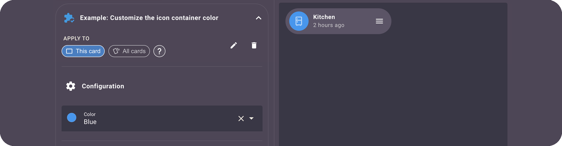
An advanced Module Editor!
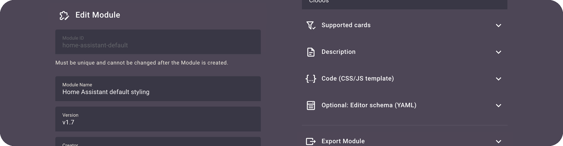
Bubble Card now includes a powerful Module Editor that lets you create, edit, or delete your Modules, right from the UI!
Here’s what a configurable Module looks like in the editor:
The possibilities are now endless, and I can’t wait to see what you all will create with these!
Meet the Module Store!
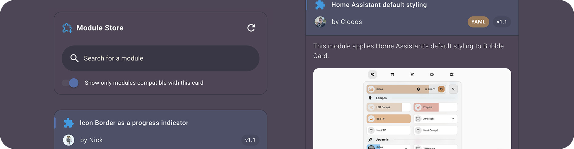
Alongside the Module Editor, I wanted to push these new Modules even further, so now with the new Module Store, you can browse available Modules, install them with a click, and even update them directly. Just like an app store! So there’s no need to know CSS or JS to customize your cards anymore!
Some community Modules are already available, and I want to give a huge thank you to everyone who contributed so far! This is a big step forward for making Bubble Card even more collaborative and flexible!
On my side, I’ve added 5 Modules, and you can for example find this one, it was highly requested and applies Home Assistant’s default styling to Bubble Card!
Slider improvements!
In previous releases, accidentally touching a slider could lead to a very bad experience, like turning on a light by mistake or even pushing the music volume to the max… not great.
That’s why you now need to hold the slider before you can change its value. This change also made it possible to support tap and double-tap actions on these cards! I’ve also finally added the ability to configure min, max and step values, you can even create read only sliders to show a battery percentage, current power production…
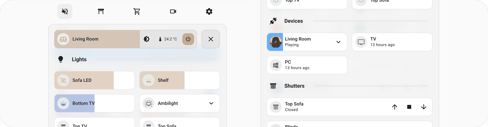
New calendar card!
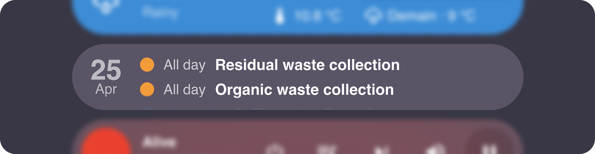
@brunosabot (aka the Man) has added a brand new card type to the collection: the calendar card. It displays your calendar in a clean and minimal format, and its content is scrollable, so you can easily browse upcoming events.
Whether you use it for waste collection, events, or birthdays, it’s super handy!
Merci Bruno again for your huge help on this project! 
Bruno is also the creator of Streamline Card, a powerful tool to create reusable templates with variables and even JS support. He wrote a great article about his latest setup using both Bubble Card and Streamline Card, definitely worth a read for some inspiration! The Man is definitely good.
Pop-up creation made easier

Before, if you wanted to create a pop-up, you had to manually insert a vertical stack first. Now? Bubble Card takes care of it for you.
When you add a new pop-up, the required stack is automatically added, meaning one less step for you. You can even have an example configuration generated with some entities already included in the pop-up.
This small change will make a big difference, especially for new users!
All cards can now be enlarged!
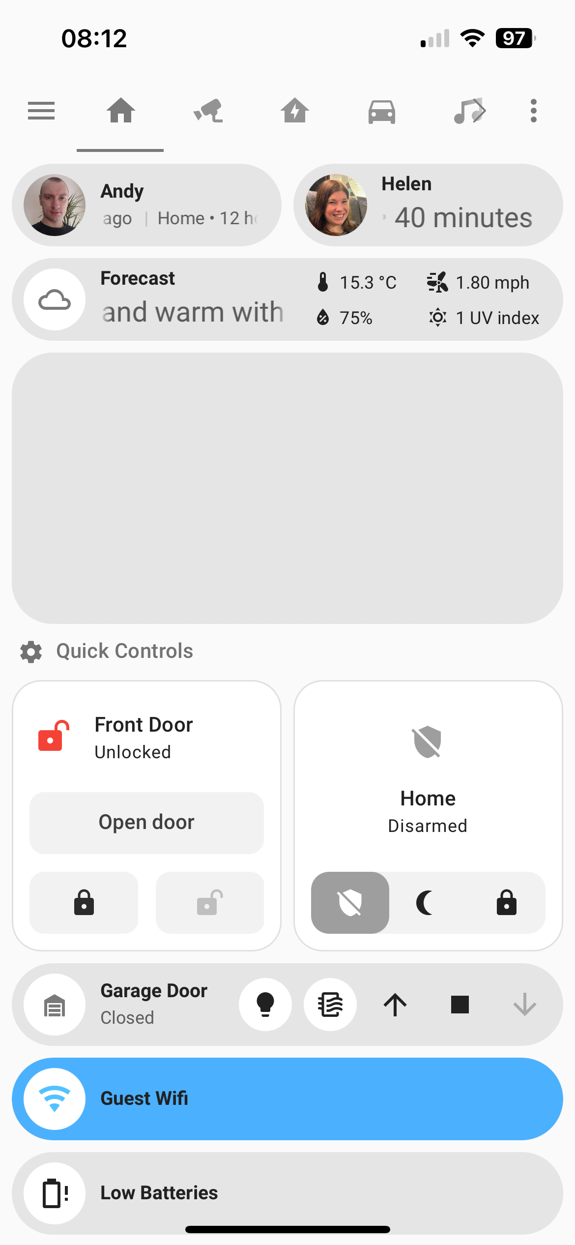
You now have the ability to change the number of rows in a section view! The sub-buttons will also reorganize to make use of the newly available space (by enabling the layout shown in this screenshot)! This is still just the first step, we plan to make even more use of that space in future releases! Thank you so much to @MrBearPresident for his work on that!
A Stronger Foundation
This release also brings major structural changes across the board:
- All cards now follow the same internal layout
- CSS and element classes are unified
- The codebase has been refactored to be more modular and easier to maintain
- And performance is dramatically improved (especially in the editor and pop-ups)
These changes were long overdue and will prevent future breaking issues, especially for custom modules and styles.
They might still affect some of your current customizations, especially for those of you who created advanced styles or tweaked the cover card, but overall, this cleanup makes Bubble Card more reliable and consistent for the future!
 Thank You
I’m incredibly proud of this v3.0.0. These past five months, I’ve poured all the time I could into making this update happen, not just because it was deeply rewarding to build, but because I truly believe it will push the project forward in the best way possible!
Thanks again to all the testers and to everyone who’s been part of this journey, and incredibly grateful to those donating or supporting my work on Patreon.
Your support truly makes all of this possible!
And here’s all the other new features, bug fixes and optimizations… again this release note is way too long…
 New features and enhancements
-
CHANGE: Better slider button:
You now need to hold it to be able to change its value. #1014 #1045 -
CHANGE: New normal layout for the cover card:
For better consistency with other cards. -
CHANGE: The large layout is now the default in a section view:
For section view users, all current and new cards are now defaulted to the large layout. I advise you to keep it this way, this improve usability a lot on mobile devices. -
CHANGE: New accent color:
The default accent color has been updated to a more accessible blue that improves contrast (a lot) with most themes, especially the default HA theme. To revert to the previous color, add this to your theme:bubble-accent-color: var(--accent-color), or download this Module from the Module Store. -
CHANGE: New default hold and double-tap action:
Hold and double-tap actions now defaults tononeon most cards. PR #1393 by @AlexDaniel -
CHANGE: Improved light slider behavior:
Hold-to-slide sliders (new default) now stop at 1% by default, matching Home Assistant’s slider behavior.
To restore the old behavior, I’ve added an option in the editor in the “Slider settings”. In YAML you can setallow_light_slider_to_0: true. #1295 -
New Module system for custom styles and templates:
A new way to define and manage styles/templates within a single YAML file. More info above. #1081 -
Global modules support:
You can enable a styling module for all cards directly from the editor using the “All cards” button. This is not available for modules with an editor, as those require a specific configuration to work. For YAML only users, just addis_global: trueto a module in yourbubble-modules.yaml. You can still exclude it from specific cards by disabling the “This card” button, or with the"!module-id"syntax in YAML. A huge improvement to reusability! -
New calendar card:
More info above. PR #1207 by @brunosabot -
Home Assistant theme-friendly module:
Added a module that automatically adapts to Home Assistant’s default styling and themes. More info above. #1144 -
Direct testing of cards/templates in edit mode:
Cards/templates are now working normally in the editor. -
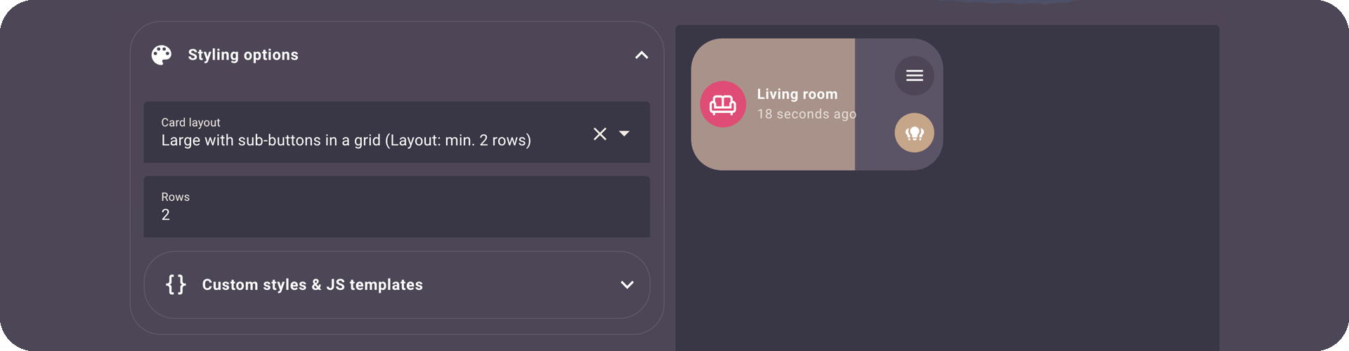
New card layout for sub-buttons in multi-row cards:
A new card layout has been added: “Large with sub-buttons in a grid (Layout: min. 2 rows)”. This layout allow sub-button reordering in cards with at least two rows. In YAML:card_layout: large-sub-buttons-grid. More info above. -
New
.bubble-containerselector:
You can now target each card container in your custom styles with a single unified selector. -
New
--bubble-borderCSS variable:
Allow more flexibility for styling borders in your Bubble Card setups. -
Added a box to display template/modules errors in the editor:
This make debugging much easier as it not needed to open the browser console anymore. -
Access to the
thisvariable in custom templates/modules:
Expanding customization possibilities. -
Section view enhancements:
Added the ability to change the number of rows in a section view. See details above. PR #1172 by @MrBearPresident, thank you again! -
.is-onand.is-offclasses:
Most cards now automatically receive.is-onand.is-offclasses for easier custom styling. -
Min/max/step values for sliders:
YAML:min_value:,max_value:andstep:. #304 #903 -
Min/max values for media player volume sliders:
YAML:min_volume:andmax_volume:. #1269 -
Min/max/step values for the climate card:
YAML:min_temp,max_temp:andstep:. -
Support for almost all entities in sliders:
- Native support for battery sensors.
- All entities with numerical states can now be displayed within a defined range. Toggle “Disable entity filter (for custom slider)”, select your entity, then set
min_value:andmax_value:. This is perfect to display your current power production for example.
-
Read-only slider option:
YAML:read_only_slider: true. -
“Tap action on card” added to most cards:
Added to sliders, climate, media player, and cover cards. -
Improved usability and accessibility:
- Larger touch areas for feature buttons.
- Mute icon now visually changes based on volume status in the media player card.
-
Better default separator line color:
Improves contrast on various backgrounds. -
Brightness transition in light sliders:
YAML:light_transition: trueandlight_transition_time: 500(default). PR #1301 by @hamayelq. -
Min/max temp limits with haptic and visual feedback:
This one looks fantastic! PR #1306 by @hamayelq. -
subButtonStatevariable for custom templates:
For example, you can now finally addsubButtonState[0] === 'on'in your templates! PR #1280 by @gregoriohc. -
Show last updated time for entities:
YAML:show_last_updated: true. PR #1289 by @StaleLoafOfBread. -
Consistent visual feedback across all interactive elements:
All clickable elements now include the default Home Assistant feedback (ha-ripple) for better and more consistent hover/click animations, no more guessing if a tap worked! -
Adjust card height (rows) in all views:
This feature was previously removed, but it’s now back and improved! You can now change the number of rows for any card using a large layout, in any view type, including inside pop-ups! More info above. #1441 -
Pop-up creation improvement:
You can now create pop-ups in only one step, just like other cards. More info above. -
Pop-up editor improvement:
You can now scroll inside the preview when editing long pop-ups.
 Bug fixes and optimizations
-
Fixed compatibility with Home Assistant 2025.5:
- Select card and select sub-button issues resolved. #1466 #1457
- Module editor now works correctly. #1459
- “Tap action on card” in the editor is functional again. #1472
-
Improved editor:
New styling and descriptions, with much faster response (10 to 20 times faster!). #698 -
Editor info texts:
Some info texts in the editor were improved to make things clearer. -
Spaces in attribute names:
Resolves an issue where attributes containing spaces was not working. PR #1229 by @sbwilson fixing #1082. Thank you so much! -
Editor styling improvements:
Various enhancements for better color contrasts. #1214 -
Dashboard scrolling blocked issue:
The system that prevents dashboard scrolling when a pop-up is open has been improved. Should fix #913 -
Missing borders in horizontal button stacks on newer iOS/macOS:
Resolves visual inconsistencies. #1124 -
Major Safari optimizations:
Improved performance and compatibility for Safari on iOS and macOS. -
Fixed a memory leak in text scrolling effect:
Boosting overall performance over time. -
Refactored and improved the custom styles/templates system:
For better overall performance. -
Editor code quality improvement:
Improved editor code structure for better maintenance. PR #1173 by @MrBearPresident. Thank you so much! -
Custom templates with errors no longer break the card or the entire view
Finally! -
Instant initialization of custom styles, templates, and modules:
Custom styles, templates, and modules now load instantly when the page is rendered. -
Fixed the horizontal button stack gap:
The visual gap between horizontal button stacks and the card above is now bigger in section views. -
Refactored a lot of code for better and faster maintenance:
Large parts of the codebase were cleaned and reorganized to simplify future updates, optimize everything, and reduce bugs. -
Optimized memory usage for stable performance over time:
Memory consumption is now better handled to avoid slowdowns during long sessions. -
Improved pop-up performance across all devices and browsers:
Pop-ups now open faster and behave more smoothly, especially on older devices. #1211 -
Improved overall performance on all devices:
General performance has been enhanced across the board, with quicker interactions and reduced latency. #1236 -
No need to refresh the page after editing pop-ups anymore (finally!):
Pop-up changes are now applied instantly in all cases, no more manual reloads needed. -
Unified classes, CSS, elements, and structure across all cards:
All cards now follow the same internal structure, making customizations and maintenance easier. -
Fixed various issues with sub-buttons:
Sub-buttons now behave more consistently. -
Fixed volume slider issue in media player:
The slider now works as expected when adjusting volume on iOS devices, and probably other devices/browsers. #1196 -
Fixed missing “curtain” icon:
The curtain icon is now correctly displayed when used in your configuration. -
Fixed weather temperature being hidden when 0:
Zero degrees is now correctly shown on weather cards instead of being hidden. #1213 -
Fixed actions being triggered after dragging over an element:
Tap and hold actions are no longer triggered by mistake after dragging. #839 -
Module styles priority:
Styles written in the card now take precedence over module styles. PR #1290 by @StaleLoafOfBread -
The +/- buttons in the climate card now respect min/max values:
Temperature controls will no longer go beyond the configured minimum or maximum limits. -
Added missing supported entities in the slider editor:
All supported entity types are now correctly listed when configuring sliders in the editor. #1221 -
Added missing vibration feedback:
Now applied to all elements where it was missing, like the main icon. #1354 -
Fixed sub-button alignment in media player cards:
Sub-buttons are now correctly aligned when all media player buttons are hidden. #1347 -
Fixed dropdown z-index issue:
The dropdown is now always in front of other elements. #1344 #1349 -
Fixed
clickpropagation:
Prevents unwanted click events from bubbling. PR #1396 by @AlexDaniel -
Fixed ability to use forecast attributes like
forecast[0]?.temperaturein HA 2025.4 and higher:
Ensures compatibility with new Home Assistant versions. #1369 -
Fixed “idle” state handling:
Theidlestate is no longer interpreted as “on”. #1388 -
Fixed sluggish buttons when double-tap is disabled:
Actions are now faster! PR #1392 by @AlexDaniel -
Fixed play/pause visibility in media player:
The play/pause button is now correctly hidden when needed. #1363 -
Fixed pop-up “background update” feature:
Map cards now display the correct zoom level inside pop-ups when this setting is enabled. #1334 -
Fixed
Cannot read properties of null (reading 'shadowRoot')error:
This rare error no longer occurs when opening certain cards or pop-ups in specific setups. -
Better handling of history with pop-ups:
Pop-ups now integrate more smoothly with browser navigation and the history stack. -
Card type selection broken:
Fixed card type picker not working in the editor. #1416 -
Constant speed for text scrolling effect:
Scrolling text now moves at a constant speed, no matter the text length. #1186 -
iOS tap action fix:
Fixed an issue where tap actions could become unreliable on iOS devices. #1439 -
Fixed
removeChilderror:
Resolved a rareFailed to execute 'removeChild' on 'Node'error. -
Relative time formatting now matches Home Assistant’s format:
Timestamps like “3 hours ago” are now properly rounded. #1228 -
All buttons are now hidden when an entity is unavailable:
For example, media player or cover controls will fully hide when the entity is unavailable. #1453 -
Pop-ups were auto-scrolling to the top:
Opening a pop-up no longer forces the view to jump to the top. #1495 -
Unwanted scroll behavior in
large-2-rowlayout:
Some cards were scrollable when they shouldn’t be, especially with dropdown sub-buttons. This is now fixed! #1513 -
Pop-up backdrop color customization works correctly again:
Customizing the backdrop color with--bubble-backdrop-background-colorhas been fixed. #1294 -
Backdrop customization from custom styles:
This was just working from a theme file, but you can now individually change the backdrop of a pop-up in the custom styles. You can do that by adding:* { --bubble-backdrop-background-color: rgb(0, 0, 0, 0.5); } -
CSS using universal selectors was leaking outside pop-ups
Custom styles in a pop-up using* { … }were unintentionally affecting other elements, this will not happen anymore! Sorry, this was not a feature
-
Various style tweaks and minor UI fixes
Several small inconsistencies and polish improvements across different cards and views. Especially in the select card.
And more…
This update brings Bubble Card closer to being the ultimate dashboard customization tool! As always, I’d love to hear your feedback, so don’t hesitate to share your thoughts and suggestions!
Thanks again for being part of this awesome community!
How to test this pre-release?
The easiest way is to click on the button below, or go to HACS, search for Bubble Card, and click on it. Then, click the three dots icon in the top-right corner and select “Redownload”. You’ll be able to choose the beta version under “Need a different version?”. You can then change back to your previous version if needed.
 Bubble Card news
I’ve been wanting to start my own YouTube channel for a while, focusing on tutorials around Home Assistant and Bubble Card. There are two videos so far, an introduction explaining the project and a first tutorial on how to create your first pop-up. I really hope you will enjoy them. Don’t hesitate to subscribe to help give my channel more visibility. Thank you in advance!
The next video will cover the new global variables, as well as custom styles and templates, since I’ve noticed more and more questions on these topics.
Over the past year, I’ve been working almost everyday on Bubble Card to make it the best it can be, and I still don’t believe how much it have grown in popularity. Watching the community getting this big and seeing so many people using my work has been incredibly rewarding.
I have another announcement to you all, I decided to create a Patreon as a way to offer something more for those who want to support me. On my Patreon, I share advanced modules, custom styles, and templates. For example, I’ve added one (my favorite) that allows up to four conditional badges placed around the card’s icons. It’s also a great way to learn about all the possibilities of Bubble Card modules, custom styles and templates!

If you like my project and want to support its development, subscribing to my Patreon is probably the best way to help me keep the project going.
Also, let me know if you have any suggestions or feedback on this. Trying to find a way to monetize my work was not something I ever imagined doing, but I really hope you see it as a way to keep improving the project, and not as a negative step.
Thank you so much for being part of this amazing community, your support will always makes a huge difference!
I want to highlight that on the GitHub page, in the Discussions section, you can share and discover some amazing YAML examples from the community. Go check it out! Some of the creations are absolutely incredible!
And if you are interested I’ve opened a Subreddit for Bubble Card where I post my progress on the project. Here it is:
7 Likes
I hope there is a solution somewhere.
I don’t like the grey or accent color for lights so I’ve changed it but how not to effect the slider RGB lights so that I can retain their RGB color ?
When applied bubble-light-color, effects all lights including RGB slider lights
Standard theme. Lights get grey color but RGB slider retains the RGB color
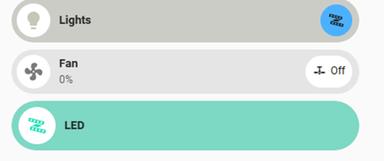
How to get best of both worlds… flexibility to modify theme color for all except RGB lights.
I don’t want plan D solution where for each card apply color (rgba(254, 193, 9, 100) and then not apply the color to RGB bubble card.
Hey! Is there a way that I can change the icon and colour or icon on a card based on state?
For example I have a “sensors” popup and if front door is closed I wand mdi:closed door “green” and if open “mdi:door-open” and red?
Seems possible but cant work out the code!
Hello,
I saw your question today, but did you made this nav bar?
I am trying, but did not went well…
What about reading the documentation? It’s all there: click me, and has been answered several times in this thread already.
Hi all just curious i use the popup option to display cameras on front door motion, is there an option to display on only 2 displays, as i have several displays but only want to show popups on 2. Probably something simple but for the life of me i cant figure it out. Thanks in advance for a fantastic addon to home assistant.
Hi,
I use hass-custom-icons from Thomas Loven and when i use them in a JS conditional in a bubble card, they flicker.
${subButtonIcon[0].setAttribute("icon", hass.states['binary_sensor.entrance_zone_all_occupancy'] === 'on' ? 'material-symbols:detection-and-zone-rounded' : 'material-symbols:zone-person-idle-rounded')}
I don’t know if this is the appropriate place to ask for help on this, but this issue doesn’t happen on any other cards.
Any ideas?
Hw do I change background of the card when active?
e.g. Fan card
Inactive
Active
I would like to change active state to different from blue
Bubble Card 3
v3.0.0
Hi everyone!
Today marks an exciting new milestone for Bubble Card and for me! This update includes some of the biggest new features ever introduced, but more importantly the long-awaited Modules
Modules are allowing you to finally manage custom styles and templates globally! But this new feature is so much more powerful than that, it lets you add actual features yourself in the Bubble Card editor, using all the default Home Assistant form options!
I won’t go into too much detail here, there’s a lot to cover, and this version comes with a never-ending list of new features, bug fixes and optimizations!
I also made a short video to show you the main new features, feel free to take a look!
An advanced Module Editor!
Bubble Card now includes a powerful Module Editor that lets you create, edit, or delete your Modules, right from the UI!
Here’s what a configurable Module looks like in the editor:
The possibilities are now endless, and I can’t wait to see what you all will create with these!
But that’s just a start, take a look below!
Meet the Module Store!
Alongside the Module Editor, I wanted to push these new Modules even further, so now with the new Module Store, you can browse available Modules, install them with a click, and even update them directly. Just like an app store! So there’s no need to know CSS or JS to customize your cards anymore!
Some community Modules are already available, and I want to give a huge thank you to everyone who contributed so far! This is a big step forward for making Bubble Card even more collaborative and flexible!
On my side, I’ve added 5 Modules, and you can for example find this one, it was highly requested and applies Home Assistant’s default styling to Bubble Card!
Slider improvements!
In previous releases, accidentally touching a slider could lead to a very bad experience, like turning on a light by mistake or even pushing the music volume to the max… not great.
That’s why you now need to hold the slider before you can change its value. This change also made it possible to support tap and double-tap actions on these cards! I’ve also finally added the ability to configure min, max and step values, you can even create read only sliders to show a battery percentage, current power production…
New calendar card!
@brunosabot (aka the Man) has added a brand new card type to the collection: the calendar card. It displays your calendar in a clean and minimal format, and its content is scrollable, so you can easily browse upcoming events.
Whether you use it for waste collection, events, or birthdays, it’s super handy!
Merci Bruno again for your huge help on this project!
Bruno is also the creator of Streamline Card, a powerful tool to create reusable templates with variables and even JS support. He wrote a great article about his latest setup using both Bubble Card and Streamline Card, definitely worth a read for some inspiration! The Man is definitely good.
Pop-up creation made easier
Before, if you wanted to create a pop-up, you had to manually insert a vertical stack first. Now? Bubble Card takes care of it for you.
When you add a new pop-up, the required stack is automatically added, meaning one less step for you. You can even have an example configuration generated with some entities already included in the pop-up.
This small change will make a big difference, especially for new users!
All cards can now be enlarged!
You now have the ability to change the number of rows in a section view! The sub-buttons will also reorganize to make use of the newly available space (by enabling the layout shown in this screenshot)! This is still just the first step, we plan to make even more use of that space in future releases! Thank you so much to @MrBearPresident for his work on that!
A Stronger Foundation
This release also brings major structural changes across the board:
- All cards now follow the same internal layout
- CSS and element classes are unified
- The codebase has been refactored to be more modular and easier to maintain
- And performance is dramatically improved (especially in the editor and pop-ups)
These changes were long overdue and will prevent future breaking issues, especially for custom modules and styles.
They might still affect some of your current customizations, especially for those of you who created advanced styles or tweaked the cover card, but overall, this cleanup makes Bubble Card more reliable and consistent for the future!
Thank You
I’m incredibly proud of this v3.0.0. These past five months, I’ve poured all the time I could into making this update happen, not just because it was deeply rewarding to build, but because I truly believe it will push the project forward in the best way possible!
Thanks again to all the testers and to everyone who’s been part of this journey, and incredibly grateful to those donating or supporting my work on Patreon.
Your support truly makes all of this possible!
And here’s all the other new features, bug fixes and optimizations… again this release note is way too long…
New features and enhancements
-
CHANGE: Better slider button:
You now need to hold it to be able to change its value. #1014 #1045 -
CHANGE: New normal layout for the cover card:
For better consistency with other cards. -
CHANGE: The large layout is now the default in a section view:
For section view users, all current and new cards are now defaulted to the large layout. I advise you to keep it this way, this improve usability a lot on mobile devices. -
CHANGE: New accent color:
The default accent color has been updated to a more accessible blue that improves contrast (a lot) with most themes, especially the default HA theme. To revert to the previous color, add this to your theme:bubble-accent-color: var(--accent-color), or download this Module from the Module Store. -
CHANGE: New default hold and double-tap action:
Hold and double-tap actions now defaults tononeon most cards. PR #1393 by @AlexDaniel -
CHANGE: Improved light slider behavior:
Hold-to-slide sliders (new default) now stop at 1% by default, matching Home Assistant’s slider behavior.
To restore the old behavior, I’ve added an option in the editor in the “Slider settings”. In YAML you can setallow_light_slider_to_0: true. #1295 -
New Module system for custom styles and templates:
A new way to define and manage styles/templates within a single YAML file. More info above. #1081 -
Global modules support:
You can enable a styling module for all cards directly from the editor using the “All cards” button. This is not available for modules with an editor, as those require a specific configuration to work. For YAML only users, just addis_global: trueto a module in yourbubble-modules.yaml. You can still exclude it from specific cards by disabling the “This card” button, or with the"!module-id"syntax in YAML. A huge improvement to reusability! -
New calendar card:
More info above. PR #1207 by @brunosabot -
Home Assistant theme-friendly module:
Added a module that automatically adapts to Home Assistant’s default styling and themes. More info above. #1144 -
Direct testing of cards/templates in edit mode:
Cards/templates are now working normally in the editor. -
New card layout for sub-buttons in multi-row cards:
A new card layout has been added: “Large with sub-buttons in a grid (Layout: min. 2 rows)”. This layout allow sub-button reordering in cards with at least two rows. In YAML:card_layout: large-sub-buttons-grid. More info above. -
New
.bubble-containerselector:
You can now target each card container in your custom styles with a single unified selector. -
New
--bubble-borderCSS variable:
Allow more flexibility for styling borders in your Bubble Card setups. -
Added a box to display template/modules errors in the editor:
This make debugging much easier as it not needed to open the browser console anymore. -
Access to the
thisvariable in custom templates/modules:
Expanding customization possibilities. -
Section view enhancements:
Added the ability to change the number of rows in a section view. See details above. PR #1172 by @MrBearPresident, thank you again! -
.is-onand.is-offclasses:
Most cards now automatically receive.is-onand.is-offclasses for easier custom styling. -
Min/max/step values for sliders:
YAML:min_value:,max_value:andstep:. #304 #903 -
Min/max values for media player volume sliders:
YAML:min_volume:andmax_volume:. #1269 -
Min/max/step values for the climate card:
YAML:min_temp,max_temp:andstep:. -
Support for almost all entities in sliders:
- Native support for battery sensors.
- All entities with numerical states can now be displayed within a defined range. Toggle “Disable entity filter (for custom slider)”, select your entity, then set
min_value:andmax_value:. This is perfect to display your current power production for example.
-
Read-only slider option:
YAML:read_only_slider: true. -
“Tap action on card” added to most cards:
Added to sliders, climate, media player, and cover cards. -
Improved usability and accessibility:
- Larger touch areas for feature buttons.
- Mute icon now visually changes based on volume status in the media player card.
-
Better default separator line color:
Improves contrast on various backgrounds. -
Brightness transition in light sliders:
YAML:light_transition: trueandlight_transition_time: 500(default). PR #1301 by @hamayelq. -
Min/max temp limits with haptic and visual feedback:
This one looks fantastic! PR #1306 by @hamayelq. -
subButtonStatevariable for custom templates:
For example, you can now finally addsubButtonState[0] === 'on'in your templates! PR #1280 by @gregoriohc. -
Show last updated time for entities:
YAML:show_last_updated: true. PR #1289 by @StaleLoafOfBread. -
Consistent visual feedback across all interactive elements:
All clickable elements now include the default Home Assistant feedback (ha-ripple) for better and more consistent hover/click animations, no more guessing if a tap worked! -
Adjust card height (rows) in all views:
This feature was previously removed, but it’s now back and improved! You can now change the number of rows for any card using a large layout, in any view type, including inside pop-ups! More info above. #1441 -
Pop-up creation improvement:
You can now create pop-ups in only one step, just like other cards. More info above. -
Pop-up editor improvement:
You can now scroll inside the preview when editing long pop-ups.
Bug fixes and optimizations
-
Fixed compatibility with Home Assistant 2025.5:
- Select card and select sub-button issues resolved. #1466 #1457
- Module editor now works correctly. #1459
- “Tap action on card” in the editor is functional again. #1472
-
Improved editor:
New styling and descriptions, with much faster response (10 to 20 times faster!). #698 -
Editor info texts:
Some info texts in the editor were improved to make things clearer. -
Spaces in attribute names:
Resolves an issue where attributes containing spaces was not working. PR #1229 by @sbwilson fixing #1082. Thank you so much! -
Editor styling improvements:
Various enhancements for better color contrasts. #1214 -
Dashboard scrolling blocked issue:
The system that prevents dashboard scrolling when a pop-up is open has been improved. Should fix #913 -
Missing borders in horizontal button stacks on newer iOS/macOS:
Resolves visual inconsistencies. #1124 -
Major Safari optimizations:
Improved performance and compatibility for Safari on iOS and macOS. -
Fixed a memory leak in text scrolling effect:
Boosting overall performance over time. -
Refactored and improved the custom styles/templates system:
For better overall performance. -
Editor code quality improvement:
Improved editor code structure for better maintenance. PR #1173 by @MrBearPresident. Thank you so much! -
Custom templates with errors no longer break the card or the entire view
Finally! -
Instant initialization of custom styles, templates, and modules:
Custom styles, templates, and modules now load instantly when the page is rendered. -
Fixed the horizontal button stack gap:
The visual gap between horizontal button stacks and the card above is now bigger in section views. -
Refactored a lot of code for better and faster maintenance:
Large parts of the codebase were cleaned and reorganized to simplify future updates, optimize everything, and reduce bugs. -
Optimized memory usage for stable performance over time:
Memory consumption is now better handled to avoid slowdowns during long sessions. -
Improved pop-up performance across all devices and browsers:
Pop-ups now open faster and behave more smoothly, especially on older devices. #1211 -
Improved overall performance on all devices:
General performance has been enhanced across the board, with quicker interactions and reduced latency. #1236 -
No need to refresh the page after editing pop-ups anymore (finally!):
Pop-up changes are now applied instantly in all cases, no more manual reloads needed. -
Unified classes, CSS, elements, and structure across all cards:
All cards now follow the same internal structure, making customizations and maintenance easier. -
Fixed various issues with sub-buttons:
Sub-buttons now behave more consistently. -
Fixed volume slider issue in media player:
The slider now works as expected when adjusting volume on iOS devices, and probably other devices/browsers. #1196 -
Fixed missing “curtain” icon:
The curtain icon is now correctly displayed when used in your configuration. -
Fixed weather temperature being hidden when 0:
Zero degrees is now correctly shown on weather cards instead of being hidden. #1213 -
Fixed actions being triggered after dragging over an element:
Tap and hold actions are no longer triggered by mistake after dragging. #839 -
Module styles priority:
Styles written in the card now take precedence over module styles. PR #1290 by @StaleLoafOfBread -
The +/- buttons in the climate card now respect min/max values:
Temperature controls will no longer go beyond the configured minimum or maximum limits. -
Added missing supported entities in the slider editor:
All supported entity types are now correctly listed when configuring sliders in the editor. #1221 -
Added missing vibration feedback:
Now applied to all elements where it was missing, like the main icon. #1354 -
Fixed sub-button alignment in media player cards:
Sub-buttons are now correctly aligned when all media player buttons are hidden. #1347 -
Fixed dropdown z-index issue:
The dropdown is now always in front of other elements. #1344 #1349 -
Fixed
clickpropagation:
Prevents unwanted click events from bubbling. PR #1396 by @AlexDaniel -
Fixed ability to use forecast attributes like
forecast[0]?.temperaturein HA 2025.4 and higher:
Ensures compatibility with new Home Assistant versions. #1369 -
Fixed “idle” state handling:
Theidlestate is no longer interpreted as “on”. #1388 -
Fixed sluggish buttons when double-tap is disabled:
Actions are now faster! PR #1392 by @AlexDaniel -
Fixed play/pause visibility in media player:
The play/pause button is now correctly hidden when needed. #1363 -
Fixed pop-up “background update” feature:
Map cards now display the correct zoom level inside pop-ups when this setting is enabled. #1334 -
Fixed
Cannot read properties of null (reading 'shadowRoot')error:
This rare error no longer occurs when opening certain cards or pop-ups in specific setups. -
Better handling of history with pop-ups:
Pop-ups now integrate more smoothly with browser navigation and the history stack. -
Card type selection broken:
Fixed card type picker not working in the editor. #1416 -
Constant speed for text scrolling effect:
Scrolling text now moves at a constant speed, no matter the text length. #1186 -
iOS tap action fix:
Fixed an issue where tap actions could become unreliable on iOS devices. #1439 -
Fixed
removeChilderror:
Resolved a rareFailed to execute 'removeChild' on 'Node'error. -
Relative time formatting now matches Home Assistant’s format:
Timestamps like “3 hours ago” are now properly rounded. #1228 -
All buttons are now hidden when an entity is unavailable:
For example, media player or cover controls will fully hide when the entity is unavailable. #1453 -
Pop-ups were auto-scrolling to the top:
Opening a pop-up no longer forces the view to jump to the top. #1495 -
Unwanted scroll behavior in
large-2-rowlayout:
Some cards were scrollable when they shouldn’t be, especially with dropdown sub-buttons. This is now fixed! #1513 -
Pop-up backdrop color customization works correctly again:
Customizing the backdrop color with--bubble-backdrop-background-colorhas been fixed. #1294 -
Backdrop customization from custom styles:
This was just working from a theme file, but you can now individually change the backdrop of a pop-up in the custom styles. You can do that by adding:* { --bubble-backdrop-background-color: rgb(0, 0, 0, 0.5); } -
CSS using universal selectors was leaking outside pop-ups
Custom styles in a pop-up using* { … }were unintentionally affecting other elements, this will not happen anymore! Sorry, this was not a feature -
Various style tweaks and minor UI fixes
Several small inconsistencies and polish improvements across different cards and views. Especially in the select card.
And more…
This update brings Bubble Card closer to being the ultimate dashboard customization tool! As always, I’d love to hear your feedback, so don’t hesitate to share your thoughts and suggestions!
Thanks again for being part of this awesome community!
…and for reading this far!
Bubble Card news
I’ve been wanting to start my own YouTube channel for a while, focusing on tutorials around Home Assistant and Bubble Card. There are three videos so far, an introduction explaining the project, a first tutorial on how to create your first pop-up and a video about the new features in Bubble Card 3. I really hope you will enjoy them. Don’t hesitate to subscribe to help give my channel more visibility. Thank you in advance!
The next video should cover the new global variables, as well as custom styles, templates and modules, since I’ve noticed more and more questions on these topics.
Over the past year, I’ve been working almost everyday on Bubble Card to make it the best it can be, and I still don’t believe how much it have grown in popularity. Watching the community getting this big and seeing so many people using my work has been incredibly rewarding.
I have another announcement to you all, I decided to create a Patreon as a way to offer something more for those who want to support me. On my Patreon, I share advanced modules, custom styles, and templates. For example, I’ve added one (my favorite) that allows up to four conditional badges placed around the card’s icons. It’s also a great way to learn about all the possibilities of Bubble Card modules, custom styles and templates!
If you like my project and want to support its development, subscribing to my Patreon is probably the best way to help me keep the project going.
Also, let me know if you have any suggestions or feedback on this. Trying to find a way to monetize my work was not something I ever imagined doing, but I really hope you see it as a way to keep improving the project, and not as a negative step.
Thank you so much for being part of this amazing community, your support will always makes a huge difference!
I want to highlight that on the GitHub page, in the Discussions section, you can share and discover some amazing YAML examples from the community. Go check it out! Some of the creations are absolutely incredible!
And if you are interested I’ve opened a Subreddit for Bubble Card where I post my progress on the project. Here it is:
25 Likes
This is just… Wow! Super impressed. Thank you for all your hard work
1 Like
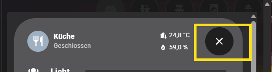
Hello together, I am struggeling with coloring the close button (X) on the popup or making the background color even transparent. Anybody knows how this work? Thanks
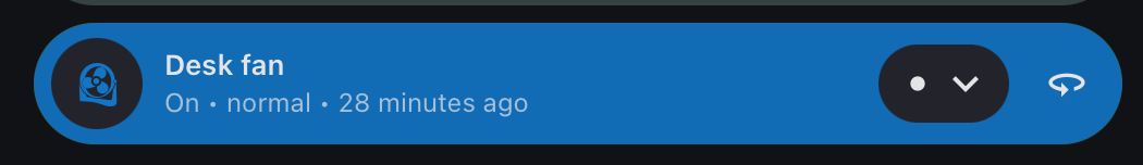
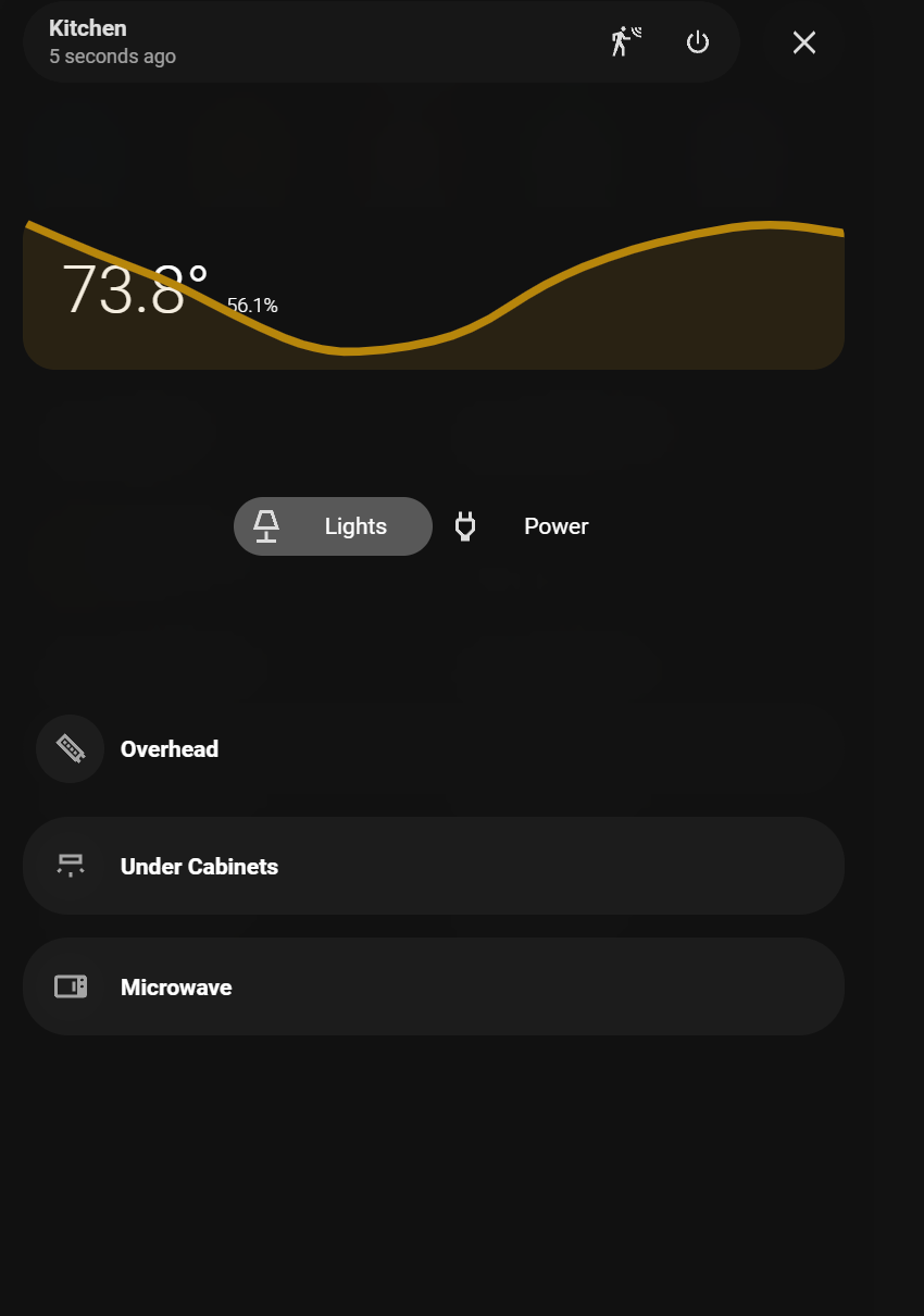
I’m having issues with changing the off background to the “Overhead” slider. The other 2 lights are switches and it was easy enough. It doesn’t appear to translate over to the slider.
What an awesome card! I just found out about this yesterday, rebuilt almost all of my views with it!
I would like to replace the name of a separator with the contents of {{ user }} but can’t find out how. Anyone who did this already?
    styles: |-
      .close-pop-up {
         background-color: rgb(239,106,94) !important;
         color: black !important;
       }
This is how to change te background color and icon color.
Is it possible to expand the state area to full width of screen?
Sorry for what might be a random, ridicolous question but… is it possible to make bubble-cards square?
I absolutely love bubble card, for its functionality (and with the modules etc, it’s absolutely amazing) but… it would be great to have that functionality, on squared /rectangular cards too…
I find myself when using custom-button etc now lacking the wonderful functions of bubble card.