Maybe I’m just blind, but I can’t seem find it. Could you write down the name it’s under?
After going over the whole GitHub page for the 8th time, I finally found it. Thanks for the help anyway.
Oh sorry! I meant to write Styling > Examples section. 
1 Like
Few quick questions… is there a way to limit scrolling and either wrap onto the next line and/or decrease the font size? Is there a way to shrink the whole size of the button and make it scale to the contents? I am trying to make a “chip” style header row, but I need to ability to use icons and text. Similar to mushroom chips (which is what I am currenlty using, but I would like to use bubble card so the style is more similar. Thanks
Hello, Can you please guide on how can we control (increase\decrease) the space between the sub-buttons?
Hi,
I am kindly asking for suggestions.
How do I scale down an image, I used instead of an icon?

I have used following styling to put it in place
styles: |-
  .bubble-button-2 {
    background-image: url("/local/icons/custom_icons/robot-2.png");
    background-size: cover;
  }
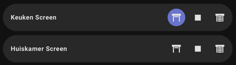
I’ve had a strange situation since today. I have two cover buttons where the background color of the bubble button indicates the status. However, now the background color of one of the buttons is no longer changing. See the image and the code for the two cover buttons.
 - type: custom:bubble-card
    card_type: cover
    entity: cover.rfy_010505_1
    show_icon: false
    icon_down: mdi:window-shutter
    icon_up: mdi:window-shutter-open
    modules:
      - default
    card_mod:
      style: |
        .bubble-button.bubble-open {
          {% if states('cover.rfy_010505_1') == 'open'  %}
          background-color: rgb(103, 114,209,1) !important;
          {% else %}
          opacity: 1 !important;
          {% endif %}
        }
        .bubble-button.bubble-close {
          {% if states('cover.rfy_010505_1') == 'closed'  %}
          background-color: rgb(103, 114,209,1) !important;
          {% else %}
          opacity: 1 !important;
          {% endif %}
        }
  - type: custom:bubble-card
    card_type: cover
    entity: cover.rfy_010509_1
    show_icon: false
    icon_down: mdi:window-shutter
    icon_up: mdi:window-shutter-open
    modules:
      - default
    card_mod:
      styles: |
        .bubble-button.bubble-open {
          {% if states('cover.rfy_010509_1') == 'open'  %}
          background-color: rgb(103, 114,209,1) !important;
          {% else %}
          opacity: 1 !important;
          {% endif %}
        }
        .bubble-button.bubble-close {
          {% if states('cover.rfy_010509_1') == 'closed'  %}
          background-color: rgb(103, 114,209,1) !important;
          {% else %}
          opacity: 1 !important;
          {% endif %}
        }
Your 1st card is style and the 2nd is styles. I think styles is correct spelling.
Oh, thanks. style is the correct one. Problem solved. Overlooked that.
Hi andy do you mind sharing what you did? I am in the same pickle as you are ><
Hello guys,
Maybe someone know better if I can do this.
- it’s default select select card with an input select from different rooms.
- it’s a sub button editor to let me know which room it’s there.

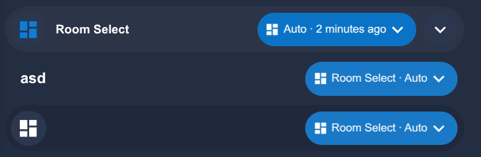
top - select card
middle - separator with sub button
down - button text card with sub button
I want to use select card because everywhere I tap the button it’ll popup the dropdown to select what I want.
- Can I make the default select card with input select entity to show as others I already showed in screenshots ?
- If not, it’s there any action I can use on tap action on card to open the input select from the right? Right now I need to exactly click there.

It would be nice if I could maximize the blue round to the all card, so basically a full card with only 1 dropdown.
is there a way to chose the attributes used to populate the drop list menu of the Select type?
I have an entity that the attribute with the list of available choices is called “options” but it seems that bubble card select doesn’t use it. So clicking on the down arrow does nothing
I am trying to change the background colour of a sub-button icon container. Would ideally like to be able to set it by state object just struggling to theme this part.
- type: custom:bubble-card
  card_type: button
  card_layout: large
  button_type: name
  show_icon: false
  show_name: false
  sub_button:
    - name: Mop Mode
      icon: mdi:water-opacity
      show_background: true
      show_arrow: false
      tap_action:
        action: select
        navigation_path: input_select.select_option
      entity: select.roborock_qrevo_mop_intensity
    - name: Mop Mode
      icon: mdi:water
      show_background: true
      show_arrow: false
      tap_action:
        action: select
        service: input_select.select_option
      entity: select.roborock_qrevo_mop_mode
    - name: DND Begin
      icon: mdi:bell-cancel
      show_background: true
      entity: time.roborock_qrevo_do_not_disturb_begin
      tap_action:
        action: toggle
    - name: DND Finish
      icon: mdi:bell-ring
      show_background: true
      entity: time.roborock_qrevo_do_not_disturb_end
    - name: DND Switch
      show_icon: true
      show_background: true
      entity: switch.roborock_qrevo_do_not_disturb
      tap_action:
        action: toggle
  card_mod:
    style: |
      ha-card {
        margin-top: 5px;
        margin-left: -10px;
        width: 440px;
        #padding-bottom: 20px;
        #color: white;
      }
  styles: |
    .card-content {
      width: 100%;
      #margin: 0 !important;
    }
    .bubble-button-background {
      opacity: 1 !important;
      background-color: rgba(0, 128, 128, 0.4) !important; border-radius: 5px !important;
    }
    .bubble-button-card-container {
      border-radius: 5px !important;
    }
    .bubble-sub-button {
      height: 36px !important;
      width: 26px !important;
    }
    .bubble-sub-button-container {
      display: flex !important;
      width: 100%;
      justify-content: space-between !important;
    }
    .bubble-sub-button-icon {
      --mdc-icon-size: inherit !important;
    }
    .bubble-name-container {
      margin-right: 0px !important;
    }
    .bubble-sub-button-1 > ha-icon {
      color: rgba(0, 128, 128, 0.4) !important;
    }
    .bubble-sub-button-2 > ha-icon {
      color: rgba(0, 128, 128, 0.4) !important;
    }
    .bubble-sub-button-3 > ha-icon {
      color: rgba(0, 128, 128, 0.4) !important;
    }
    .bubble-sub-button-4 > ha-icon {
      color: rgba(0, 128, 128, 0.4) !important;
    }
    .bubble-sub-button-5 > ha-icon {
      color: rgba(0, 128, 128, 0.4) !important;
    }
1 Like
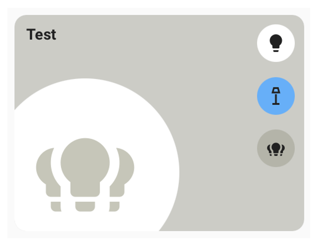
Here it is after a little experimentation and code… I don’t know what it’s for :), but it might help!!!
type: custom:bubble-card
card_type: button
button_type: name
icon: mdi:liquor
name: KARTICA
scrolling_effect: false
sub_button:
  - entity: sensor.terasa_termometar_temperature
    show_state: true
modules: []
card_mod:
  style: |
    .bubble-icon-container {
      overflow: visible;
    }


    .bubble-icon::after {
      content: "Test";
      position: absolute;
      top: -15%;
      right: -55%;
      display: flex;
      justify-content: center;
      align-items: center;
      font-size: 10px;
      font-weight: 400;
      color: white;

      width: 30px;
      height: 18px;

      background: rgb(76, 175, 80);
      border-radius: 25%;
      }

    .bubble-sub-button-1:after {
      content: "{{states ('sensor.terasa_termometar_humidity')}}%";
      position: absolute;
      top: -15%;
      right: -5%;
      display: flex;
      justify-content: center;
      align-items: center;
      font-size: 10px;
      font-weight: 400;
      color: white;

      width: 40px;
      height: 18px;


      background: rgb(76, 175, 80);
      border: 0px solid transparent;
      border-color: rgb(76, 175, 80);
      border-radius: 25%;
      } !important;
More variations in the same style
type: custom:bubble-card
card_type: button
card_layout: large
button_type: name
show_icon: false
show_name: false
sub_button:
  - show_icon: true
    state_background: true
    show_background: false
    name: Brano
    tap_action:
      action: navigate
      navigation_path: "#brano"
styles: |
  .card-content {
    width: 100%;
    margin: 0 10 0 10 !important;
  }
  .bubble-button-card-container {
    background: none;
    border: none;
  }
  .bubble-sub-button {
    height: 42px !important;
    width: 42px !important;
  }
  .bubble-sub-button-container {
    display: flex !important;
    width: 100%;
    justify-content: center !important;
  }

  .bubble-sub-button-1 {
    background-image: url(${hass.states['person.branislav'].attributes.entity_picture});
    background-size: contain!important;
    border-radius: 50px !important;
  }
  .bubble-sub-button-1:after {
      content: "";
      position: absolute;
      top: -2px;
      left: -2px;
      width: calc(80% + 4px);
      height: calc(80% + 4px);
      border: 4px solid transparent;
      border-radius: 50%;
      border-color: ${
        hass.states['person.branislav'].state === 'home'
          ? "#008000" // Green
          : "#FF0000" // Red
      } !important;
    }
Hello,
I’m currently trying to setup my dashboard for mobile phones using this awesome Bubble Cards, but I’m struggling with some styling and dimensioning issues.
The setup I’m testing right now uses the module Room Card Module
The dimensions and proportions of the test-card I have designed are looking correct on my laptop dashboard, even if the big icon and the circle around is a bit too large for my understanding.
If I open this dashboard in the HA app on my iPhone the dimensions are messed up and the sub buttons are touching the edge of the button.

What is the right way to move the sub buttons slightly to the left that they do no longer interfere with the edge of the card itself? And how can I shrink the icon and the circle around the icon that it does not take that much space?
I know that there is possibility to modify the Code (CSS/JS template) of the Room Card Module, but can anybody tell me what variables and values need to be modified to achieve what im looking for?
thanks
Try it!
    .large .bubble-sub-button-container {
      position: absolute;
      right: 20px; /* fiksna udaljenost od desne ivice */
      top: calc((100% - 4 * 36px)/5); /* vertikalni razmak */
      display: flex !important;
      flex-direction: column;
      gap: calc((100% - 4 * 36px)/5) !important;
      justify-content: flex-start;
      height: 100% !important;
      padding-right: 0 !important;
    }
An example of my custom Room card, maybe it will help someone
type: custom:bubble-card
card_type: button
show_attribute: false
show_name: true
show_icon: true
scrolling_effect: true
show_state: false
card_layout: large-2-rows
tap_action:
  action: none
button_type: name
name: Boravak
icon: mdi:sofa
sub_button:
  - name: Rasveta boravak
    icon: mdi:lightbulb-group
    tap_action:
      action: navigate
      navigation_path: "#rasveta_boravak"
    entity: light.rasveta_boravak
  - name: Media
    icon: mdi:television-off
    tap_action:
      action: navigate
      navigation_path: "#media_boravak"
    entity: remote.android_tv
  - name: Media
    tap_action:
      action: navigate
      navigation_path: "#klima_boravak"
    entity: climate.boravak_ac
styles: >-
  .bubble-icon-container {
    overflow: visible;
  }

  .bubble-icon {
    color: teal!important;
    opacity: .5 !important;
  }

  .bubble-icon-container {
      opacity: 1 !important;
      background: var(--icon-Background-Color); !important;
    }

  .large .bubble-sub-button-container {
    position: absolute;
    right: 10px; /* fiksna udaljenost od desne ivice */
    top: calc((100% - 4 * 36px)/5); /* vertikalni razmak */
    display: flex !important;
    flex-direction: column;
    gap: calc((100% - 4 * 36px)/5) !important;
    justify-content: flex-start;
    height: 100% !important;
    padding-right: 0 !important;
  }


  .large .bubble-sub-button {
    height: 36px !important;
  }

  .bubble-sub-button {
    height: 36px !important;
    width: 36px !important;
    border-radius: 10px !important;
  }


  .bubble-sub-button-icon {
    --mdc-icon-size: 24px !important;
  }


  ${subButtonIcon[1].setAttribute("icon", hass.states['remote.android_tv'].state
  === 'on' ? 'mdi:television' : 'mdi:television-off')}

  ${subButtonIcon[2].setAttribute("icon",
  hass.states['climate.boravak_ac'].state === 'heat'
    ? 'mdi:fire'
    : hass.states['climate.boravak_ac'].state === 'heat_cool'
    ? 'mdi:sun-snowflake'
    : hass.states['climate.boravak_ac'].state === 'cool'
    ? 'mdi:snowflake'
    : hass.states['climate.boravak_ac'].state === 'dry'
    ? 'mdi:water-percent'
    : hass.states['climate.boravak_ac'].state === 'fan_only'
    ? 'mdi:fan'
    : 'mdi:air-conditioner')}
card_mod:
  style: |
    .bubble-icon::after {
      content: "{{states ('sensor.boravak_termometar_temperature')}}°C/{{states ('sensor.boravak_termometar_humidity')}}%";
      position: absolute;
      top: -30px;
      left: 30px;
      color: var(--primary-text-color);
      opacity: 1 !important;
      font-size: 12px;
    }


    {% if states('sensor.broj_osvetljenja_boravak') | int > 0 %}
    .bubble-sub-button-1:after {
      content: "{{ states('sensor.broj_osvetljenja_boravak') }}";
      position: absolute;
      top: -5px;
      left: 22px;
      width: 18px !important;
      height: 15px !important;
      display: flex;
      align-items: center;
      justify-content: center;
      color: black;
      background-color: orange;
      border-radius: 20%;
      font-size: 10px;
    }
    {% endif %}

    {% if states('climate.boravak_ac') !='off' %}
    .bubble-sub-button-3:after {
      content: "{{ state_attr('climate.boravak_ac', 'temperature') }}";
      position: absolute;
      top: -5px;
      left: 22px;
      width: 18px !important;
      height: 15px !important;
      display: flex;
      align-items: center;
      justify-content: center;
      color: black;
      background-color: var(--primary-color);
      border-radius: 20%;
      font-size: 10px;
    }
    {% endif %}
grid_options:
  columns: 6
  rows: 3
modules:
  - room_card
6 Likes
Here’s the title, I like it, but it doesn’t discuss tastes…Maybe it will help someone

type: custom:vertical-stack-in-card
cards:
  - type: custom:bubble-card
    card_type: separator
    name: Name
    sub_button:
      - entity: sensor.time
        show_name: false
        show_icon: false
        name: Vreme
        show_state: true
        state_background: false
        show_background: false
      - tap_action:
          action: perform-action
          perform_action: input_boolean.toggle
          target:
            entity_id: input_boolean.notifications
        icon: ""
        state_background: false
        show_background: false
        entity: sensor.alarm_stan
        name: Alarm
        visibility:
          - condition: state
            entity: sensor.alarm_stan
            state: Alarm
    styles: >-

      .card-content {
        width: 100%;
        margin: 0 !important;
      } .bubble-button-card-container {
        background: none;
        border: none;
      } .bubble-name:before { color: red; content: attr(data-before);
      padding-right: 0.5em } .bubble-line { background-color: #ccae99; }
      .bubble-sub-button-1 { font-weight: bold !important; font-size: 1.2em
      !important; }

      .bubble-sub-button-2 {
        color:  ${
          hass.states['input_boolean.notifications'].state ==='on'
            ? "red"
            : ""// Red
          } !important;
      }
        .bubble-sub-button {
          height: 26px !important;
          width: 26px !important;
        }
      ${card.querySelector('.bubble-name').setAttribute('data-before', new
      Date().toLocaleDateString('sr-Latn-SR', {weekday:
      'long'}).toUpperCase())}; ${card.querySelector('.bubble-name').innerText =
      new Date().toLocaleDateString('sr-Latn-SR', {day: 'numeric', month:
      'long'}).toUpperCase()};
    rows: "0.8"
    modules:
      - home-assistant-default
  - type: conditional
    conditions:
      - entity: input_boolean.notifications
        state: "on"
    card:
      type: custom:bubble-card
      card_type: button
      modules:
        - home-assistant-default
      sub_button:
        - entity: sensor.voda_stan
          name: Voda
          state_background: false
          tap_action:
            action: navigate
            navigation_path: "#voda"
          visibility:
            - condition: state
              entity: sensor.voda_stan
              state_not: "0"
        - entity: sensor.otvorena_vrata_stan
          show_state: true
          state_background: false
          name: Vrata
          tap_action:
            action: navigate
            navigation_path: "#vrata"
          visibility:
            - condition: state
              entity: sensor.otvorena_vrata_stan
              state_not: "0"
        - entity: sensor.baterija_broj_uredjaj_sa_niskim_nivoom
          show_state: true
          show_icon: true
          state_background: false
          tap_action:
            action: navigate
            navigation_path: "#baterija"
          name: Baterija
          visibility:
            - condition: state
              entity: sensor.baterija_broj_uredjaj_sa_niskim_nivoom
              state_not: "0"
        - entity: binary_sensor.ulaz_posta_occupancy
          show_state: false
          state_background: false
          icon: mdi:email-newsletter
          tap_action:
            action: navigate
            navigation_path: null
          name: Posta
          visibility:
            - condition: state
              entity: binary_sensor.ulaz_posta_occupancy
              state: "on"
        - entity: sensor.broj_osvetljenja_stan
          show_state: true
          state_background: false
          tap_action:
            action: navigate
            navigation_path: "#rasveta"
          name: Rasveta
          visibility:
            - condition: state
              entity: sensor.broj_osvetljenja_stan
              state_not: "0"
        - entity: alarm_control_panel.home_alarm
          show_state: false
          state_background: false
          name: Alarm
          tap_action:
            action: navigate
            navigation_path: "#alarm"
      button_type: name
      name: ""
      icon: ""
      use_accent_color: false
      styles: |-
        .card-content {
          width: 100%;
          margin: 0 !important;
        }
        .bubble-button-card-container {
          background: none;
          border: none;
        }

        .bubble-sub-button-container {
          display: flex !important;
          width: 100%;
          justify-content: right !important;
        }


        .bubble-name-container {
          margin-right: 0px !important;
        }


        .bubble-sub-button {
          height: 26px !important;
          width: 46px !important;
        }

        .bubble-sub-button-1 {
          animation: ${hass.states['sensor.voda_stan'].state>0? 'fade-animate 3s ease-in-out infinite' : '' };
          color:  ${
            hass.states['sensor.voda_stan'].state > 0
              ? "red"
              : "white"
            } !important;

           }

          @keyframes fade-animate {
           0%, 100% {
             opacity: 1;
           }
           50% {
             opacity: 0;
           }
           }


         }

        .bubble-sub-button-2 {
          animation: ${hass.states['sensor.otvorena_vrata_stan'].state>0? 'fade-animate 3s ease-in-out infinite' : '' };
          color:  ${
            hass.states['sensor.otvorena_vrata_stan'].state > 0
              ? "red"
              : "white"
            } !important;

           }

          @keyframes fade-animate {
           0%, 100% {
             opacity: 1;
           }
           50% {
             opacity: 0;
           }
           }


         }

        .bubble-sub-button-3 {
          color:  ${
            hass.states['sensor.baterija_broj_uredjaj_sa_niskim_nivoom'].state > 0
              ? "red"
              : "white"
            } !important;

           }
        .bubble-sub-button-5 {
          color:  ${
            hass.states['sensor.broj_osvetljenja_stan'].state >0
              ? "orange"
              : "none" // Red
            } !important;


          }
        .bubble-sub-button-6 {
          animation: ${hass.states['alarm_control_panel.home_alarm'].state == 'arming' ? 'fade-animate 3s ease-in-out infinite' : '' };

          color:  ${
            hass.states['alarm_control_panel.home_alarm'].state == 'disarmed'
              ? "blue"
              : hass.states['alarm_control_panel.home_alarm'].state ==  'armed_home'
              ? "green"
              : hass.states['alarm_control_panel.home_alarm'].state ==  'armed_away'
              ? "teal"
              : hass.states['alarm_control_panel.home_alarm'].state ==  'arming'
              ? "orange"
              : "#FF0000" // Red
            } !important;

         }
          @keyframes fade-animate {
           0%, 100% {
             opacity: 1;
           }
           50% {
             opacity: 0;
           }
           }

          ${subButtonIcon[5].setAttribute("icon",
          hass.states['alarm_control_panel.home_alarm'].state == 'disarmed'
            ? 'mdi:shield-off'
              : hass.states['alarm_control_panel.home_alarm'].state ==  'armed_home'
              ? 'mdi:shield-home'
              : hass.states['alarm_control_panel.home_alarm'].state ==  'armed_away'
              ? 'mdi:shield-lock'
              : hass.states['alarm_control_panel.home_alarm'].state ==  'arming'
              ? 'mdi:shield'
              : "#FF0000" // Red
            )}
      show_icon: false
      scrolling_effect: false
      show_name: false
      rows: "0.8"
    alignment: justify
card_mod:
  style: |
    ha-card{
      background: transparent;
      border:none;

    }
Here is a copy of the Alarm card 

type: custom:bubble-card
card_type: button
button_type: switch
entity: alarm_control_panel.home_alarm
show_attribute: true
show_state: true
force_icon: false
show_icon: true
scrolling_effect: false
show_name: true
sub_button:
  - entity: script.alarm_aktivan_van_kuce
    icon: mdi:shield-lock
    tap_action:
      action: toggle
    double_tap_action:
      action: none
    visibility:
      - condition: state
        entity: alarm_control_panel.home_alarm
        state_not: armed_away
  - icon: mdi:shield-home
    tap_action:
      action: toggle
    double_tap_action:
      action: none
    visibility:
      - condition: state
        entity: alarm_control_panel.home_alarm
        state_not: armed_home
    entity: script.alarm_aktivan_u_kuci
  - icon: mdi:shield-off
    state_background: true
    show_background: true
    tap_action:
      action: toggle
    visibility:
      - condition: state
        entity: alarm_control_panel.home_alarm
        state_not: disarmed
    entity: script.alarm_neaktivan
tap_action:
  action: none
double_tap_action:
  action: none
hold_action:
  action: none
modules:
  - subbutton_colors
  - home-assistant-default
subbutton_colors:
  subbutton1:
    color: teal
    condition:
      - condition: state
        state: armed_away
        entity_id: alarm_control_panel.home_alarm
  subbutton2:
    color: green
    condition:
      - condition: state
        state: armed_home
        entity_id: alarm_control_panel.home_alarm
  subbutton3:
    color: indigo
    condition:
      - condition: state
        state: disarmed
        entity_id: alarm_control_panel.home_alarm
card_layout: large-sub-buttons-grid
button_action:
  tap_action:
    action: none
  hold_action:
    action: none
styles: |-
  .bubble-icon-container {
    animation: ${state === 'arming' ? 'fade-animate 3s ease-in-out infinite' : '' };
    background:  ${
      state == 'disarmed'
        ? "blue"
        : state ==  'armed_home'
        ? "green"
        : state ==  'armed_away'
        ? "teal"
        : state ==  'arming'
        ? "orange"
        : "#FF0000" // Red
    } !important;
    border-radius: 25%!important;
    color: white!important;
   }
   @keyframes fade-animate {
     0%, 100% {
       opacity: 1;
     }
     50% {
       opacity: 0;
     }

  ${card.querySelector('.bubble-state').innerText =
    state == 'armed_home' ? "Alarm aktiviran (Kod kuće)"
    : state == 'armed_away' ? "Alarm aktiviran (Odsutan)"
    : state == 'disarmed' ? "Alarm deaktiviran"
    : "Aktiviranje alarma"
  }

  ${state == 'armed_home' ? icon.setAttribute("icon", 'mdi:shield-home')
   : state == 'armed_away' ? icon.setAttribute("icon", 'mdi:shield-lock')
   : state == 'disarmed' ? icon.setAttribute("icon", 'mdi:shield-off')
   :icon.setAttribute("icon", 'mdi:shield')};
  }
name: Alarm kućni
thank you… I played around a bit and ended up with this
.large .bubble-icon-container {
        margin: 5px;
        z-index: 1;

        min-width: ${this.config.room_card?.square_icon ? '110px' : '120px'};
        max-width: ${this.config.room_card?.square_icon ? '110px' : '120px'};
        min-height: ${this.config.room_card?.square_icon ? '110px' : '120px'};
        max-height: ${this.config.room_card?.square_icon ? '110px' : '120px'};
        border-radius: ${this.config.room_card?.square_icon ? '0px' : '80px'};
        border-top-right-radius: ${this.config.room_card?.square_icon ? '12px' : '80px'};
        transform: ${this.config.room_card?.square_icon ? 'translate(0px,37px)' : 'translate(-16px,50px)'};
      }