⚪ Bubble Card - A minimalist card collection for Home Assistant with a nice pop-up touch

Bubble Card 3

v3.0.2

HOTFIX:
Sliders (without “Tap to slide” enabled) were not sliding anymore after the v3.0.1 update, this is now fixed!

Sorry for that!

v3.0.1

Hi everyone!

First, I just want to say a huge thank you for the amazing reception of v3.0.0! The feedback, kind words, bug reports, donations, new Patreon supporters, and the new modules you’ve shared on the Module Store have been incredible to see! The community energy around this update has been next-level. It truly makes all the work worth it! :heart:

This release focuses on polishing the v3 foundation, fixing a bunch of issues that popped up after the big launch, and adding a few handy improvements to make the experience smoother. I plan to fix more bugs before moving on to bigger new features, but this version addresses the ones I considered most important or most reported.

Here’s the full changelog:


:bulb: New features and enhancements

:heavy_check_mark: Bug fixes and improvements

  • Invalid authentication error fixed:
    This critical issue could cause problems when installing, saving, or updating modules, and in some cases even block your IP from accessing Home Assistant! Everything is now working as expected! #1713

  • Module Editor and Store initialization fix:
    They now check that sensor.bubble_card_modules is properly configured before being enabled. #1663 #1549

  • Module Store cache refresh:
    The cache now refreshes automatically, no need to hit the refresh button manually anymore.

  • Instant module import:
    Importing an existing module via the “Import from YAML” button now takes effect immediately.

  • Module conditions improvements:

    • “Not” condition is now working properly.
    • Disabling a condition in the editor now behaves as expected.
  • Sub-button creation fix:
    New sub-buttons now appear right away without needing to change another option first (like before).

  • Editor safety checks:
    Invalid YAML/JS configs in a module are now blocking the “Save Module” button to prevent breaking the editor. #1715

  • Slider icon tap action fixed:
    When “Tap to slide” was enabled, the icon’s tap action was not working. This is now fully functional. #1651

  • Mobile pop-up overlay issue resolved:
    On mobile, opening “Device Info” from a pop-up left the overlay visible. This is now fixed. #1660

  • “Close pop-up after any click or tap” restored:
    This option is working again as expected. #1711

  • Dropdown positioning fix:
    Dropdowns (other than Bubble Card’s own) inside pop-ups now open correctly. #1727

  • Climate card fix:
    Temperature buttons are now shown correctly if the entity was previously unavailable. #1544

  • 404 error handling:
    If bubble-modules.yaml is missing, you’ll now just see a single harmless 404 in the console (this can be ignored). #1699


:information_source: Bubble Card news


I’ve been wanting to start my own YouTube channel for a while, focusing on tutorials around Home Assistant and Bubble Card. There are three videos so far, an introduction explaining the project, a first tutorial on how to create your first pop-up and a video about the new features in Bubble Card 3. I really hope you will enjoy them. Don’t hesitate to subscribe to help give my channel more visibility. Thank you in advance!

YouTube

The next video should cover the new global variables, as well as custom styles, templates and modules, since I’ve noticed more and more questions on these topics.


Over the past year, I’ve been working almost everyday on Bubble Card to make it the best it can be, and I still don’t believe how much it have grown in popularity. Watching the community getting this big and seeing so many people using my work has been incredibly rewarding.

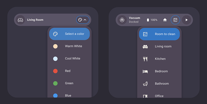
I have another announcement to you all, I decided to create a Patreon as a way to offer something more for those who want to support me. On my Patreon, I share advanced modules, custom styles, and templates. For example, I’ve added this module that lets you fully customize the labels, icons, and icon colors of dropdown items, while also defining actions or adding navigation to pop-ups or dashboard pages. It works with both the main select card and sub-buttons in supported cards, making it perfect for quick controls, a vacuum room selector, or even a light color picker.

If you like my project and want to support its development, subscribing to my Patreon is probably the best way to help me keep the project going.

Also, let me know if you have any suggestions or feedback on this. Trying to find a way to monetize my work was not something I ever imagined doing, but I really hope you see it as a way to keep improving the project, and not as a negative step.

Patreon Clooos

Thank you so much for being part of this amazing community, your support will always makes a huge difference! :heart:


I want to highlight that on the GitHub page, in the Discussions section, you can share and discover some amazing YAML examples from the community. Go check it out! Some of the creations are absolutely incredible!

Community creations


And if you are interested I’ve opened a Subreddit for Bubble Card where I post my progress on the project. Here it is:

Reddit Page

:beers:

3 Likes

Hi Breno69,

thank you! Can you also share your theme please?

I have an inputtext entity called input_text.lastusedsidedoor

The state of this entity is a timestamp followed by either the word (Open) or (Closed), ex;

Tue, Aug 12 at 12:42 PM (Open)

In my bubble card Visibility tab, I add a condition “Entity State”, but I can only use “Unavailable” and “Unknown”, I can’t use a value_template to express a condition such as;

value_template: "{{ '(Open)' in states('input_text.lastusedsidedoor') }}"

I’m seeking to limit visibility based on if the word “Open” or “Closed” exists in the state. Any way around this?

How to define the color of bubble card elements depending on the active HA theme (Light/Dark)?

I’ll try to explain, when I have a dark theme, I would like the card color to be for example yellow with black letters, and when it’s a light theme, I would like the card color to be dark blue with lowercase letters…

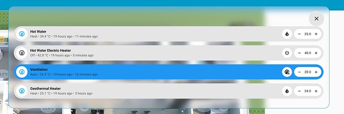
Trying to add bubble card as pop-up for floor plan picture element card, is there a way to make the pop-up in the middle of the screen (instead of stretching all the way to the bottom)?
Thank you!

Try it, maybe it will help!!!

2 Likes

Does anybody know if it’s possible? I used bubble card pop-up for group entries of devices, so I don’t have many bubbles in each card, and would like to just pop-up in the center of the screen instead of stretching all the way to the bottom. :pray:

Try!!!

3 Likes

That works! Thanks a lot!

Ok a few tweaks which I’d like but couldn’t figure out how to do it.
On my PC right now it is too wide, I tried to change default setting 540px but it didn’t seem to take effect. Also would like to show it in the middle of the picture element card (instead of the screen). For my picture element card it scales in respect to height of the screen hence there will be some white space left (see image below):

Any hint where I should look?

Im trying to work out the correct syntax to colour the icon based on state and also it would be helpful to use a variable for the entity so i can easily re-use the code?

this is current

type: custom:bubble-card
card_type: button
button_type: switch
entity: lock.520d_xdrive_lock
grid_options:
  rows: 1
  columns: 4
scrolling_effect: true
show_icon: true
force_icon: false
show_name: true
show_state: true
show_last_changed: false
show_last_updated: false
show_attribute: false
card_layout: normal
name: BMW
styles: |-
  .bubble-background {
      background-color: ${
        hass.states['lock.520d_xdrive_lock'].state === 'unlocked'
          ? '#ff4a4a87'
          : 'inherit'
      } !important;
  }
  .bubble-icon {
    ${icon.setAttribute(
      "icon",
      hass.states['lock.520d_xdrive_lock'].state === 'unlocked'
        ? 'mdi:lock-open-alert'
        : 'mdi:lock'
    )}
  }
  
1 Like

Try!!!

          .bubble-icon {    
            color: ${state === 'unlocked' ? '#ff4a4a87' : '' } !important;
          }

Perfect, sure I tried something along those lines. Be good if I can get a variable working for it all

I’m wondering if there is a way to trigger a pop-up if no other pop-ups are already triggered. I could just have the pop-up become permanent then have whatever other pop-up I want cover over it but I’m looking for another way that’ll make it easier to have the permanent part different in different rooms.

I believe in the kiss method. Cards like this I make a 3 card horizontal stack. Card A. (my card) Card B your card. and Card C my card again. The cards are transparent markdown cards and will be useful for so many times where you want blank spaces. Yes, I know CSS is more “better” but this adheres to the KISS method of dashboard configuration. I know this isn’t exactly what you are asking for, but keep it in your back pocket, you may want it someday.

type: markdown
content: " "
card_mod:
  style: |
    ha-card {
      background: transparent;
      box-shadow: none;
      height: 50px;
      border-radius: 12px;
    }
    .markdown {
      padding: 0;
    }

Ok so what I meant is the below doesn’t work for pop-up:

width_desktop: 300px

When adding the style it does make the width to 300px, but when pop-up it gets wider again…

I have made a button bubble card overview of my EV charger and use 2 sensors (which gives the states true or false):

  • sensor when the car is connected: state is true otherwise it’s state is false when disconnected
  • sensor when the car is charging: state true otherwise it’s state is false when not charging

Is there any easy way to make the state of the subbuttons templatable so it can show the state Connected/Disconnected and Charging/Not charging instead of the state false/true?

Try!

${card.querySelector('.bubble-sub-button-1').querySelector('.bubble-sub-button-name-container').innerText = 
   hass.states['sensor.XXXXX'].state === 'on'
     ? 'Connected'
     : 'Disconnected '
  }

For sub-button-1!!!

2 Likes

Many thanks! That did the trick. Exactly was I was looking for.
You support is appreciated ; :clap:

Anyone using an auto-entities card that displays a vertical-stack with a bubble-card for each item in a todo list, by chance?

I tried and tried but cant it to work!