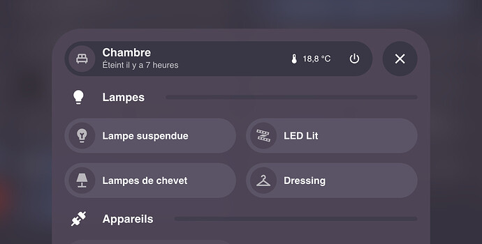
Is anyone having issues using variables in the popups for backgrounds? I am trying to change the background of popups based on light or dark theme but it doesn’t seem to want to change the colour for me?!?! ie. I still get a light background on dark mode etc, no matter what I do, unless I hard code in the rgba value
Magnify your card in V.2. But I’m having a lot of trouble being able to edit the colors and transparent backgrounds of the header. Could you enlighten us and give us some instructions on how we can edit the styles? Thanks in advance.
I have a little problem viewing a bubble card on my mobile and do not know how to solve it.
As you can see in the screenshot, the cards are larger than the mobile screen.
While in desktop are seen as expected.
What to change in the settings of the card?
Bubble Card 2 - The Final Beta?
Version 2.0.0-beta.3, 4 and 5
Hello, everyone!
It took me more effort than I thought, but I believe I’ve resolved all the issues you’ve reported. This beta might just be our stable version! ![]()
Meanwhile, I’ve included some new features you requested. For example, you can now turn off the scrolling text effect. Plus, I’ve added even more icons that change according to the state, just like Home Assistant does by default.
I’ve also fixed a new issue that popped up in this v2. With pop-ups and the horizontal buttons stack, you no longer need to apply the “Fix when the sidebar is hidden” setting, it’s automatic now and I’ve removed this option from the editor.
About the editor, there were some major issues on some setups, especially with the sub-buttons and tap actions. These should all be sorted out now!
For Google Nest Hub users, I’ve worked on a longstanding problem. I don’t own a Google Nest Hub myself, but I’m hopeful this update will finally solve it!
And here is more:
 New features
- Media player volume now shows the percentage on the slider.
- You can now disable auto-scrolling for text.
- Set default actions for sub-buttons to “More info”.
- Brought back the previous ‘scroll to close’ for pop-ups.
- Added default icons for (nearly) everything.
 Bug fixes and optimizations
- Changed the colors of the sub-buttons for users with light themes.
- Fixed the sub-button layout updating with every Home Assistant refresh.
- Google Nest Hub issue fixed?
- The pop-up header now updates entity state changes correctly.
- Resolved a slider issue on desktop.
- Fixed several issues with the horizontal buttons stack.
- Fixed and removed the unnecessary fix for when the sidebar is hidden.
- Sorted out some editor issues with sub-buttons and tap actions.
- Pop-up layout issues is now fixed.
And there are even more improvements that I’ve not listed.
Well, finger crossed ![]()
I’m unable to replicate this issue, can you tell me more about your setup? Is it happening on all cards?
Hey @Cloos ,
awesome, thanks for the update!
Would it be possible to add ‘last changed’ in addition to ‘last updated’ that is already available? ‘Last changed’ seems more stable for my use cases.
To be honest I didn’t knew that there was a difference between these two. What is the exact difference?
I don’t know the exact difference but ‘last updated’ is sometimes randomly resetting the time to zero, even in cases where the entity (switch, button, …) hasn’t changed. Therefore I’m only using ‘last changed’ what doesn’t show this kind of behavior.
Thank you for the details, I will change that now!
Great, thanks!
Here’s the explanation:
Thanks for the hard work!
It is possible to change the icon color for the slide button? I have been able to change the background color but not the icon one:
  - type: custom:bubble-card
    card_type: button
    button_type: slider
    entity: cover.persiana_comedor
    show_state: true
    show_last_updated: true
    show_attribute: true
    attribute: current_position
    styles: |
      .range-fill {
        background: rgba(79, 69, 87, 1) !important;
      }
    show_icon: true
    force_icon: true
    name: Comedor
Indeed this so much better with last_changed, I’ve changed it and this will be available in the next release (hopefully the stable one!).
You can change the icon color like this:
.bubble-icon {
  color: white !important;
}
You can find every class you can edit in the styles.ts file in every cards, here is the one from the buttons:
For example you can change the background color of a button like this:
.bubble-button-background {
    background: red !important;
}
I will add more explaination on this in the upcoming v2 documentation.
What layout are you using? Because this seems like a layout issue, for example I don’t recommend to use the grid one. Here is how it looks like on my setup:
I’ve just made some modifications in my code, in the next release it will be possible to add this in the custom style section of all cards (except for the horizontal buttons stack for now, this one is tricky).
For example this custom style will change the icon based on the state of a light:
${state === 'on' ? icon.setAttribute("icon", "mdi:lightbulb") : icon.setAttribute("icon", "mdi:lightbulb-off")};
You’re a beast, thank you! Keep up the awesome work (:
I am sorry that I did not clarify that in my post. I am actually using the new Sections layout. I can confirm that it looks much better in the Masonry (default) layout. I may need to do some rearranging and get things set up on that layout instead. Thanks!
Question on sliders. I’m trying to implement them but when I slide a light for example, the percentage will jump back a bit and then land on the correct percentage. Nothing physically is happening with the lights but it seems like the card is catching up to something else?


