Any reason this separator not working for me?
Rounded theme

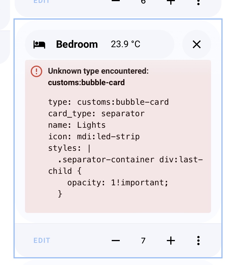
Try custom instead of customs ?
 thanks, it was it
1 Like
I test removing the horizontal-stack and create it again but issue still here.
I test on mobile only.
On all cards if i have a horizontal-stack button if not it is ok.
Would be nice if a subbutton color could change based on the value.
Like you could with mini graph card
example:
    color_thresholds:
      - value: 100
        color: '#a3ff00'
      - value: 500
        color: '#e3ff00'
      - value: 1000
        color: '#ffa300'
      - value: 1500
        color: '#ff4d00'
      - value: 2000
        color: '#ff0000'

Hi! I’ve just released a new Bubble Card 2 beta that should fix all the latest issues. Well… fingers crossed again! 
Bubble Card 2 - The True Final Beta?
Version 2.0.0-beta.6
 New features
- Added the possibility to change the icon in a custom style template, you can now do this:
${state === 'on' ? icon.setAttribute("icon", "mdi:lightbulb") : icon.setAttribute("icon", "mdi:lightbulb-off")};
 Bug fixes and optimizations
- Fixed an issue with the custom icons of the cover buttons
- Fixed an issue on the button slider when the entity is an input_number
- Changed last_updated to last_changed for the states
- Removed scrolling effect in the sub-buttons editor (it was unused)
- Fixed some color issues in the editor
- Fixed the horizontal button stack errors
- Fixed the pop-up default color on some themes
- Changed pop-up z-index to 5
7 Likes
Thanks for the great card!!
Just one question - font family cannot be adjusted via “font-family: font-type;” or is there a different way to consider this in the styling options ?
Many thanks @Cloos
Loving all the updates! Just updated to beta 6 now and looking smooth…
So Cloos… can we get the code for your set up yet? Keen to see how you’ve gone about it.
1 Like
Also eager to see his setup, hopefully also a tablet setup with bubbles 
I have a strange thing when I save a code.
2 buttons horizontal with a call service.
The 2nd button call service is working.
When I want to save this code to the first button I automatically sets the target: {}
Example 2 identical buttons:
type: horizontal-stack
cards:
  - type: custom:bubble-card
    card_type: button
    name: Dicht
    show_state: true
    show_last_updated: false
    tap_action:
      action: none
    hold_action:
      action: call-service
      service: lock.unlock
      target:
        entity_id: lock.danalock
    entity: lock.danalock
    button_type: switch
    icon: mdi:shield-lock
  - type: custom:bubble-card
    card_type: button
    name: Dicht
    show_state: true
    show_last_updated: false
    tap_action:
      action: none
    hold_action:
      action: call-service
      service: lock.lock
      target:
        entity_id: lock.danalock
    entity: lock.danalock
    button_type: switch
    icon: mdi:shield-lock
But after saving it changes only the first button target
target: {}
This way the call service is not working, the second button works and is not changed.
type: horizontal-stack
cards:
  - type: custom:bubble-card
    card_type: button
    name: Dicht
    show_state: true
    show_last_updated: false
    tap_action:
      action: none
    hold_action:
      action: call-service
      service: lock.unlock
      target: {}
    entity: lock.danalock
    button_type: switch
    icon: mdi:shield-lock
  - type: custom:bubble-card
    card_type: button
    name: Dicht
    show_state: true
    show_last_updated: false
    tap_action:
      action: none
    hold_action:
      action: call-service
      service: lock.lock
      target:
        entity_id: lock.danalock
    entity: lock.danalock
    button_type: switch
    icon: mdi:shield-lock
Nothing to do with latest beta, already in there previous verions
Thanks for the feedback, I will check that!
1 Like
I will… one day… I’m working so much on Bubble Card that I haven’t worked on my dashboard since the first release of the project, I’ve just added two sub-buttons in a pop-up… That’s not really impressive 
But I’m working on a new and clearer documentation, and I’m planning to add more advanced examples.
1 Like
Have you tried adding !important; at the end of your CSS declaration?
Like this:
* {
  font-family: Arial, Helvetica, sans-serif !important;
}
Brilliant. I’ll wait…
In the latest beta release (2.0b6), or a recent one anyway, something must have changed with how colors render on lights. This has led to the buttons becoming completely unreadable with bright white text on a very light orange backdrop.
Nothing to do with the theme, it happens with the default theme also. I don’t have any custom CSS or styling and again am using the default theme here.
Can this be fixed?

Thank you for pointing me this, indeed I’ve changed something. I will fix that.
1 Like
I have a setup with grid-layout, however, I need to define for each bubble popup a grid position (otherwise the popup won’t show up in the defined layout). Unfortunately, the (invisible) popups take up space in my layout with this setup, even if I put the popup cards in the first position of my dashboard.
Is there a chance you could fix this also for grid layouts?
Take a look at this, this looks like the solution to your issue:
Hello, thanks for last beta.
I Still have my issue when editing on mobile once there is the button horizontal-stack.
Regarding the diez of the screen too wide
Nb my code.
views:
  - title: Home
    cards:
      - type: vertical-stack
        cards:
          - type: custom:bubble-card
            card_type: pop-up
            button_type: slider
            entity: light.salon_lumieres
            name: Salon
            hash: '#salon'
            show_state: true
            show_attribute: false
            force_icon: false
          - type: custom:bubble-card
            card_type: button
            button_type: state
            entity: person.olivier
          - type: custom:bubble-card
            card_type: media-player
            entity: media_player.piece_a_vivre
          - type: custom:bubble-card
            card_type: button
            button_type: state
            entity: sensor.porte_podposition
            sub_button:
              - icon: ''
                entity: button.porte
            styles: >-
              ha-card > div > div > div.bubble-button-card.switch-button >
              div.bubble-icon-container.icon-container::after {

              #ha-icon {
                  color: {% if is_state('sensor.porte_podposition','LOCK') %} green !important {% endif %} {% if is_state('sensor.porte_podposition','CLOSE') %} white !important {% endif %} {% if is_state('sensor.porte_podposition','OPEN') %} red !important {% endif %};
              }
            show_attribute: false
            attribute: templates
          - type: horizontal-stack
            cards:
              - type: custom:mushroom-template-card
                primary: 'Porte entrée '
                secondary: |
                  {% if is_state('sensor.porte_podposition','LOCK') %}
                  Verrouillée
                  {% endif %}
                  {% if is_state('sensor.porte_podposition','CLOSE') %}
                  Fermée
                  {% endif %}
                  {% if is_state('sensor.porte_podposition','OPEN') %}
                  Ouverte
                  {% endif %}
                icon: |
                  {% if is_state('sensor.porte_podposition','LOCK') %}
                  kuf:fts_door_locked
                  {% endif %}
                  {% if is_state('sensor.porte_podposition','CLOSE') %}
                  kuf:fts_door
                  {% endif %}
                  {% if is_state('sensor.porte_podposition','OPEN') %}
                  kuf:fts_door_open
                  {% endif %}
                tap_action:
                  action: more-info
                badge_icon: |
                  {% if is_state('sensor.porte_podposition','LOCK') %}
                  mdi:lock
                  {% endif %}
                  {% if is_state('sensor.porte_podposition','CLOSE') %}
                  mdi:lock-off
                  {% endif %}
                  {% if is_state('sensor.porte_podposition','OPEN') %}
                  mdi:lock
                  {% endif %}
                icon_color: |-
                  {% if is_state('sensor.porte_podposition','LOCK') %}
                  green
                  {% endif %}
                  {% if is_state('sensor.porte_podposition','CLOSE') %}
                  white
                  {% endif %}
                  {% if is_state('sensor.porte_podposition','OPEN') %}
                  red
                  {% endif %}
                badge_color: |
                  {% if is_state('sensor.porte_podposition','LOCK') %}
                  green
                  {% endif %}
                  {% if is_state('sensor.porte_podposition','CLOSE') %}
                  green
                  {% endif %}
                  {% if is_state('sensor.porte_podposition','OPEN') %}
                  red
                  {% endif %}
                fill_container: true
                hold_action:
                  action: more-info
                double_tap_action:
                  action: call-service
                  service: button.press
                  target:
                    entity_id: button.porte
                entity: sensor.porte_podposition
      - type: vertical-stack
        cards:
          - type: custom:bubble-card
            card_type: pop-up
            button_type: state
            name: Météo
            hash: '#meteo'
            show_state: true
            show_attribute: false
            force_icon: false
            entity: weather.pontoise
            show_icon: false
          - type: custom:meteofrance-weather-card
            entity: weather.pontoise
            cloudCoverEntity: sensor.pontoise_cloud_cover
            rainChanceEntity: sensor.pontoise_rain_chance
            freezeChanceEntity: sensor.pontoise_freeze_chance
            snowChanceEntity: sensor.pontoise_snow_chance
            uvEntity: sensor.pontoise_uv
            rainForecastEntity: sensor.pontoise_next_rain
            alertEntity: sensor.95_weather_alert
            number_of_forecasts: '5'
            current: true
            details: false
            one_hour_forecast: true
            alert_forecast: true
            forecast: true
          - type: custom:hourly-weather
            entity: weather.pontoise
            show_wind: speed
            num_segments: '24'
            label_spacing: '4'
            show_date: 'false'
            show_precipitation_amounts: false
            name: ' '
            icons: true
            show_precipitation_probability: false
          - type: custom:weather-chart-card
            entity: weather.pontoise
            show_main: false
            show_temperature: true
            show_current_condition: true
            show_attributes: true
            show_time: false
            show_time_seconds: false
            show_day: false
            show_date: false
            show_humidity: true
            show_pressure: true
            show_wind_direction: true
            show_wind_speed: true
            show_sun: true
            show_feels_like: false
            show_dew_point: false
            show_wind_gust_speed: false
            show_visibility: false
            show_last_changed: false
            use_12hour_format: false
            icons_size: 25
            animated_icons: true
            icon_style: style2
            forecast:
              precipitation_type: rainfall
              show_probability: false
              labels_font_size: '11'
              precip_bar_size: '100'
              style: style2
              show_wind_forecast: true
              condition_icons: true
              round_temp: false
              type: daily
              number_of_forecasts: '0'
              disable_animation: false
            units:
              pressure: ''
              speed: ''
          - type: custom:weather-radar-card
            show_zoom: true
            square_map: false
            show_recenter: false
            show_scale: true
            show_range: false
            extra_labels: false
            static_map: false
            show_marker: true
            zoom_level: 10
            map_style: Voyager
      - type: custom:bubble-card
        card_type: horizontal-buttons-stack
        1_link: '#salon'
        1_icon: mdi:sofa
        2_link: '#meteo'
        2_icon: mdi:weather-partly-cloudy
Is there currently anyway to make a button without a state indicator?
Currently buttons change to another color when pressed, but I don’t want that to be the case for something like a wake on lan button, where it isnt on, but rather just a single event.