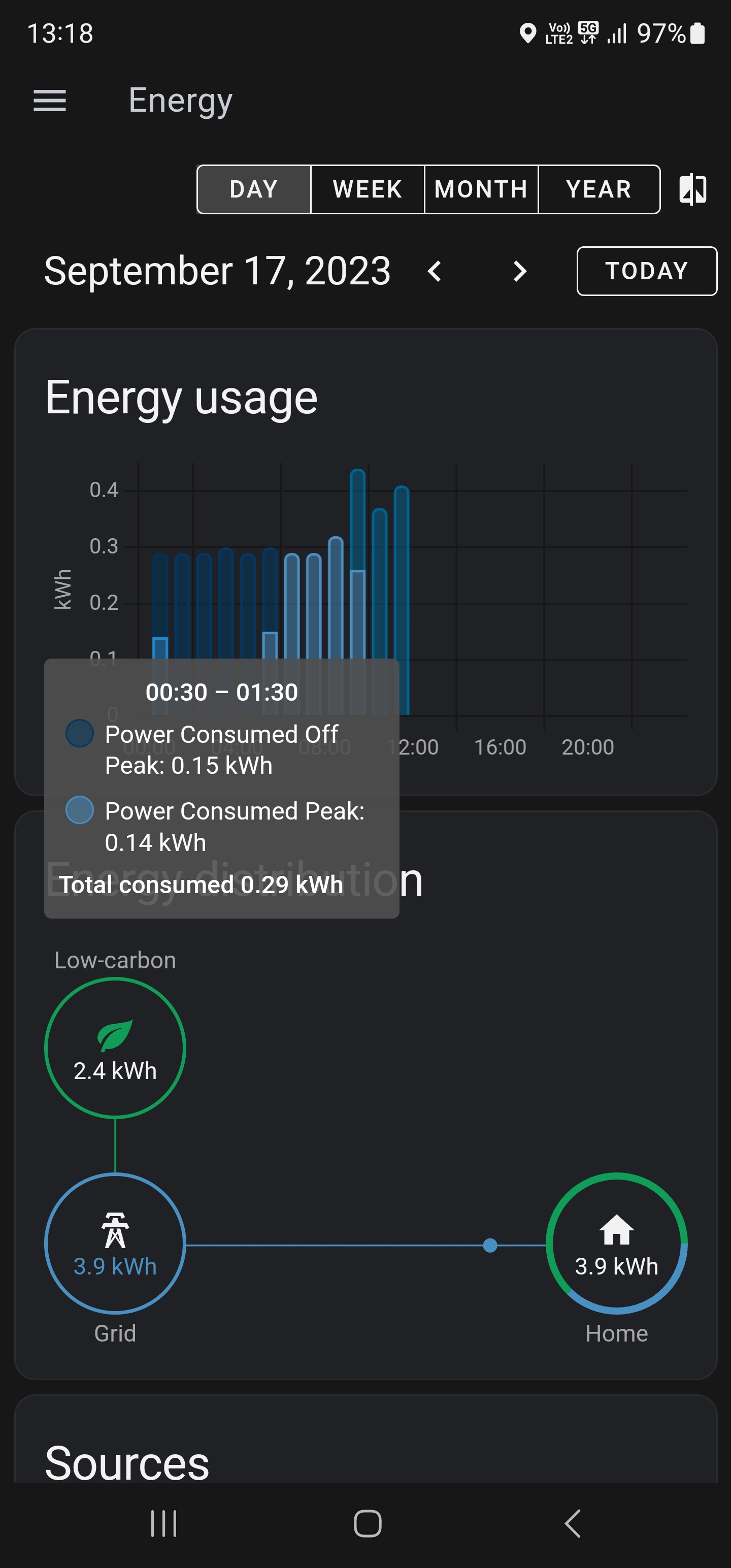
So to me, this seems to be a bug in how this graph is calculated/drawn as the splits seem to be incorrect to me.
My timezone is at a half-hour break (+0930 UTC), and the graph looks to be calculated on the hour, not when the local system’s time is, making the chart look incorrect.
Tarif times:
OffPeak: 0100-0600
Peak: 0600-1000
Shoulder: 1000-1500
Peak: 1500-0100
So if you ask me the very first bar should only be light blue and not have the top half as that is the 1 AM time, which should be the next bar. As all the time splits are on the hour, and not on the half hour, all the bars should be one colour each.
Should this be submitted as a bug? Besides this is seems to be working mostly alright.
I think nat is South Australia going by the tariffs (as am I). I’ve noticed the same behaviour (clock is correct).
The dashboard will calculate from half hour past midnight (e.g., 00:30-01:30) instead of the expected midnight onwards (00:00-01:00).
For people in full hour time zones (e.g., GMT+10:00) the calculations correctly start from midnight.
I don’t think it’s technically a ‘bug’ but it doesn’t seem to allow for the time zones that are half hour out.
No. It was only designed to meet a certain set of criteria. You happen to fall outside that criteria.
A temporary employee of Nabu Casa designed the energy dashboard to fit as many situations as their time allowed. This necessitated some simplification. It is not meant to meet everyone’s needs.
Having said that changes have been implemented by popular demand since then (water tracking for example).
Not really, more a missing feature as the actual dashboard works to design.
It would be nice to have but Home Assistant probably isn’t what you want to be using for energy tracking for more reasons other than the half hour out.
It’s great for automations triggered by energy, the tracking is really just a bonus.
For my own use, I use HA to send my energy data to PVOutput which gives a good view.
I had my own energy dashboard set up from before the core dashboard was released. I use both in Home Assistant (short term) and Grafana (long term).
I set up the core dashboard too but don’t really use it. Though it has evolved over time and I have imported some of the core energy cards to my dashboard.
To give you an idea of what is possible (well beyond the core energy dashboard):