in my theme yaml, I have some calls to some variable colors.
  # General Colors Light
  wa-teal: var(--wa-primary)
  wa-green: '#25d366'
and in Mushroom Template card the color for the icon is set at icon_color: blue. Is there a way to reference the variable in the theme yaml in that icon_color attribute? I don’t want a hard coded color, but the primary color of my theme if I switch themes.
not sure if anyone is still looking for an answer. But it terms being able to use the var(--primary-color) etc CSS variables, I just found that you could do it like this:
You are seeing the default primary color because as @Ildar_Gabdullin pointed out, that color doesn’t exist. It is simply reverting to the standard primary color upon the fault.
Oh no it works. I’m using it right now. I have Material Design Theme installed though so perhaps this aids in exposing the primary colour variable in this way. Try it yourself and tell me what you find.
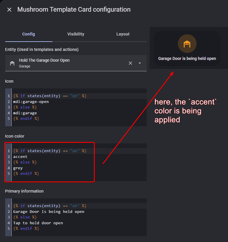
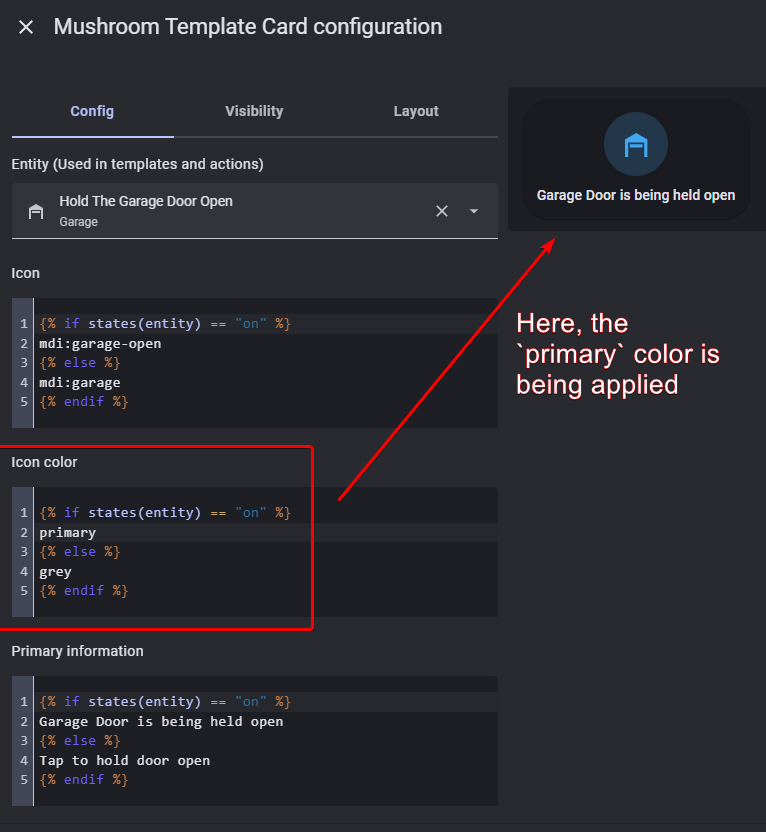
Here’s my example. So far I have found it works for the primary variable and the accent variable. Again, before saying “I doubt this will work”, try it yourself and report back
To further explain how and why this works, I did some reading and here’s what I found:
The Mushroom Cards use a predefined internal mapping between friendly color names (like "primary", "accent", "disabled", etc.) and actual CSS variables defined in a theme.
So, when you set icon_color: primary, the card internally resolves that to:
var(--primary-color)
Similarly:
accent → var(--accent-color)
disabled → var(--disabled-text-color)
grey or gray → typically mapped to var(--secondary-text-color) or var(--divider-color) depending on context.
This is handled by the Mushroom card’s frontend code and it looks for known keyword colors and resolves them to corresponding CSS variables.
Check with Code inspector instead. If card mod injects a css style with “color: primary” and this is not causing an error - then may be you are right.
First you said that translation “primary → var(…)” is performed by a custom theme, then you said that this translation is performed by mushrooms. I am not using that particular custom theme and mushrooms, so asking.
I’m not the original poster. Just someone offering help and solutions. Couldn’t find any documentation, but if you check the source code for mushroom, here’s where the mapping explicitly occurs
I see, thanks for the info!
Does it have any conflicts with card-mod? Card-mod simply injects “color:primary” into css, it does not process a value of “primary”. Or your proposal was not based on card-mod at all?
That’s correct! My solution does not need card-mod at all. If you read the mushroom docs they actually explicitly state that they don’t support the use of card-mod because their design philosophy was to move away from that complexity and make it easier to implement simple templating.
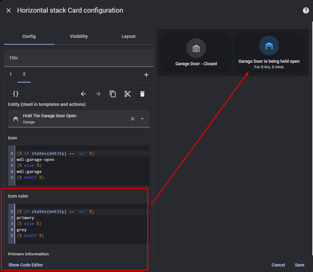
My example above already shows how this works. But for completeness, here’s the full yaml of an example card using the variable primary and the variable accent. Other css variables like disabled also appear to work