Cannot find selector to style ha-switch within theme

Hi there, I created my custom theme which uses card_mod to apply various styles. But there’s one element I cannot seem to change named “ha-switch”. It’s the toggle within an ha-card.

I’ve tried various selectors and also tried card-mod-helper. But that gave me an enormous selector which didn’t work either.

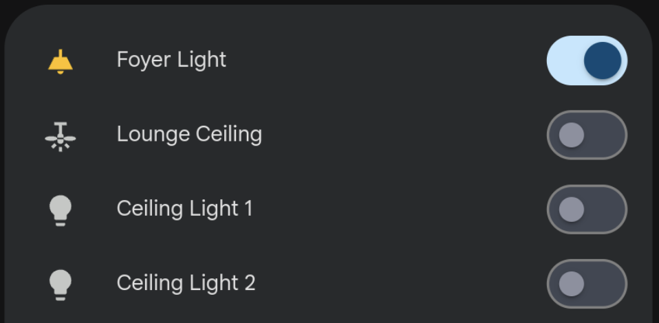
Anyone an idea to override the styles within ha-switch if it’s nested in an ha-card? I would like to change the opacity of the track as it’s not 100% by default.

The part of my current theme where I tried to apply the styles:

 card-mod-view: |
      hui-view-container::before {
        content: "";
        background: var(--lovelace-background) !important;
        background-repeat: no-repeat !important;
        background-attachment: scroll !important;
        position: fixed;
        width: 100%;
        height: 100vh;
        top: 0;
        left: 0;
        pointer-events: none;
      }
            
    card-mod-card: |
      ha-card .mdc-data-table,
      ha-card .mdc-data-table__header-cell {
          background: transparent !important;
      }
      ha-card {
          transition: none !important;
      }
      hui-toggle-entity-row $ hui-generic-entity-row $ ha-entity-toggle $:
        ha-switch $: |
            .mdc-switch__track {
                opacity: 1 !important;
            }
        .: |
            .mdc-switch__track {
                opacity: 1 !important;
            }

The html looks like this:

Ask in the proper place.

1 Like

The location of ha-switch can vary by card or dialog but I’ve covered most locations that can be modified with card-mod in my theme in this file for cards, this file for more-info dialogs, and this file for card rows. This file are the styles being applied for further reference for CSS selectors you can use.

1 Like

Thanks! I’ll take a look.

@Nerwyn, those examples you mentioned looks clean! I’ve tried it myself but still no success.

My last tries in my theme.yaml where something like this:

 card-mod-card: |
      ha-card .mdc-data-table,
      ha-card .mdc-data-table__header-cell {
          background: transparent !important;
      }
      ha-card {
          transition: none !important;
      }
      hui-entity-toggle-row $ hui-generic-entity-row $ ha-entity-toggle $ ha-switch $:
          $: |
           .mdc-switch__track {
               opacity: 1 !important;
           }

      hui-entity-toggle-row $ hui-generic-entity-row $ ha-entity-toggle $ ha-switch $: |
           .mdc-switch__track {
               opacity: 1 !important;
           }

But all the selectors so far didn’t seem to work. Maybe it has something to do with the switches being inside a vertical-stack/grid. So for now I’ll leave it for what is it.

Switch track remains with 0.54 opacity :frowning: but it’s acceptable.

My selectors work even when in a stack or row. It looks like you erroneously added hui-generic-entity-row to your selectors. While the toggles switches are within that element, they are not within it’s shadow-root so you shouldn’t include it in the card-mod selector. Try this instead:

card-mod-card: |
      ha-card .mdc-data-table,
      ha-card .mdc-data-table__header-cell {
          background: transparent !important;
      }
      ha-card {
          transition: none !important;
      }
      hui-entity-toggle-row$:
        ha-entity-toggle$ ha-switch$: |
          .mdc-switch__track {
            opacity: 1 !important;
        }

Although for rows in the entities card, you should be using card-mod-row.

card-mod-row: |
  ha-entity-toggle$:
    ha-switch$: |
      .mdc-switch__track {
          opacity: 1 !important;
      }
1 Like

if I add these files to my HA with the same file structure as the GitHub says of course will my toggle switches look like material3 themed like they do on your material-rounded theme? If so that’s exactly what I want

Nope, those are the uncompiled files. In my order to use them in Home Assistant you have to either use my theme or compile them into a card-mod theme yourself. This file is my themes pre-commit build pipeline, but the gist of it is is that the CSS files have to be copied into the YAML files where they’re referenced with jinja, and then those YAML files have to be copied into their corresponding card-mod-*-yaml fields.

1 Like

Ah ok, so that’s a no then cuz tbh I don’t understand how to do it myself lol. Thanks.

Nice, I’m jealous, wish I could style them in such a way! Looks so easy but for some reason for me as a experienced front-end developer, I cannot manage to sort this out :frowning:

@Nerwyn thanks for taking your time to help. I’ve tried your suggestions but unfortunately it’s not working. Last week I’ve spent several hours with a lot of selectors to fix it, but none of them seem to work. Also the card_mod HTML output seems odd, not sure if it’s what is suppose to be:

<card-mod slot="none" card-mod-type="card" style="display: none;">
<!---->
<style>
<!---->
ha-card .mdc-data-table,
ha-card .mdc-data-table__header-cell {
background: transparent !important;
}
ha-card {
transition: none !important;
}
ha-entity-toggle$ ha-switch$: |
.mdc-switch__track {
opacity: 1 !important;
}
<!---->
</style>
</card-mod>

This is a part of my current theme.yaml after your suggestions.

  card-mod-card: |
    ha-card .mdc-data-table,
    ha-card .mdc-data-table__header-cell {
      background: transparent !important;
    }
    ha-card {
      transition: none !important;
    }
    ha-entity-toggle$ ha-switch$: |
      .mdc-switch__track {
        opacity: 1 !important;
      }
          
  card-mod-row-yaml: |
    ha-entity-toggle$:
     ha-switch$: |
      .mdc-switch__track {
        opacity: 1 !important;
      }

Should be somewhere inside card-mod-row-yaml.

2 Likes

It should, but no way to style it in my config with a DOM as shown below, thanks for your time guys!

It’s not a big issue for now :slight_smile: