Canvas Gauges - sizing? Mine are itty bitty

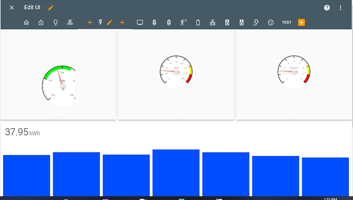
I’ve been playing around with the canvas-gauge card and I’m able to configure them well enough for what I need, some with value boxes, and some without. The sizing for my phone is fine, but on anything larger, the gauges are showing up very small relative to the page, and I’m not sure how to fix that:

I currently have three gauges in a horizontal stack, but I’ve also tried a grid and the gauge size didn’t increase. Here’s the YAML for the full stack:

type: horizontal-stack
cards:
  - type: custom:canvas-gauge-card
    entity: sensor.home_energy_meter_electric_consumed_v
    name: Voltage
    gauge:
      type: radial-gauge
      title: Volts
      width: 120
      height: 300
      borderShadowWidth: 0
      borderOuterWidth: 0
      borderMiddleWidth: 0
      borderInnerWidth: 0
      minValue: 110
      maxValue: 130
      startAngle: 45
      ticksAngle: 270
      valueBox: false
      majorTicks:
        - '110'
        - '115'
        - '120'
        - '125'
        - '130'
      minorTicks: 5
      strokeTicks: true
      colorTitle: '#000000'
      highlights:
        - from: 115
          to: 122
          color: '#00FF00'
      borders: false
  - type: custom:canvas-gauge-card
    entity: sensor.home_energy_meter_electric_consumed_a
    name: Current
    card_height: 120
    gauge:
      type: radial-gauge
      title: Amps
      width: 120
      height: 300
      borderShadowWidth: 0
      borderOuterWidth: 0
      borderMiddleWidth: 0
      borderInnerWidth: 0
      minValue: 0
      maxValue: 200
      startAngle: 45
      ticksAngle: 270
      valueBox: false
      majorTicks:
        - '0'
        - '25'
        - '50'
        - '75'
        - '100'
        - '125'
        - '150'
        - '175'
        - '200'
      minorTicks: 5
      strokeTicks: true
      highlights:
        - from: 150
          to: 175
          color: '#FFFF00'
        - from: 175
          to: 200
          color: '#FF0000'
      borders: false
  - type: custom:canvas-gauge-card
    entity: sensor.home_energy_meter_electric_consumed_w
    name: Power
    gauge:
      type: radial-gauge
      title: Kilowatts
      width: 120
      height: 300
      borderShadowWidth: 0
      borderOuterWidth: 0
      borderMiddleWidth: 0
      borderInnerWidth: 0
      minValue: 0
      maxValue: 24000
      startAngle: 45
      ticksAngle: 270
      valueBox: false
      majorTicks:
        - '0'
        - '3'
        - '6'
        - '8'
        - '12'
        - '15'
        - '18'
        - '21'
        - '24'
      minorTicks: 3
      strokeTicks: true
      highlights:
        - from: 18000
          to: 21000
          color: '#FFFF00'
        - from: 21000
          to: 24000
          color: '#FF0000'
      borders: false

When I adjust width to anything >120, the gauge gets cut off (here’s a value of 150):

…so if I then increase height, it pushes the gauge downward (here’s height = 400):

card_height is undefined, but that doesn’t seem to make much difference, either. What am I missing? Is it because this is still in alpha?

If you look closely, the gauge name (not title) is under each gauge in white; I’m not sure how to change the color of that yet.

Sometimes you have to Ctrl-F5 to reload it; but I have found using style works for the canvas gages.
I have found that that if you are dealing with the circle canvas gauge that the width and height should be equal; believe it or not the value in height and width does not really matter in the larger scheme of things (see below)
This has worked fairly well for going between different screen sizes such as desktop to phone.
Below is an entire gauge setup but the canvas-gauge-card/style/transform/scale is what you would be interested in.
Scale 1,1 is 100% vertical and 100% horizontal so 0.5 would be 50% or 2 would be 200%.

type: picture-elements
image: /local/gauge/AQI_Index.png
elements:
  - type: state-label
    style:
      top: 84%
      left: 50%
      box-shadow: none
      background-color: transparent
    entity: sensor.purpleair_description
    prefix: ''
    attribute: ''
    title: null
  - type: custom:canvas-gauge-card
    entity: sensor.purpleair_aqi_a
    style:
      top: 50%
      left: 50%
      width: null
      heigth: null
      box-shadow: none
      background-color: transparent
      transform: scale(1,1) translate(-50%,-50%)
    gauge:
      type: radial-gauge
      title: AQI
      width: 230
      height: 230
      minValue: 0
      maxValue: 500
      startAngle: 40
      ticksAngle: 280
      valueBox: true
      majorTicks:
        - '0'
        - '50'
        - '100'
        - '150'
        - '200'
        - '250'
        - '300'
        - '350'
        - '400'
        - '450'
        - '500'
      minorTicks: 5
      strokeTicks: true
      highlights:
        - from: 0
          to: 50
          color: rgba(104, 225, 67, .75)
        - from: 50
          to: 100
          color: rgba(255, 255, 85, .75)
        - from: 100
          to: 150
          color: rgba(239, 133, 51, .75)
        - from: 150
          to: 200
          color: rgba(234, 51, 36, .75)
        - from: 200
          to: 300
          color: rgba(140, 26, 75, .75)
        - from: 300
          to: 500
          color: rgba(115, 20, 37, .75)
      borders: 'no'
      needleType: arrow
      needleWidth: 4
      needleCircleSize: 7
      needleCircleOuter: true
      needleCircleInner: false
      animationDuration: 1500
      animationRule: linear
      valueBoxBorderRadius: 10
      colorValueBoxRect: '#222'
      colorValueBoxRectEnd: '#333'
      valueDec: 0
      valueInt: null
  - type: image
    image: /local/gauge/AQI_Logo.png
    style:
      top: 50%
      left: 50%
      width: 25%
      box-shadow: none
      background-color: transparent
  - type: custom:text-element
    text: Good
    style:
      top: 75%
      left: 5%
      color: rgb(0,0,0)
      font-family: Quicksand
      font-size: 140%
      font-weight: bold
      transform: rotate(0deg)
      background-color: rgba(0,0,0,.0)
      border-radius: 50%
      text-align: center
  - type: custom:text-element
    text: Moderate
    style:
      top: 50%
      left: 1%
      color: rgb(0,0,0)
      font-family: Quicksand
      font-size: 130%
      font-weight: bold
      transform: rotate(0deg)
      background-color: rgba(0,0,0,.0)
      border-radius: 50%
      text-align: center
  - type: custom:text-element
    text: Unhealthy</br>for Sensitive</br>Groups
    style:
      top: 30%
      left: 2%
      color: rgb(0,0,0)
      font-family: Quicksand
      font-size: 115%
      font-weight: bold
      transform: rotate(0deg)
      background-color: rgba(0,0,0,.0)
      border-radius: 50%
      text-align: center
  - type: custom:text-element
    text: Unhealthy
    style:
      top: 5%
      left: 3%
      color: rgb(0,0,0)
      font-family: Quicksand
      font-size: 140%
      font-weight: bold
      transform: rotate(0deg)
      background-color: rgba(0,0,0,.0)
      border-radius: 50%
      text-align: center
  - type: custom:text-element
    text: Very Unhealthy
    style:
      top: 5%
      left: 33%
      color: rgb(255,255,255)
      font-family: Quicksand
      font-size: 140%
      font-weight: bold
      transform: rotate(0deg)
      background-color: rgba(0,0,0,0)
      border-radius: 50%
      text-align: center
  - type: custom:text-element
    text: Hazardous
    style:
      top: 69%
      left: 75%
      color: rgb(255,255,255)
      font-family: Quicksand
      font-size: 140%
      font-weight: bold
      transform: rotate(0deg)
      background-color: rgba(0,0,0,0)
      border-radius: 50%
      text-align: center

1
Since I have been using this technique the gauges have not been cut-off as in your example.

Believe it or not this is one of my more simple canvas gauge setups. There is allot that does not apply to your case, but I like to add all the options whether I use them or not in a specific case so I don’t have to go look up what option it was. I the case above the scale(1,1) ‘should’ not have any impact at all…but it does in that I never have cut-offs anymore.

(Edit) Other examples:
https://github.com/GlennGoddard/CanvasGaugeBackgrounds

1 Like

I told myself I wouldn’t get into card-mod until I got past “function” and into “form,” but I guess since I’m messing with stuff this trivial, I’m there. Thanks, I’ll dig into that and see if I can get these to cooperate.

EDIT: Yep, this works for me after a few minutes of playing around with it. I’ll need to do some more tweaks, but the gauges are at least visible now. Thanks again.