Styling Glance card:
Colored icons:
Only left items (which are not togglable):

type: picture-glance
title: left
image: /local/images/blue_low.jpg
entities:
  - entity: binary_sensor.iiyama_2_ping_availability_status
  - entity: sun.sun
  - entity: sun.sun
  - entity: sun.sun
  - entity: input_boolean.test_boolean
  - entity: input_boolean.test_boolean
  - entity: input_boolean.test_boolean
  - entity: input_boolean.test_boolean
card_mod:
  style:
    .box div:nth-child(2) .wrapper:
      ha-icon-button ha-state-icon:
        $: |
          ha-svg-icon {
            color: cyan;
          }
Different colors for items:

Note: white color = default style for on, --disabled-color - for off.
type: picture-glance
title: some
image: /local/images/blue_low.jpg
entities:
  - entity: binary_sensor.iiyama_2_ping_availability_status
  - entity: sun.sun
  - entity: sun.sun
  - entity: sun.sun
  - entity: input_boolean.test_boolean
  - entity: input_boolean.test_boolean
  - entity: input_boolean.test_boolean
  - entity: input_boolean.test_boolean
card_mod:
  style:
    .box div:nth-child(2):
      div:nth-child(1):
        ha-icon-button ha-state-icon:
          $: |
            ha-svg-icon {
              color: orange;
            }
      div:nth-child(2):
        ha-icon-button ha-state-icon:
          $: |
            ha-svg-icon {
              color: cyan;
            }
      div:nth-child(4):
        ha-icon-button ha-state-icon:
          $: |
            ha-svg-icon {
              color: yellow;
            }
    .box div:nth-child(3):
      div:nth-child(1):
        ha-icon-button ha-state-icon:
          $:
            ha-icon:
              $: |
                ha-svg-icon {
                  color: red;
                }
      div:nth-child(4):
        ha-icon-button ha-state-icon:
          $:
            ha-icon:
              $: |
                ha-svg-icon {
                  color: lightgreen;
                }
Different colors for items + changed default colors:

Default colors are defined by these variables:
--ha-picture-icon-button-on-color;--ha-picture-icon-button-color.
type: picture-glance
title: +vars
image: /local/images/blue_low.jpg
entities:
  - entity: binary_sensor.iiyama_2_ping_availability_status
  - entity: sun.sun
  - entity: sun.sun
  - entity: sun.sun
  - entity: input_boolean.test_boolean
  - entity: input_boolean.test_boolean
  - entity: input_boolean.test_boolean
  - entity: input_boolean.test_boolean
card_mod:
  style:
    .box div:nth-child(2):
      div:nth-child(1):
        ha-icon-button ha-state-icon:
          $: |
            ha-svg-icon {
              color: orange;
            }
      div:nth-child(2):
        ha-icon-button ha-state-icon:
          $: |
            ha-svg-icon {
              color: cyan;
            }
      div:nth-child(4):
        ha-icon-button ha-state-icon:
          $: |
            ha-svg-icon {
              color: yellow;
            }
    .box div:nth-child(3):
      div:nth-child(1):
        ha-icon-button ha-state-icon:
          $:
            ha-icon:
              $: |
                ha-svg-icon {
                  color: red;
                }
      div:nth-child(4):
        ha-icon-button ha-state-icon:
          $:
            ha-icon:
              $: |
                ha-svg-icon {
                  color: lightgreen;
                }
    .: |
      ha-card {
        --ha-picture-icon-button-on-color: black;
        --ha-picture-icon-button-color: brown;
      }
Different default colors for items:

type: picture-glance
title: vars
image: /local/images/blue_low.jpg
entities:
  - entity: binary_sensor.iiyama_2_ping_availability_status
  - entity: sun.sun
  - entity: sun.sun
  - entity: sun.sun
  - entity: input_boolean.test_boolean
  - entity: input_boolean.test_boolean
  - entity: input_boolean.test_boolean
  - entity: input_boolean.test_boolean
style: |
  .box div:nth-child(2) div:nth-child(2) {
    --ha-picture-icon-button-on-color: cyan;
    --ha-picture-icon-button-color: brown;
  }
  .box div:nth-child(2) div:nth-child(3) {
    --ha-picture-icon-button-on-color: black;
    --ha-picture-icon-button-color: green;
  }
  .box div:nth-child(3) div:nth-child(1) {
    --ha-picture-icon-button-on-color: red;
    --ha-picture-icon-button-color: black;
  }
  .box div:nth-child(3) div:nth-child(2) {
    --ha-picture-icon-button-on-color: black;
    --ha-picture-icon-button-color: pink;
  }
  .box div:nth-child(3) div:nth-child(4) {
    --ha-picture-icon-button-on-color: lightgreen;
    --ha-picture-icon-button-color: yellow;
  }
Resized icons:
For all items:

type: picture-glance
title: all
image: /local/images/blue_low.jpg
entities:
  - entity: binary_sensor.iiyama_2_ping_availability_status
  - entity: sun.sun
  - entity: sun.sun
  - entity: sun.sun
  - entity: input_boolean.test_boolean
  - entity: input_boolean.test_boolean
  - entity: input_boolean.test_boolean
  - entity: input_boolean.test_boolean
style: |
  ha-card {
    --mdc-icon-size: 40px;
  }
For left items:

type: picture-glance
title: left
image: /local/images/blue_low.jpg
entities:
  - entity: binary_sensor.iiyama_2_ping_availability_status
  - entity: sun.sun
  - entity: sun.sun
  - entity: sun.sun
  - entity: input_boolean.test_boolean
  - entity: input_boolean.test_boolean
  - entity: input_boolean.test_boolean
  - entity: input_boolean.test_boolean
card_mod:
  style:
    .box .wrapper:
      ha-icon-button ha-state-icon:
        $:
          ha-icon:
            $: |
              ha-svg-icon {
                vertical-align: super;
              }
    .: |
      .box div:nth-child(2) .wrapper {
        --mdc-icon-size: 40px;
      }
Different sizes for items:

type: picture-glance
title: some
image: /local/images/blue_low.jpg
entities:
  - entity: binary_sensor.iiyama_2_ping_availability_status
  - entity: sun.sun
  - entity: sun.sun
  - entity: sun.sun
  - entity: input_boolean.test_boolean
  - entity: input_boolean.test_boolean
  - entity: input_boolean.test_boolean
  - entity: input_boolean.test_boolean
card_mod:
  style:
    .box .wrapper:
      ha-icon-button ha-state-icon:
        $:
          ha-icon:
            $: |
              ha-svg-icon {
                vertical-align: super;
              }
          .: |
            ha-svg-icon {
              vertical-align: super;
            }
    .: |
      .box div:nth-child(2) div:nth-child(2) {
        --mdc-icon-size: 10px;
      }
      .box div:nth-child(2) div:nth-child(3) {
        --mdc-icon-size: 50px;
      }
      .box div:nth-child(3) div:nth-child(1) {
        --mdc-icon-size: 35px;
      }
Colored title:

type: picture-glance
title: Title
image: /local/images/blue_low.jpg
entities:
  - entity: binary_sensor.iiyama_2_ping_availability_status
  - entity: sun.sun
  - entity: sun.sun
  - entity: input_boolean.test_boolean
  - entity: input_boolean.test_boolean
  - entity: input_boolean.test_boolean
  - entity: input_boolean.test_boolean
style: |
  .box .title {
    color: orange;
  }
How to limit an area for the title:
By default the long title occupies all available area and icons are shifted to the right, causing some items not to be displayed:

To prevent this you may limit an area available for the title.
But in this case the title will be clipped.
This styling makes a better look:

type: picture-glance
title: Title long long long long long
image: /local/images/blue_low.jpg
entities:
  - entity: binary_sensor.iiyama_2_ping_availability_status
  - entity: sun.sun
  - entity: sun.sun
  - entity: input_boolean.test_boolean
  - entity: input_boolean.test_boolean
  - entity: input_boolean.test_boolean
  - entity: input_boolean.test_boolean
style: |
  .box .title {
    text-overflow: unset;
    white-space: normal;
    max-width: 130px;
    font-size: 13px;
    line-height: 1.2;
    align-self: center;
  }
Rotating icons:
Only right items:
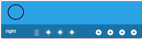
type: picture-glance
title: right
image: /local/images/blue_low.jpg
entities:
  - entity: binary_sensor.iiyama_2_ping_availability_status
  - entity: sun.sun
  - entity: sun.sun
  - entity: sun.sun
  - entity: input_boolean.test_boolean
    icon: mdi:plus-circle
  - entity: input_boolean.test_boolean
    icon: mdi:plus-circle
  - entity: input_boolean.test_boolean
    icon: mdi:plus-circle
  - entity: input_boolean.test_boolean
    icon: mdi:plus-circle
style:
  .box div:nth-child(3):
    .wrapper:
      ha-icon-button ha-state-icon $ ha-icon $: |
        ha-svg-icon {
          animation: rotation 0.5s linear infinite;
        }
        @keyframes rotation {
          0% {
            transform: rotate(0deg);
          }
          100% {
            transform: rotate(359deg);
          }
        }
Some items:

type: picture-glance
title: some
image: /local/images/blue_low.jpg
entities:
  - entity: binary_sensor.iiyama_2_ping_availability_status
  - entity: sun.sun
  - entity: sun.sun
  - entity: sun.sun
  - entity: input_boolean.test_boolean
    icon: mdi:plus-circle
  - entity: input_boolean.test_boolean
    icon: mdi:plus-circle
  - entity: input_boolean.test_boolean
    icon: mdi:plus-circle
  - entity: input_boolean.test_boolean
    icon: mdi:plus-circle
style:
  .box div:nth-child(2):
    div:nth-of-type(2) ha-icon-button ha-state-icon $: |
      ha-svg-icon {
        animation: rotation 0.5s linear infinite;
      }
      @keyframes rotation {
        0% {
          transform: rotate(0deg);
        }
        100% {
          transform: rotate(359deg);
        }
      }
    div:nth-of-type(3) ha-icon-button ha-state-icon $: |
      ha-svg-icon {
        animation: rotation 5s linear infinite;
      }
      @keyframes rotation {
        0% {
          transform: rotate(0deg);
        }
        100% {
          transform: rotate(359deg);
        }
      }
  .box div:nth-child(3):
    div:nth-of-type(1) ha-icon-button ha-state-icon $ ha-icon $: |
      ha-svg-icon {
        animation: rotation 5s linear infinite;
      }
      @keyframes rotation {
        0% {
          transform: rotate(0deg);
        }
        100% {
          transform: rotate(359deg);
        }
      }
    div:nth-of-type(2) ha-icon-button ha-state-icon $ ha-icon $: |
      ha-svg-icon {
        animation: rotation 1s linear infinite;
      }
      @keyframes rotation {
        0% {
          transform: rotate(359deg);
        }
        100% {
          transform: rotate(0deg);
        }
      }
Note that the “sun” icon is not centered - IMHO it happens because the icon ITSELF not centered properly.
Update: should be fixed in a future MDI release.
Some more animations:

type: picture-glance
title: some
image: /local/images/blue_low.jpg
entities:
  - entity: binary_sensor.iiyama_2_ping_availability_status
  - entity: sun.sun
  - entity: sun.sun
  - entity: sun.sun
    icon: mdi:bell
  - entity: input_boolean.test_boolean
    icon: mdi:plus-circle
  - entity: input_boolean.test_boolean
    icon: mdi:plus-circle
  - entity: input_boolean.test_boolean
    icon: mdi:plus-circle
  - entity: input_boolean.test_boolean
    icon: mdi:plus-circle
card_mod:
  style:
    .box div:nth-child(2):
      div:nth-of-type(1) ha-icon-button ha-state-icon $: |
        ha-svg-icon {
          animation: jumping 1s linear infinite alternate;
        }
        @keyframes jumping {
          0% {
            margin-top: -20px;
          }
          100% {
            margin-top: 6px;
          }
      div:nth-of-type(2) ha-icon-button ha-state-icon $: |
        ha-svg-icon {
          animation: coloring 1s linear infinite;
        }
        @keyframes coloring {
          0% {
            color: blue;
          }
          100% {
            color: red;
          }
        }
      div:nth-of-type(3) ha-icon-button ha-state-icon $: |
        ha-svg-icon {
          animation: resizing 1s linear infinite;
        }
        @keyframes resizing {
          0% {
            --mdc-icon-size: 8px;
          }
          25% {
            --mdc-icon-size: 12px;
          }
          50% {
            --mdc-icon-size: 16px;
          }
          75% {
            --mdc-icon-size: 20px;
          }
          100% {
            --mdc-icon-size: 24px;
          }
        }
      div:nth-of-type(4) ha-icon-button ha-state-icon $ ha-icon $: |
        ha-svg-icon {
          animation: wobbling 1s linear infinite alternate;
        }
        @keyframes wobbling {
        0% {
          transform: rotate(-45deg);
        }
        100% {
          transform: rotate(+45deg);
        }
    .box div:nth-child(3):
      div:nth-of-type(1) ha-icon-button ha-state-icon $ ha-icon $: |
        ha-svg-icon {
          animation: stretching_x 1s linear infinite alternate;
        }
        @keyframes stretching_x {
          0% {
            transform: scaleX(0.5);
          }
          100% {
            transform: scaleX(2.0);
          }
        }
      div:nth-of-type(2) ha-icon-button ha-state-icon $ ha-icon $: |
        ha-svg-icon {
          animation: stretching_y 1s linear infinite alternate;
        }
        @keyframes stretching_y {
          0% {
            transform: scaleY(0.5);
          }
          100% {
            transform: scaleY(2.0);
          }
      div:nth-of-type(3) ha-icon-button ha-state-icon $ ha-icon $: |
        ha-svg-icon {
          animation: flipping 1s linear infinite;
        }
        @keyframes flipping {
          0% {
            transform: rotateX(0deg);
          }
          100% {
            transform: rotateX(359deg);
          }
        }
      div:nth-of-type(4) ha-icon-button ha-state-icon $ ha-icon $: |
        ha-svg-icon {
          animation: disappearing 1s linear infinite alternate;
        }
        @keyframes disappearing {
          0% {
            opacity: 0;
          }
          100% {
            opacity: 1;
          }
        }
Colored state:
All states:

type: picture-glance
title: all
image: /local/images/blue_low.jpg
entities:
  - entity: sun.sun
  - entity: sun.sun
    show_state: true
  - entity: sun.sun
    show_state: true
  - entity: sun.sun
    show_state: true
  - entity: sun.sun
  - entity: input_boolean.test_boolean
  - entity: input_boolean.test_boolean
style:
  .box .row: |
    .wrapper .state {
      color: orange;
    }
Some state:

type: picture-glance
title: some
image: /local/images/blue_low.jpg
entities:
  - entity: sun.sun
  - entity: sun.sun
    show_state: true
  - entity: sun.sun
    show_state: true
  - entity: sun.sun
    show_state: true
  - entity: sun.sun
  - entity: input_boolean.test_boolean
  - entity: input_boolean.test_boolean
style: |
  .box .row div:nth-child(3) .state {
    color: red;
  }
  .box .row div:nth-child(4) .state {
    color: black;
  }
Overwritten style:

type: picture-glance
title: some
image: /local/images/blue_low.jpg
entities:
  - entity: sun.sun
  - entity: sun.sun
    show_state: true
  - entity: sun.sun
    show_state: true
  - entity: sun.sun
    show_state: true
  - entity: sun.sun
  - entity: input_boolean.test_boolean
  - entity: input_boolean.test_boolean
style:
  .box .row: |
    .wrapper .state {
      color: orange;
    }
    div:nth-child(3) .state {
      color: red !important;
    }
How to display long states:
Here is how states are displayed by default:

To make states visible:
- increase a width for items;
- decrease a font-size.

type: picture-glance
title: title
image: /local/images/blue_low.jpg
entities:
  - entity: sun.sun
  - entity: sun.sun
    show_state: true
  - entity: sun.sun
    show_state: true
  - entity: sun.sun
    show_state: true
  - entity: sun.sun
style:
  .box .row: |
    .wrapper {
      width: 70px !important;
    }
    .wrapper ha-icon-button {
      align-self: center;
    }
    .wrapper .state {
      font-size: 9px;
    }
Long states may be displayed as 2 lines. For this enable word-wrapping for a text.
Note that the whole row is automatically increased.

type: picture-glance
title: title
image: /local/images/blue_low.jpg
entities:
  - entity: sun.sun
  - entity: sun.sun
    show_state: true
  - entity: sun.sun
    show_state: true
  - entity: sun.sun
    show_state: true
  - entity: sun.sun
style:
  .box .row: |
    .wrapper {
      width: 50px !important;
    }
    .wrapper ha-icon-button {
      align-self: center;
    }
    .wrapper .state {
      text-overflow: unset;
      white-space: normal;
      font-size: 9px;
    }
How to change a style for some item:

type: picture-glance
title: title
image: /local/images/blue_low.jpg
entities:
  - entity: sun.sun
  - entity: sun.sun
    show_state: true
  - entity: sun.sun
    show_state: true
  - entity: sun.sun
    show_state: true
  - entity: sun.sun
style:
  .box .row: |
    div:nth-child(3) {
      width: 70px !important;
    }
    .wrapper ha-icon-button {
      align-self: center;
    }
    div:nth-child(3) .state {
      font-size: 9px;
    }
or this:

type: picture-glance
title: title
image: /local/images/blue_low.jpg
entities:
  - entity: sun.sun
  - entity: sun.sun
    show_state: true
  - entity: sun.sun
    show_state: true
  - entity: sun.sun
    show_state: true
  - entity: sun.sun
style:
  .box .row: |
    div:nth-child(3) {
      width: 50px !important;
    }
    .wrapper ha-icon-button {
      align-self: center;
    }
    div:nth-child(3) .state {
      text-overflow: unset;
      white-space: normal;
      font-size: 9px;
    }
How to display states for resized icons:
If icons are resized, then states may be misplaced:

type: picture-glance
title: title
image: /local/images/blue_low.jpg
entities:
  - entity: sun.sun
    show_state: true
  - entity: sun.sun
    show_state: true
  - entity: sun.sun
    show_state: true
  - entity: sun.sun
style: |
  ha-card {
    --mdc-icon-size: 80px;
  }
If a width for items is increased, then it is clear that states are misaligned too (not aligned with respect to icons):

type: picture-glance
title: title
image: /local/images/blue_low.jpg
entities:
  - entity: sun.sun
    show_state: true
  - entity: sun.sun
    show_state: true
  - entity: sun.sun
    show_state: true
  - entity: sun.sun
style: |
  ha-card {
    --mdc-icon-size: 80px;
  }
  ha-card .box .row div {
    width: 100px !important;
  }
How to solve it:

type: picture-glance
title: title
image: /local/images/blue_low.jpg
entities:
  - entity: sun.sun
    show_state: true
  - entity: sun.sun
    show_state: true
  - entity: sun.sun
    show_state: true
  - entity: sun.sun
style: |
  ha-card .box .row .wrapper ha-icon-button {
    --mdc-icon-button-size: 80px !important;
  }
  ha-card {
    --mdc-icon-size: 80px;
  }
  ha-card .box .row .wrapper {
    align-items: center !important;
  }
  ha-card .box .row div {
    width: 100px !important;
  }
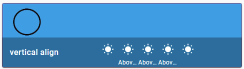
How to align text vertically for the title (+ resizing the footer):
If states are displayed, then the title may be not aligned vertically:

To align it vertically, set the "line-height" property = height of the footer (should be measured via Inspector):
type: picture-glance
title: vertical align
image: /local/images/blue_low.jpg
entities:
  - entity: sun.sun
  - entity: sun.sun
    show_state: true
  - entity: sun.sun
    show_state: true
  - entity: sun.sun
    show_state: true
  - entity: sun.sun
style: |
  .box .title {
    line-height: 52px;
  }
Also, it is possible to specify the height of the footer explicitly:

type: picture-glance
title: vertical align
image: /local/images/blue_low.jpg
entities:
  - entity: sun.sun
  - entity: sun.sun
    show_state: true
  - entity: sun.sun
    show_state: true
  - entity: sun.sun
    show_state: true
  - entity: sun.sun
style: |
  ha-card .box {
    height: 80px;
  }
  ha-card .box .title {
    line-height: 80px;
  }
Changed background for the bottom row:

type: picture-glance
title: Kitchen
image: /local/images/blue_low_2.jpg
entities:
  - entity: sun.sun
  - entity: sun.sun
  - entity: input_boolean.test_boolean
  - entity: input_boolean.test_boolean
style: |
  ha-card .box {
    background-color: rgba(0,255,0,0.5);
  }
Styling an image:
This section describes how to make the image to fit the defined card’s size.
By default the card’s size depends on the image’s size:

type: picture-glance
title: Kitchen
image: /local/images/blue_low_2.jpg
entities:
  - entity: binary_sensor.iiyama_2_ping_availability_status
  - entity: sun.sun
  - entity: sun.sun
  - entity: input_boolean.test_boolean
  - entity: input_boolean.test_boolean
  - entity: input_boolean.test_boolean
  - entity: input_boolean.test_boolean
If the card’s size is defined then the image’s size do not change automatically:

type: picture-glance
title: Kitchen
image: /local/images/blue_low_2.jpg
entities:
  - entity: binary_sensor.iiyama_2_ping_availability_status
  - entity: sun.sun
  - entity: sun.sun
  - entity: input_boolean.test_boolean
  - entity: input_boolean.test_boolean
  - entity: input_boolean.test_boolean
  - entity: input_boolean.test_boolean
style: |
  ha-card {
    height: 300px !important;
  }
Here is how to fix it:

type: picture-glance
title: Kitchen
image: /local/images/blue_low_2.jpg
entities:
  - entity: binary_sensor.iiyama_2_ping_availability_status
  - entity: sun.sun
  - entity: sun.sun
  - entity: input_boolean.test_boolean
  - entity: input_boolean.test_boolean
  - entity: input_boolean.test_boolean
  - entity: input_boolean.test_boolean
style:
  hui-image:
    $: |
      div {
        height: inherit;
      }
      div img {
        height: inherit;
      }
    .: |
      hui-image {
        height: 100%;
      }
  .: |
    ha-card {
      height: 300px !important;
    }
Without a bottom row:

Note: this will work if the bottom row’s height is 40px (+8px for padding); otherwise use an approprite value in formula instead of “48px”.
type: picture-glance
title: Kitchen
image: /local/images/blue_low_2.jpg
entities:
  - entity: binary_sensor.iiyama_2_ping_availability_status
  - entity: sun.sun
  - entity: sun.sun
  - entity: input_boolean.test_boolean
  - entity: input_boolean.test_boolean
  - entity: input_boolean.test_boolean
  - entity: input_boolean.test_boolean
card_mod:
  style:
    hui-image:
      $: |
        div {
          display: inline;
        }
        div img {
          height: 100%;
        }
      .: |
        hui-image {
          height: calc(100% - 48px);
        }
    .: |
      ha-card {
        height: 300px !important;
      }
More examples are described here.