An example of using "card-mod" for "multiple-entity-row" to display a "last-changed" for items:
Same method may be used to display ANY text below items.
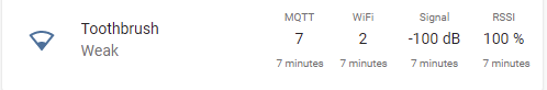
Even for icons:

code
      - type: custom:multiple-entity-row
        entity: sun.sun
        show_state: false
        entities:
          - entity: sun.sun
            icon: true
            name: false
          - entity: sun.sun
            icon: true
            name: false
          - entity: sun.sun
            icon: true
            name: false
        card_mod:
          style: |
            .entities-row div.entity:nth-child(1) div::after  {
              color: var(--secondary-text-color);
              font-size: 0.7rem;
              content: "\A label";
              white-space: pre;
            }
            .entities-row div.entity:nth-child(2) div::after  {
              color: var(--secondary-text-color);
              font-size: 0.7rem;
              content: "\A {{states('sun.sun')}}";
              white-space: pre;
            }
            .entities-row div.entity:nth-child(3) div::after  {
              color: var(--secondary-text-color);
              font-size: 0.7rem;
              content: "\A {{state_attr('sun.sun','elevation')}}";
              white-space: pre;
            }