šŸ”¹ Card-mod - Add css styles to any lovelace card

quite. This:

  - type: custom:stack-in-card
    mode: horizontal
    title: Screens
    <<: *header
#    keep:
#      background: false
#      box_shadow: false
#      margin: false
#      outer_padding: false
#      border_radius: false
    cards:
      - type: custom:shutter-card
        card_mod:
        style: |
          ha-card {
            box-shadow: none;
          }
        entities:
          - entity: cover.screen_keuken
            name: Keuken
      - type: custom:shutter-card
        entities:
          - entity: cover.raamverduistering_stookhok
            name: Stookhok

does it also, no need for the keep object in the stack-in-card?

on mobile this is a really cut-off experienced though,

and when tilting to landscape mode, things get even worseā€¦

Default values are false.

iPhone 5S:

  • portrait - cut right side
  • landscape - OK

Try using state-switch dependingly on screen size.

+1 to that suggestion. Works a treat.

ha, glad you like the state-switch card, so new to it and already suggesting it to me :wink:

not really sure what you suggest here? if in portrait mode, use the stack-in-card horizontal mode, if in landscape, use single card config? (I have regular 2 columns in landscape)

or

if desktop, use stack-in-card, if mobile, use not stacked cards maybe even better, given the fact the cards are cut-off right sided on mobile no matter the view

trying this:

  - type: custom:state-switch
    entity: deviceID
    states:
      'bredacted devices Safari9':
        <<: &desktop-view
          type: custom:stack-in-card
          mode: horizontal
          title: Screens
          <<: *header
          keep:
            background: false
            box_shadow: false
            margin: false
            outer_padding: false
            border_radius: false
          cards:
            - type: custom:shutter-card
              card_mod:
              style: |
                ha-card {
                  box-shadow: none;
                }
              entities:
                - entity: cover.screen_keuken
                  name: Keuken
            - type: custom:shutter-card
              entities:
                - entity: cover.raamverduistering_stookhok
                  name: Stookhok
      '6redacted devices chrome0a':
        <<: *desktop-view
      default: # for all other device-id's including mobile
        type: custom:shutter-card
        title: Screens
        <<: *header
        entities:
          - entity: cover.screen_keuken
            name: Keuken
          - entity: cover.raamverduistering_stookhok
            name: Stookhok

I cant get it to work, mobile still shows the horizontal stackā€¦ (will move this to state-card if the issue remains)

You can set it for screen pixels rather than user agent. I can show an example tomorrow if you likeā€¦ lidar helped me with a couple of cards a while ago ane I ended up using bothā€¦ one for iPad in Landscape mode and one for my PCā€¦ works really well.

Marius, David - managed to display the shutters on iPhone 5S for portrait & landscape orientations - check here: šŸ”¹ state-switch - conditional card on steroids - #92 by Ildar_Gabdullin

1 Like

Here is my setup

style: |
  .sc-shutter-label {
    font-size: 14px;
    padding-left: 20px;
  }
  .card-header {
    padding-bottom: 0px;
  }
  .sc-shutter-middle {
    margin-left:auto !important;
    margin-right:auto !important;
    padding-bottom: 10px;
    padding-top: 20px
  }
  .sc-shutter:first-child .sc-shutter-middle {
    padding-top: 0px
  }

There is something weird with this shutter card - it causes glitches.

  1. Create 1 new view.
  2. Add a shutter-card with some styles for "ha-card".
  3. Add one more shutter-card w/o style.
  4. The 2nd card will have same style - which is WRONG.
  - title: test 2
    path: test-2
    badges: []
    cards:
      - type: custom:shutter-card
        title: no style
        entities:
          - entity: cover.left_living_shutter
            name: Left shutter
            buttons_position: left
            title_position: top
          - entity: cover.bedroom_shutter
            name: Right shutter
            buttons_position: left
            title_position: top
      - type: custom:shutter-card
        card_mod:
          style: |
            ha-card {
              --ha-card-background: rgb(168,240,255);
              --ha-card-header-color: black;
              --ha-card-header-font-size: 16px;
              --ha-card-border-radius: 8px;
            }
        title: My shutters (+style)
        entities:
          - entity: cover.left_living_shutter
            name: Left shutter
            buttons_position: left
            title_position: top
          - entity: cover.bedroom_shutter
            name: Right shutter
            buttons_position: left
            title_position: top
  1. Move the 2nd card to another view.
  2. The 2nd card will be displayed without style - which is RIGHT.
    image

The same glitch was mentioned earlier - it was about 2 cards inside "vertical-stack":

Iā€™m looking for help with sizing and placement of icons. I have a panel in the garage with this

Iā€™m looking to get the garage door icon centered vertically and the up/down buttons as well. Ideally the up/down buttons could come further in from the right hand edge as well. Any advice?

Bonus questionā€¦ I have another card just the same for ā€œopenā€ which is red. Is there any way to have just one card that changes colour based on the state?

Here is the code

type: custom:auto-entities
card:
  type: entities
  state_color: true
  card_mod:
    style: |
      ha-card {
        --ha-card-background: green;
        color: white;
        font-family: DB Sans Cond;
        line-height: 2.2;
        --card-mod-icon-color: white;
      }
      :host {
        --mdc-icon-size: 4vw;
        font-size: 4vw;   
          }
filter:
  include:
    - entity_id: cover.garage_car_door_state
      state: closed
  exclude: []
sort:
  method: friendly_name
show_empty: false

Jinja2 is possible within card-mod.

Hi!.

I am just starting to learn how to add CSS to Lovelace cards and I am sure my question is very silly but when I see a code I like to understand all of it.
I have seen in the codes that are used some special characters, for example:

| 
<<:
.:
[[  ]]
$:

Please could someone explain to me what they mean?

Thanks.

1 Like

|
yaml multiline (google it)

<<:
yaml anchors (google it)

.:, $:
used in card-mod for navigating

[[ ]]
used to define templates in cards like custom:button-card

Thanks for your answer.

I still donā€™t understand the use of .: and $: and I have not been able to find more info on google.
Can you tell me a link where it is explained, please?

Check the card-mod page on github

Wondering if anyone can help me with my theme, as I cannot for the life of me get it to apply a text style.

Below is my structure, and I am wanting to apply a style to the h1 tag inside of the shadow-root inside the hui-grid-card

In my themes.yaml I am using the card-mod-view-yaml option like so:

card-mod-view-yaml: >
        "grid-layout$":
          hui-grid-card:
            $: |
              h1 {
                line-height: 0 !important;
                padding: 1vw 0 0vw 0 !important;
                font-weight: 500 !important;
                color: red !important;
             }

From what I can tell, this should be working:
card-mod-view-yaml styles inside of hui-view
grid-layout$ styles inside of the grid-layout shadow-root
hui-grid-card goes into the hui-grid-card
$: goes into the first shadow-root
h1 applies the style to the h1 tag

Clearly though this isnā€™t working as you can see that ā€œOfficeā€ below has left padding, normal font-weight and is not red. The card-header class is applied by the layout-card, however my styles arenā€™t even being applied, let alone being overridden (which shouldnā€™t matter due to !important)

image
image

only now exploring the card-mod power for entities, please help me out here. Trying both icon and icon color:

      - entity: sensor.snapshot_backup
        card_mod:
          style:
            hui-generic-entity-row:
              $:
                state-badge:
                  $:
                    ha-icon:
                      $: |
                        ha-svg-icon {
                          icon:
                            {% if states(config.entity) == 'backed_up' %} mdi:check-circle
                            {% else %} mdi:alert-circle
                            {% endif %}
                          color:
                            {% if states(config.entity) == 'backed_up' %} green
                            {% else %} red
                            {% endif %}
                        }

doesnt work at all (no icon or color set), while another card-mod:

      - entity: binary_sensor.snapshots_stale
        card_mod:
          style:
            hui-generic-entity-row:
              $:
                state-badge:
                  $:
                    ha-icon:
                      $: |
                        ha-svg-icon {
                          color:
                            {% if states(config.entity) == 'off' %} green
                            {% else %} red
                            {% endif %}
                        }

shows fine. What am I doing wrong in the top templates? leaving out the icon template makes the color work. Of course I do need the icon template tooā€¦

maybe easier using this method in stead of the css:

        card_mod:
          style: |
            :host {
              --paper-item-icon-color:
                {% if states(config.entity) == 'backed_up' %} green
                {% else %} red
                {% endif %}
            }

how to add the icon template here? because the same with ā€“card-mod-icon:

        card_mod:
          style: |
            :host {
              --paper-item-icon-color:
                {% if states(config.entity) == 'backed_up' %} green
                {% else %} red
                {% endif %}

              --card-mod-icon:
                {% if states(config.entity) == 'backed_up' %} mdi:check-circle
                {% else %} mdi:alert-circle
                {% endif %}
            }

doesnā€™t work either, even though both the single icon and the icon color template now work, so thats progress. now how to use both of these templates?
please have a look, thanks!

  1. You forgot to specify semicolon:
    some_css_style: some_value;

  2. The "icon" property does not work (I am not sure that there is a CSS property "icon").
    Try using "--card-mod-icon".
    I wrote ā€œtry usingā€ - because the "--card-mod-icon" seems to not work always, check this example:

type: entities
entities:
  - entity: sensor.test_value
    name: "using :host"
    card_mod:
      style: |
        :host {
          --paper-item-icon-color:
            {% if states(config.entity) == 'backed_up' %} green;
            {% else %} red;
            {% endif %}
        }
  - entity: sensor.test_value
    name: "using DOM, no icon's change"
    card_mod:
      style:
        hui-generic-entity-row:
          $:
            state-badge:
              $:
                ha-icon:
                  $: |
                    ha-svg-icon {
                      --card-mod-icon: mdi:alert-circle;
                      color:
                        {% if states(config.entity) == 'backed_up' %} green;
                        {% else %} red;
                        {% endif %}
                    }
  - entity: sensor.test_value
    name: "using DOM, icon's change"
    card_mod:
      style: |
        :host {
          --card-mod-icon: mdi:alert-circle;
        }

image
case 1 - changed color by using "--paper-item-icon-color" inside ":host";
case 2 - changed color inside "ha-svg-item", failed to change icon by using the "--card-mod-icon";
case 2 - changed icon by using the "--card-mod-icon" inside ":host".
So, the "--card-mod-icon" works for ":host" here only.
As for me, so far I have never used the "--card-mod-icon" ā€¦

Marius, sorry for an off-topic, but I thought that you used Custom UI for such things.
Does Custom UI still work? I thought that it is deprecated.
And I do not see any active threads dedicated to it.

Hey Ildar,

yes, as you can see in the post above, the last 2 templates on their own work, and indeed, it uses --card-mod-icon:

what I can not get working, is the 2 templates together. canā€™t this be done?

this does work:

        card_mod:
          style: |
                  :host {
                    --paper-item-icon-color: red;
                    --card-mod-icon: mdi:home;
                  }

so I guess I must be making a mistake with the 2 templatesā€¦

EDIT:
wait, I found it, checking the above, I suddenly spotted the delimiters ;
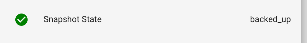
so:

      - entity: sensor.snapshot_backup
        card_mod:
          style: |
            :host {
              --card-mod-icon:
                {% if states(config.entity) == 'backed_up' %} mdi:check-circle
                {% else %} mdi:alert-circle
                {% endif %};

              --paper-item-icon-color:
                {% if states(config.entity) == 'backed_up' %} green
                {% else %} red
                {% endif %};
            }

looks like:

also, this immediately exhibits the difference between custom-ui and card-mod. Where card-mod Mods the card, (appropriately of course), custom-ui customizes the entity. thatā€™s why the more-info of the snapshot state still looks like:

compared to custom-ui, which makes the entities show in more-info with their customizationsā€¦


custom-ui works for almost everything, except for entities created in Python scripts, or some CCā€™s. Like in this case, where the entities are made by the Snapshot to Google add-on, or, as earlier, the fan, which is made by the ArgonOne active cooling add-on

If you have questions on custom-ui, please hop over to the Github repo, and Ill be glad to help. youā€™ll be very pleased with the simplicity, and global functioning of eg:

    device_tracker.*_bt:
      templates: &bt
        icon: >
          if (state == 'home') return 'mdi:bluetooth';
          return 'mdi:bluetooth-off';
        icon_color: >
          if (state == 'home') return 'rgb(0,123,255)';
          return 'grey';

custom-ui is still very functional, and it isnā€™t deprecated, it simply never was supported :wink:

1 Like

I told you - because you missed semicolon.
Compare:

              --paper-item-icon-color:
                {% if states(config.entity) == 'backed_up' %} green
                {% else %} red
                {% endif %}

and

              --paper-item-icon-color:
                {% if states(config.entity) == 'backed_up' %} green;
                {% else %} red;
                {% endif %}

or

              --paper-item-icon-color:
                {% if states(config.entity) == 'backed_up' %} green
                {% else %} red
                {% endif %}
                ;

Yes, exactly))

1 Like

crossposted here. and yes, you did, I simply didnt focus on that, and now see it was your first remarkā€¦ sorry.