Hi, I am not using this card and cannot help you, unfortunately. Styling a new card is always step-by-step thing, sometimes need lots of time for trying…
I see. As this card is really gorgeous and quite simple AND powerful I’d like to learn styling it.
—> Can you kickstart me and point me to the right direction: how to inspect a card‘s element and how to get the name of it‘s elements?
I saw some basic guide some time ago but can’t find it anymore.
Hi,
This is my first time using card-mod and I have gotten the basics right.
But I am trying to hide the “preload stream” selector of the picture entity card and I am not able to do it.
For now I have this:
main-theme:
  card-mod-theme: main-theme
  card-mod-more-info-yaml: |
      paper-checkbox {
          display: none !important;
      }
I am a person who used to be a programmer 15 years ago but was never related to web programming, so my explanation & ways are a bit specific. Initially I knew nothing about CSS.
BTW, this resource I am using for studying CSS - https://www.w3schools.com, I find it very helping.
So, there is a card - let it be Entities card.
The card contains elements inside a tree-like structure.
Every node has a name.
Some subnodes are inside a special node which is called “shadow-root”.
Here is a primitive tree:
> card
>> header
>> rows
>>> row 1
>>>> state
>>>> shadow-root
>>>>> icon
>>>>> name
...
Each node has some properties (font-size, element’s height, text color etc).
Sometimes a property on some node reflects on it’s subnodes - but sometimes some subnode overrides some property.
The Code Inspector is used to show the elements’ tree & each element’s properties.
Before using card-mod you may change some property instantly in the Inspector and see if it works.
As a result you know which property should be changed for which element.
Then you should find out a path to some particular element starting from some basic node.
There are two cases for the Entities card: either your basic node is ha-card element (i.e. the card itself - then you may change card-wide properties or a title) or the basis node is root level of some row.
Use examples from the 1st post and then you will easily get the point.
Also, sometimes we have to use mod-card but this is another story.
2 Likes
can anyone help me out with this? i’m stuck, i’ve tried literally everything i can think of and i just can’t get it to work…
I wonder if there are parsing changes in combination with 2021.10.x? Before, this was working:
  - type: custom:restriction-card
    card_mod:
      style:
        hui-cover-entity-row:
          $:
            hui-generic-entity-row:
              $:
                state-badge:
                  $:
                    ha-icon:
                      $: |
                        ha-svg-icon {
                          {% if state_attr('cover.rolladen_kinderzimmer', 'current_position')|int < 100 %}
                            color: var(--hilf-color);
                          {% else %}
                            color: var(--hilf-active-color);
                          {% endif %}
                        }
    row: true
    card:
      entity: cover.rolladen_kinderzimmer
      name: Kinderzimmer
    restrictions:
      confirm:
        text: Schalter aktivieren?
    condition:
      entity: switch.shelly_hausturklingel_klingelstatus
      value: 'off'
and not anymore with 2021.10.3
And only by chance, duringig plaing around I saw that this additinal $ on same level (???) is now fixing this. But only at this position.
  - type: custom:restriction-card
    card_mod:
      style:
        $:
        hui-cover-entity-row:
          $:
            hui-generic-entity-row:
              $:
                state-badge:
                  $:
                    ha-icon:
                      $: |
                        ha-svg-icon {
                          {% if state_attr('cover.rolladen_kinderzimmer', 'current_position')|int < 100 %}
                            color: var(--hilf-color);
                          {% else %}
                            color: var(--hilf-active-color);
                          {% endif %}
                        }
And this problem is independent if the restriction is on or off.
Any ideo of this change and why it is working with such addational $ the same level?
Question: Is the custom:entity-attributes-card already investigated so it can be styled? Are you maybe using it already @Ildar_Gabdullin ?
What I´m looking for:
I´d like to highlight some lines (bold text), remove some empty space above the table area etc. Great card but doesn´t look that great out of the box unfortunately.
Card: https://github.com/custom-cards/entity-attributes-card
Usage example:
type: conditional
conditions:
  - entity: sensor.dwd_wetterwarnung_current_warning_level
    state_not: '0'
card:
  type: custom:entity-attributes-card
  title: ❗❗❗ Aktuelle Wetterwarnung ❗❗❗
  heading_name: ' '
  heading_state: ' '
  filter:
    include:
      - key: sensor.dwd_wetterwarnung_current_warning_level.warning_1_headline
        name: '▶'
      - key: sensor.dwd_wetterwarnung_current_warning_level.warning_1_description
        name: ' '
      - key: sensor.dwd_wetterwarnung_current_warning_level.warning_1_start
        name: 'Von:'
      - key: sensor.dwd_wetterwarnung_current_warning_level.warning_1_end
        name: 'Bis:'
  card_mod:
    style:
      .: |
        ha-card { # NOT WORKING BECAUSE NOT APPLIED TO CUSTOM CARD!!!
          margin-left: 1px;
          margin-right: 1px;
          #margin-top: -30px;
          #margin-bottom: -30px;
          #box-shadow: none;
        }

Want:
- first line BOLD
- remove empty space between card title and first line of custom card generated table
No, I am not
I’ve been trying to reduce the amount of lovelace code I originally coded. When I first coded this I used conditional cards to change my styling. Now, I think I can use card-mod to help reduce code but I’m missing something. It nevers bolds the label, please point me in the right direction.
      - type: state-label
        entity: input_text.br2
        tap_action:
          action: none
        hold_action:
          action: none
        style:
          top: *row_03
          left: *column_1
          max-width: 1px
        card_mod:
          style: |
            ha-card {
              font-weight:
                {% if is_state('sensor.room_presence', 'BR2') %}700{% else %}400{% endif %};
            }
Use ":host" and read this.
Also, you can use combined method - use card-mod to set a variable & use this variable with stock style: option:
type: vertical-stack
cards:
  - type: entities
    entities:
      - input_boolean.test_boolean
  - type: picture-elements
    card_mod:
      style: |
        ha-card {
          {% if is_state('input_boolean.test_boolean', 'on') %}
          --my-font-weight: 400;
          {% else %}
          --my-font-weight: 700;
          {% endif %}
        }
    elements:
      - type: state-label
        entity: input_text.test_text
        style:
          top: 10%
          left: 10%
        card_mod:
          style: |
            :host {
              font-weight:
                {%- if is_state('input_boolean.test_boolean', 'on') -%}
                700
                {%- else -%}
                400
                {%- endif %};
            }
      - type: state-label
        entity: input_text.test_text
        style:
          top: 30%
          left: 10%
          font-weight: var(--my-font-weight)
    image: /local/images/blue.jpg
2 Likes
figured it out from playing around with it…leaving the solution here in case anyone else is interested and stumbles upon this thread.
basically, i had to tweak both the svg for the gauge as well as the text for the card itself. in order to get the gauge pct text into the middle further, i had to add the overflow: visible property, which then extended the left part of the gauge into the bottom of the card…so to fix that, i added a white background on the card text and expanded it to cover the part of the now visible svg that i didn’t need (to basically cut off the bottom half of the gauge to make it look like it originally did, just smaller).
      - entity: sensor.front_door_battery_level
        card_mod:
          style:
            .: |
              .name {
                font-size: 14px !important;
                background-color: white;
                position: absolute;
                bottom: 0px;
                padding-bottom: 20px;
                padding-top: 25px;
              }
            ha-gauge$: |
              svg {
                transform: scale(0.7) translateY(-10px);
                overflow: visible;
              }
              svg text {
                transform: scale(0.6) translateY(-65px);
              }
        max: 100
        min: 0
        name: Front Door Battery
        severity:
          green: 50
          red: 15
          yellow: 30
        type: gauge
yields this result (which is a smaller gauge and smaller pct text, with the text moved up a bit into the middle of the gauge):

2 Likes
It works and saved me 200 lines of code, Thank you so much!
I’m trying to remove the footer of the custom:spotify-card. In Chrome browser i can find:
#footer {
display: flex;
If i change it to:
#footer {
display: none;
The footer is gone, but i can’t fing a way to get this in HA?
EDIT: The same for:
#content {
background-color: rgb(126 46 46 / 0%);
}
Can change the color in Chrome but have no idea how to change in HA
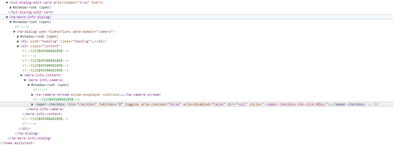
I found that I had an error in the javascript console saying:
TypeError: Cannot read property 'then' of undefined
Searched in the project issues I found that this is fixed in a commit, but the next version “3.0.13” has not been released and therefore, people who have installed card-mod through HACS will not be able to use the CSS in the dialogs using the tag “card-mod-more-info-yaml”.
In the end I added the card-mod.js file with the other installation method.
Once this was fixed, I found a way to hide the “Preload stream” checkbox:
  card-mod-more-info-yaml: |
    more-info-content more-info-camera:
      $: |
        paper-checkbox {
          display: none;
        }
Any ideas on this? Perhaps card_mod grandmaster Ildar?
Styling cover entity row:

type: entities
entities:
  - entity: cover.garage_door
    card_mod:
      style: |
        :host {
          color: green;
        }
  - entity: cover.garage_door
    card_mod:
      style: |
        :host {
          --paper-item-icon-color: cyan;
        }
  - entity: cover.garage_door
    card_mod:
      style:
        hui-generic-entity-row:
          $: |
            state-badge {
              color: yellow;
            }
  - entity: cover.garage_door
    card_mod:
      style:
        hui-generic-entity-row ha-cover-controls:
          $: |
            .state ha-icon-button {
              color: orange;
            }
  - entity: cover.garage_door
    card_mod:
      style:
        hui-generic-entity-row ha-cover-controls:
          $: |
            .state ha-icon-button:nth-child(1) {
              color: orange;
            }
            .state ha-icon-button:nth-child(2) {
              color: red;
            }
            .state ha-icon-button:nth-child(3) {
              color: magenta;
            }
        .: |
          :host {
            --paper-item-icon-color: cyan;
            color: green;
          }
2 Likes
In your case, you should style from the Entities card level, not from restriction-card.
But why did it work before and now only with this additional $:? And what happens with this additional $:?
(according to 🔹 Card-mod - Super-charge your themes! - #867 by MaestroMetty / following up on 🔹 Card-mod - Add css styles to any lovelace card - #1974 by Ildar_Gabdullin)
I use a
- custom:mod-card
→ inside of this: grid card
→ --> inside of this: several button cards
And I´m applying this to the custom:mod-card
card_mod:
  style:
    hui-grid-card:
      $: |
        .card-header {
          text-align: center;
          #font-weight: bold;
          font-weight: 500;
          letter-spacing: 3px;
          margin-top: -10px;
        }
    .: |
      ha-card {
        border: 2px solid grey;
        padding: 5px;
        background: none;
      }
Strange behaviour: On iOS and Windows the .card-header inside the hui-grid-card is respected and applied correctly. But on my Android devices (HA Companion app and browser) it´s not, so my lovelace view looks different depending on the device - which is quite bad 
To be more specific: only the text-align: center; is correctly applied, everything else seems like it´s being ignored.
Is there an Android specific thing (bug) or the need to address the .card-header on another way 

If someone missing secondary_info: last-changed for input_select entity-row (sadly it is not available out-of-box):
Update (21.06.22): the post is updated with styles for MDC controls; old style (see at the bottom of the post) does not work since 2022.3.

Code
  - entity: input_select.test_value
    card_mod:
      style: |
        ha-select::after {
          content: "{{relative_time(states[config.entity].last_changed)}} ago";
          font-size: var(--paper-font-caption_-_font-size);
          color: var(--secondary-text-color);
          padding-left: 12px;
        }
Old style - not valid since HA 2022.3

  - entity: input_select.test_value
    name: some name
    icon: mdi:weather-night
    card_mod:
      style:
        ha-paper-dropdown-menu:
          $:
            paper-menu-button:
              .dropdown-trigger:
                paper-input:
                  $:
                    paper-input-container:
                      $: |
                        .underline::after {
                          content: "{{relative_time(states[config.entity].last_changed)}} ago";
                          font-size: var(--paper-font-caption_-_font-size);
                          color: var(--secondary-text-color);
                        }
                      .: |
                        paper-input-container {
                          padding-bottom: 20px;
                        }
Also, any text may be added:

Code
  - entity: input_select.test_value
    card_mod:
      style: |
        ha-select::after {
          content: "Sun: {{states('sun.sun')}}";
          font-size: var(--paper-font-caption_-_font-size);
          color: magenta;
          padding-left: 12px;
        }
  - entity: input_select.test_value
    card_mod:
      style: |
        ha-select::after {
          content: "Sun: {{states('sun.sun')}}\A Elvn: {{state_attr('sun.sun','elevation')}}";
          font-size: var(--paper-font-caption_-_font-size);
          color: magenta;
          padding-left: 12px;
          display: block;
          white-space: pre;
        }