Styling Picture Elements card:
Intro:
Some styling may be done by using a stock "style" options available for the “Picture Elements” card.
In my opinion, the "card-mod" should be used for styling which cannot be achieved with the stock feature, for example:
- for styling of internal parts of elements which cannot be achieved by using CSS variables (like
"--label-badge-text-color"); - for animations;
- for bulk styling of many elements;
- for elements which are custom cards.
Colored background & rounded corners:

Code
type: picture-elements
title: colored background + rounded corners
style: |
  ha-card {
    height: 200px !important;
    --ha-card-background: red;
    --ha-card-border-radius: 20px;
  }
elements:
  - type: state-badge
    entity: sensor.cleargrass_1_co2
    style:
      top: 18%
      left: 10%
image: /local/images/blue.jpg
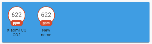
Colored title:

Method 1
      - type: picture-elements
        title: colored title (#1)
        card_mod:
          style:
            $: |
              .card-header {
                color: green !important;
              }
        elements:
          - type: state-badge
            entity: sensor.xiaomi_cg_1_co2
            style:
              top: 18%
              left: 10%
        image: /local/images/test/blue.jpg
Method 2
      - type: picture-elements
        title: colored title (#2)
        card_mod:
          style: |
            ha-card {
              --ha-card-header-color: green;
            }
        elements:
          - type: state-badge
            entity: sensor.xiaomi_cg_1_co2
            style:
              top: 18%
              left: 10%
        image: /local/images/test/blue.jpg
Styling “state-label” elements:
For some element:

Code
type: picture-elements
style: |
  ha-card {
    height: 80px !important;
  }
elements:
  - type: state-label
    entity: sensor.cleargrass_1_co2
    icon: mdi:cloud
    style:
      top: 6%
      left: 10%
  - type: state-label
    entity: sensor.cleargrass_1_co2
    icon: mdi:cloud
    style:
      top: 6%
      left: 30%
    card_mod:
      style: |
        :host {
          color: red;
        }
image: /local/images/white.jpg
For all elements:

Code
type: picture-elements
style:
  hui-state-label-element:
    $: |
      div {
        color: red;
      }
  .: |
    ha-card {
      height: 80px !important;
    }
elements:
  - type: state-label
    entity: sensor.cleargrass_1_co2
    icon: mdi:cloud
    style:
      top: 6%
      left: 10%
  - type: state-label
    entity: sensor.cleargrass_1_co2
    icon: mdi:cloud
    style:
      top: 6%
      left: 30%
image: /local/images/white.jpg
Word-wrapped long text:

Code
  - type: picture-elements
    elements:
      - type: state-label
        entity: sensor.test_text
        style:
          top: 22%
          left: 30%
          width: 100px
          border: 1px solid black
      - type: state-label
        entity: sensor.test_text
        style:
          top: 62%
          left: 30%
          width: 100px
          border: 1px solid black
        card_mod:
          style: |
            div {
              white-space: unset !important;
            }
Styling “state-icon” elements:
For some element:
Code

type: picture-elements
style: |
  ha-card {
    height: 70px !important;
  }
elements:
  - type: state-icon
    entity: sensor.cleargrass_1_co2
    style:
      top: 10%
      left: 10%
  - type: state-icon
    entity: sensor.cleargrass_1_co2
    style:
      top: 10%
      left: 40%
    card_mod:
      style: |
        :host {
          --paper-item-icon-color: red;
          --mdc-icon-size: 50px;
        }
image: /local/images/blue.jpg
For all elements:

Code
type: picture-elements
style: |
  hui-state-icon-element {
    --paper-item-icon-color: red;
    --mdc-icon-size: 50px;
  }
  ha-card  {
    height: 70px !important;
  }
elements:
  - type: state-icon
    entity: sensor.cleargrass_1_co2
    style:
      top: 10%
      left: 10%
  - type: state-icon
    entity: sensor.cleargrass_1_co2
    style:
      top: 10%
      left: 40%
image: /local/images/blue.jpg
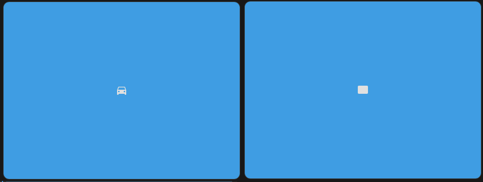
Styling “icon” elements:
For some element:

Code
type: picture-elements
style: |
  ha-card {
    height: 70px !important;
  }
elements:
  - type: icon
    icon: mdi:car
    style:
      top: 10%
      left: 10%
  - type: icon
    icon: mdi:car
    style:
      top: 10%
      left: 40%
    card_mod:
      style: |
        :host {
          color: red;
          --mdc-icon-size: 50px;
        }
image: /local/images/blue.jpg
For all elements:

Code
type: picture-elements
style: |
  hui-icon-element {
    color: red;
    --mdc-icon-size: 50px;
  }
  ha-card  {
    height: 70px !important;
  }
elements:
  - type: icon
    icon: mdi:car
    style:
      top: 10%
      left: 10%
  - type: icon
    icon: mdi:car
    style:
      top: 10%
      left: 40%
image: /local/images/blue.jpg
Styling “state-badge” elements:
Note: possible styles for badges are listed here.
For some badges:

Code
type: picture-elements
image: /local/images/white.jpg
style: |
  ha-card {
    height: 130px !important;
  }
elements:
  - type: state-badge
    entity: sensor.cleargrass_1_co2
    style:
      top: 8%
      left: 10%
    card_mod:
      style:
        ha-state-label-badge:
          $:
            ha-label-badge:
              $: |
                .badge-container .label-badge .label span {
                  border-style: solid;
                  border-color: green;
                  color: blue;
                  background-color: magenta;
                 }
        .: |
          :host {
            color: orange;
            --label-badge-background-color: yellow;
            --label-badge-text-color: red;
            --label-badge-red: cyan;
          }
  - type: state-badge
    entity: binary_sensor.updater
    style:
      top: 8%
      left: 30%
    card_mod:
      style: |
        :host {
          color: orange;
          --label-badge-background-color: yellow;
          --label-badge-text-color: red;
          --label-badge-blue: cyan;
        }
  - type: state-badge
    entity: sensor.cleargrass_1_co2
    style:
      top: 8%
      left: 50%
  - type: state-badge
    entity: sensor.cleargrass_1_co2
    style:
      top: 8%
      left: 70%
For all badges:

Code
type: picture-elements
image: /local/images/white.jpg
style:
  hui-state-badge-element:
    $:
      ha-state-label-badge:
        $:
          ha-label-badge:
            $: |
              .badge-container .label-badge .label span {
                border-style: solid;
                border-color: green;
                color: blue;
                background-color: magenta;
               }
      .: |
        ha-state-label-badge {
          color: orange;
          --label-badge-background-color: yellow;
          --label-badge-text-color: red;
          --label-badge-red: cyan;
          --label-badge-blue: cyan;
        }
  .: |
    ha-card {
      height: 130px !important;
    }
elements:
  - type: state-badge
    entity: sensor.cleargrass_1_co2
    style:
      top: 8%
      left: 10%
  - type: state-badge
    entity: binary_sensor.updater
    style:
      top: 8%
      left: 30%
  - type: state-badge
    entity: sensor.cleargrass_1_co2
    style:
      top: 8%
      left: 50%
  - type: state-badge
    entity: sensor.cleargrass_1_co2
    style:
      top: 8%
      left: 70%
How to replace a label for a “state-badge”:
Described here.
Update 27.12.25: it is possible to replace a label with using a “name” option since this PR merged.
How to hide a label for a “state-badge”:

Code
      - type: picture-elements
        image: /local/images/test/blue.jpg
        elements:
          - type: state-badge
            entity: sensor.xiaomi_cg_1_co2
            style:
              top: 18%
              left: 10%
          - type: state-badge
            entity: sensor.xiaomi_cg_1_co2
            style:
              top: 18%
              left: 30%
            card_mod:
              style:
                ha-state-label-badge $ ha-label-badge $ .badge-container: |
                  .title {
                    display: none;
                  }
Styling “service-button” elements:
For some element:

Code
type: picture-elements
style: |
  ha-card {
    height: 80px !important;
  }
elements:
  - type: service-button
    title: Button
    style:
      top: 6%
      left: 20%
    service: homeassistant.update_entity
    service_data:
      entity_id: sun.sun
    card_mod:
      style: |
        :host {
          background: orange;
          border: 1px solid black;
          border-radius: 10px;
          min-width: 100px;
          text-align: center;
          --mdc-theme-primary: red;
          --mdc-typography-button-font-size: 10px;
        }
  - type: service-button
    title: Button
    style:
      top: 6%
      left: 50%
    service: homeassistant.update_entity
    service_data:
      entity_id: sun.sun
image: /local/images/white.jpg
For all elements:

Code
type: picture-elements
style: |
  hui-service-button-element {
    background: orange;
    border: 1px solid black;
    border-radius: 10px;
    min-width: 100px;
    text-align: center;
    --mdc-theme-primary: red;
    --mdc-typography-button-font-size: 10px;
  }
  ha-card {
    height: 80px !important;
  }
elements:
  - type: service-button
    title: Button
    style:
      top: 6%
      left: 20%
    service: homeassistant.update_entity
    service_data:
      entity_id: sun.sun
  - type: service-button
    title: Button
    style:
      top: 6%
      left: 50%
    service: homeassistant.update_entity
    service_data:
      entity_id: sun.sun
image: /local/images/white.jpg
Animation:
For “state-icon”: for some & all elements:

Note: animation for “--mdc-icon-size” currently does not work in Apple; use “height" & "width`” instead.
Code
type: vertical-stack
cards:
  - type: picture-elements
    style:
      hui-state-icon-element:
        $: |
          state-badge {
            color: red;
            animation: resizing 1s linear infinite alternate;
          }
          @keyframes resizing {
            0% {
            --mdc-icon-size: 10px;
            }
            25% {
              --mdc-icon-size: 15px;
            }
            50% {
              --mdc-icon-size: 20px;
            }
            75% {
              --mdc-icon-size: 26px;
            }
            100% {
              --mdc-icon-size: 32px;
            }
          }
      .: |
        ha-card  {
          height: 70px !important;
        }
    elements:
      - type: state-icon
        entity: sensor.cleargrass_1_co2
        style:
          top: 6%
          left: 10%
      - type: state-icon
        entity: sensor.cleargrass_1_co2
        style:
          top: 6%
          left: 40%
      - type: state-icon
        entity: sensor.cleargrass_1_co2
        style:
          top: 6%
          left: 70%
    image: /local/images/white.jpg
  - type: picture-elements
    style: |
      ha-card {
        height: 70px !important;
      }
    elements:
      - type: state-icon
        entity: sensor.cleargrass_1_co2
        style:
          top: 6%
          left: 10%
      - type: state-icon
        entity: sensor.cleargrass_1_co2
        style:
          top: 6%
          left: 40%
      - type: state-icon
        entity: sensor.cleargrass_1_co2
        style:
          top: 6%
          left: 70%
        card_mod:
          style: |
            state-badge {
              color: red;
              animation: resizing 1s linear infinite alternate;
            }
            @keyframes resizing {
              0% {
                --mdc-icon-size: 10px;
              }
              25% {
                --mdc-icon-size: 15px;
              }
              50% {
                --mdc-icon-size: 20px;
              }
              75% {
                --mdc-icon-size: 26px;
              }
              100% {
                --mdc-icon-size: 32px;
              }
            }
    image: /local/images/white.jpg
For “icon”: for some & all elements:

Code
type: vertical-stack
cards:
  - type: picture-elements
    style:
      hui-icon-element:
        $:
          ha-icon:
            $: |
              ha-svg-icon {
                color: red;
                animation: rotation 0.5s linear infinite;
              }
              @keyframes rotation {
                0% {
                  transform: rotate(0deg);
                }
                100% {
                  transform: rotate(360deg);
                }
              }
      .: |
        ha-card  {
          height: 70px !important;
        }
    elements:
      - type: icon
        icon: mdi:fan
        style:
          top: 6%
          left: 10%
      - type: icon
        icon: mdi:fan
        style:
          top: 6%
          left: 40%
      - type: icon
        icon: mdi:fan
        style:
          top: 6%
          left: 70%
    image: /local/images/white.jpg
  - type: picture-elements
    style: |
      ha-card {
        height: 70px !important;
      }
    elements:
      - type: icon
        icon: mdi:car
        style:
          top: 6%
          left: 10%
      - type: icon
        icon: mdi:fan
        style:
          top: 6%
          left: 40%
        card_mod:
          style:
            ha-icon:
              $: |
                ha-svg-icon {
                  color: red;
                  animation: rotation 0.5s linear infinite;
                }
                @keyframes rotation {
                  0% {
                    transform: rotate(0deg);
                  }
                  100% {
                    transform: rotate(360deg);
                  }
                }
      - type: icon
        icon: mdi:bell
        style:
          top: 6%
          left: 70%
        card_mod:
          style:
            ha-icon:
              $: |
                ha-svg-icon {
                  color: red;
                  animation: wobbling 1s linear infinite alternate;
                }
                @keyframes wobbling {
                  0% {
                    transform: rotate(-45deg);
                  }
                  100% {
                    transform: rotate(+45deg);
                  }
                }
    image: /local/images/white.jpg
Other animation examples are provided here.
Styling conditional elements:
post
Styling custom cards:
Example 1 - Markdown card:
The Markdown could be used as a static label - i.e. a label with ANY text.
Since the Markdown card is not a custom card, we need to use a "custom:hui-element" card.
By default the Markdown card is displayed with a "box-shadow" style which may be removed by the "card-mod":

Code
type: picture-elements
style: |
  ha-card {
    height: 100px !important;
  }
elements:
  - type: custom:hui-element
    card_type: markdown
    content: |
      Static label:
      Hello, world!
    style:
      top: 8%
      left: 20%
  - type: custom:hui-element
    card_type: markdown
    content: |
      Static label:
      Hello, world!
    style:
      top: 8%
      left: 60%
    card_mod:
      style: |
        ha-card {
          box-shadow: 0px 0px 0px 0px;
          color: magenta;
        }
image: /local/images/white.jpg
Example 2 - entity rows:
In the example below the "card-mod" is used to perform a word-wrapping a long text and for coloring a text:

Code
      - type: picture-elements
        style: |
          ha-card {
            height: 400px !important;
          }
        elements:
          - type: custom:hui-element
            row_type: toggle-entity
            entity: input_boolean.test_boolean
            name: toggle-entity
            style:
              top: 0%
              left: 0%
              transform: translate(0,0)

          - type: custom:hui-element
            row_type: toggle-entity
            entity: input_boolean.test_boolean
            name: toggle-entity - long long long long long name
            style:
              top: 10%
              left: 0%
              transform: translate(0,0)

          - type: custom:hui-element
            row_type: toggle-entity
            entity: input_boolean.test_boolean
            name: toggle-entity - long long long name + card_mod
            style:
              top: 20%
              left: 0%
              transform: translate(0,0)
              width: 250px
            card_mod:
              style:
                hui-generic-entity-row:
                  $: |
                    .info {
                      text-overflow: unset !important;
                      white-space: unset !important;
                      color: red;
                    }

          - type: custom:hui-element
            row_type: sensor-entity
            entity: input_boolean.test_boolean
            name: sensor-entity - colored
            style:
              top: 30%
              left: 0%
              transform: translate(0,0)
              width: 250px
            card_mod:
              style:
                hui-generic-entity-row:
                  $: |
                    .info {
                      color: red;
                    }

          - type: custom:hui-element
            row_type: toggle-entity
            entity: input_boolean.test_boolean
            name: toggle-entity - colored (:host)
            style:
              top: 40%
              left: 0%
              transform: translate(0,0)
              width: 300px
            card_mod:
              style: |
                :host {
                  color: red;
                }
        image: /local/images/white.jpg
Displaying an additional info for elements:
This method is used.
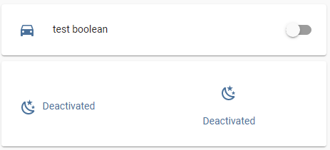
Code
  - type: vertical-stack
    title: "state-icon: additional info"
    cards:
      - type: entities
        entities:
          - input_boolean.test_boolean
      - type: picture-elements
        image: /local/images/test/white.jpg
        card_mod:
          style: |
            ha-card {
              height: 120px !important;
            }
        elements:
          - type: state-icon
            entity: sun.sun
            style:
              top: 10%
              left: 10%
            card_mod:
              style: |
                state-badge::after {
                  content: "{% if is_state('input_boolean.test_boolean','on') -%}
                            Activated
                            {%- else -%}
                            Deactivated
                            {%- endif %}";
                }
                state-badge {
                  display: flex;
                  flex-direction: row;
                  column-gap: 8px;
                }
          - type: state-icon
            entity: sun.sun
            style:
              top: 7%
              left: 70%
            card_mod:
              style: |
                state-badge::after {
                  content: "{% if is_state('input_boolean.test_boolean','on') -%}
                            Activated
                            {%- else -%}
                            Deactivated
                            {%- endif %}";
                }
                state-badge {
                  display: flex;
                  flex-direction: column;
                  align-items: center;
                }
Changing icons dynamically:
Code
type: picture-elements
elements:
  - type: icon
    icon: anything
    style:
      top: 50%
      left: 50%
    card_mod:
      style: |
        :host {
          {% if ... -%};
          --card-mod-icon: mdi:car;
          {%- else -%}
          --card-mod-icon: mdi:card;
          {%- endif %}
        }
image: /local/images/test/blue.jpg
More examples are described here.