ok, that’s what i thought thx. for the pic"overview", always good to know the whole context, as the code-snippet dont tell whether you are editing yaml, or a card, with cards within a card … also a browser, + refresh of same is essential
… seems like in the code-snippet you have 3 “button-card” , but pic showing 2 ?
anyway, justify-content: flex-start might not work on a “conditional” card ( as it’s not a card )
If you f.ex. use paper-button-row, you get exactly ( the most “intensified” packed to the left ) view, thou maybe then you have to “specify” your “conditions” else where, i don’t even know what the purpose here, setting each button to “on” vs “of”, or what are you trying to achive with the 1 “condition”, isn’t it something that should/could be in a template ?
To be honest it looks like your view is a “grid-view”
PS: you have (it shows) 2 cards> with content to the most left ! , will never be(look) different, unless you pack that “row” with cards
@CM000n … i did type “styles” above, anyway wont be of any use due to your “setup” … unless you skip your “card-setup”, use other cards to achieve what/which “look” you want
Seems like your card now, ( " horizontal-stack" = a row )( filled with Button-card from “conditional-card” “on”)(only 1 condition) … so sometimes none, or 1 card, 2 or 3 cards, if entity is “on” … they will take available space, whether 1, 2 or 3
Maybe start with a grid, define width of column ( to match your Icon ), place a “conditional - button-card” in each “space”, or define column-width to hold 3 Icons (3 button-cards) ( i.e 3 column for a row, in your case) = most likely not possible
… Or , fill the row with button-cards, use the first 3, replace with empty card ( if not-on)
I definitely don’t like this way, as i want my “View” responsive, have to look good whether i use 4K TV, Laptop or Phone, regardsless of res
Thx, but that’s what I already know
But if I change the „flex“ condition in the root of the conditional cards in the developer tools of a browser it works as intended.
All Buttons on the left and no gap between them.
So I thought it would be something that I can achieve via card mod.
You can’t use card-mod like that. You have to apply it directly to cards. Anchors could help reduce the duplication. But, I think this is more towards themes.
ok, thx , i did looked at browser-mod and mini-player , as i only need a “simple” player for “streaming-channels” , but your top-menu gave me more ideas for automation’s, i.e wakeup, cast
I had these .card-header {} mods in all of my cards, in 2 versions (with and without bottom margin) so the caused some serious repetition. Top card got the &header anchor, and all cards below that re-used it via *header. Very easy.
However, I recently switched to creating a class in my card-mod-themes and now only set a class on the cards (and repeat those with anchors, which saves yet another line
Hey everyone! Reaching out for some help here styling a card.
I’ve worked with card-mod before but struggling with styling the Mushroom Person card - if anyone is familiar with the Mushroom project.
My goal is to change the width/height of the div.container holding the entity picture.
Ive tried using Card-mod-helper. Below is the JS path to the div.container.
If so, I haven’t used that feature, so I won’t be able to help with that, sorry. Just looking at the docs, there is a strong emphasis on where those themed definitions should be added, and that is not under a dashboard view.
In another card i used, i didn’t wanted a name, and with name: false i got the entity-name instead(how funny is that) … i went to Configuration/entities, gave the entity a (.) dot … as name, i know i doesn’t move/remove it , but now it’s only a tiny dot, i hardly see with my old eyes and dirty glasses
… ahhh i just got another idea … write whatever i want, style the text same color as background


 for automation’s, i.e wakeup, cast
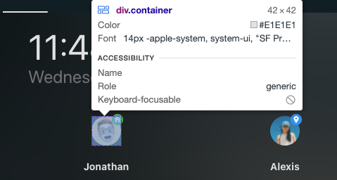

 … as name, i know i doesn’t move/remove it , but now it’s only a tiny dot, i hardly see with my old eyes and dirty glasses