šŸ”¹ Card-mod - Add css styles to any lovelace card

Could someone help me with the correct syntax please iā€™m trying to apply object-fit: fill to the video tag in a picture-glance card

Iā€™ve tried everything I can think of without much success

camera_view: live
type: picture-glance
entities: []
camera_image: camera.doorbell_main_proxy
card_mod:
  style:
    video$: |
      :host, video {
        object-fit: fill !important;
      }
      video {
        object-fit: fill !important;  /* fill the whole card */
      }
    .: |
      ha-card {
        object-fit: fill !important;  /* fill the whole card */
      }
      ha-card, video {
        object-fit: fill !important;  /* fill the whole card */
      }
      ha-card video {
        object-fit: fill !important;  /* fill the whole card */
      }
      #video {
        object-fit: fill !important;  /* fill the whole card */
      }
      video {
        object-fit: fill !important;  /* fill the whole card */
      }
      :host, video {
        object-fit: fill !important;
      }

Probably you should try only possibly valid selectors instead of trying everything.

Which is why iā€™m asking for help.

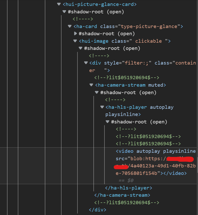
There are examples for picture glance card (check the 1st post).
Since you know what a Code Inspector is you may construct a valid path to a needed element based on those examples.

Hi all, can you please let me know the correct attribute to a background colour to my vertical stack in my hui-element card.

I think the CSS element is the ā€œhui-vertical-stack-cardā€ but I havenā€™t had any success with the correct attribute to change the background value. I have removed all the backgrounds for the child cards.

type: custom:hui-element
card_type: vertical-stack
cards:
  - type: markdown
    content: Network UPS - {{ states['sensor.unifi_ups_status'].state }}
    style: |
      ha-card {
          --paper-card-background-color: 'rgba(0, 0, 0, 0.0)';
          --ha-card-background: "rgba(0, 0, 0, 0.0)";
          --ha-card-box-shadow: 'none';
          font-size: 18px;
          font-weight: bold;
          text-align: center;
          margin-bottom: -10px;
          margin-top: -10px;
      }

Thanks in advance

There 2 reasons to use hui-element for some card:
ā€“ if you want to place the card into Entities card for some reason;
ā€“ if you want to create a decluttering template for some entity-row element.
Assume you are having the 1st reason.

The ā€œvertical-stackā€ does not have itā€™s own ā€œha-cardā€ element.
If the stack is placed into the Entities card (which does have the ā€œha-cardā€ element) - there is a limited way to style the stack:

type: entities
entities:
  - type: custom:hui-element
    card_type: vertical-stack
    cards:
      - type: markdown
        content: Network UPS
        card_mod:
          style: |
            ha-card {
              --ha-card-background: red;
            }
      - type: entity
        entity: sun.sun
      - type: entities
        entities:
          - sun.sun
        card_mod:
          style: |
            ha-card {
              --ha-card-background: yellow;
            }
    card_mod:
      style: |
        :host {
          --ha-card-background: cyan;
        }
  - sun.sun

image

Here you may style something but not the ā€œouter spaceā€ between inserted cards, for example.

To do so - get rid of ā€œhui-elementā€ and place the stack into ā€œmod-cardā€:

type: entities
entities:
  - type: custom:mod-card
    card:
      type: vertical-stack
      cards:
        - type: markdown
          content: Network UPS
          card_mod:
            style: |
              ha-card {
                --ha-card-background: red;
              }
        - type: entity
          entity: sun.sun
        - type: entities
          entities:
            - sun.sun
          card_mod:
            style: |
              ha-card {
                --ha-card-background: yellow;
              }
    card_mod:
      style: |
        ha-card {
          --ha-card-background: cyan;
          background: blue;
        }
  - sun.sun

image

@Ildar_Gabdullin Thank you so much. That answers my question.

Hi guys, Iā€™m getting nuts trying to figure this out. I want to style the shopping list card. I managed to style the font-family and font-size but cannot get the font color to change. Inspecting the elements I get this:

Manually manipulating the value from the color field characters do change color but I fail miserably when trying to put that into yaml, nothing works:

        - type: shopping-list
          style: |
            ha-card {
                --mdc-typography-subtitle1-font-size: 1.5em;
            }
            :host {
                color: rgba(255,255,255,1);
            }

thanks in advanded

Since you can see a path in a Code inspector you may define a path for required element/elements.
Now using a ā€œ:hostā€ is just a guess.

Yeah, previously to that, I tried that too to no avail:

        - type: shopping-list
          style: 
            ha-textfield$: |
                What should go here?  {
                color: red;
                  }

this wonā€™t work and I tried several variations

        - type: shopping-list
          style:
            ha-textfield$: |
                .mdc-text-field:not  {
                color: red;
                  }

this wonā€™t either:

        - type: shopping-list
          card_mod:
            style:
              ha-textfield$: |
                .mdc-text-field:not(.mdc-text-field--disabled) .mdc-text-field__input {
                  color: red;
                    }

Iā€™m really lost

I always suggest to start more granular and then limit afterwards.

Why not (without test) starting/trying such things first.

card_mod:
  style:
    ha-textfield:
      $: |
        input {
          color: red !important;
        }

Hello Folks,

Iā€™m trying to manipulate a paper-button-row custom card.
I have an AirConditioner which I control with paper-buttons: turn on for time period, or off.
Also I have an automation to control it based on a preset.
I figured, if the automation is ON, i do not want anyone to mess around with the manual settings, so I disabled them with card-mode.
image
Problem, is I cannot disable only the paper-buttons, but the whole entity-row, with the icon (visual issue) and the title, which means I cannot access the state history and such.
image

Could someone help me please to apply my mods only on the paper-buttons?

My code would be this so far:

type: entities
entities:
  - entity: automation.toohotinhere
    card_mod:
      style: |
        :host {
          {% if is_state('automation.toohotinhere','on') %}
            --paper-item-icon-color: var(--disabled-text-color);
            pointer-events: none;
          {% endif %}
          }
    extend_paper_buttons_row:
      position: right
      base_config:
        style:
          button:
            background-color: lightblue
            border-radius: 4px
            padding-top: 2px
            padding-right: 6px
            padding-bottom: 2px
            padding-left: 5px
            margin-right: 5px
            border-style: solid
            border-width: 2px
            font-weight: 500
      buttons:
        - entity: asd.asd
          layout: icon|name
          name: auto
          style:
            button:
              width: 100%
              background-color: none
              border-style: none
              border-width: 2px
              font-weight: 500
              justify-content: flex-start
            ripple:
              display: none
        - name: 30M
          tap_action:
            action: call-service
            service: script.KlimaFor30Script
        - name: 1H
          tap_action:
            action: call-service
            service: script.KlimaFor1hScript
        - name: 2H
          tap_action:
            action: call-service
            service: script.1656525217310
        - name: 'OFF'
          tap_action:
            action: call-service
            service: script.offklima

Oh my, you got it! How did you get to this? why did you suggest input?

Hi guys, I have this two styled cards working separately but I donā€™t know how to put them together in the same card? Thanks in advaned, any help is appreciated.

Card 1

        - type: shopping-list
          card_mod:
            style:
              ha-textfield:
                $: |
                    input {
                      color: #c8c8c8 !important; --mdc-typography-subtitle1-font-size: 1.5em;
                    }

Card 2

        - type: shopping-list
          card_mod:
            style: |
                    ha-card {
                        --mdc-text-field-fill-color: rgba(0,0,0,0);
                    }

Look at your picture. This is the element, you want to style. And as suggested, this is more granular to start. If you want only style the same element, if it has a special id or class, you can narrow down afterwards.

Please always have a look in the examples in this thread, esp. in the ones from Ildar in den Link at the first post. You would see a lot (!) of examples, which give the answer directly.

card_mod:
  style:
    .: |
      ha-card {
    ha-textfield:
      $: |
        input {
2 Likes

@arganto but in my picture I see tons of things besides ā€œinputā€, call me idiot but I still canā€™t realize where you get the input thing exactly from.

I just saw it, thanks.

sorry mate, I saw 3429 posts and I didnā€™t even consider reading one and using the search tool didnā€™t help. I appreciate!

Hello,

I use plenty of ā€œcustom:stack-in-cardā€ with ā€œcustom:multiple-entity-rowā€ and other integrated cars - and in these cards ā€œcard_modā€ to colour or exchange icons or to adjust the borders.

So far this has always worked, but now it doesnā€™t (without me changing anything!?) The icons are not coloured, the spacing is ignored.

An example with an icon:

type: custom:stack-in-card
card_mod:
  style:
    .: |
      ha-card {      
        padding-left: 20px;
        padding-right: 20px;
        padding-bottom: 10px;
        padding-top: 10px;
      }
cards:
  - type: markdown
    content: |
      ## KĆ¼che und VorrƤte
  - entity: binary_sensor.hmipw_dri32_1_2_r02_kellerfenster_state
    type: custom:multiple-entity-row
    icon: mdi:chili-hot
    show_state: false
    state_color: false
    name: Vorratskeller
    card_mod:
      style: >
        {% if
        (states("sensor.zigbee_tempsensor_tz2000_r02_1_temperature"))|float
        > 20 %}
          :host { 
             --card-mod-icon-color: red; 
             --card-mod-icon: mdi:corn-off}     
        {% endif %}
    entities:
      - entity: binary_sensor.hmipw_dri32_1_1_r03_kellerfenster_state
        name: false
        icon: mdi:door
        state_color: true
      - entity: sensor.zigbee_tempsensor_tz2000_r02_1_temperature
        name: Temperatur
        hide_unavailable: true
        format: precision0
      - entity: sensor.zigbee_tempsensor_tz2000_r02_1_humidity
        name: Feuchte
        format: precision0
        hide_unavailable: true

Card-Mod works if I use it within an regular entity card, i. e:

type: entities
entities:
  - entity: sensor.irmelder_1_r53_gartenhaus_brightness
    type: custom:multiple-entity-row
    name: Helligkeit
    state_header: Lux
    unit: false
    secondary_info: false
    card_mod:
      style: |
        {% if (states("sun.sun")) == 'below_horizon' %}
          :host { --card-mod-icon: mdi:weather-night; }
        {% elif (states("sensor.k68_ha_uv_index")) | float(0) > 3 %}
           :host { --card-mod-icon-color: #FF8F00; }
        {% elif (states("sensor.k68_ha_uv_index")) | float(0) > 5 %}
           :host { --card-mod-icon-color: red; }
        {% endif %}    

So it may be a conflicct between ā€œcustom:stack-in-cardā€ and ā€œcard_modā€?

Iā€™ve searched here but havenā€™t found anything - or overlooked it. Sorry if that was the case.

Grateful for any help,
Eckart

First, instead of this:

    card_mod:
      style: |
        {% if ... %}
          element { prop: value; }
        {% endif %} 

use this:

    card_mod:
      style: |
        element {
          {% if ... %}
          prop: value;
          {% endif %} 
        }

since it will let you build more complex styles.

Next, regarding using ā€œ--card-mod-icon-xxxā€.
This is not a ā€œpure card-modā€. This is a ā€œtrickā€ added by card-mod - which is not obliged to work always & everywhere. See Github issues.
For styling multiple-entity-row - see post #1.

Also, multiple-entity-row is NOT supposed to be used as a separate card, it should be inside Entities card. I am not saying that it will not work. But it will have some unexpected features.

building on that buttons post, I am trying to mod the footer section of an entities card:

to have that button centered (and if that works out, make the container a bit tighter, by applying margin or padding)

footer:

  type: buttons
  entities:
    - entity: sensor.speedtest_download
      name: Run Speedtest
      icon: mdi:speedometer
      tap_action:
        action: call-service
        service: speedtestdotnet.speedtest

card_mod:
  style:
    hui-buttons-base $ .ha-scrollbar ha-chip:
      $: |
        .mdc-chip {
          width: 120px;
          justify-content: center;
        }

does exactly nothing, even though the path seems to be correct

Not really sure how to combine that with the generic header-footer stylings of the header/footer post thoughā€¦
do I set it on the entities card as a whole, or on the buttons in the footer?

give the fact I also have a class for the header, I suppose to would need to be on the entities card:

type: entities
title: Speedtest
card_mod:
  class: class-header-margin
  style:
    hui-buttons-base $ .ha-scrollbar ha-chip:
      $: |
        .mdc-chip {
          width: 120px;
          justify-content: center;
        }
    .: |
      .header-footer.footer {
        padding: 0px;
      }
entities: