It’s possible to make it slow down to a stop when the attribute is off? How would I do that? I’ve tried placing animation-timing-function: ease-out in “else” but it doesn’t work.
I would recommend creating another keyframe, and setting animation as a whole instead of individually.
To come back to my own post: There is definitely some heavy impact with card-mod. I’m not sure however where the issue itself is. I disabled card-mod and noticed how blazing fast everything was again.
I also remembered that I haven’t updated my brothers installation for some time. His Lovelace is also blazing fast. I still have card-mod 2.0.3 on his system installed. So I downgraded mine to 2.0.3 as well and noticed it was a lot faster again.
On card-mod 3.0 my Samsung tablet is completely useless, it won’t even load up the dashboard completely and freezes. Using card-mod 2.0.3 loads up everything again. This explains now why it suddenly was like this overnight (because I updated to card-mod 3.0 back then)
On more powerfull hardware (like new iPhones, Galaxy phones and desktop) I also noticed this huge improvement. On card-mod 3.0 a lot of the state changes of button-cards are delayed when toggling. Also delays occur a lot when changing tabs inside a dashboard. All that works fast again now using the latest version before 3.0 dropped.
Not sure if something drastic has changed in how 3.0 handles certain stylings (so changing variables might fix it) or that there is something else going on. I noticed on 3.0 when using a dashboard with only 4 button-cards (RomRiders), there was no performance hit. Using more button-cards made the UI a lot more sluggish. Using the exact same setup with many button-cards, is a lot faster on 2.0.3 than on 3.0 however. I’ll try to investigate further and create a ticket.
You could try around with the Performance tab in the browser devtools.
1 Like
Thanks, I will investigate using that with both builds and report on Github.
Styling footer (or header):
This whole description outdated since HA 2021.12 when new "chip" buttons were presented.
Earlier I tried to understand the styling and faced some problem which was described here and here. The problem was not solved but I found a walkaround - and then decided not to worry about the problem (since there is another solution).
Resizing icons:

      - type: entities
        style: |
          .header-footer.footer {
            --mdc-icon-size: 50px;
            height: 50px;
          }
        entities:
          - sun.sun
          - type: divider
        footer:
          type: buttons
          entities:
            - entity: binary_sensor.updater
            - entity: binary_sensor.updater
Note: this method allows to resize icons but do not align them with respect to the center of the card:

To make icons aligned, the following method must be used:
      - type: entities
        style:
          .header-footer.footer hui-buttons-header-footer$:
            hui-buttons-base$div: |
              state-badge {
                width: unset !important;
              }
          .: |
            .header-footer.footer {
              --mdc-icon-size: 50px;
              height: 50px;
            }
        entities:
          - sun.sun
          - type: divider
        footer:
          type: buttons
          entities:
            - entity: binary_sensor.updater
            - entity: binary_sensor.updater

Colored icons:
Method #1 - works for all kind of entities including "sensor", "input_boolean", "binary_sensor", "sun.sun":

type: entities
card_mod:
  style:
    hui-buttons-header-footer$:
      hui-buttons-base$div: |
        state-badge {
          color: red;
        }
entities:
  - sun.sun
  - type: divider
footer:
  type: buttons
  entities:
    - entity: sun.sun
    - entity: sun.sun
    - entity: sun.sun
Method #2 - same for some particular items:

type: entities
card_mod:
  style:
    hui-buttons-header-footer$:
      hui-buttons-base$div: |
        div:nth-child(1) state-badge {
          color: red;
        }
        div:nth-child(3) state-badge {
          color: cyan;
        }
entities:
  - sun.sun
  - type: divider
footer:
  type: buttons
  entities:
    - entity: sun.sun
    - entity: sun.sun
    - entity: sun.sun
Method #3 - changing "--paper-item-icon-color" & "--paper-item-icon-active-color" variables which define styles for binary_sensor, input_boolean, switch, sun.sun:

type: entities
card_mod:
  style: |
    .header-footer.footer {
      --paper-item-icon-active-color: orange;
      --paper-item-icon-color: grey;
    }
entities:
  - sun.sun
  - type: divider
footer:
  type: buttons
  entities:
    - entity: sensor.cleargrass_1_co2
    - entity: sun.sun
    - entity: input_boolean.service_true_value
Changing a background:

type: entities
entities:
  - sun.sun
footer:
  type: buttons
  entities:
    - entity: sun.sun
    - entity: sun.sun
style:
  .header-footer.footer hui-buttons-header-footer:
    $: |
      hui-buttons-base {
        background-color: red;
      }
####### END of old style-buttons #######
Styling an image inside a footer:
By default the footer’ height is automatically set dependingly on the image’s size:

type: entities
entities:
  - sun.sun
footer:
  type: picture
  image: >-
    https://www.home-assistant.io/images/lovelace/header-footer/balloons-header.png
Here is how to adjust the image’s height to the card’s height:

type: entities
entities:
  - sun.sun
footer:
  type: picture
  image: >-
    https://www.home-assistant.io/images/lovelace/header-footer/balloons-header.png
style:
  .header-footer.footer hui-picture-header-footer:
    $: |
      img {
        height: 100%;
      }
  .: |
    .header-footer.footer {
      height: 200px;
    }
P.S. Do you know that you can use a GIF?

type: entities
entities:
  - sun.sun
footer:
  type: picture
  image: 'https://i.gifer.com/Z23b.gif'
style:
  .header-footer.footer hui-picture-header-footer:
    $: |
      img {
        height: 100%;
      }
  .: |
    .header-footer.footer {
      height: 100px;
    }

  type: entities
  entities:
    - sun.sun
  footer:
    type: picture
    image: 'https://i.gifer.com/5uwq.gif'
  style:
    .header-footer.footer hui-picture-header-footer:
      $: |
        img {
          height: 100%;
        }
    .: |
      .header-footer.footer {
        height: 70px;
      }
      ha-card {
        --ha-card-background: black ;
        color: white;
      }
More examples are described here.
2 Likes
One thing I remembered: with card-mod 3.0 the syntax has changed. While the old syntax still works like Thomas mentioned in the changelog, I now wonder if using the old syntax could somehow cause a performance hit.
Old:
style:
  ... stuff here ...
New:
card_mod:
  style:
    ... stuff here ...
Since I use the old syntax, I figured maybe this can cause this. If it’s unknown, I’ll re-create a dashboard with some elements using the new syntax and load 3.0. And then compare that with old syntax on 3.0 and use the performance tab. A lot of people still use the old syntax, so I find it odd no-one else has mentioned or experienced this performance hit.
But could be I’m way off and the syntax has no influence (I’m not experienced enough to make that assumption). I want to prevent wasting a lot of time in testing stuff that has no effect ofcourse.
I gonna ask some probably silly questions (sorry for broken English).
I have HA on RPi 3 (docker).
My HA setup includes 3 dashboards (for HA itself, for testing things, for testing card-mod), each dashboard includes lots (~10…20) of views.
This is all edited in UI, not in yaml files (I know nothing about yaml-mode, it is in my plans).
And I use an old card-mod syntax in most cases (99%).
Every time when I work with Inspector (Chrome, Win10x64) with views with card-mod, I observe a high CPU load on my PC (~40% load for Chrome).
Sometimes I have to restart Chrome since it becomes too slow.
When I do not use Inspector - it works quite fine.
And I usually use Inspector only for testing card-mod.
Q1: Is it normal for Chrome to become so slow when using an Inspector?
If not - should I change something in Chrome’s settings?
Also, as I understand, a code for some particular view works only when I open this view in my browser.
And some part of this code works on RPi, some part - on my PC.
That means that I can have lots of views in my HA setup, and it will not make my HA slower - unless I open some very complex view. But - this is just my opinion, my knowledge about HA internal structure is very poor.
Q2: Since I have a separate dashboard with ~20 views for testing card-mod - may it slow down my HA when I do not open this dashboard?
Meanwhile - a small Animation for bar-card:
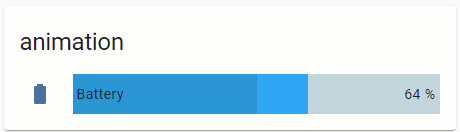
The progress is moving if the battery is charging.
type: 'custom:bar-card'
title: animation
columns: 1
entities:
  - entity: sensor.battery_life360_ildar_iphone_5s
    direction: right
    name: Battery
    icon: 'mdi:battery'
    height: 40px
    decimal: '0'
    min: '0'
    max: '100'
    target: '100'
style: |
  bar-card-row bar-card-card bar-card-background bar-card-targetbar {
    {% if is_state('binary_sensor.battery_charging_life360_ildar_iphone_5s','on') %}
    animation: filling 5s linear infinite;
    {% endif %}
    --bar-percent: 0 !important;
  }
  @keyframes filling {
    0% {
      --bar-target-percent: 0;
    }
    10% {
      --bar-target-percent: 10%;
    }
    20% {
      --bar-target-percent: 20%;
    }
    30% {
      --bar-target-percent: 30%;
    }
    40% {
      --bar-target-percent: 40%;
    }
    50% {
      --bar-target-percent: 50%;
    }
    60% {
      --bar-target-percent: 60%;
    }
    70% {
      --bar-target-percent: 70%;
    }
    80% {
      --bar-target-percent: 80%;
    }
    90% {
      --bar-target-percent: 90%;
    }
    100% {
      --bar-target-percent: 100%;
    }
  }
  bar-card-row bar-card-card bar-card-background bar-card-markerbar {
    display: none;
  }
More examples are described here.
6 Likes
Hi Guys,
I wonder if you can help me I am in the process of setting up my card for my air fresheners im 90% there but I can’t seem to figure out how to style the text input highlighted below:
using the following I have been able to change the font size:
--paper-input-container-shared-input-style_-_font-size: 12px;
but I can’t work out how to change the colour and justify the text to the right hand side. Any ideas?

You’ll probably need to shadow-root into it.
Styling an "input-text" row inside the Entities card:
Update (21.06.22): the post is updated with styles for MDC controls; old styles (see at the bottom of the post) do not work since 2022.3.
Colored name:
Two methods are available:
– using a CSS variable;
– using a CSS property with a detailed DOM navigation.

Notes:
1.The 1st method - the name’s color changes if an input field is selected (from " --mdc-text-field-label-ink-color" to “--mdc-theme-primary”).
2.The 2nd method - allows to change a color permanently (whether the input field is selected or not).
code
          - entity: input_text.test_text
            name: Colored name (method 1)
            card_mod: &ref_card_mod_red_text_host
              style: |
                :host {
                  --mdc-text-field-label-ink-color: red;
                }
          - entity: input_text.test_text
            name: Colored name (method 2)
            card_mod: &ref_card_mod_red_text_dom
              style:
                ha-textfield $: |
                  span#label {
                    color: red;
                  }
          - entity: input_text.test_text
            name: default
How to style several rows:

Note that a common style may be overwritten for some particular entity.
code
      - type: entities
        title: Colored name for all entities
        card_mod:
          style:
            .card-content:
              div:
                hui-input-text-entity-row $ hui-generic-entity-row ha-textfield $: |
                  span#label {
                    color: orange;
                  }
        entities:
          - entity: input_text.test_text
            name: Cannot be overwritten
            card_mod:
              style: |
                :host {
                  --mdc-text-field-label-ink-color: red !important;
                }
          - entity: input_text.test_text
            name: Overwritten style
            card_mod: &ref_card_mod_overwritten_text
              style:
                ha-textfield $: |
                  span#label {
                    color: red !important;
                  }
          - entity: input_text.test_text
            name: Colored name (common)
Colored icon:
Two methods are available:
– using a CSS variable;
– using a CSS property with a detailed DOM navigation.

code
      - type: entities
        title: Colored icon for some entity
        entities:
          - entity: input_text.test_text
            name: 'Colored icon (method #1)'
            card_mod:
              style: |
                :host {
                  --paper-item-icon-color: red;
                }
          - entity: input_text.test_text
            name: 'Colored icon (method #2)'
            card_mod:
              style:
                hui-generic-entity-row $: |
                  state-badge {
                    color: red;
                  }
          - entity: input_text.test_text
            name: default
How to style several rows:

Note that a common style may be overwritten for some particular entity.
code
      - type: entities
        title: Colored icon for all entities
        card_mod:
          style: |
            ha-card {
              --paper-item-icon-color: cyan;
            }
        entities:
          - entity: input_text.test_text
            name: Overwritten color
            secondary_info: last-changed
            card_mod:
              style: |
                :host {
                  --paper-item-icon-color: red;
                }
          - entity: input_text.test_text
            name: Colored icon (common)
          - entity: input_text.test_text
            name: Colored icon (common)
Some other styles for an icon - resized icon, hidden icon:

code
      - type: entities
        title: Other styles for icon
        entities:
          - entity: input_text.test_text
            name: resized icon
            card_mod:
              style: |
                :host {
                  --mdc-icon-size: 40px;
                }
          - entity: input_text.test_text
            name: hidden icon
            card_mod:
              style:
                hui-generic-entity-row $: |
                  state-badge {
                    display: none;
                  }
Colored value:
Two methods are available:
– using a CSS variable;
– using a CSS property with a detailed DOM navigation.

code
      - type: entities
        title: Colored value
        entities:
          - entity: input_text.test_text
            name: colored value (method 1)
            card_mod:
              style: |
                :host {
                  --mdc-text-field-ink-color: red;
                }
          - entity: input_text.test_text
            name: colored value (method 2)
            card_mod:
              style:
                ha-textfield $: |
                  .mdc-text-field__input {
                    color: red !important;
                  }
          - entity: input_text.test_text
            name: default
Colored field’s background:

code
      - type: entities
        title: Colored background
        entities:
          - entity: input_text.test_text
            name: colored background
            card_mod:
              style: |
                :host {
                  --mdc-text-field-fill-color: lightgreen;
                }
          - entity: input_text.test_text
            name: default
Colored underline:
The underline had 3 possible states:
– a default (static) state;
– the input field is hovered by a mouse;
– the input field is selected by a mouse.
There are CSS variables for each state.
In the example below:
– the 1st row is modded by using these CSS variables;
– the 2nd row is modded by changing CSS properties with a detailed DOM navigation;
– the 3rd row has transparent underlines.

code
      - type: entities
        title: Colored underline
        entities:
          - entity: input_text.test_text
            name: colored underline (method 1)
            card_mod:
              style: |
                :host {
                  --mdc-text-field-idle-line-color: red;
                  --mdc-text-field-hover-line-color: cyan;
                  --mdc-theme-primary: magenta;
                }
          - entity: input_text.test_text
            name: colored underline (method 2)
            card_mod:
              style:
                ha-textfield $: |
                  .mdc-line-ripple::before {
                    border-bottom-color: orange !important;
                  }
                  .mdc-line-ripple::after {
                    border-bottom-color: magenta !important;
                  }
          - entity: input_text.test_text
            name: no underline
            card_mod:
              style:
                ha-textfield $: |
                  .mdc-line-ripple::before,
                  .mdc-line-ripple::after {
                    border-bottom-style: none !important;
                  }
          - entity: input_text.test_text
            name: default
Making the name hidden or more compact:
Since the row has a bigger height than other entity rows, we may want to make a row more compact.
First, we need to customize the row’s height.
Next, there are 2 options for a name & a value:
– remove the name;
– place the name and the value closer to each other.

code
  - type: entities
    title: Hidden/compact name
    entities:
      - entity: input_text.test_text
        name: custom
        card_mod:
          style:
            ha-textfield $: |
              .mdc-text-field {
                height: 40px !important;
              }
              .mdc-text-field__input {
                align-self: center;
              }
              span#label {
                display: none;
              }
            .: |
              ha-textfield {
                height: 40px;
              }
      - entity: input_text.test_text
        name: custom
        card_mod:
          style:
            ha-textfield $: |
              .mdc-text-field {
                height: 40px !important;
              }
              .mdc-text-field__input {
                align-self: end;
              }
            .: |
              ha-textfield {
                height: 40px;
              }
      - entity: input_text.test_text
        name: default
How to disable an input_text row:
Two methods are available:
– the row is displayed as disabled;
– the row only has a read-only input field.

code
  - type: entities
    title: Locked input_text
    entities:
      - entity: input_boolean.test_boolean
        name: Lock input_text
      - entity: input_text.test_text
        name: disabled
        tap_action:
          action: none
        card_mod:
          style: |
            :host {
              {% if is_state('input_boolean.test_boolean','on') %}
                --mdc-text-field-ink-color: var(--disabled-text-color);
                --mdc-text-field-label-ink-color: var(--disabled-text-color);
                --mdc-text-field-idle-line-color: var(--disabled-text-color);
                --paper-item-icon-color: var(--disabled-text-color);
                pointer-events: none;
              {% endif %}
            }
      - entity: input_text.test_text
        name: read-only
        tap_action:
          action: none
        card_mod:
          style: |
            :host {
              {% if is_state('input_boolean.test_boolean','on') %}
                pointer-events: none;
              {% endif %}
            }
Short list of CSS variables available for “textfield” control:

Old styles - not valid since HA 2022.3
Colored name:

Method #1:
type: entities
entities:
  - entity: input_text.test_text
    style:
      hui-generic-entity-row:
        $: |
          .info {
            color: red;
          }
Method #2:
type: entities
entities:
  - entity: input_text.test_text
    style: |
      :host {
        color: red;
      }
Colored value:

Method #1:
type: entities
entities:
  - entity: input_text.test_text
    style:
      hui-generic-entity-row:
        paper-input:
          $: |
            paper-input-container iron-input {
              color: red;
            }
Method #2:
type: entities
entities:
  - entity: input_text.test_text
    style: |
      :host {
        --paper-input-container-input-color: red;
      }
Colored background:

Method #1:
type: entities
entities:
  - entity: input_text.test_text
    style:
      hui-generic-entity-row:
        paper-input:
          $: |
            paper-input-container iron-input {
              background-color: orange;
            }
Method #2:
type: entities
entities:
  - entity: input_text.test_text
    style: |
      :host {
        --paper-input-container-shared-input-style_-_background: orange;
      }
Aligned value:

Method #1:
type: entities
entities:
  - entity: input_text.test_text
    style:
      hui-generic-entity-row:
        paper-input:
          $: |
            paper-input-container iron-input {
              text-align: right;
            }
Method #2:
type: entities
entities:
  - entity: input_text.test_text
    style: |
      :host {
        --paper-input-container-input_-_text-align: right;
      }
Wrapping a text for the name:
By default a long name is clipped:

type: entities
entities:
  - entity: input_text.test_text
    name: long long long long long long long
How to enable wrapping:

type: entities
entities:
  - entity: input_text.test_text
    name: long long long long long long long
    style:
      hui-generic-entity-row:
        $: |
          .info {
            text-overflow: unset !important;
            white-space: unset !important;
          }
Changing a width of the input field:

Method #1:
type: entities
entities:
  - entity: input_text.test_text
    style:
      hui-generic-entity-row:
        paper-input:
          $: |
            paper-input-container iron-input {
              width: 300px;
            }
Method #2:
type: entities
entities:
  - entity: input_text.test_text
    style: |
      :host {
        --paper-input-container-shared-input-style_-_width: 300px;
      }
Hidden name:

type: entities
entities:
  - entity: input_text.test_text
    style:
      hui-generic-entity-row:
        $: |
          .info {
           display: none;
          }
        paper-input:
          $: |
            paper-input-container iron-input {
              --paper-input-container-shared-input-style_-_width: 400px;
            }
Colored underline:


Method #1:
type: entities
entities:
  - entity: input_text.test_text
    style:
      hui-generic-entity-row:
        paper-input:
          $:
            paper-input-container:
              $: |
                .underline .unfocused-line {
                  border-color: orange;
                }
                .underline .focused-line {
                  border-color: red;
                }
Method #2:
type: entities
entities:
  - entity: input_text.test_text
    style: |
      :host {
        --paper-input-container-focus-color: red;
        --paper-input-container-color: orange;
      }
Disabled control:

type: entities
title: Locked input_text
entities:
  - entity: input_boolean.test_boolean
    name: Lock input_text
  - entity: input_text.test_text
    tap_action:
      action: none
    card_mod:
      style: |
        :host {
          {% if is_state('input_boolean.test_boolean','on') %}
            --paper-item-icon-color: var(--disabled-text-color);
            --paper-input-container-color: var(--disabled-text-color);
            --paper-input-container-input-color: var(--disabled-text-color);
            color: var(--disabled-text-color);
            pointer-events: none;
          {% endif %}
        }
Also, you may remove color options to make the row clearly visible but “read-only”.
More examples are described here.
5 Likes
Thank you so much, was really pulling my hair out over this one.
I’m super noob but simply want to reduce the size of the fonts in my card. Have it working in some cards but can’t see to get it working in this horizontal card. In my codef i’m just applying it for now in 2 of the cards in the stack. I’d also like to control the font size of the horizontal stack card itself (the title).
Appreciate any help to get me started…
type: horizontal-stack
title: Living Room
cards:
  - type: button
    tap_action:
      action: toggle
    entity: scene.living_room_hang
    name: Hang Scene
    icon_height: '-4px'
  - type: light
    entity: light.living_room_fireplace
    double_tap_action:
      action: toggle
    name: Fireplace
    card_mod:
      style: |
        ha-card {
        font-size: 10px;
        }
  - type: gauge
    entity: sensor.living_room_trisensor_temperature_measurement
    min: 0
    max: 100
    name: Temp
    card_mod:
      style: |
        ha-card {
        font-size: 8px;
        }
  - type: light
    entity: light.living_room_walls
    double_tap_action:
      action: toggle
    name: Walls
type: 'custom:mod-card'
style:
  hui-vertical-stack-card$: |
    .card-header {
      font-size: 10px !important;
    }
card:
  type: vertical-stack
  title: Changed font
  cards:
  ###################
1 Like
Thanks! I tried all kinds of combinations but can’t seem to get it formatted or added to my code properly.
So does this “custom:mod-card” type snippet go at the top of the card before my horizontal stack code?
In meantime i’ll spend more time understanding how the custom:mod-card fits into all of this…
card mod is extention to existing cards. it allows to style html entities inside the card. you use it by adding style attribute to every card definition.
However sometimes card-mod cannot reach some outer html objects (styling allows to apply styles to children items while some cards has outer objects unavailable to card-mod). mod-card creates a container with your card inside. This way your whole card turns into mod-card’s child element, allowing to style it from mod-card level
Some examples of using "::before", "::after" & "content":
Note: may be used with many Lovelace cards (I hope).
NOTE:
Do not forget to add a "card_mod:" keyword before "style:" (new in card-mod 3).
Prefix & suffix:
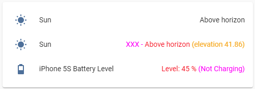
type: entities
entities:
  - entity: sun.sun
  - entity: sun.sun
    style:
      hui-generic-entity-row $: |
        .text-content.pointer:not(.info) {
          color: red;
        }
        .text-content.pointer:not(.info)::before {
          content: "XXX - ";
          color: magenta;
        }
        .text-content.pointer:not(.info)::after {
          content: " (elevation {{state_attr(config.entity,'elevation')}})";
          color: orange;
        }
  - entity: sensor.iphone_5s_battery_level
    style:
      hui-generic-entity-row: |
        .text-content {
          color: red;
        }
        .text-content::before {
          content: "Level: ";
          color: red;
        }
        .text-content::after {
          content: " ({{states('sensor.iphone_5s_battery_state')}})";
          color: magenta;
        }
+ undocumented feature for "secondary_info":
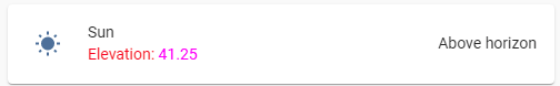
type: entities
entities:
  - entity: sun.sun
    secondary_info: true
    style:
      hui-generic-entity-row:
        $: |
          .info .secondary {
            color: red;
          }
          .info .secondary::before {
            content: "Elevation: ";
            color: red;
          }
          .info .secondary::after {
            content: "{{state_attr(config.entity,'elevation')}}";
            color: magenta;
          }
“Undocumented” means that you can use also "secondary_info: bla_bla_bla" instead of "secondary_info: true", it will create a "div" element anyway.
Math operations:

type: entities
entities:
  - entity: sensor.cleargrass_1_co2
    style:
      hui-generic-entity-row: |
        .text-content {
          color: red;
        }
        .text-content::before {
          content: "{{states(config.entity)|int/10}} (divided), ";
          color: magenta;
        }
Replacing a value:
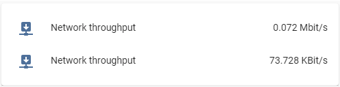
For the Entities card it is enough to set a transparent color for the element keeping the state:
type: entities
entities:
  - entity: sensor.network_throughput_in_eth0_mbits
    name: Network throughput
  - entity: sensor.network_throughput_in_eth0_mbits
    name: Network throughput
    style:
      hui-generic-entity-row: |
        .text-content::after {
          content: "{{states(config.entity)|float*1024}} KBit/s";
          color: var(--primary-text-color);
        }
        .text-content {
          color: transparent;
        }
But for the Glance card I have to set a zero font-size:

type: glance
entities:
  - entity: sensor.network_throughput_in_eth0_mbits
    name: Network throughput
  - entity: sensor.network_throughput_in_eth0_mbits
    name: Network throughput
    style: |
      :host div:not(.name)::after {
        content: "{{states(config.entity)|float*1024}} KBit/s";
        font-size: var(--mdc-typography-body1-font-size, 1rem);
      }
      :host div:not(.name) {
        font-size: 0px;
      }
One more example for “input_boolean” entity:

type: glance
entities:
  - entity: input_boolean.test_boolean
    name: default
  - entity: input_boolean.test_boolean
    name: modded
    style: |
      :host div:not(.name)::after {
        content: "{% if is_state(config.entity,'on') -%}
                  switched ON
                  {%- else -%}
                  switched OFF
                  {%- endif %}";
        font-size: var(--mdc-typography-body1-font-size, 1rem);
      }
      :host div:not(.name) {
        font-size: 0px;
      }
For "multiple-entity-row" it is much tricky:

The original value must be transparent & placed on the next line whose height must be set to 0px:
type: entities
entities:
  - type: 'custom:multiple-entity-row'
    style: |
      .entities-row div.entity:nth-child(1) div::before {
        color: orange;
        content: {%if is_state('sun.sun','above_horizon') -%} "Rise and shine\A" {%- else -%} "Sleep well\A" {%- endif %};
        line-height: var(--mdc-typography-body1-line-height, 1.5rem);
      }
      .entities-row div.entity:nth-child(1) div {
        color: transparent;
        line-height: 0px;
      }
    entity: sun.sun
    entities:
      - entity: sun.sun
        name: xxx
        styles:
          width: 60px
      - entity: sun.sun
        name: xxx
        styles:
          width: 60px
    unit: ''
    icon: ''
    toggle: false
    show_state: false
    state_header: ''
    state_color: false
For badges inside "picture-elements" card:
This trick may be useful since there is no possibility to display any text for the entity’s name (BTW, for badges displayed on the top of views this possibility is present - a “name” property).
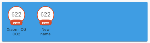
type: picture-elements
image: /local/images/blue.jpg
style: |
  ha-card { height: 130px !important; }
elements:
  - type: state-badge
    entity: sensor.cleargrass_1_co2
    style:
      top: 18%
      left: 10%
  - type: state-badge
    entity: sensor.cleargrass_1_co2
    style:
      top: 18%
      left: 30%
    card_mod:
      style:
        ha-state-label-badge:
          $:
            ha-label-badge:
              $:
                .badge-container: |
                  .title {
                    color: transparent;
                    line-height: 0px !important;
                  }
                  .title::before {
                    color: var(--primary-text-color);
                    content: "New name\A";
                    line-height: normal;
                  }
For icons inside “picture-elements” card:

Described here.
custom:multiple-entity-row:
How to display "last-changed" for items:
described here
custom:mini-graph-card:
How to display an additional info on the card:

described here
Any card with a title:
How to add a small header:
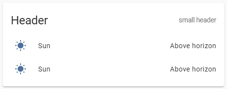
described here
More examples are described here.
4 Likes
I’m trying to use style my markdown-card with the help of card-mod.
But whatever I am trying, nothing wil change the format of the markdown-card.
What am I doing wrong?
      - type: markdown
        style: |
          ha-card {
            font-size: 20px;
            font-family: Quicksand;
            height: 30px;
            background: none;
          }
          ha-markdown {
            padding: 0px 0px 0px 8px !important;
            border-left: 3px solid var(--accent-color);
          }
        content: 'Modi'
2 Likes
Styling vertical-stack (horizontal-) card.
Styling a title:

Method #1:
type: 'custom:mod-card'
style: |
  ha-card {
    --ha-card-header-color: red;
    --ha-card-header-font-size: 10px;
  }
card:
  type: vertical-stack
  title: Changed font for title
  cards:
    - type: entities
      entities:
        - entity: sun.sun
        - entity: sun.sun
    - type: entity
      entity: sun.sun
Method #2:
type: 'custom:mod-card'
style:
  hui-vertical-stack-card$: |
    .card-header {
      font-size: 10px !important;
      color: red !important;
    }
card:
  type: vertical-stack
  title: Changed font for title
  cards:
    - type: entities
      entities:
        - entity: sun.sun
        - entity: sun.sun
    - type: entity
      entity: sun.sun
Colored header:

type: 'custom:mod-card'
style:
  hui-vertical-stack-card$: |
    .card-header {
      background-color: green;
    }
card:
  type: vertical-stack
  title: Some title
  cards:
    - type: entities
      entities:
        - entity: sun.sun
        - entity: sun.sun
    - type: entity
      entity: sun.sun
Colored background:

type: 'custom:mod-card'
style: |
  ha-card {
    background-color: red;
  }
card:
  type: vertical-stack
  title: Colored background
  cards:
    - type: entities
      entities:
        - entity: sun.sun
        - entity: sun.sun
    - type: entity
      entity: sun.sun
Using an image for the background:

Notes:
- The
"--ha-card-background"variable is used to style the child cards. - The background image is stretched to fit the card’s size.
type: 'custom:mod-card'
style: |
  ha-card {
    background-image: url('/local/images/blue_low_2.jpg');
    background-size: 100% 100%;
    --ha-card-background: rgba(50,50,50,0.3);
  }
card:
  type: vertical-stack
  title: Image for background
  cards:
    - type: entities
      entities:
        - entity: sun.sun
        - entity: sun.sun
    - type: entity
      entity: sun.sun
Using an image for the header:

type: 'custom:mod-card'
style:
  hui-vertical-stack-card$: |
    .card-header {
      background-image: url('/local/images/blue_low_2.jpg');
      background-size: 100% 100%;
    }
card:
  type: vertical-stack
  title: Image for background
  cards:
    - type: entities
      entities:
        - entity: sun.sun
        - entity: sun.sun
    - type: entity
      entity: sun.sun
More styles for vertical-stack:

type: custom:mod-card
card_mod:
  style:
    hui-vertical-stack-card $: |
      hui-card:nth-of-type(1) {
        --ha-card-background: rgba(50,50,50,0.7);
        margin: 0px 150px 150px 20px;
      }
      hui-card:nth-of-type(2) {
        --ha-card-background: rgba(50,50,50,0.1);
        margin: 0px 20px 20px 150px;
      }
    .: |
      ha-card {
        background-image: linear-gradient(to right, red,orange,yellow,green,blue,indigo,violet);
        --ha-card-header-color: white;
        --ha-card-header-font-size: 40px;
        height: 500px !important;
        border: 4px solid black;
      }
card:
  type: vertical-stack
  title: Some title
  cards:
    - type: entities
      entities:
        - entity: sun.sun
        - entity: sun.sun
    - type: entity
      entity: sun.sun
More styles for horizontal-stack:
Example #1:

type: 'custom:mod-card'
style:
  hui-horizontal-stack-card$: |
    hui-entities-card {
      margin-left: 10px !important;
      margin-bottom: 10px !important;
      --ha-card-background: rgba(50,50,50,0.1);
    }
    hui-entity-card {
      margin-right: 10px !important;
      margin-bottom: 10px !important;
      --ha-card-background: rgba(50,50,50,0.7);
    }
  .: |
    ha-card {
      background-color: lightblue;
    }
card:
  type: horizontal-stack
  title: Some title
  cards:
    - type: entities
      entities:
        - entity: sun.sun
        - entity: sun.sun
        - entity: sun.sun
    - type: entity
      entity: sun.sun
Example #2:

type: 'custom:mod-card'
style:
  hui-horizontal-stack-card$: |
    hui-entities-card {
      margin-left: 10px !important;
      margin-right: 10px !important;
      margin-bottom: 10px !important;
      width: 150%;
      flex: auto !important;
    }
    mini-graph-card {
      margin-right: 10px !important;
      margin-bottom: 10px !important;
      flex: auto !important;
    }
  .: |
    ha-card {
      background-color: lightblue;
      --ha-card-background: rgba(50,50,50,0.1);
    }
card:
  type: horizontal-stack
  title: Some title
  cards:
    - type: entities
      entities:
        - entity: sun.sun
        - entity: sun.sun
        - entity: sun.sun
    - type: 'custom:mini-graph-card'
      entities:
        - sensor.cleargrass_1_co2
      hours_to_show: 12
      points_per_hour: 60
      show:
        name: false
        icon: false
Example #3:

type: custom:mod-card
card_mod:
  style:
    hui-horizontal-stack-card $: |
      div#root > :first-child > * {
        width: 30%;
        flex: auto;
      }
      div#root > :last-child > * {
        width: 70%;
        flex: auto;
      }
card:
  type: horizontal-stack
  cards:
    - type: entity
      entity: sun.sun
    - type: custom:tabbed-card
      tabs:
        ...
Align a title: (added in 2024.6)

type: custom:mod-card
card_mod:
  style: |
    ha-card {--ha-stack-title-text-align: end;}
card:
  type: vertical-stack
  title: xxxxxxxxxx
  cards:
    - type: entity
      entity: sun.sun
    - type: button
      entity: sun.sun
More examples are described here.
3 Likes