Conditional styling for different clients:
Assume you have a Windows desktop, iPhone & iPad.
In some cases we need to specify different styles for different clients.
Here is how to differentiate iOS client & not-iOS client:
place a selector with a style into a condition to specify a style for iOS clients:
        @supports (-webkit-touch-callout: none) {
          selector {
            ...
          }
        }
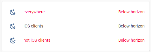
The example below contains 3 rows:
– styled for all clients;
– styled for iOS clients;
– styled for not iOS clients.
Code
type: entities
entities:
  - entity: sun.sun
    name: everywhere
    card_mod:
      style: |
        :host {color: red}
  - entity: sun.sun
    name: iOS clients
    card_mod:
      style: |
        @supports (-webkit-touch-callout: none) {
          :host {color: red;}
        }
  - entity: sun.sun
    name: not iOS clients
    card_mod:
      style: |
        @supports not (-webkit-touch-callout: none) {
          :host {color: red;}
        }
Screenshots are taken on a Windows desktop.
If a style includes a "shadowRoot" - need to place that conditions in every place.
Consider this style:
type: entities
entities:
  - entity: sun.sun
    name: Colored name & value
    style:
      hui-generic-entity-row $: |
        .info.pointer.text-content {
          color: orange;
        }
        .text-content:not(.info) {
          color: red;
        }
      .: |
        :host {
          --paper-item-icon-color: cyan;
        }
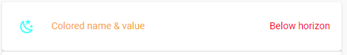
Here is how to render it:
    card_mod:
      style:
        hui-generic-entity-row $: |
          @supports (-webkit-touch-callout: none) {
            .info.pointer.text-content {
              color: orange;
            }
            .text-content:not(.info) {
              color: red;
            }
          }
        .: |
          @supports (-webkit-touch-callout: none) {
            :host {
              --paper-item-icon-color: cyan;
            }
          }
A bit cumbersome; unfortunately, we cannot place the whole style into one condition:
    card_mod:
      style: |
        @supports not (-webkit-touch-callout: none) {
          hui-generic-entity-row $: |
            .info.pointer.text-content {
              color: orange;
            }
            .text-content:not(.info){
              color: red;
            }
          .: |
            :host {
              --paper-item-icon-color: cyan;
            }
        }
An whole example:
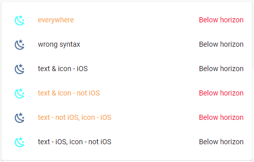
Code
type: entities
entities:
  - entity: sun.sun
    name: everywhere
    card_mod:
      style:
        hui-generic-entity-row $: |
          .info.pointer.text-content {
            color: orange;
          }
          .text-content:not(.info){
            color: red;
          }
        .: |
          :host {
            --paper-item-icon-color: cyan;
          }
  - entity: sun.sun
    name: wrong syntax
    card_mod:
      style: |
        @supports not (-webkit-touch-callout: none) {
          hui-generic-entity-row $: |
            .info.pointer.text-content {
              color: orange;
            }
            .text-content:not(.info){
              color: red;
            }
          .: |
            :host {
              --paper-item-icon-color: cyan;
            }
        }
  - entity: sun.sun
    name: text & icon - iOS
    card_mod:
      style:
        hui-generic-entity-row $: |
          @supports (-webkit-touch-callout: none) {
            .info.pointer.text-content {
              color: orange;
            }
            .text-content:not(.info) {
              color: red;
            }
          }
        .: |
          @supports (-webkit-touch-callout: none) {
            :host {
              --paper-item-icon-color: cyan;
            }
          }
  - entity: sun.sun
    name: text & icon - not iOS
    card_mod:
      style:
        hui-generic-entity-row $: |
          @supports not (-webkit-touch-callout: none) {
            .info.pointer.text-content {
              color: orange;
            }
            .text-content:not(.info) {
              color: red;
            }
          }
        .: |
          @supports not (-webkit-touch-callout: none) {
            :host {
              --paper-item-icon-color: cyan;
            }
          }
  - entity: sun.sun
    name: text - not iOS, icon - iOS
    card_mod:
      style:
        hui-generic-entity-row $: |
          @supports not (-webkit-touch-callout: none) {
            .info.pointer.text-content {
              color: orange;
            }
            .text-content:not(.info) {
              color: red;
            }
          }
        .: |
          @supports (-webkit-touch-callout: none) {
            :host {
              --paper-item-icon-color: cyan;
            }
          }
  - entity: sun.sun
    name: text - iOS, icon - not iOS
    card_mod:
      style:
        hui-generic-entity-row $: |
          @supports (-webkit-touch-callout: none) {
            .info.pointer.text-content {
              color: orange;
            }
            .text-content:not(.info) {
              color: red;
            }
          }
        .: |
          @supports not (-webkit-touch-callout: none) {
            :host {
              --paper-item-icon-color: cyan;
            }
          }
Next point is - how to differentiate iPhone & iPad?
A desktop with 4K display & smaller panel 1920x1080?
Use "@media" conditions for different viewports & screen orientations.
Assume that besides Windows clients we have 3 iOS devices - iPad Air 2, iPhone 5s, iPhone 6 (please do not tell me that they are ancient - I do know it; you wanna fix it - buy me a coffee).
And we need 5 styles for these devices - and these styles must work for these devices only.
Means - we need to define rules for each device.
This code works on a Windows client with 1920x1080 display (fullscreen or less):
    card_mod:
      style: |
        @supports not (-webkit-touch-callout: none) {
          @media (max-width: 1920px) {
            :host { color: red; }
          }
        }
The code for a Windows client with 4K display (fullscreen or less):
    card_mod:
      style: |
        @supports not (-webkit-touch-callout: none) {
          @media (min-width: 1921px) and (max-width: 3840px) {
            :host { color: red; }
          }
        }
This code for iPad Air 2 (1536x2048) for different orientations:
    card_mod:
      style: |
        @supports (-webkit-touch-callout: none) {
          @media (orientation: portrait) and (min-width: 768px) {
            :host { color: red; }
          }
        }
    card_mod:
      style: |
        @supports (-webkit-touch-callout: none) {
          @media (orientation: landscape) and (min-width: 1024px) {
            :host { color: red; }
          }
        }
This code for iPhone 5S (640x1136) for different orientations:
    card_mod:
      style: |
        @supports (-webkit-touch-callout: none) {
          @media (orientation: portrait) and (max-width: 320px) {
            :host { color: red; }
          }
        }
    card_mod:
      style: |
        @supports (-webkit-touch-callout: none) {
          @media (orientation: landscape) and (max-width: 568px) {
            :host { color: red; }
          }
        }
This code for iPhone 6 (750x1334) for different orientations:
    card_mod:
      style: |
        @supports (-webkit-touch-callout: none) {
          @media (orientation: portrait) and (min-width: 321px) and (max-width: 375px) {
            :host { color: red; }
          }
        }
    card_mod:
      style: |
        @supports (-webkit-touch-callout: none) {
          @media (orientation: landscape) and (min-width: 569px) and (max-width: 667px) {
            :host { color: red; }
          }
        }
Values for these "min-width" & "max-width" for iOS devices are set dependingly on “viewport sizes” which may be found here.
Have no idea how these “viewport sizes” are defined; why for iPad it is “768x1024” for “1536x2048” resolution and for iPhone it is “320x568” for “640x1136” (twice less) - is a riddle for me.
Some info may be googled (for example, here).
Another issue is “scaling in iOS Companion App”. My observations tell me that for a correct handling that "@media" conditions the scaling must be “100%”.
I myself usually use “50%” in Companion App for iPad; as for iPhone - do not use it, the App is too slow / too buggy (much more buggy than the App for iPad). So, with “50%” I observed that conditions not working…


