Thx @ASNNetworks for the clarification.
Exactly this was my intention and approach @boheme61 
1 Like
me myself have(still) struggling with ideas, in regards to card-mod, some times i end up using “entities-card” as base, thou, thou i want different cards, and some CSS, i prefer in “View-configuration”( applied to all (almost) cards in my View … it’s my copy/paste/pick approach to make it work( and to “verify” what the Docs. says ) … not that i don’t trust the authors, im just curious  … i.e “What happens if i…”
edit: i mend Theme, not View
try this:
    styles:
justify-content: flex-start;Nope, that doesn’t seem to work 
      - type: horizontal-stack
        cards:
          - type: conditional
            style:
              justify-content: flex-start
              flex-grow: 1
              flex-shrink: 1
              flex-basis: 1
            conditions:
              - entity: binary_sensor.spuehlmaschine
                state: "on"
            card:
              type: 'custom:button-card'
              template: chip_mdi_icon_only
              variables:
                ulm_chip_mdi_icon_only_entity: binary_sensor.spuehlmaschine
                ulm_chip_mdi_icon_only_icon: mdi:dishwasher
          - type: conditional
            style:
              justify-content: flex-start
              flex-grow: 1
              flex-shrink: 1
              flex-basis: 1
            conditions:
              - entity: binary_sensor.waschmaschine
                state: "on"
            card:
              type: 'custom:button-card'
              template: chip_mdi_icon_only
              variables:
                ulm_chip_mdi_icon_only_entity: binary_sensor.waschmaschine
                ulm_chip_mdi_icon_only_icon: mdi:washing-machine
          - type: conditional
            style:
              justify-content: flex-start
              flex-grow: 1
              flex-shrink: 1
              flex-basis: 1
            conditions:
              - entity: binary_sensor.trockner
                state: "on"
            card:
              type: 'custom:button-card'
              template: chip_mdi_icon_only
              variables:
                ulm_chip_mdi_icon_only_entity: binary_sensor.trockner
                ulm_chip_mdi_icon_only_icon: mdi:tumble-dryer
        view_layout:
          grid-area: chips_c

ok, that’s what i thought thx. for the pic"overview", always good to know the whole context, as the code-snippet dont tell whether you are editing yaml, or a card, with cards within a card … also a browser, + refresh of same is essential
… seems like in the code-snippet you have 3 “button-card” , but pic showing 2 ?
anyway, justify-content: flex-start might not work on a “conditional” card ( as it’s not a card )
If you f.ex. use paper-button-row, you get exactly ( the most “intensified” packed to the left ) view, thou maybe then you have to “specify” your “conditions” else where, i don’t even know what the purpose here, setting each button to “on” vs “of”, or what are you trying to achive with the 1 “condition”, isn’t it something that should/could be in a template ?
To be honest it looks like your view is a “grid-view”
PS: you have (it shows) 2 cards> with content to the most left ! , will never be(look) different, unless you pack that “row” with cards
Edit2: https://github.com/jcwillox/lovelace-paper-buttons-row
Edit3: or you have in fact 1 row -2 column ?
@CM000n … i did type “styles” above, anyway wont be of any use due to your “setup” … unless you skip your “card-setup”, use other cards to achieve what/which “look” you want
It shows only two cards because they are conditional cards.
And the conditions are only fulfilled for two of them 
Seems like your card now, ( " horizontal-stack" = a row )( filled with Button-card from “conditional-card” “on”)(only 1 condition) … so sometimes none, or 1 card, 2 or 3 cards, if entity is “on” … they will take available space, whether 1, 2 or 3
Maybe start with a grid, define width of column ( to match your Icon ), place a “conditional - button-card” in each “space”, or define column-width to hold 3 Icons (3 button-cards) ( i.e 3 column for a row, in your case) = most likely not possible
… Or , fill the row with button-cards, use the first 3, replace with empty card ( if not-on)
I definitely don’t like this way, as i want my “View” responsive, have to look good whether i use 4K TV, Laptop or Phone, regardsless of res
Thx, but that’s what I already know
But if I change the „flex“ condition in the root of the conditional cards in the developer tools of a browser it works as intended.
All Buttons on the left and no gap between them.
So I thought it would be something that I can achieve via card mod.
Look here for further explanation:
ok, yes i guess the “button-card” match the size of your Icon
What do you mean “in developer tools of a browser” ? , work in developer tools, but not when applied to “View” ? or
lol, i don’t have these concerns, i want my “Centered”
but as you like "empty row, 1,2,3 or more (entities) depending on State, maybe you are looking for auto-entities-card (horizontal add)
I would like to use card-mod-card: to apply styles to any of my cards.
But I can’t figure it out where to place that style code.
I tried this (top level of the dashboard - doesn’t work):
title: Dashboard
card-mod-card: |
  ha-card .card-header {
    font-size: 1.2em;
    font-weight: var(--mcg-title-font-weight, 500);
    max-height: 1.4em;
    min-height: 1.4em;
    opacity: 0.65;
    padding: 0px 16px 16px;
  }
views:
   [...]
And this (inside one view - doesn’t work, too):
title: Dashboard
views:
  - icon: mdi:home-battery
    card-mod-card: |
      ha-card .card-header {
        font-size: 1.2em;
        font-weight: var(--mcg-title-font-weight, 500);
        max-height: 1.4em;
        min-height: 1.4em;
        opacity: 0.65;
        padding: 0px 16px 16px;
      }
    cards:
       [...]
What I am doing wrong?
EDIT: Same style code in a single card with style: works.
You can’t use card-mod like that. You have to apply it directly to cards. Anchors could help reduce the duplication. But, I think this is more towards themes.
If you’d like to make global changes, there is a way to set theme overrides: https://gist.github.com/thomasloven/2a37152725c582fec4420ecedb65ebe3.
Also see:
modding the somewhat unique styled custom:browser-player,

I made this:
  - type: custom:browser-player
    card_mod:
      style: |
        ha-card {
          height: 48px;
        }
        .card-content {
          padding-top: 0px;
          padding-bottom: 0px;
        }
        .device-id {
          padding-left: 20px;
          position: absolute;
          left: 0%;
          bottom: 0%;
        }
appear like

and gives it the same size as my headers and menu bars.
I couldn’t move the device-id with other styling elements though, so maybe anyone here could have a look at the options?
think I will try to get the player tools (icon slider icon) to use more width of the card too, but I cant manage, even with:
        .card-content {
          padding-top: 0px;
          padding-bottom: 0px;
          justify-content: space-between;
          margin: 0px -16px;
        }
which shows a double card-content in inspector:

and clears the justify-content by itself…
Changing the top .card-content to space-between,

results in

which is more like it. However, how to get these 2 to work together in real life Lovelace…
thanks!
I don’t have “media_player” and couldn’t find such “custom: browser_player” in hacs,(so i don’'t know whether it’s actually just 1 row, or 3 column.)
… but maybe you could try something like this:
        ha-slider {
          max-width: none;
          min-width: 100px;
          width: 100%;
and maybe “apply”
flex-shrink: 100;
to the other 2 objects
thx, ill have a look. fyi, this card is provided by the browser-mod CC. If you have that, and have it make a media_player, you can use it like above.
ok, thx , i did looked at browser-mod and mini-player , as i only need a “simple” player for “streaming-channels” , but your top-menu gave me more ideas for automation’s, i.e wakeup, cast
Thanks for clarification.
So card-mod-{thing} is only for theming?
And this class-thing mentioned here, too?
I’ll try with anchors.
I had these .card-header {} mods in all of my cards, in 2 versions (with and without bottom margin) so the caused some serious repetition. Top card got the &header anchor, and all cards below that re-used it via *header. Very easy.
  - type: entities
    title: First card
    card_mod: &header_no_margin
      style: |
        .card-header {
          background-color: var(--background-color-off);
          color: var(--text-color-off);
          padding-top: 0px;
          padding-bottom: 0px;
          /* margin: 0px 0px 16px 0px; */
        }

  - type: entities
    title: Next card
    card_mod: *header_no_margin
However, I recently switched to creating a class in my card-mod-themes and now only set a class on the cards (and repeat those with anchors, which saves yet another line
have a look here for the class creation : https://gist.github.com/Mariusthvdb/9069c8c4dcad6324035a679244bbfdf1#file-themes_card_mod-yaml-L64
use them in the views:
type: entities
title: Audio settings
card_mod:
  class: class-header-margin
Hey everyone! Reaching out for some help here styling a card.
I’ve worked with card-mod before but struggling with styling the Mushroom Person card - if anyone is familiar with the Mushroom project.
My goal is to change the width/height of the div.container holding the entity picture.
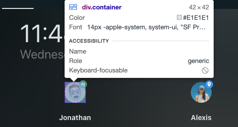
Ive tried using Card-mod-helper. Below is the JS path to the div.container.
document.querySelector("body > home-assistant").shadowRoot.querySelector("home-assistant-main").shadowRoot.querySelector("app-drawer-layout > partial-panel-resolver > ha-panel-lovelace").shadowRoot.querySelector("hui-root").shadowRoot.querySelector("#view > hui-view > vertical-layout").shadowRoot.querySelector("#columns > div > hui-horizontal-stack-card:nth-child(3)").shadowRoot.querySelector("#root > mushroom-person-card:nth-child(1)").shadowRoot.querySelector("mushroom-card > div > mushroom-state-item > mushroom-shape-avatar").shadowRoot.querySelector("div")
Any ideas? My goal is to change the container width/height to 75px - instead of 42px.
Thanks!