šŸ”¹ Card-mod - Add css styles to any lovelace card

Trying to decrease line spacing on an entities card that is using custom:template-entity-row. The posted code_mod code works on entity cards with standard entities, but not when using custom:template-entity-row.

Update: Changing the two values below in the CSS code allows the line spacing to change, but canā€™t figure out how to accomplish this in card_mod.

#wrapper { min-height: 25px;} Changed from 40 to 25
div#wrapper { height: 25px;} Added this line

> type: entities
> entities:
>   - type: custom:template-entity-row
>     entity: binary_sensor.htpc
>     icon: mdi:server-network
>     state: >-
>       {% if is_state('binary_sensor.htpc', 'unavailable')%} Off {% else %}
>       {{states('binary_sensor.htpc') | capitalize}} {%endif%}
>     active: '{{ is_state("binary_sensor.htpc", "on") }}'
>     card_mod:
>       style: |
>         hui-generic-entity-row {
>           height: 25px;
>         }
>   - type: custom:template-entity-row
>     entity: binary_sensor.xbox_360_media_center_extender_2
>     name: Kitchen Xbox
>     icon: mdi:microsoft-xbox
>     state: >-
>       {% if is_state('binary_sensor.xbox_360_media_center_extender_2',
>       'unavailable')%} Off {% else %}
>       {{states('binary_sensor.xbox_360_media_center_extender_2') | capitalize }}
>       {%endif%}
>     active: '{{ is_state("binary_sensor.xbox_360_media_center_extender_2", "on") }}'
>     card_mod:
>       style: |
>         hui-generic-entity-row {
>           height: 25px;
>         }

This code worked:

card_mod:
      style: |
        div#wrapper { 
          min-height:  10px; 
          }
        div#wrapper {
          height:  25px; 
          }

Hi,

Iā€™m trying to use the browser variable but obviously Iā€™m doing something wrong :slight_smile:
Anyone that knows how to use it?

      {% if browser == 'pixel7-app' %}
        top: 2px;
      {% else %}
        top: var(--header-height); 
      {% endif %}

Hi there,

does anyone know how to disable the slider row of this entry equal to the date-input entry?
image

Actually only the icon will be disabled when I click the ā€œinput_boolean.ui_kellerlichtā€ button but it would be very nice if the slider also is disabled.

Thx. Spartacus

type: entities
title: 'minimale Einschaltdauer:'
entities:
  - entity: input_number.auto_kellerlicht_offset
    name: in Minuten
    type: custom:slider-entity-row
card_mod:
  style:
    .: |
      :host {
          {% if is_state('input_boolean.ui_kellerlicht','off') %}
            color: var(--disabled-text-color);
            --paper-item-icon-color: var(--disabled-text-color);
            pointer-events: none;
          {% endif %}

         --mdc-text-field-fill-color: transparent;
         --mdc-select-fill-color: transparent;
         --ha-card-header-font-size: 20px;
         --ha-card-header-color:  #C0C0C0;;
         }

Hey lads, I have been trying to find a solution to a problem Iā€™ve had since yesterday and itā€™s the fact that I cannot change the mushroom slider color. It doesnā€™t work with any selector that has anything to do with the slider. Anyone ran into this issue or know a solution?

Ps: I have used card-mod-helper but neither that worked.

- type: custom:mushroom-media-player-card
    entity: media_player.niels_tv
    use_media_info: true
    show_volume_level: true
    media_controls:
      - play_pause_stop
    volume_controls:
      - volume_mute
      - volume_set
    collapsible_controls: true
    tap_action:
      action: toggle
    fill_container: false
    card_mod:
      style: |
          mushroom-slider {
            --main-color: var(--google-blue) !important;
            --bg-color: rgba(61, 90, 254, 0.2) !important;
            # --shape-color: rgba(137, 179, 248, 0.2) !important;
          }

Changing the two values below in the CSS code allows the line spacing to change, but canā€™t figure out how to accomplish this in card_mod.

#wrapper { min-height: 25px;} Changed from 40 to 25
div#wrapper { height: 25px;} Added this line

This code worked:

card_mod:
      style: |
        div#wrapper { 
          min-height:  10px; 
          }
        div#wrapper {
          height:  25px; 
          }

Hi,

is there a way to style the horizontal stack so all child items (mini graph card state) have the same color?
For now i could only figure out to style all child items on its own. Is this possible?

  type: horizontal-stack
  cards:
    - type: custom:mini-graph-card
      style: |
        .states { 
          color: #467fcf;
         }  
      entities:
        - sensor.adguard_home_dns_queries
    - type: custom:mini-graph-card
      style: |
        .states { 
          color: #467fcf;
         }      
      entities:
        - sensor.adguard_home_dns_queries

image

1st post ā†’ link at the bottom ā†’ mini-graph

this is what i have done. But my question is if i can put my card styling into the horizontal stack instead of styling every mini graph card on its own.

Your case was explained too.

1 Like

horizontal vertical and grid stack canā€™t have css card-mod but you can use ā€œlayout-cardā€ instead perhaps

i swear it wasnt there the first 3 times i red this section. but i found it. thank you!

Was added long time ago (1ā€¦2 years), letā€™s call it a magic)))

1 Like

Hi I am trying to style my lovelace card
Lovelace

I am trying for the lowest 4 boxes to change the format as well.

type: statistic
period:
  calendar:
    period: day
stat_type: change
icon: mdi:flash
icon_color: orange
entity: sensor.envoy_122125010596_lifetime_energy_production
name: D
unit: Wh
card_mod:
  style: |
    ha-card {
      font-size: 14px;
      text-color: rgb(var(rgb red));
      }

Who can ppoint me in the right direction

I think your top cards are mushroom cards. I would also make the HASS lovelace cards with mushroom. It is a lot of work to base a normal lovelace card on it.

I think the best idea is to grab a custom:mushroom-template-card and style it.

Example:

- type: grid
  columns: 2
  square: false
  cards:
  - type: custom:mushroom-template-card
    primary: Dag
    icon: mdi:calendar-today
    icon_color: blue
    layout: horizontal
    secondary: |-
      {{ states('sensor.envoy_122125010596_lifetime_energy_production') }} Wh
  - type: custom:mushroom-template-card
    primary: Week
    icon: mdi:calendar-week
    icon_color: blue
    layout: horizontal
    secondary: |-
      {{ states('sensor.envoy_122125010596_lifetime_energy_production') }} Wh
  - type: custom:mushroom-template-card
    primary: Maand
    icon: mdi:calendar-month
    icon_color: blue
    layout: horizontal
    secondary: |-
      {{ states('sensor.envoy_122125010596_lifetime_energy_production') }} Wh
  - type: custom:mushroom-template-card
    primary: Jaar
    icon: mdi:calendar-blank-multiple
    icon_color: blue
    layout: horizontal
    secondary: |-
      {{ states('sensor.envoy_122125010596_lifetime_energy_production') }} Wh

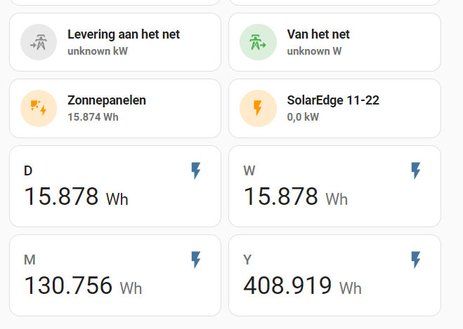
Edit: With this configuration it is necessary to create a helper sensor for the days, weeks, months and years. The helper is called utility meter, and is meant for this very purpose.

Thanks!

stats
SORRY now in english.
How Can i Change the values of the helpers. Now they start counting from teh moment i created them.

Would you guys mind writing in English? This is english forum and others would also like to understand your problems and solutionsā€¦thanks!

Sure, i am sorry for the dutch language

I am quite unsure, though I am very certain there is a way to set up a sensor or modify it in such a way that youā€™d be able to pull the right data. I canā€™t help you with that though as I have only been using HASS for the last 2 weeks and donā€™t know enough :sweat_smile: