šŸ”¹ Card-mod - Add css styles to any lovelace card

Not sure which one you mean. AFAIK there’s none: Material Symbols and Icons - Google Fonts

Also it’s a matter of not using 2 separate icon libraries, as other elements of the dashboard are using those icons and they’d be different. It’s quite confusing as well. AFAIK there’s mdi (Material Design Icons, the ones we can use everywhere in HA) but it’s not the same as these Material Icons that we can use in card-mod.

Thanks, but that way is too rough. Rather not do it. Bg was just an idea, but I refuse to believe there’s no way to use the standard mdi icons in any way. :S

You are right. I was looking at the google font library instead. Whoopps.
I do in general agree with also trying to remove yourself from google as much as possible, but unfortunately they kinda have a strangle hold on fonts and icons in web development for some reason…

Like i said if you have the svg values of the mdi you want it looks like its possible to set as a background image, example:
SmartSelect_20240101_120228_Home Assistant

type: custom:mushroom-template-card
icon: mdi:test-tube
icon_color: red
badge_icon: mdi:motion-sensor
badge_color: >-
  {{ iif(is_state('binary_sensor.presence_sensor_living_room_presence', 'on'),
  'blue', '') }}
card_mod:
  style: |
    mushroom-badge-icon:before {
      content: '';
      position: absolute;
      display: flex;
      justify-content: center;
      align-items: center;
      right: 32px;
      width: var(--mush-badge-size, 16px);
      height: var(--mush-badge-size, 16px);
      border-radius: var(--mush-badge-border-radius, 50%);
      background: rgba(var(--rgb-disabled), 1) !important;
      background-image: url('data:image/svg+xml,%3Csvg xmlns="http%3A%2F%2Fwww.w3.org%2F2000%2Fsvg" width="12" height="12" viewBox="-2 -2 22 22"%3E%3Cpath fill="white" d="M12 3c-1.11 0-2 .89-2 2H3v14H2v2h20v-2h-1V5c0-1.11-.89-2-2-2zm0 2h7v14h-7zm-7 6h2v2H5z"%2F%3E%3C%2Fsvg%3E') !important;
      background-repeat: no-repeat !important;
    }

Keep in mind with this its being imported from the below site instead of being self hosted.
https://icon-sets.iconify.design/mdi/door-open/

1 Like

You can refuse as much as you want :wink:
but the reason it wont be possible (at least without getting into overlapping multiple cards) is because the icon is usually a div on its own.

We cant create new divs with card mod, only pseudo elements. So no way to set an mdi on to it.

I did it. :wink:

card_mod:
  style: |
    mushroom-badge-icon:before {        
        position: absolute;
        display: flex;
        justify-content: center;
        align-items: center;
        right: 32px;
        line-height:0;

        {% if is_state('binary_sensor.living_room_door_contact','on') %}
        background: rgb(var(--rgb-blue));
        content: url('https://api.iconify.design/mdi/door-open.svg?color=white&width=12');
        {% else %}
        background: rgb(var(--rgb-grey));
        content: url('https://api.iconify.design/mdi/door-closed.svg?color=white&width=12');
        {% endif %}

        width: var(--mush-badge-size, 16px);
        height: var(--mush-badge-size, 16px);
        border-radius: var(--mush-badge-border-radius, 50%);
      }

It’s a compromise. Using your suggestion, instead of using the svg code, which is long and clutters the yaml, I rather use the CSS version. Much cleaner imo, and also easier to copy/paste and change icons just typing.

Also had to play with the color CSS since I didn’t want the main badge state to control the colour of the secondary badge, so you can’t use --main-color and cannot use ā€œyaml blueā€ either.

image
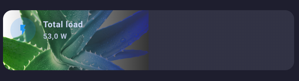
Here’s the result. Secondary badge with same behaviour for a diff entity.
The studio badge is the default one with mdi icon.
Only thing left bothering me is that slight vertical padding difference. Will try to adjust it now.
Edit: solved using line-height:0

1 Like

I know, everyone is aware, and so was I and I’m using card_mod: for a very long time.
But so long that some of my cards were still using the style: tag alone and I learned it the hard way when upgrading to 3.4.0.

So, as a reminder for whoever is like me and don’t pay attention to release notes:

@thomasloven thomasloven released this 5 days ago

v3.4.0

BREAKING:

The ancient (more than two years outdated) way of using card_mod:

 style: ...

has been removed.

Now only

 card_mod: 
   style: ...

works

3 Likes

With the card-mod breaking change from v3.4.0 my decluttering templates are broken and I can’t find a workaround / solution.

this worked until v3.4.0

decluttering_templates:
  bignumber_template_1:
    card:
      type: custom:bignumber-card
      entity: '[[entity]]'
      style: |
        #value {
          color: red;
        }
views:
  - title: Test
    cards:
      - type: custom:decluttering-card
        template: bignumber_template_1
        variables:
          - entity: sensor.test

I’ve even tried something like this

  bignumber_template_2:
    card:
      type: custom:mod-card
      card:
        type: custom:bignumber-card
        entity: '[[entity]]'
      card-mod:
        style: |
          #value {
            color: red;
          }
views:
  - title: Test
    cards:
      - type: custom:decluttering-card
        template: bignumber_template_2
        variables:
          - entity: sensor.test

It’s not only the bignumber-card, I have 3 dashboards and 5-6 different (custom) cards and none of them works with the decluttering card like before the 3.4.0 update. Does anybody have a good example for decluttering card and card mod? Or does anybody know how to fix this?

might seem like a dumb question, but have you tried just this:

decluttering_templates:
  bignumber_template_1:
    card:
      type: custom:bignumber-card
      entity: '[[entity]]'
      card_mod:
        style: |
          #value {
            color: red;
          }
views:
  - title: Test
    cards:
      - type: custom:decluttering-card
        template: bignumber_template_1
        variables:
          - entity: sensor.test

Yes I’ve tried that, would have been the most obvious solution, but that doesn’t work either.

I also know that decluttering is a bit special because it doesn’t generate a ha-card, but then I still don’t understand why it worked before.

did you fully clear your cache after updating? this exact setup works for me:
image

decluttering_templates:
  bignumber_template_1:
    card:
      type: custom:bignumber-card
      entity: '[[entity]]'
      card_mod:
        style: |
          #value {
            color: red;
          }
views:
  - title: Test
    cards:
      - type: custom:decluttering-card
        template: bignumber_template_1
        variables:
          - entity: sensor.all_standby_energy

thank you … I’m stupid … it’s: cardUNDERSCOREmod not cardMINUSmod :man_facepalming: :man_facepalming: :man_facepalming:

Hahaha, well that would certainly do it lol

Hi Everyone

Ive just updated to 3.4.1 this morning and the breaking changes said that
style:...
was being depricated and that

card-mod:
   style:

was taking its place.

I have about 200k lines of lovelace to go through to fix, a significant proportion of which uses card-mod and some cards just use the style: attribute natively within their own card (such as custom:button-card and custom:simple-thermostat)

How can I easily ā€œin bulkā€ determine where card-mod is being used (so I can update it) vs stuff I can ignore?

BTW: I upgraded with the full knowledge of the breaking changes

Could be a good reason for re-using a code.

UNDERSCORE

I hastily typed this on my phone this morning… LOLZ

apologies for the ā€œfat fingersā€

card_mod:
  style:

regardless - any ideas on how to bulk find all instances of the old card_mod: syntax???

1 Like

Also, In my slow effort of fixing

Can anyone help with the background image on simple clock card

This used to work - but now no background image

      - type: custom:simple-clock-card
        style: |
          ha-card {
              border: none; 
              box-shadow: none;
              background-image: url('/local/t1/buttons/button_medium_test1.png');
              background-size: cover;
                  }          
type: custom:simple-clock-card
card_mod:
  style: |
    ha-card {
    border: none !important; 
    box-shadow: none !important;
    background-image: url('/local/t1/buttons/button_medium_test1.png');
    background-size: cover;
     }

Thanks @derailius for attempting this however -

My ability to post accurately is inversely proportional to my New Years Day hangover…

I originally had tried

- type: custom:simple-clock-card
    card_mod:
      style: |
          ha-card {
              border: none; 
              box-shadow: none;
              background-image: url('/local/t1/buttons/button_medium_test1.png');
              background-size: cover;
                  }

but I posted ā€œold style: codeā€

Unfortunately this does not work which was why I originally posted. :frowning:

how to remove blue color? where does it come from if it’s not in the photo?

type: custom:stack-in-card
cards:
  - type: custom:mushroom-entity-card
    entity: sensor.total_load
    name: Total load
card_mod:
  style: |
    ha-card {
      --ha-card-border-width: 0;
      background: url('/local/images/aloe.png'), linear-gradient(to right, transparent, var(--card-background-color) 50%);
      background-size: 50% auto, cover;
      background-position: left;
      background-repeat: no-repeat;
      background-blend-mode: saturation;        
      width: 100%;
      top: 0px;
      height: 100px !important;
    }

You have a linear gradient with 50% being set to the card background color:

linear-gradient(to right, transparent, var(--card-background-color) 50%)

Try and use a different color in the var(--card-background-color) so like this for example and see what happens:

background: url('/local/images/aloe.png'), linear-gradient(to right, transparent, red 50%);

You should hopefully then be able to do what you want to do :slight_smile:

My card background color is dark gray
Naturally, I tried setting a different color and everything worked
but it’s very dark)