To be honest I’ve never bothered with anchors.
VSCode multi-line find and replace is making short work of it. I just have to be careful when some cards are indented more than others due to being in a stack.
To be honest I’ve never bothered with anchors.
VSCode multi-line find and replace is making short work of it. I just have to be careful when some cards are indented more than others due to being in a stack.
Hi
“config.entity” NOT works with Entities Card, the unique that I am been able to works is using specific entity, any ideas why “config.entity” is not working with my code?. I have a similar but with Glance Card and all is working fine
There is no entity in the configuration of the entities card. Try adding the style to the entities instead of the card itself. There’s an example in the readme.
Thanks for that information, now I can continue.
If I have the following code the bg color gets set:
entities:
  - entity: sensor.upper_freezer_temp
    color: blue
style: |
  ha-card {
    background-color: #0000ee
    }
font_size: 75
line_color: var(--accent-color)
line_width: 8
type: 'custom:mini-graph-card'
If I change it to the following it doesn’t work
entities:
  - entity: sensor.upper_freezer_temp
    color: blue
style: |
  ha-card {
    background-color: states('sensor.maintank_color')
    }
font_size: 75
line_color: var(--accent-color)
line_width: 8
type: 'custom:mini-graph-card'
sensor.maintank_color is an mqtt sensor whose values are colors in hex format including the #. If I look at the state of sensor.maintank_color using the developer tools the state is #0000ee. Is there any reason this shouldn’t work?
You need to enclose templates in “{{ }}”
background-color: "{{ states('sensor.maintank_color') }}"
Thank you. I don’t know if it’s a byproduct of using the Configure UI editor, but I had to omit the ".
So it literally looks like:
background-color: {{ states('sensor.maintank_color') }}
The documents on card mod templating just point to the home assistant templating docs. And as I didn’t see an example of a single line template on the card mod github page I just followed the HA format. Glad you worked it out.
i have these css code block i got from someone using a card and i cant for the life of me figue out why i have a line on the verey top, any chance you can take a look?
decluttering_templates:
  large_divider:
    default:
      - opacity: 0
    card:
      type: divider
      style:
        background-color: var(--secondary-text-color)
        height: 0px
        margin: 0px auto
        opacity: 0
        background: none
        box-shadow: none
  type: vertical-stack
- cards:
  type: custom:vertical-stack-in-card
  cards:
    - type: entities
      entities:
        - type: section
          label: Incoming
          style: |
            .divider { display: none; }
            .label { margin-top: 0; }
        - entity: sensor.mail_usps_mail
          type: custom:secondaryinfo-entity-row
          name: Mail
          secondary_info: >
            [[ sensor.stats_mail_this_week ]] item(s) this week
          tap_action:
            action: call-service
            service: browser_mod.popup
            service_data:
              title: 'Expected Mail'
              deviceID:
                - this
              card:
                type: custom:config-template-card
                entities:
                  - sensor.mail_usps_mail
                variables:
                  - states['sensor.mail_usps_mail'].last_updated
                card:
                  type: picture
                  image: '${"url-to-my/mail_today.gif?v=" + vars[0]}'
          hold_action:
            action: none
        - type: custom:decluttering-card
          template: large_divider
      style: |
        .card-content { padding-bottom: 0; }
4
https://imgur.com/a/BubbGGc
what it looks likeI’m trying to mod the input number so that it’s further to the left, mainly because on mobile/smaller screens, the box is being cut off.
I want it to look like the Base Heat one in the pic below. I got that to work (temporarily) by changing it in Elements. Obviously, it just resets itself and can’t get it to work in yaml.
This is what I have and I’m not sure how far off I am. I’ve got this much just by looking through previous comments on this forum and trying to figure out how it applies. The .card-header part is working but not the paper-input part. Please help.
- type: entities
  title: ''
  show_header_toggle: false
  state_color: true
  style:  |
      ha-card {
      }
      .card-header {
        font-size: var(--ha-card-header-font-size, 20px);
        letter-spacing: -0.012em;
        line-height: 20px;
        padding: 2px 40px 6px;
      }
      hui-input-number-entity-row:
        $:
          hui-generic-entity-row:
            $: |
                paper-input {
                  text-align: start;
                  margin-right: 20px;
                  width: 16%;
                }
  entities:
    - entity: input_number.aircon_temp_heat_base
      name: Base Heat
Hi everyone. First of all, thank you “thomasloven” for this absolutely essential card. I love it !
Here is an exemple in my config, but i would like to go further:

Does anybody knows how to “add” a grey opacity layer on top of the cover-art to match the media_player luminosity.
Here is my lovelace code:
      - type: conditional
        conditions:
          - entity: media_player.maison
            state_not: "unavailable"
          - entity: media_player.maison
            state_not: "off"
        card:
          type: custom:state-switch
          entity: deviceID
          states:
            'REDACTED':

              type: custom:stack-in-card
              style: |
                ha-card {
                  background: url({{state_attr("media_player.maison", "entity_picture_local")}});
                  --paper-listbox-background-color: black;
                  text-shadow: 1px 1px 0 #000;
                  --primary-text-color: rgb(250,250,250);
                  ha-card-box-shadow: "0px 5px 5px rgba(0,0,0,0.5)"
                  ha-card-background: "rgba(46, 51, 58, 0.6)"
                }
              mode: vertical
              cards:
                - type: custom:mini-media-player

                  entity: media_player.maison
                  artwork: cover
                  power_color: true
                  group: true
                  source: icon
                  info: short
                  hide:
                    volume: true
                - type: entities
                  entities:
                    - type: custom:mini-media-player
                      entity: media_player.hub
                      group: true
                      hide:
                        controls: true
                        power: true
                        icon: true
                        progress: true
                        info: true
                    - type: custom:mini-media-player
                      entity: media_player.salon
                      group: true
                      hide:
                        controls: true
                        power: true
                        icon: true
                        progress: true
                        info: true
                    - type: custom:mini-media-player
                      entity: media_player.chambre
                      group: true
                      hide:
                        controls: true
                        power: true
                        icon: true
                        progress: true
                        info: true
                - type: conditional
                  conditions:
                    - entity: media_player.chromecast_audio
                      state_not: "unavailable"
                    - entity: media_player.chromecast_audio
                      state_not: "off"
                  card:
                    type: custom:mini-media-player
                    entity: media_player.chromecast_audio
                    group: true
                    hide:
                      controls: true
                      power: true
                      icon: true
                      progress: true
                      info: true
Thank you for help.
Hi @thomasloven. Great mod! I just want to highlight that I think Your lovelace-card-mod example.yaml misses apostrophes (’) on line 291 for example. Or at least this is what works for me:
{% if is_state('switch.officelighttoggle', 'on') %} green {% endif %};
Your config.entity without apostrophes is misleading if Im right.
As states in the comment right above that that example makes use of the config variable, and thus shouldn’t use quotation marks.
Entity names should have quotes, variables shouldn’t, just like in any other template.
True. My mistake. Thank You
Hi,
as I am certainly not a programer and so I am cautiously asking for pardon, if I am asking a straight forward question - but I got stuck ein my understanding and need help, please.
I love the idea of card-mod and would like to use it extensively. So have installed card-mod and it is working 
But I am having challenges to use card-mod appropriately. Based on the explanation I understand to start with all cards via their ha-card (if available). Well, I am using the Thermostat card as follows:

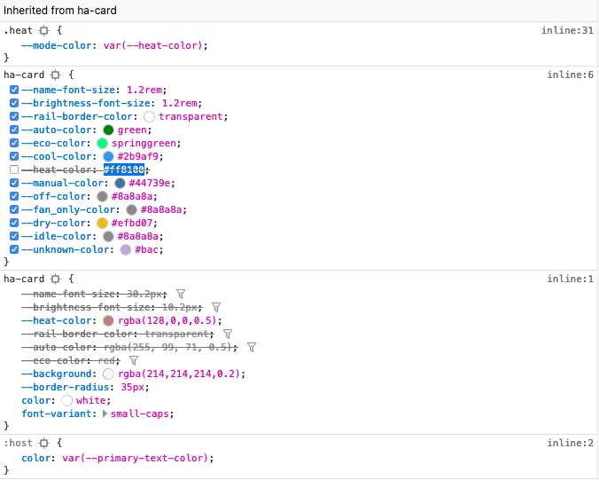
All good but I would like to change some of the colours, so I was opening the screen and used the Inspector of Firefox and had it showing me the CSS style definition for the round-slider. In the CSS definition I found following details:
Based on that I interpreted that for the heating indication the variable for the color is --heat-color, so I changed the heat-colour to some kind of maroon color, just for trying. But the definition is completely ignored, just as well as the different name-font-size, or other try outs.

However, the font-variant: small-caps is not being ignored but presented in the Inspector for CSS code in a different “segment”.
I am learning lots of new things here and have no clue about CSS but I am trying to do my best - why can I change some part of the CSS portion and some other not?
Any help highly appreciated!
Thanks!
opacity: 0.5%
edit: Cancel that. This will be tricky. You essentially need to add a layer on top of your card background. You may need to get inventive with cards for this one. Like a picture elements with a picture entity card behind a entities card. Where you change color of the background to black and make it have an alpha value.
Are you following the docs in regards to advanced configuration? There’s a debug tool helps you through the process. Also, right click the elements click copy-> copy selector and that should help you with the selector rows.
When overriding css variables, you need to maintain the variable name:
--heat-color: rgba(...)
Yes, I tried that before - the result was to ignore the definition like this:

I made an interesting observation: when I am deactivating the --heat-color on the top definition in the Inspector, my definition becomes valid and shows up:
Which could mean that somewhere in the process of lading the card, the yaml definition is overwritten by the original of the card.
Where could that happen?