If you mean my version - replaced icons stay persistent.
Using “id” is not an option.
FYI, I workarounded your grid issue.
1 Like
that is what I noticed yes, they keep changing.
it is too bad, because I have 4 tabbed cards on 1 view, and they all use the above card_mod style with an include.
I need to rewrite that now, because in all of my 4 tabbed cards , the icon changes now 
nice.
I added a comment: I believe the square: false should be inherited by/applied to the nested cards, so also by a nested grid…
Ask the author about a new option like “id_part”.
Then you will define smth like
id_part: devices #for a tab for devices
...
id_part: garden #for a tab for a garden
then the card will compose a new id = ${id_part + some_unique_number}.
And you may address tabs by an id containing your unique part.
Already done: [FR] Allow defining a part of id · kinghat/tabbed-card · Discussion #157 · GitHub
1 Like
yes, I will add a FR for that, however, Kinghat is not very active in adding features, so I wont keep my hopes up.
There already is a FR for allowing dynamic tabs since a long time, and he acknowledged, but postponed…
btw, my active icon is back using the correct spacing, I must have fluked above
card_mod 3.5.0 styling, so dont copy on 3.4.4!!
# tabbed-card style
style:
  .: |
    mwc-tab:hover {
      --mdc-theme-primary: var(--power-color);
      --mdc-tab-color-default: var(--power-color);
    }
    mwc-tab-bar {
      background: {{'var(--lovelace-background)'
                    if is_state('binary_sensor.donker_thema','on')
                    else 'var(--primary-color)'}};
    }
    mwc-tab:nth-child(4) ha-icon {
      --card-mod-icon:
          {{'mdi:coffee' if is_state('switch.espresso_keuken','on') else
            'mdi:coffee-off'}};
        }
  mwc-tab:
    $:
      mwc-tab-indicator $: |
       .mdc-tab-indicator__content--underline {
          border-color: var(--active-color) !important; /*override generic theme primary*/
        }

      .: |
        .mdc-tab {
          min-width: 80px;
        }
        .material-icons {
          display: contents !important;
        }

        .mdc-tab--active {
          --mdc-icon-size: {{states('input_number.active_icon_size')}}px;
          /*background: var(--text-color-off) !important;*/
        }
What I will do is create a dedicated !include styling per tabbed card, and only for the ones I like to use the dynamic icons in (most are fixed, well, for now )
It’s easy enough to add those dynamic icons now so it wont be much of an issue and only a bit more yaml. For the fun of it.
second tab on:

and off

even colorize them:
    mwc-tab:nth-child(2) ha-icon {
      --card-mod-icon:
          {{'mdi:coffee' if is_state('switch.espresso_keuken','on') else
            'mdi:coffee-off'}};
      --card-mod-icon-color:
          {{'var(--alert-color)' if is_state('switch.espresso_keuken','on') else
            'var(--success-color)'}};
      }


nice!
tighter template:
    mwc-tab:nth-child(2) ha-icon {
      {% set coffee = is_state('switch.espresso_keuken','on') %}
      --card-mod-icon:
          mdi:coffee{{'' if coffee else '-off'}};
      --card-mod-icon-color:
         var(-- {{'alert' if coffee else 'success'}}-color);
      }
Did FR already, and this change does not seem to be hard, may be will do it myself.
cool, ultimately it would be preferable if we could simply do it on the icon option itself, either as a template, or as a direct setting, much like custom:button-card
tabs:
  - card:
      !include /config/dashboard/includes/plattegrond/include_tab_bijkeuken.yaml
    attributes:
      icon: mdi:washing-machine
but I fear that would blow up the tabbed card resource… adding an id there and being able to reference that in the card-mod might be simplest?
I have defined mushroom-shape-icon in the theme css so it hides globally.
  card-mod-card: |
    mushroom-shape-icon {
      --shape-color: none !important;
      --shape-color-disabled: none !important;
    }
However, I want to enable it for a certain cards, by manually defining it for a each card. I tried this, but couldn’t get it to work. Any ideas please? thanks
card_mod:
  style:
    mushroom-shape-icon$: |
      .shape {
        background: initial !important;
       }
    mushroom-state-info$: |
      .container {
        width: 100%;
      }
      .secondary {
        color: gray !important;
      }
    .: |
      ha-card {
        border-radius: 25px;
        background: none !important;
      }
Hello
I want to ask for help. What am I doing wrong that makes the background not transparent?
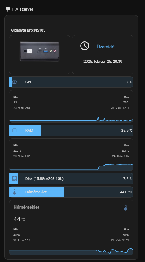
type: custom:config-template-card
variables:
  lemezhasznalat: states['sensor.system_monitor_lemezhasznalat'].state
  szabad_lemezterulet: states['sensor.system_monitor_szabad_lemezterulet'].state
  memorirahasználat: states['sensor.system_monitor_memoriahasznalat'].state
  processzorhasznalat: states['sensor.system_monitor_processzor_hasznalat'].state
  processzorhomerseklet: states['sensor.system_monitor_processzor_homerseklet'].state
entities:
  - sensor.system_monitor_lemezkihasznaltsag_szazalekban
  - sensor.system_monitor_szabad_lemezterulet
  - sensor.system_monitor_lemezhasznalat
  - sensor.system_monitor_memoriafelhasznalas
  - sensor.system_monitor_processzor_hasznalat
  - sensor.system_monitor_processzor_homerseklet
card:
  type: entities
  show_header_toggle: "off"
  style: |
    .card-header {
      padding: 0px 0px 0px 0px !important;
    }
  entities:
    - type: section
      label: ${ 'Gigabyte Brix N5105' }
    - type: custom:hui-element
      card_type: vertical-stack
      cards:
        - type: horizontal-stack
          cards:
            - type: picture
              style: |
                ha-card {
                    --paper-card-background-color: 'rgba(0, 0, 0, 0.0)';
                    --ha-card-background: 'rgba(0, 0, 0, 0.0)';
                    --ha-card-box-shadow: 'none';
                }
              image: /local/brix_photo.png
            - type: custom:button-card
              layout: icon_name
              show_icon: true
              show_state: true
              styles:
                grid: null
                card:
                  - "--ha-card-background": rgba(0, 0, 0, 0.0)
                  - "--ha-card-box-shadow": none
                icon:
                  - padding: 10px 0px 0px
                  - height: 40px
                  - width: 40px
                state:
                  - padding: 30px 10px 30px
                  - justify-self: center
                  - font-family: Roboto, sans-serif
                  - font-size: 14px
                name:
                  - padding: 19px 0px 0px
                  - justify-self: start
                  - color: "#2eb9ff"
              entity: sensor.uptime
              name: "Üzemidő:"
              icon: mdi:clock-outline
        - type: vertical-stack
          cards:
            - type: custom:bar-card
              show_icon: true
              align: split
              columns: 1
              max: 100
              icon: mdi:cpu-64-bit
              positions:
                icon: inside
                indicator: inside
                name: inside
                value: inside
              unit_of_measurement: "%"
              severity:
                - color: "#2eb9ff"
                  from: 0
                  to: 33
                - color: "#FFB732"
                  from: 34
                  to: 50
                - color: "#e67e00"
                  from: 51
                  to: 70
                - color: "#d11919"
                  from: 71
                  to: 100
                  severity: null
              animation:
                - state: "on"
                - speed: 10
              style: |
                ha-card {
                  --paper-card-background-color: 'rgba(0, 0, 0, 0.0)';
                  --ha-card-background: "rgba(0, 0, 0, 0.0)";
                  --paper-item-icon-color: 'var(--text-primary-color';
                  --ha-card-box-shadow: 'none';
                }
              entity: sensor.system_monitor_processzor_hasznalat
              name: CPU
              entity_row: true
        - type: custom:mini-graph-card
          height: 30
          line_width: 2
          font_size: 70
          hours_to_show: 168
          points_per_hour: 1
          show:
            extrema: true
            fill: true
            name: false
            icon: false
            state: false
          style: |
            ha-card {
              --ha-card-background: "rgba(0, 0, 0, 0.0)";
              --ha-card-box-shadow: 'none';
              border-radius: 5px;
            }
            .info.flex {
              font-size: 12px !important;
            }
          entities:
            - sensor.system_monitor_processzor_hasznalat
          name: CPU
          color_thresholds:
            - value: 33
              color: "#2eb9ff"
            - value: 50
              color: "#FFB732"
            - value: 70
              color: "#e67e00"
            - value: 71
              color: "#d11919"
        - type: vertical-stack
          cards:
            - type: custom:bar-card
              show_icon: true
              align: split
              columns: 1
              max: 100
              icon: mdi:memory
              positions:
                icon: inside
                indicator: inside
                name: inside
                value: inside
              unit_of_measurement: "%"
              severity:
                - color: "#2eb9ff"
                  from: 0
                  to: 33
                - color: "#FFB732"
                  from: 34
                  to: 50
                - color: "#e67e00"
                  from: 51
                  to: 70
                - color: "#d11919"
                  from: 71
                  to: 100
                  severity: null
              animation:
                - state: "on"
                - speed: 10
              style: |
                ha-card {
                  --paper-card-background-color: 'rgba(0, 0, 0, 0.0)';
                  --ha-card-background: "rgba(0, 0, 0, 0.0)";
                  --paper-item-icon-color: 'var(--text-primary-color';
                  --ha-card-box-shadow: 'none';
                }
              entity: sensor.system_monitor_memoriahasznalat
              name: RAM
              entity_row: true
        - type: custom:mini-graph-card
          height: 30
          line_width: 2
          font_size: 70
          hours_to_show: 168
          points_per_hour: 1
          show:
            extrema: true
            fill: true
            name: false
            icon: false
            state: false
          style: |
            ha-card {
              --ha-card-background: "rgba(0, 0, 0, 0.0)";
              --ha-card-box-shadow: 'none';
              border-radius: 5px;
            }
            .info.flex {
              font-size: 12px !important;
            }
          entities:
            - sensor.system_monitor_memoriahasznalat
          name: RAM
          color_thresholds:
            - value: 33
              color: "#2eb9ff"
            - value: 50
              color: "#FFB732"
            - value: 70
              color: "#e67e00"
            - value: 71
              color: "#d11919"
          cards: null
        - type: custom:bar-card
          show_icon: true
          align: split
          columns: 1
          max: 100
          icon: mdi:harddisk
          positions:
            icon: inside
            indicator: inside
            name: inside
            value: inside
          unit_of_measurement: "%"
          severity:
            - color: "#2eb9ff"
              from: 0
              to: 33
            - color: "#FFB732"
              from: 34
              to: 50
            - color: "#e67e00"
              from: 51
              to: 70
            - color: "#d11919"
              from: 71
              to: 100
              severity: null
          animation:
            - state: "on"
            - speed: 10
          style: |
            ha-card {
                --paper-card-background-color: 'rgba(0, 0, 0, 0.0)';
                --ha-card-background: "rgba(0, 0, 0, 0.0)";
                --paper-item-icon-color: 'var(--text-primary-color';
                --ha-card-box-shadow: 'none';
            }
          entities:
            - entity: sensor.system_monitor_lemezkihasznaltsag_szazalekban
          name: ${ 'Disk (' + lemezhasznalat + 'Gb/' + szabad_lemezterulet + 'Gb)' }
          entity_row: true
        - type: custom:bar-card
          show_icon: true
          align: split
          columns: 1
          max: 100
          icon: mdi:thermometer
          positions:
            icon: inside
            indicator: inside
            name: inside
            value: inside
          unit_of_measurement: °C
          severity:
            - color: "#2eb9ff"
              from: 0
              to: 55
            - color: "#FFB732"
              from: 56
              to: 65
            - color: "#e67e00"
              from: 66
              to: 75
            - color: "#d11919"
              from: 85
              to: 100
              severity: null
          animation:
            - state: "on"
            - speed: 10
          style: |
            ha-card {
                --paper-card-background-color: 'rgba(0, 0, 0, 0.0)';
                --ha-card-background: "rgba(0, 0, 0, 0.0)";
                --paper-item-icon-color: 'var(--text-primary-color';
                --ha-card-box-shadow: 'none';
            }
          entities:
            - entity: sensor.system_monitor_processzor_homerseklet
          name: Hőmérséklet
          entity_row: true
        - type: custom:mini-graph-card
          height: 30
          line_width: 2
          font_size: 70
          hours_to_show: 168
          points_per_hour: 1
          show:
            extrema: true
            fill: true
          style: |
            ha-card {
              --ha-card-background: "rgba(0, 0, 0, 0.0)";
              --ha-card-box-shadow: 'none';
              border-radius: 5px;
            }
            .info.flex {
              font-size: 12px !important;
            }
          entities:
            - sensor.system_monitor_processzor_homerseklet
          name: Hőmérséklet
          color_thresholds:
            - value: 50
              color: "#2eb9ff"
            - value: 65
              color: "#FFB732"
            - value: 75
              color: "#e67e00"
            - value: 85
              color: "#d11919"
Map card: show small pics for source device_trackers

code
type: map
entities:
  - ...
card_mod:
  style:
    ha-map $: |
      {% for entity in config.entities -%}
        {%- set PERSON = entity -%}
        {%- set TRACKER = state_attr(PERSON, 'source') -%}
        {%- set PICTURE = state_attr(TRACKER, 'entity_picture') -%}
        {%- if PICTURE is not none -%}
          ha-entity-marker[entity-id="{{entity}}"]:after {
            content: "";
            background: url({{PICTURE}});
            background-size: 100% 100%;
            left: 32px;
            bottom: 32px;
            position: absolute;
            width: 24px;
            height: 24px;
            border-radius: 50%;
            /* add if needed
            border: 1px solid var(--divider-color);
            */
          }
        {%- endif %}
      {%- endfor %}
Of course you may add other data into a badge like a “battery_level” etc.
Is it possible to style the contents of a iframe/webpage card?
I would love to have this page start scrolled up, and tweak some of the box sizing in it too.
I haven’t figured out how to target the css elements inside it.
type: iframe
url: https://www.goodsurfnow.co.nz/location/ocean_beach
aspect_ratio: 100%
grid_options:
  columns: full
  rows: 8
card_mod:
  style: |
    div.wrapper {
      margin-top -900px;
    }
Hi all! I´ve searched but could not find it. I’m sorry if this is elsewhere. I am looking to create a border around each SECTION that I have in my dashboard using Section layout.
Any idea on how to do this using card-mod?
Quite right - not sure how it got there, but removed. The rest works ok though!
Now, how does that work?
I would love to apply all the code to any textfiield/select area/textarea, which is underneath here, into some some sort of card-mod portion inside my theme, which does not seem to work:
If you want literally any text input… just do something like :host ha-textfield from card-mod-root-yaml. That should hit them all.
1 Like
those posts/questions really are for card-mod theming, so check the dedicated thread for that in this community. you’ll find a lot of suggestions there.
1 Like
Thank you!
2025.3:
new toggle feature for Tile! Mod it with this How to set border-radius on Tile card Features - #8 by Mariusthvdb
also, the statistics card (header) can now be modded out of the shadow root
# card-header statistics-graph
card_mod:
  style:
    .: |
      ha-card {
        box-shadow: var(--box-shadow);
      }

      .card-header {
         background: var(--background-color-off);
         font-weight: 400 !important;
         font-size: 20px !important;
         color: var(--text-color-off) !important;
         padding: 0px 12px !important;
         margin: 0px 0px 16px 0px !important;
      }

I’m trying to build a ‘card’ with many card inside it. For this I’ll be using custom:stack-in-card. Within the stack I’ll be using custom:layout-card to get the grid I want. In my example below I’m using a custom:mushroom-entity-card. My problem is, is that I can’t get rid of the background and border of the custom:mushroom-entity-card. Individually the card_mod seems to work, but once I incorporate the card in a custom:stack-in-card and custom:layout-card the card_mod doesn’t work anymore. I can’t figure out to solve this. Anyone got any tips?
(A few months ago this actually has worked …)

type: custom:stack-in-card
mode: vertical
cards:
  - type: custom:layout-card
    layout_type: grid
    layout:
      grid-template-columns: 46% 27% 27%
    cards:
      - type: custom:mushroom-entity-card
        entity: sensor.thermostat_day_setting
        primary_info: none
        fill_container: true
        icon_type: none
        card_mod:
          style: |
            ha-card {
              background-color: red !important;
              box-shadow: 0px 0px !important;
            }