Johan_L
September 4, 2025, 9:02am
9066
I came here to ask a question but, @tom_l GitHub - NemesisRE/kiosk-mode: 🙈 Hides the Home Assistant header and/or sidebar with this you have user level blocking on almost every part of a dashboard.
Now my question
I found that it should be .hand.minute and .hand.hour but i can’t get i working, dit anyone already managed this?
When i use developer tools and i change it hard in the css it works but can’t figure how it works with cardmod.
tom_l
September 4, 2025, 9:16am
9067
Hmm. Seems a bit like cracking a walnut with a sledgehammer.
Why don’t you give it a try. It is a real great tool.
Been using it for years and it is super robust.
Best of all, no need to tinker with card-mod
But yeah if you only need to hide those buttons in the header and won’t use any of the other features in Kiosk-mode, I guess a few lines of card-mod theme ing can do that for you too
( I have the new + button hidden with card-mod)
 ha-button-menu:nth-of-type(1) {
        display: none;
      }
But as you can see this is hard coded 1st element, so if they change anything ( and they probably will…) it needs adjusting. Again.
I would just use a custom JS module. I’ll send you an example…
1 Like
stefan1982
September 5, 2025, 4:06pm
9070
Could you post it here, although bot on topic… More people could benefit and learn from it.
MelleD
September 6, 2025, 5:10pm
9071
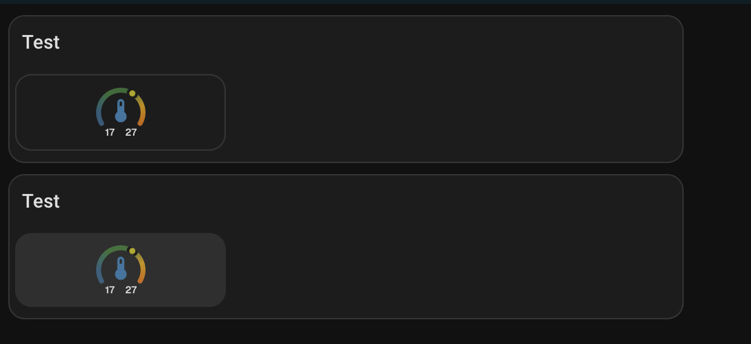
I’m currently trying to create a margin with card mod so that the cards have a small border. It currently looks like this.
This is how it should look. Unfortunately, I can’t reach that element with card mod.
This is the css element or hui-card which I need inside
Can anyone give me a hint? All my attempts have failed so far.
      - type: grid
        columns: 3
        square: false
        card_mod:
          style: |
            hui-grid-card$:
            .: |
              hui-card {
                background: teal;
                margin: 10px;
              }
MelleD:
background: teal;
Based off your posted info, it is not clear what you are trying to achieve. Please post the entire card code, not just a snippet.
An example
type: custom:mod-card
card_mod:
  style: |
    ha-card {
       background: teal;
       border: 2px solid red;
      }
card:
  type: grid
  cards:
    - type: custom:mushroom-template-card
      icon: mdi:mushroom
      icon_color: yellow
1 Like
MelleD
September 8, 2025, 9:31am
9073
I changed the grid layout to the custom:layout-card then it works.
type: custom:layout-card
layout_type: custom:grid-layout
type: custom:vertical-stack-in-card
  cards:
    - type: custom:mushroom-template-card
      primary: "Test"
    - type: custom:layout-card
      layout_type: custom:grid-layout
      layout:
          grid-template-columns: 33% 33% 33%
          grid-template-rows: auto
          margin: 0px
          padding: 0px
      cards:
          - type: custom:mod-card
            card_mod:
              style: |
                ha-card {
                  background: rgba(var(--rgb-primary-text-color), 0.05);
                  border-radius: var(--ha-card-border-radius,12px);
                  box-shadow: none;
                  border: none;
                  margin: 0px;
                }
            card:
              type: custom:ring-tile
MelleD:
- type: custom:mod-card
From what you have shared, there is no need to use - type: custom:mod-card
MelleD
September 8, 2025, 10:46am
9075
Ok let me check if it works without
EDIT: Nope without card mod is not working
    - type: custom:layout-card
      layout_type: custom:grid-layout
      ...
      cards:
        - type: custom:mod-card
          card_mod:
            style: !include ../card_mod_template/tile_card_style_template.yaml
          card:
            type: custom:ring-tile
             ...
        - type: custom:ring-tile
          card_mod:
            style: !include ../card_mod_template/tile_card_style_template.yaml
These are most likely are influencing the CSS.
Using - type: custom:mod-card is generally a last resort. You can attack most card mods directly…
MelleD
September 8, 2025, 11:04am
9077
This just the card mod css from, that I can reuse it for every tile card. Don’t like copy paste
  ha-card {
      background: rgba(var(--rgb-primary-text-color), 0.05);
      border-radius: var(--ha-card-border-radius,12px);
      box-shadow: none;
      border: none;
      margin: 0px;
  }
But how I said without card_mod card is not working. Not sure what I should try?
My understanding is type:mod-card should only be used for cards when a direct mod doesn’t override the CSS.
Source info
Ring Tile doesn’t fall into that category…
type: custom:ring-tile
entity: sensor.xxxx
card_mod:
  style: |
    ha-card {
      background: red;
      border-radius: var(--ha-card-border-radius,12px);
      box-shadow: none;
      border: none;
      margin: 0px;
     }
MelleD
September 8, 2025, 11:33am
9079
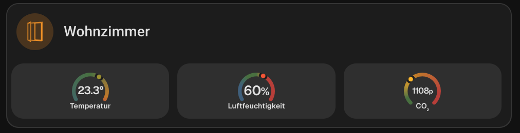
Yes alone it works, but with the combination vertical-stack-in then grid-layout it’s not working.
I think it don’t reach the shadow root.
Post your latest code.
If you are using these
MelleD
September 8, 2025, 12:50pm
9081
This is not working
      - type: custom:vertical-stack-in-card
        cards:
          - type: custom:mushroom-template-card
            primary: "Test"
            card_mod:
              style: |
                ha-card {
                    padding-bottom: 0px !important;
                  }
          - type: custom:layout-card
            layout_type: custom:grid-layout
            layout:
              grid-template-columns: 33% 33% 33%
              grid-template-rows: auto
              margin: 0px
              padding: 0px
            cards:
              - type: custom:ring-tile
                entity: sensor.xxx
                ring_only: true
                card_mod:
                  style: |
                    ha-card {
                        background: rgba(var(--rgb-primary-text-color), 0.05);
                        border-radius: var(--ha-card-border-radius,12px);
                        box-shadow: none;
                        border: none;
                        margin: 0px;
                    }
This is working only the card_mod card
- type: custom:vertical-stack-in-card
cards:
- type: custom:mushroom-template-card
primary: "Test"
card_mod:
style: |
ha-card {
padding-bottom: 0px !important;
}
- type: custom:layout-card
layout_type: custom:grid-layout
layout:
grid-template-columns: 33% 33% 33%
grid-template-rows: auto
margin: 0px
padding: 0px
cards:
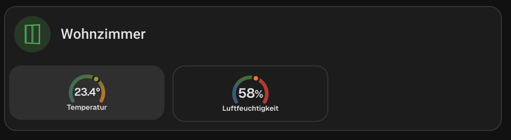
- type: custom:ring-tile
entity: sensor.wohnzimmer_temperatur
ring_only: true
card_mod:
style: |
ha-card {
background: rgba(var(--rgb-primary-text-color), 0.05);
border-radius: var(--ha-card-border-radius,12px);
box-shadow: none;
border: none;
margin: 0px;
}
- type: custom:vertical-stack-in-card
cards:
- type: custom:mushroom-template-card
primary: "Test"
card_mod:
style: |
ha-card {
padding-bottom: 0px !important;
}
- type: custom:layout-card
layout_type: custom:grid-layout
layout:
grid-template-columns: 33% 33% 33%
grid-template-rows: auto
margin: 0px
padding: 0px
cards:
- type: custom:mod-card
card_mod:
style: |
ha-card {
background: rgba(var(--rgb-primary-text-color), 0.05);
border-radius: var(--ha-card-border-radius,12px);
box-shadow: none;
border: none;
margin: 0px;
}
card:
type: custom:ring-tile
entity: sensor.xxx
ring_only: true
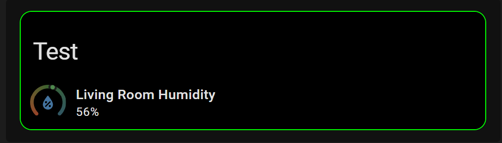
An example:
type: custom:vertical-stack-in-card
cards:
  - type: custom:mushroom-title-card
    title: Test
    card_mod:
      style: |
        ha-card {
         background: black !important;
        }

  - type: custom:ring-tile
    entity: sensor.living_room_humidity
    card_mod:
      style: |
        ha-card {
         background: black !important;
         }
card_mod:
  style: |
    ha-card {
      border: 1px solid lime;
     }
Stacking a grid card in a vertical stack is not necessary for most scenarios.
I am still confused on your end goal??
MelleD
September 8, 2025, 1:33pm
9083
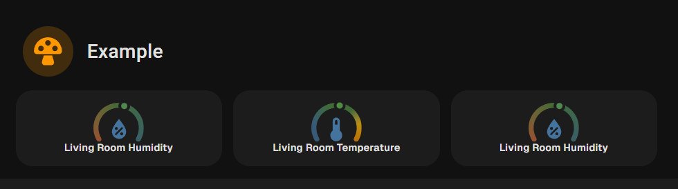
I use the grid layout because in the end I have 3 columns. This was just for a MRE
The end goal is this layout
type: vertical-stack
cards:
  - type: custom:mushroom-template-card
    icon: mdi:mushroom
    icon_color: orange
    primary: Example
    card_mod:
     style: |
       ha-card{
       background: none;
         }
  - type: custom:layout-card
    layout_type: custom:grid-layout
    layout:
      grid-template-columns: 1fr 1fr 1fr
      margin: -15px 0
    cards:
      - type: custom:ring-tile
        entity: sensor.living_room_humidity
        ring_only: true
        bottom_element: name
      - type: custom:ring-tile
        entity: sensor.living_room_temperature
        ring_only: true
        bottom_element: name
      - type: custom:ring-tile
        entity: sensor.living_room_humidity
        ring_only: true
        bottom_element: name
No need for - type: custom:mod-card
1 Like
image969
September 8, 2025, 3:05pm
9085
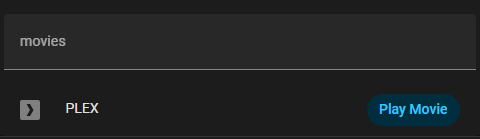
Hello,
Ever since I updated from 2025.7 to 2025.9 my run button inside my entities card, now has this ugly blue background and the text color is no longer changing ( I had it gray). Can someone please tell me what I can do to target the action-name, button label or whatever this is called, to correct it?
Thanks in advance
type: entities
    entities:
      - type: call-service
        name: PLEX
        icon: mdi:plex
        action_name: Play Movie
        service: script.plex_stream_alayna_2
    card_mod:
      style: |
        ha-card {
        --card-mod-icon-color: grey;
        --card-mod-button: grey;
        padding: 0px 10px 0px 0px;
        margin: -30px 0px -10px 0px;
 In the new upgrade the default clock card got some nice updates but i would like to change the styles of the hands and ticks. (color and opacity)


 The shadow-root isn’t an issue