Holy it works, i feel i already tried this but the smallest mistake …
Thank u so much
Holy it works, i feel i already tried this but the smallest mistake …
Thank u so much
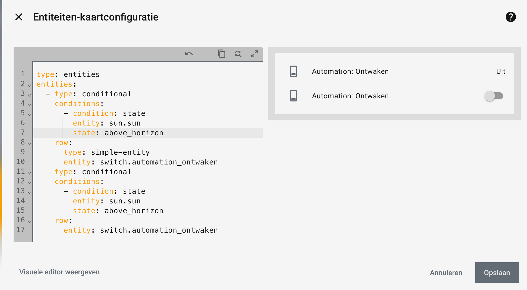
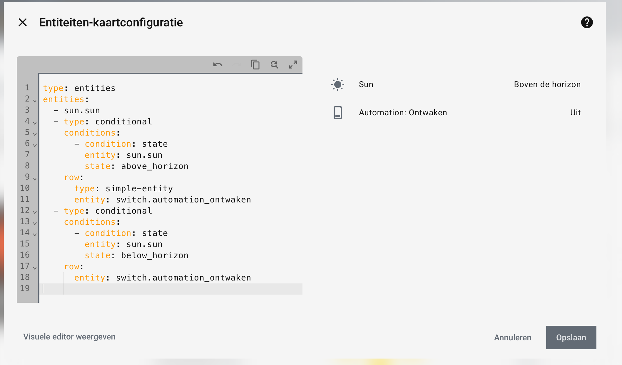
you can hide/show those toggles in native HA also using a type: simple-entity
      type: simple-entity
      entity: switch.automation_ontwaken
that is by far the most robust technique, as it will always be supported in HA and support is up to HA Frontend team.
Those hui-generic-entity-rows get changed every now and then leaving us with fixing the stylings when we use card-mod or other custom stuff …
Posting also here, as a 1 time cross-post I did in card-mod theme thread
Update: see 💡 UI eXtension - Add CSS styles to (almost) any part of the Home Assistant UI
for the new UIX integration by @dcapslock as drop in replacement for card-mod plugin.
Read all about it at https://uix.lf.technology/ which is still a work in progress
This should have been done in the very beginning half a year ago:
Were you able to find anything? I’ve kept trying and haven’t found it. Thanks in advance. Best regards.
card_mod:
  style:
    hui-energy-period-selector $: |
      .header-title {
        font-size: 14px;
      }
if you have non-yaml style at the moment place that under key .:
First of all, thank you for your work. I haven’t been able to reply sooner due to work commitments and because I hadn’t tested it. I’ve tried several methods and it still doesn’t work, so I’ll leave it as is for now. Thank you very much for your time. Best regards.
Are you trying to alter the built in energy dashboard or your own energy dashboard?
No, my own panel is a bubble card popup that simply displays electricity energy, and the date picker comes by default with a very large font and it ends up on two lines, and that’s annoying.
I’ve created some buttons to turn on different scenes.
Tried to get a modern look.
This is the bigger round buttons:
type: custom:button-card
name: Bright
icon: mdi:brightness-5
tap_action:
  action: call-service
  service: scene.turn_on
  service_data:
    entity_id: scene.<YOUR-SCENE-NAME>
show_state: false
styles:
  card:
    - border-radius: 50%
    - height: 90px
    - width: 90px
    - padding: 0
    - display: grid
    - place-items: center
    - backdrop-filter: blur(10px)
    - background: rgba(15,35,55,0.55)
    - box-shadow: |
        8px 8px 18px rgba(0,0,0,0.6), -8px -8px 18px rgba(80,140,200,0.15)
    - border: 1px solid rgba(255,255,255,0.08)
    - transition: all 0.15s ease
  icon:
    - width: 42px
    - color: "#FFD76A"
  name:
    - font-size: 14px
    - font-weight: 600
    - color: "#e6f2ff"
    - padding-bottom: 10px
extra_styles: |
  ha-card:active {
    transform: translateY(2px);
    box-shadow:
      inset 6px 6px 12px rgba(0,0,0,0.6),
      inset -6px -6px 12px rgba(80,140,200,0.15) !important;
  }
This is the the smaller buttons underneath: (used to controll Philips festavia string lights)
On-Off button
type: custom:button-card
entity: light.festavia_string_lights_1
show_name: false
name: xmas lights
color: "#FF4500"
show_icon: true
show_state: false
tap_action:
  action: toggle
  service: light.turn_on
  target:
    device_id: d1de6**censored**786b
  data:
    effect: none
icon: mdi:power
size: 40px
card_mod:
  style: |
    ha-card {
      background: rgba(15,35,55,0.55);
      backdrop-filter: blur(8px);
      -webkit-backdrop-filter: blur(8px);
      border-radius: 50px;
      border: 1px solid rgba(255,255,255,0.08);
      box-shadow:
        4px 4px 10px rgba(0,0,0,0.6),
        -4px -4px 10px rgba(80,140,200,0.12);
      padding: 6px 14px;
      transition: all 0.15s ease;
    }

    ha-card:active {
      box-shadow:
        inset 4px 4px 8px rgba(0,0,0,0.6),
        inset -4px -4px 8px rgba(80,140,200,0.12);
      transform: translateY(1px);
    }
Scene switch button
type: custom:button-card
entity: light.festavia_string_lights_1
show_name: false
name: Candle
color: "#FFD700"
show_icon: true
show_state: false
tap_action:
  action: call-service
  service: light.turn_on
  target:
    device_id: d1de6**censored**786b
  data:
    effect: candle
icon: mdi:candle
size: 40px
card_mod:
  style: |
    ha-card {
      background: rgba(15,35,55,0.55);
      backdrop-filter: blur(8px);
      -webkit-backdrop-filter: blur(8px);
      border-radius: 50px;
      border: 1px solid rgba(255,255,255,0.08);
      box-shadow:
        4px 4px 10px rgba(0,0,0,0.6),
        -4px -4px 10px rgba(80,140,200,0.12);
      padding: 6px 14px;
      transition: all 0.15s ease;
    }

    ha-card:active {
      box-shadow:
        inset 4px 4px 8px rgba(0,0,0,0.6),
        inset -4px -4px 8px rgba(80,140,200,0.12);
      transform: translateY(1px);
    }
You should really use button-card s own wealth in styling options, and prevent using card-mod there as much as possible.
The past has proven that combination unfavorably, though I’m not saying it is impossible of course 
Can you share your bubble card config?
Hi @Ildar_Gabdullin , your code to hide the name and reduce the hight of the box as well as to remove the underline was working perfectly until the last update, so I was wondering if there is a new way to do that, I hope so? I’m not that experimented to use the inspector, so I gave it a try without success. I wonder if somebody has solved this and can help me. Many thanks!
Yes, it was broken due to a recent redesign of ha-select.
Will give you a working code soon.
(may be even update the main thread for ha-select, but not soon; in fact, this is a patch work…)
Try:
type: entities
entities:
  - entity: input_select.test_value
    card_mod:
      style:
        ha-select $ ha-picker-field $: |
          ha-combo-box-item {
            --md-list-item-one-line-container-height: 40px !important;
            --md-list-item-two-line-container-height: 40px !important;
          }
          span[slot="overline"] {
            display: none;
          }
where one of those vars can be removed - experiment)))
Also, try w/o important (cannot test myself right now).
Great it’s working very well! You only need the --md-list-item-two-line-container-height var and you need to add important!
Is there a way to hide the underline? It only shows up when clicked to select…
The following is the old code:
ha-select $: |
  .mdc-line-ripple::before,
  .mdc-line-ripple::after {
    border-bottom-style: none !important;
  }
And finally, to justify the text to start?
Many thanks!
Again untested, try to add this to the style (host = ha-select):
:host {
  --mdc-text-field-idle-line-color: transparent;
}
It should work at least for not-selected input.
As for a selected input - need to dig in, do not remember.
You’re right, I already had that variable which seems that didn’t change… In fact the following are all the variables I’m using, but none of them hides the underline when clicking the input_select:
:host {
--mdc-text-field-fill-color: transparent;
--mdc-select-fill-color: transparent;
--mdc-text-field-idle-line-color: transparent;
--mdc-text-field-hover-line-color: transparent;
--mdc-select-idle-line-color: transparent;
--mdc-select-hover-line-color: transparent;
}
As you can see in the image below, there is an underline when the text is selected and the text is centered instead of left aligned...

PD: by some reason I cannot upload a screen capture?
Many thanks!!
@Ildar_Gabdullin If I add “align-self: start” to the following rule in the inspector, the text is left aligned, but I don’t know how to add this variable to card-mod?:
.default-slot, .text ::slotted(*) {
    overflow: hidden;
    text-overflow: ellipsis;
    align-self: start;
}
Many thanks!
Please post a picture to show what you wish to align.