I am preparing a dedicated post for picture-elements card.
Hope it will be ready within a week.
What do you need particularly?
Some effects may be done using a "picture-elements::element::style" (not by "card-mod").
I am preparing a dedicated post for picture-elements card.
Hope it will be ready within a week.
What do you need particularly?
Some effects may be done using a "picture-elements::element::style" (not by "card-mod").
I’m glad to hear that, waiting for that post …
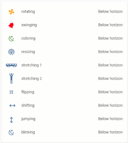
for example, make it rotate the icon of an input number into a custom: slider-entity-row card or de icon of type: state-badge
I have tried it with card mod and I have not got any, I do not clarify much either, so I really appreciate all your examples
Thanks again
I finally got it …
              elements:
                - type: custom:slider-entity-row
                  entity: input_number.zone_1
                  card_mod :
                    style:
                      hui-generic-entity-row:
                        $:
                          state-badge:
                            $:
                              ha-icon:
                                $: |
                                  ha-svg-icon {
                                    {% if is_state('timer.timer_1','active') %}
                                    animation: flipping 3s linear infinite;
                                    {% endif %}
                                  }
                                  @keyframes flipping {
                                    0% {
                                      transform: rotateX(0deg);
                                    }
                                    100% {
                                      transform: rotateX(360deg);
                                    }
                                  }
                  style:
                    top: 30%
                    left: 50%
waiting for your new post… 
The first post isn’t really visible, though.
That is right, but anyway we cannot solve everyone’s problems if some people are not even trying to search a solution…
Also, people do not read docs - very often I see posts like “I tried smth but it does not work - why?!” - and this “smth” is even not described in docs as a supported feature; sometimes people invent new properties or take properties from other cards and ask questions like “why this property does not work?”.
Sorry for my broken English, in Russian I speak better…
sharing a little snippet that makes cameras have a red outline when motion is detected
  - aspect_ratio: '16:9'
    camera_image: camera.north_roof
    entities:
      - entity: binary_sensor.motion_north_roof
      - entity: sensor.motion_recording_north_roof
      - entity: binary_sensor.kitchen_exit
    title: NORTH SIDE
    type: picture-glance
    card_mod:
      style: |
        ha-card {
          color: red;
          outline: {% if is_state('binary_sensor.motion_north_roof', 'on') %} solid {% else %} none {% endif %};
        }

I’m using card-mod nicely, but recently I had to try to use mod-card to customize a vertical-stack, but I got this error:
type: custom:mod-card
style:
  hui-vertical-stack-card: null
  $: |
    #root > * {
    margin: 0px 0 0px 0;
    }
  card:
    type: vertical-stack
    cards:
      - type: entity
        entity: sensor.processor_temperature
        name: CPU Temp.
        icon: 'mdi:thermometer'
      - type: entity
        entity: sensor.processor_temperature
        name: CPU Temp.
        icon: 'mdi:thermometer'
      - type: entity
        entity: sensor.processor_temperature
        name: CPU Temp.
        icon: 'mdi:thermometer'
Your indentation is off. The card definition should be less indented as a whole.
Also check the docs regarding the new syntax if you’re using the latest version of card-mod.
I have a fairly complex UI for my irrigation system

Before I post any code and waste anyone’s time I wanted to check if it is likely to be possible to solve my two small issues.


Thanks for any help and I am more than happy to post the code if it might be worthwhile.
please post the code
By all means if you think you might have an insight as to why I have these issues.
If you just want to see it, it is on my GitHub and I’m happy to link to it.
But it is quite a lot of code to clog up this thread with just for interest.
Hello sorry for disturbing you, but i searched everywhere i didnt found any answer.
Where i have to copy the code to customize badges ? I dont find any code editor for badges.
Thanks a lot for helping
Select your view with badges, switch to edit mode:
Select “Raw config editor”:

Scroll down to your view with badges, put required styles:
Ohhhh, Raw config editor ! This is what i missed.
Thanks a lot !!! 
Racking my brain on how I can use card_mod to move mini-media-players progress bar from the bottom, to the top of the player.
Heres what I have so far, but no dice:
card_mod:
  style:
    .mmp__container mmp-progress:
      $: |
        .mmp-progress {
          top: 0px;
          bottom: none;
        }
Anyone more experienced with CSS have any ideas?
Never mind, I got it to work by changing this:
          style:
            .mmp__container mmp-progress:
              $: |
                div.mmp-progress {
                  top: 0px;
                  bottom: unset;
                }
hi, can you tell me how did you integrate the Vocolinc humidifier? I have the Mistflow, I have had it integrated before but after I had to reset it, I’m just unable to add it again. Thanks!
It’s not the vocolink humidifer that I integrated , it’s just the vocolink switch who control my basic humidifier for on or off.
Styling "restriction-card":
Vertical alignment of the “lock” icon:
I found old post regarding "restriction-card".
There is another option to align the “lock” icon for "multiple-entity-row":
    style: |
      div#overlay {
        align-items: center;
      }
How it works - check the example below: there are 4 identical rows:
"secondary_info", 1 w/o it);"secondary_info", 1 w/o it).In all rows w/o card-mod the “lock” icon is not vertically aligned.
type: entities
entities:
  - type: 'custom:restriction-card'
    style: |
      div#overlay {
        align-items: center;
      }
    row: true
    card:
      type: 'custom:multiple-entity-row'
      entity: sun.sun
      entities:
        - entity: sun.sun
        - entity: sun.sun
          name: false
          icon: true
        - entity: sun.sun
          toggle: true
      name: normal + card-mod
      show_state: false
      secondary_info: last-changed
  - type: 'custom:restriction-card'
    style: |
      div#overlay {
        align-items: center;
      }
    row: true
    card:
      type: 'custom:multiple-entity-row'
      entity: sun.sun
      entities:
        - entity: sun.sun
        - entity: sun.sun
          name: false
          icon: true
        - entity: sun.sun
          toggle: true
      name: normal + card-mod
      show_state: false
  - type: 'custom:restriction-card'
    row: true
    card:
      type: 'custom:multiple-entity-row'
      entity: sun.sun
      entities:
        - entity: sun.sun
        - entity: sun.sun
          name: false
          icon: true
        - entity: sun.sun
          toggle: true
      name: normal
      show_state: false
      secondary_info: last-changed
  - type: 'custom:restriction-card'
    row: true
    card:
      type: 'custom:multiple-entity-row'
      entity: sun.sun
      entities:
        - entity: sun.sun
        - entity: sun.sun
          name: false
          icon: true
        - entity: sun.sun
          toggle: true
      name: normal
      show_state: false

Other styles - managed by theme variables:
For rows - check the example below:
type: entities
entities:
  - type: 'custom:restriction-card'
    row: true
    card:
      entity: sun.sun
      name: default styles
      secondary_info: last-changed
  - type: 'custom:restriction-card'
    restrictions:
      block: true
    row: true
    card:
      entity: sun.sun
      secondary_info: last-changed
    style: &ref_style |
      :host {
        --restriction-lock-icon-size: 18px;
        --restriction-regular-lock-color: var(--accent-color);
        --restriction-success-lock-color: green;
        --restriction-lock-row-margin-left: 24px;
      }
  - type: 'custom:restriction-card'
    restrictions:
      pin:
        code: 1234
    row: true
    card:
      entity: sun.sun
      secondary_info: last-changed
    style: *ref_style
  - type: 'custom:restriction-card'
    row: true
    style: *ref_style
    card:
      entity: sun.sun

For cards - check the example below:
type: vertical-stack
cards:
  - type: custom:restriction-card
    card:
      type: entities
      title: Default styles
      entities:
        - entity: sun.sun
        - entity: sun.sun
  - type: custom:mod-card
    style: |
      restriction-card {
        --restriction-lock-icon-size: 18px;
        --restriction-regular-lock-color: var(--accent-color);
        --restriction-success-lock-color: green;
      }
    card:
      type: custom:restriction-card
      card:
        type: entities
        title: Changed styles
        entities:
          - entity: sun.sun
          - entity: sun.sun

Using a decluttering template:
Since the "restriction-card" may be used in many places of your HA setup, it could be a good idea to use a "decluttering-card" for that (described here with examples).
Here is an upgraded version of the decluttering template - with "card-mod" support:
  decl_restriction_card_row:
    default:
      - VALUE_ROW: false
      - STYLE_CARD_ROW: ''
    card:
      type: 'custom:mod-card'
      style:
        restriction-card:
          $:
            'div#card': '[[STYLE_CARD_ROW]]'
            .: |
              div#overlay {
                {% if [[VALUE_ROW]] == true %}
                align-items: center;
                {% endif %}
              }
          .: |
            restriction-card {
              --restriction-lock-icon-size: 16px;
              --restriction-regular-lock-color: var(--accent-color);
              --restriction-success-lock-color: green;
              --restriction-lock-row-margin-left: 24px;
            }
      card:
        type: 'custom:restriction-card'
        restrictions:
          pin:
            code: 1234
            text: Введите PIN для разблокировки
            retry_delay: 3
            max_retries: 3
            max_retries_delay: 10
        action: hold
        duration: 10
        row: '[[VALUE_ROW]]'
        card: '[[CARD_OR_ROW]]'
This template has 3 types of styles:
How to use the template:
type: entities
title: Default styles (rows)
entities:
  - type: 'custom:decluttering-card'
    template: decl_restriction_card_row
    variables:
      - VALUE_ROW: true
      - CARD_OR_ROW:
          entity: sun.sun
          name: default styles
          secondary_info: last-changed
  - type: 'custom:decluttering-card'
    template: decl_restriction_card_row
    variables:
      - VALUE_ROW: true
      - CARD_OR_ROW:
          type: 'custom:multiple-entity-row'
          entity: sun.sun
          entities:
            - entity: sun.sun
            - entity: sun.sun
              name: false
              icon: true
            - entity: sun.sun
              toggle: true
          name: default styles
          show_state: false
          secondary_info: last-changed

For cards:
type: 'custom:decluttering-card'
template: decl_restriction_card_row
variables:
  - CARD_OR_ROW:
      type: entities
      title: Default styles (card)
      entities:
        - entity: sun.sun
        - entity: sun.sun
          secondary_info: last-changed

"restriction-card":type: vertical-stack
title: Style as a part of card definition
cards:
- type: 'custom:decluttering-card'
template: decl_restriction_card_row
variables:
- CARD_OR_ROW:
type: entities
entities:
- entity: sun.sun
secondary_info: last-changed
- entity: sun.sun
secondary_info: last-changed
style: |
ha-card {
color: red;
}
- type: 'custom:decluttering-card'
template: decl_restriction_card_row
variables:
- CARD_OR_ROW:
type: entities
entities:
- entity: sun.sun
secondary_info: last-changed
- entity: sun.sun
secondary_info: last-changed
style:
hui-text-entity-row:
$:
hui-generic-entity-row $: |
.text-content:not(.info) {
color: red;
}

"restriction-card":decluttering-card definition;Method 1:
Need to specify a full path to the row:
type: entities
entities:
  - type: 'custom:decluttering-card'
    template: decl_restriction_card_row
    variables:
      - VALUE_ROW: true
      - CARD_OR_ROW:
          entity: sun.sun
          secondary_info: last-changed
    style:
      mod-card$.type-custom-mod-card restriction-card$:
        'div#card hui-text-entity-row$': |
          hui-generic-entity-row$: |
            .text-content:not(.info) {
              color: red;
            }

Method 2:
Need to specify a style as an input variable:
type: vertical-stack
title: Style as an input variable
cards:
  - type: custom:decluttering-card
    template: decl_restriction_card_row
    variables:
      - VALUE_ROW: true
      - CARD_OR_ROW:
          entity: sun.sun
          name: style passed to decluttering
          secondary_info: last-changed
      - STYLE_CARD_ROW:
          hui-text-entity-row$:
            hui-generic-entity-row$: |
              .text-content:not(.info) {
                color: cyan;
              }

  - type: custom:decluttering-card
    template: decl_restriction_card_row
    variables:
      - VALUE_ROW: true
      - CARD_OR_ROW:
          type: custom:multiple-entity-row
          entity: sun.sun
          entities:
            - entity: sun.sun
            - entity: sun.sun
              name: false
              icon: true
            - entity: sun.sun
              toggle: true
          name: style passed to decluttering
          show_state: false
          secondary_info: last-changed
      - STYLE_CARD_ROW:
          multiple-entity-row$hui-generic-entity-row:
            $: |
              state-badge {
                color: magenta;
              }
            .: |
              div.entity:nth-child(2) state-badge {
                color: red;
              }

Method 2 may be used for styling cards too. But I would recommend to specify a style as a part of card definition (see above).
Custom background:
post


More examples are described here.