šŸ”¹ Card-mod - Super-charge your themes!

Styling sidebar

Some time ago I realized that undocumented "card-mod-sidebar" is supported.
Here some examples of useful / useless styles.

Styling ā€œmenuā€ button:
ŠøŠ·Š¾Š±Ń€Š°Š¶ŠµŠ½ŠøŠµ

  card-mod-sidebar-yaml: |
    .: |
      .menu ha-icon-button {
        color: red !important;
        --mdc-icon-size: 10px;
      }
      .menu .title {
        color: cyan;
      }

Additional info instead of the ā€œmain titleā€:
ŠøŠ·Š¾Š±Ń€Š°Š¶ŠµŠ½ŠøŠµ

  card-mod-sidebar-yaml: |
    .: |
      .menu .title {
        display: none !important;
      }
      .menu:after {
        content: "Issues: {{states('input_number.test_number_2')|float(default=0)|round(0)}}";
        margin-left: 16px;
      }

Here "input_number.test_number_2" stands for a number of HA issues.
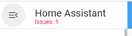

Additional info below the ā€œmain titleā€:
If some HA issues detected:
ŠøŠ·Š¾Š±Ń€Š°Š¶ŠµŠ½ŠøŠµ
If no issues:
ŠøŠ·Š¾Š±Ń€Š°Š¶ŠµŠ½ŠøŠµ

  card-mod-sidebar-yaml: |
    .: |
      .menu .title:after {
        content: "{% if states('input_number.test_number_2')|float(default=0) > 0 -%}
                  \A Issues: {{states('input_number.test_number_2')|float(default=0)|round(0)}}
                  {%- endif %}";
        white-space: pre;
        font-size: 12px;
        display: block;
        line-height: 4px;
        color: red;
      }

Sidebarā€™s background & icons:
ŠøŠ·Š¾Š±Ń€Š°Š¶ŠµŠ½ŠøŠµ

  card-mod-sidebar-yaml: |
    .: |
      :host {
        background: rgba(255, 0, 0, 0.3) !important;
      }
      .iron-selected paper-icon-item {
        background: yellow;
      }
      .iron-selected paper-icon-item ha-icon {
        color: red !important;
      }

Sidebarā€™s background & icons while hovering:
side

  card-mod-sidebar-yaml: |
    .: |
      a:hover paper-icon-item ha-icon {
        color: red !important;
      }
      a:hover paper-icon-item .item-text{
        color: red;
      }
      a:hover paper-icon-item {
        background: yellow;
      }

Customizing a particular menu item: (fill free to select colors yourself, this is not about a design)
If security mode ON, no security issues detected:
ŠøŠ·Š¾Š±Ń€Š°Š¶ŠµŠ½ŠøŠµ
If security mode ON, some security issues detected:
ŠøŠ·Š¾Š±Ń€Š°Š¶ŠµŠ½ŠøŠµ
If security mode OFF:
ŠøŠ·Š¾Š±Ń€Š°Š¶ŠµŠ½ŠøŠµ

  card-mod-sidebar-yaml: |
    .: |
      a[data-panel='lovelace-security'] paper-icon-item ha-icon {
        {% if is_state('input_boolean.test_boolean','off') %}
          color: yellow !important;
        {% else %}
          {% if states('input_number.test_number_2')|float(default=0) > 0 %}
            color: red !important;
          {% else %}
            color: green !important;
          {% endif %}
        {% endif %}
      }
      a[data-panel='lovelace-security'] paper-icon-item .item-text {
        color: cyan;
      }

Here "input_boolean.test_boolean" stands for ā€œsecurity mode ONā€, "input_number.test_number_2" for a number of security issues.

Alternatively - a blinking menu item (+changed icon !!!) when issues are detected:
Untitled Project

  card-mod-sidebar-yaml: |
    .: |
      a[data-panel='lovelace-security'] paper-icon-item {
        {% if is_state('binary_sensor.security_mode_guarded_home','off') %}
          {% set COLOR = 'rgb(250,218,67)' %}
          {% set ICON = 'mdi:shield-off' %}
        {% else %}
          {% if states('sensor.security_number_of_issues')|float(default=0) > 0 %}
            {% set COLOR = 'red' %}
            {% set ICON = 'mdi:shield-alert' %}
            animation: blinkhard 1.5s linear infinite;
          {% else %}
            {% set COLOR = 'green' %}
            {% set ICON = 'mdi:shield-check' %}
          {% endif %}
        {% endif %}
        --sidebar-text-color: {{COLOR}};
        --sidebar-selected-text-color: {{COLOR}};
        --sidebar-selected-icon-color: {{COLOR}};
        --sidebar-icon-color: {{COLOR}};
        --card-mod-icon: {{ICON}};
      }
      @keyframes blinkhard {
        0%,49% {
          opacity: 0;
        }
        50%,100% {
          opacity: 1;
        }
      }

or even with added additional info:
Untitled Project

  card-mod-sidebar-yaml: |
    .: |
      a[data-panel='lovelace-security'] paper-icon-item {
        {% if is_state('binary_sensor.security_mode_guarded_home','off') %}
          {% set COLOR = 'rgb(250,218,67)' %}
          {% set ICON = 'mdi:shield-off' %}
        {% else %}
          {% if states('sensor.security_number_of_issues')|float(default=0) > 0 %}
            {% set COLOR = 'red' %}
            {% set ICON = 'mdi:shield-alert' %}
            animation: blinkhard 1.5s linear infinite;
          {% else %}
            {% set COLOR = 'green' %}
            {% set ICON = 'mdi:shield-check' %}
          {% endif %}
        {% endif %}
        --sidebar-text-color: {{COLOR}};
        --sidebar-selected-text-color: {{COLOR}};
        --sidebar-selected-icon-color: {{COLOR}};
        --sidebar-icon-color: {{COLOR}};
        --card-mod-icon: {{ICON}};
      }
      @keyframes blinkhard {
        0%,49% {
          opacity: 0;
        }
        50%,100% {
          opacity: 1;
        }
      }
      a[data-panel='lovelace-security'] paper-icon-item .item-text:after {
        {% if is_state('binary_sensor.security_mode_guarded_home','off') %}
          {% set STATE = 'OFF' %}
        {% else %}
          {% if states('sensor.security_number_of_issues_home')|float(default=0) > 0 %}
            {% set STATE = 'ON (' + states('sensor.security_number_of_issues_home') + ' issues)' %}
          {% else %}
            {% set STATE = 'ON' %}
          {% endif %}
        {% endif %}
        content: "\A {{STATE}}";
        font-size: 11px;
        white-space: pre;
      }

or even with a badge:
Untitled Project

  card-mod-sidebar-yaml: |
    .: |
      a[data-panel='lovelace-security'] paper-icon-item {
        {% if is_state('binary_sensor.security_mode_guarded_home','off') %}
          {% set COLOR = 'var(--theme-security-off)' %}
          {% set ICON = 'mdi:shield-off' %}
        {% else %}
          {% if states('sensor.security_number_of_issues_home')|float(default=0) > 0 %}
            {% set COLOR = 'var(--theme-security-issues)' %}
            {% set ICON = 'mdi:shield-alert' %}
          {% else %}
            {% set COLOR = 'var(--theme-security-on)' %}
            {% set ICON = 'mdi:shield-check' %}
          {% endif %}
        {% endif %}
        --sidebar-text-color: {{COLOR}};
        --sidebar-selected-text-color: {{COLOR}};
        --sidebar-selected-icon-color: {{COLOR}};
        --sidebar-icon-color: {{COLOR}};
        --card-mod-icon: {{ICON}};
      }
      a[data-panel='lovelace-security'] paper-icon-item:after {
        {% set NUMBER_OF_ISSUES = states('sensor.security_number_of_issues_home')|float(default=0) %}
        {% if is_state('binary_sensor.security_mode_guarded_home','on') and NUMBER_OF_ISSUES > 0 %}
          content: "{{NUMBER_OF_ISSUES|round(0)}}";
          {% if NUMBER_OF_ISSUES < 10 %}
            font-size: 14px;
            padding: 0px 6px;
          {% elif NUMBER_OF_ISSUES >= 10 and NUMBER_OF_ISSUES < 100 %}
            font-size: 11px;
            padding: 0px 4px;
          {% elif NUMBER_OF_ISSUES >= 100 and NUMBER_OF_ISSUES < 1000 %}
            font-size: 8px;
            padding: 0px 3px;
          {% else %}
            font-size: 6px;
            padding: 0px 2px;
          {% endif %}
          font-weight: 400;
          left: calc(var(--app-drawer-width,248px) - 42px);
          position: absolute;
          min-width: 20px;
          box-sizing: border-box;
          border-radius: 50%;
          background-color: var(--theme-security-issues);
          line-height: 20px;
          text-align: center;
          color: var(--text-accent-color, var(--text-primary-color));
        {% endif %}
      }

Tested in Chrome 107.0.5304.123 (Win10x64), iPad (iOS 15.7).
Tested in 2023.2.5.


Update 24.11.23:
How to add a badge to a minimized sidebar:
here


A small addition: how to animate an icon only:

ac

  card-mod-sidebar-yaml: |
    .: |
      a[data-panel='lovelace-settings'] paper-icon-item ha-icon {
        animation: spin 3s infinite linear;
      }
      @keyframes spin {
        0% {
          transform: rotate(0deg);
        }
        100% {
          transform: rotate(359deg);
        }
      }
9 Likes

the issue I made some months ago was re-openend: Search menu item on Mobile doesnt get an aria-label Ā· Issue #12659 Ā· home-assistant/frontend Ā· GitHub

please chime in if you could, with some additional maybe more detailed info than I could suggest?

btw, what was the purpose of

        a.menu-link[target="_blank"] {
          display: none;
        }

I can not see a change in the menu bar, so wonder if this is still doing something?

        /* Hide the quickbar launcher. */
        app-toolbar > ha-icon-button {
          display: {{'none' if not is_state('input_select.mode','Developer')}};
        }

works just fine showing/hiding the loupe in the menu bar depending on the mode selector.

This is from me? And/or where does it come from? The purpose of such is to select an attribute or the content of an attribute. Same es for the aria attribute as well.

no it isnt from you! sorry, didnt imply that, it was from KTibow šŸ”¹ Card-mod - Super-charge your themes! - #408 by KTibow

read the comment:

      /* This hides the help button. */
      a.menu-link[target="_blank"] {
        display: none;
      }

missed that earlier in my copy.

update

still havent found the Help icon in the menu though, where is thatā€¦?

update 2

its the help icon when in UI editing mode, linking to the dashboard settings in the documentationā€¦

this is so nice, and so what I have been looking for, thanks!

started experimenting small with

  card-mod-sidebar-yaml: |
    .: |
      a[data-panel='ui-data'] paper-icon-item ha-icon {
          color: {% if states('sensor.netto_verbruik')|int(default=0) < 0 %} var(--primary-color)
                 {% else %} var(--text-color-off)
                 {% endif %};
      }

and see only a whitened icon in the menu. When I change that to html color names, it works fine:

  card-mod-sidebar-yaml: |
    .: |
      a[data-panel='ui-data'] paper-icon-item ha-icon {
          color: {% if states('sensor.netto_verbruik')|int(default=0) < 0 %} gold;
                 {% else %} brown;
                 {% endif %}
      }

apparently, there are issues using the color vars declared in the main theme. Could that be an inheritance order issue? I mean, the main theme starts with the card-mod-theme line, and only below that, the theme variables are declared.

No, vars work fine on my case.

Iā€™m getting some weird aliasing artifacts on the .bar class sitting on top of the .path class, where the grey path is showing through the anti-alias shading of the bar.
image
I attempted to fix this by widening the stroke on .bar, but I canā€™t seem to target it. Hereā€™s the structure, and below that are some of the various ways Iā€™ve tried targeting .bar with no luck.

 card-mod CSS:
  card-mod-card:
    .bar {
      stroke-width: 5px;
    }

Some things I have tried (these methods have worked for the majority of the other things Iā€™ve tried):

.bar
.slider.bar
g.slider.bar
g.slider > .bar
path.bar
g.slider > path.bar
ha-card > .bar
etc.

The shadow DOM still confuses the crap out of me, and Iā€™m not a real web developer. Iā€™ve learned everything via trial and error, so any patient help would be appreciated.

Iā€™m very bad with CSS and I tried my best to adapt the airy theme provided in GitHub but nothing is working as Iā€™d like.

What I want are the #badges section at the bottom of the page and I canā€™t figure how to do it.
I deleted everything I tried and now here is my theme (at least the beginning of the file, ready to try whatever could possibly work.

midnight2:

  card-mod-theme: midnight2
  card-mod-view-yaml: |
    "*:first-child$": |
      #badges {

      }

I know that this where I should put something, in airy it is:

        padding: 8px;
        display: flex !important;
        justify-content: start;
        flex-direction: column;

and it is a column on the left.
What Iā€™ve tried so far to push it to the bottom of the screen (not changing anything else):
Change column to row and center, that does work:

        flex-direction: row
        justify-content: center;

Put it down, that doesnā€™t work

        position: absolute; /* fixed is not working */
        bottom: 15px;

This is not working either

        align-items: end;

Iā€™m very sure that someone will find a very easy solution but as my CSS knowledge is very limited, Iā€™m about to give up. Please help me.

I have used your code and had same problem. Fixed it with changing top to auto.
header is higher in edit mode so fixed height wont work

      app-header {
        top: auto !important;   /* THIS
        bottom: 0 !important;
        transform: unset !important;
      }

also here is code I am using:

  card-mod-view-yaml: |
    hui-sidebar-view $: |
      .container {
        flex-direction: row-reverse;
        height: calc( 100vh - var(--header-height) - env(safe-area-inset-top) - env(safe-area-inset-bottom) );
        margin: 0px !important
      }
      #sidebar{
        max-width: 413px !important;
        background-color: var(--primary-background-color);
        height: 100%;
      }
      ha-fab {
        bottom: calc(116px + env(safe-area-inset-bottom)) !important;
      }
    hui-masonry-view$: |
      mwc-fab[title="Add Card"] {
        bottom: 96px !important;
      }

  # Header
  card-mod-root-yaml: |
  
    ha-tabs$: |
      #tabsContainer {
        display: flex;
        justify-content: center;
      }

    ha-app-layout$: |
      /* This corrects top padding for the view. */
      #contentContainer {
        /* Change this to 0px if you want the header on the bottom */
        padding-top: 0px !important;
      }
      #contentContainer.edit-mode {
        padding-bottom: 104px !important;
      }
    .: |
      app-header {
        top: auto !important;
        bottom: 0 !important;
        transform: unset !important;
      }
      /* This forces background-color and text-color. */
      .edit-mode, app-header, app-toolbar {
        background-color: var(--primary-background-color) !important;
        color: var(--primary-text-color) !important;
      }
      /* Make the color of the plus white instead of black. */
      #add-view ha-svg-icon {
        color: #EEE !important;
      }


      /* Color selected tabs */
      paper-tab[aria-selected="true"] > ha-icon {
        color: var(--primary-color) !important;
      }
      paper-tab[aria-selected="true"] {
        color: var(--primary-color) !important;
      }
      /* Styles for mobile */
      @media (orientation: portrait) {
        /* Hide sidebar button and keep room for the overflow menu button */
        paper-tabs {
          margin-left: 5px !important;
          margin-right: 48px !important;
        }
        /* Hide voice button */
        mwc-icon-button[label="Start conversation"] {
          display: none !important;
        }
        /* Hide sidebar button */
        ha-menu-button {
          display: none !important;
        }
      }
      /* Make help button have contrast */
      app-toolbar a {
        color: var(--primary-text-color) !important;
      }
        
      #view {
        height: 100vh !important;
        min-height: calc( 100vh - env(safe-area-inset-top) - env(safe-area-inset-bottom) );
      }
      .edit-mode #view {
        min-height: calc( 100vh - 104px - env(safe-area-inset-top) - env(safe-area-inset-bottom) ) !important;
        height: auto !important;
      }
      hui-sidebar-view {
        padding: 0px !important;
      }
      hui-sidebar-view.container {
        margin: 0px !important;
      }
      /* Hide search button */
        mwc-icon-button[label="Search"] {
          display: none !important;
        }


  card-mod-more-info-yaml: | 
    ha-dialog$: |
      .mdc-dialog .mdc-dialog__scrim {
        background-color: var(--card-dialog-background-color, #fff);
      }

Custom CSS on the sidebar and header bar is not loading unless a dashboard has loaded first. For instance, if I refresh on the Settings or Apps page, no custom CSS loads. I have to navigate to a dashboard and back to see the CSS load. Is this a known issue? I think I took it for granted, but someone logged a bug on my theme and figured I should do the due diligence. Iā€™ve not seen this in the documentation or the issue tracker for card-mod.

Badges in a header:
image

  card-mod-root-yaml: |
    .: |
      paper-tab[aria-label='badge_in_tab'] ha-icon:after {
        {% set NUMBER = states('input_number.test_number')|float(default=0) %}
        {% if NUMBER > 0 %}
          content: "{{NUMBER|round(0)}}";
          {% if NUMBER < 10 %}
            font-size: 14px;
            padding: 0px 6px;
          {% elif NUMBER >= 10 and NUMBER < 100 %}
            font-size: 11px;
            padding: 0px 4px;
          {% elif NUMBER >= 100 and NUMBER < 1000 %}
            font-size: 8px;
            padding: 0px 3px;
          {% else %}
            font-size: 6px;
            padding: 0px 2px;
          {% endif %}
          font-weight: 400;
          left: calc(var(--mdc-icon-size,24px) / 2);
          top: calc(var(--mdc-icon-size,24px) / 2);
          position: absolute;
          box-sizing: border-box;
          border-radius: 50%;
          background-color: var(--accent-color);
          text-align: center;
        {% endif %}
      }

Update: checked in 2023.2.5

3 Likes

Team,
I would like to increase the size of lovelace view ICONS.
In HTML I can make a change that does exactly what I want but the question is: (how) can this be done in the theme YAML?

:host {
    display: var(--ha-icon-display, inline-flex);
    align-items: center;
    justify-content: center;
    position: relative;
    vertical-align: middle;
    fill: currentcolor;
    width: var(--mdc-icon-size, 44px);
    height: var(--mdc-icon-size, 24px);

The big change is the width: from 24px to 44px. Result:
image
instead of
image

The text is fine as is.

Any idea how I can make these icons appear BIGGER?

How to change a headerā€™s icon size:

  card-mod-root-yaml: |
    .: |
      paper-tab[aria-label='changed_header_4'] ha-icon {
        --mdc-icon-size: 10px;
      }

image

now aria-labels are no longer available in the menu items, the former mods to en/disable specific items are no longer functional either.

Cuould we use the actual Name of those menu items, maybe based on this #text:

still using this for the selected tab:

        /* Set the color of the currently selected tab indicator.
           Set size of the currently selected tab icon*/
        paper-tab[aria-selected=true] {
          color: gold;
          background-color: rgba(var(--primary),0.3);
          --mdc-icon-size: {{states('input_number.active_icon_size')}}px;
        }

and that works really nice and makes the current tab stand out just that bit

Still trying to put the badge section at the bottom of the pages.
My new try is this:

midnight2:
  card-mod-theme: midnight2
  card-mod-view-yaml: |
    "*:first-child$": |
      #badges {
        display: flex !important;
        justify-content: center !important;
        align-items: end !important:
      }

But still unsuccessful.

Hi everyone. Happy New Year. Can anyone help explain why this doesnā€™t workā€¦

- entity: sensor.allergy_forecast
    icon: mdi:flower
    card_mod:
      style:
        hui-generic-entity-row:
          $: |
            .text-content:not(.info) {
              color:
                {% if states(config.entity), 'Extreme' %} 
                  red
                {% elif states(config.entity), 'Moderate' %}                 
                  yellow
                {% endif %}
                ;
            }

New-1

Thanks in advance!

Hi
Beginner question
I wanted to set the color of my cards based on the state of the device .
I was able to do that using this

active-theme:
  card-mod-theme: active-theme
  card-mod-card: |
    ha-card {
      border-color:black;
      background-color: {% if is_state(config.entity, 'on') %} orange {% else %} white {% endif %};
      primary-color:black;
      primary-text-color:black;
      secondary-color:black;
      secondary-text-color:black;
    }

I want also to change the color icon and I tried several attribute with no success

icon-color-on:green;
icon-color-off:green;

I tried other attributes with no success .

  1. Hoe can I change the icon color?
  2. Where can I find list of all attributes and description ?

Thanks

@0MartyMcFly0

  1. This question should be asked in a card-mod thread. This thread is about card-mod theme, a bit different thing.

  2. This code is wrong.:

Instead of ā€œstates(config.entity), ā€˜Moderateā€™ā€ you should use ā€œis_state(config.entity,ā€™some_valueā€™)ā€, where ā€˜some_valueā€™ is an exact value corresponding to ā€˜Moderateā€™ (could be ā€˜Moderateā€™, ā€˜moderateā€™ - check it with Dev tools).
Alternatively - use ā€œif states(config.entity) == ā€˜some_valueā€™ā€.

Also, conditions should be rewritten. What you have now is (warning: this is not jinjia, this is a pseudo code to demonstrate a logic):

color:
 if A then color_1
 elif B then color_2
;

and what will you get if none of conditions is true?
You will get ā€œcolor: ;ā€ - which will cause an error.
Use something like this:

color:
 if A then color_1
 elif B then color_2
 else - color_3
;

I myself use this construction:

 if A then color: color_1
 elif B then color: color_2
 else - color: color_3
2 Likes

Thank you so much for the help. I love this community. My apologies for posting in the wrong thread.

1 Like

Anyone Please ?