The heading card docs show a heading that looks like a multi-line collapsible heading but there seems no explanation on how to create it.
Does anyone has an idea how to create this using the default HA functionality?
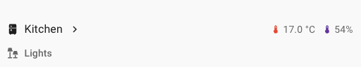
Good catch). And a code below does not conform to a picture.
I discovered (by accident) that the greater than sign in the image gets displayed when the Heading Card has a navigate action as interaction. The second line is likely just a Heading Card of the Heading style Subtitle. So no collapsing…
The code: Title (without the entities)
type: heading
icon: mdi:fridge
heading: Kitchen
heading_style: title
tap_action:
  action: navigate
  navigation_path: /whatever
Subtitle
type: heading
icon: mdi:lamps
heading: Lights
heading_style: subtitle