Compass Card - Points you in the right direction 🧭

Love the compass card and it has been on my kiosk dashboard from the start. However some styling has changed and I cannot get it. Can somebody help me?

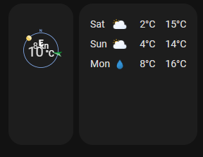
This is how it currently looks

vs earlier

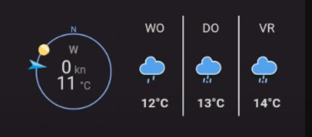
The compass is much smaller and the card is somehow long then necessary.

I have already tried to adjust the styling code but without success. Anybody that can help me in the right direction? Below is my current code.


                - type: custom:compass-card
                  view_layout:
                    grid-area: wind
                  indicator_sensors:
                    - sensor: sensor.wind_direction
                      indicator:
                        image: arrow_inward
                        dynamic_style:
                          sensor: sensor.wind_speed
                          bands:
                            - from_value: 0
                              color: "#039BE5"
                            - from_value: 5.0
                              color: "#0da035"
                            - from_value: 10.0
                              color: "#e0b400"
                            - from_value: 15.0
                              color: "#e45e65"
                    - sensor: sun.sun
                      attribute: azimuth
                      indicator:
                        image: circle
                  value_sensors:
                    - sensor: sensor.wind_speed
                    - sensor: sensor.outdoor_temperature
                  compass:
                    north:
                      show: true
                      offset: 0
                  card_mod:
                    style: |
                      ha-card {
                        box-shadow: none;
                        height: 100px !important;
                      }
                      compass-card {
                        box-shadow: none;
                        height: 100px !important;
                      }
                      .compass {
                        height: 100px !important;
                      }
                      .sensors {
                        height: 100px !important;
                      }
                      .sensor-0 {
                        line-height: 20px;
                      }    
                      .sensor-0 .abbr {
                        --secondary-text-color: white;
                        font-size: 12px !important; 
                      }
                      .sensor-0 .value {
                        --secondary-text-color: white;
                        font-size: 12px !important; 
                      }
                      .sensor-0 .measurement {
                        --secondary-text-color: white;
                        font-size: 12px !important; 
                      }
                      .sensor-0.indicator-sensor {
                        font-size: 12px !important; 
                        line-height: 10px !important;
                        top: 20px !important;
                      } 
                      .sensor-1 {
                        line-height: 20px;
                      }    
                      .sensor-1 .abbr {
                        --secondary-text-color: white;
                        font-size: 12px !important; 
                      }
                      .sensor-1 .value {
                        --secondary-text-color: white;
                        font-size: 20px !important; 
                      }
                      .sensor-1 .measurement {
                        --secondary-text-color: white;
                        font-size: 12px !important; 
                      }
                      .sensor-1.indicator-sensor {
                        font-size: 12px !important; 
                        line-height: 10px !important;
                        top: 40px !important;
                      } 

And this was my style that worked before


                    card_mod:
                      style: |
                        ha-card {
                          box-shadow: none;
                        }
                        .indicator-sensors {
                          font-size: 12px !important; 
                          line-height: 10px !important;
                          top: 20px !important;
                        } 
                        .value-sensors {
                          top: 35px !important;
                          line-height: 16px !important;
                        }
                        .value-sensors .value {
                          font-size: 20px !important; 
                        }
                        .value-sensors .measurement {
                          font-size: 12px !important; 
                        }
                        .compass {
                          height: 100px !important;
                        }
                        .content {
                          height: 100px !important;
                          margin-top: 10px !important;
                        }

Please open a n issue in the GitHub page (link in first post)

It looks like the card is embedded in another card. Please post the full configuration of the parent card including the compass-card and other cards contained my the parent card.

Also specify if the card is used on a sections or masonry dashboard. And for sections layout, the layout configuration of the parent card and compass-card.

The change in size is probably due to the autoresize functionality. And all info requested above is needed to properly reproduce the sizing issue.

Hi Tom, sure add to an existing issue (#1199) that seem related. Let me know if you need more details!