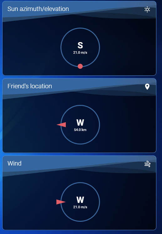
I actually did a bit of theme tweaking and am more than happy enough to add it now:
Day:
Night:
Card:
class: top-level-graph
direction_offset: 0
entity: sensor.bom_hobart_wind_direction
name: Wind Direction
secondary_entity: sensor.bom_hobart_wind_speed_kt
type: 'custom:compass-card'
Themes:
#################################################################
## Day
#################################################################

day:
  ### Main Interface Colors ###
  primary-color: "#93abca"
  light-primary-color: "#5F81B0"
  primary-background-color: "#F0F5FF"
  secondary-background-color: var(--primary-background-color)
  secondary-background-color-alpha: "rgba(220, 225, 235, 0.6)"
  divider-color: "#D6DFEB"
  lovelace-background: 'center / cover no-repeat url("/local/background/day.jpg") fixed'

  ### Text ###
  primary-text-color: "#395274"
  secondary-text-color: '#5294E2'
  text-primary-color: "#FFFFFF"
  disabled-text-color: "#88A1C4"

  ### Sidebar Menu ###
  sidebar-icon-color: "#395274"
  sidebar-text-color: var(--sidebar-icon-color)
  sidebar-selected-background-color: var(--primary-background-color)
  sidebar-selected-icon-color: "#FF6262"
  sidebar-selected-text-color: var(--sidebar-selected-icon-color)
  sidebar-background-color: var(--primary-background-color)

  ### States and Badges ###
  state-icon-color: "#395274"
  state-icon-active-color: "#ebb307"
  state-icon-unavailable-color: var(--disabled-text-color)

  ### Sliders ###
  paper-slider-knob-color: "#FF6262"
  paper-slider-knob-start-color: var(--paper-slider-knob-color)
  paper-slider-pin-color: var(--paper-slider-knob-color)
  paper-slider-active-color: var(--paper-slider-knob-color)
  paper-slider-secondary-color: var(--light-primary-color)

  ### Labels ###
  label-badge-background-color: "#FFFFFF"
  label-badge-text-color: "#395274"
  label-badge-red: "#FF8888"

  ### Cards ###
  # ha-card-background: 'url("/local/background/card_bg_Day.png")'
  card-background-color: "rgba(255, 255, 255, 1)"
  paper-listbox-background-color: '#F0F1F3'
  mdc-theme-surface: var(--primary-background-color)
  ha-card-border-radius: 10px
  border-color: 'var(--primary-text-color)'

  ### Toggles ###
  paper-toggle-button-checked-button-color: "#FF6262"
  paper-toggle-button-checked-bar-color: "#FF6262"
  paper-toggle-button-unchecked-button-color: "#395274"
  paper-toggle-button-unchecked-bar-color: "#9CB2CE"
  switch-checked-color: "var(--paper-toggle-button-checked-button-color)"
  switch-unchecked-button-color: "var(--paper-toggle-button-unchecked-button-color)"
  switch-unchecked-color: "var(--paper-toggle-button-unchecked-bar-color)"
  switch-unchecked-track-color: "var(--paper-toggle-button-unchecked-bar-color)"

  ### Table row ###
  table-row-background-color: var(--primary-background-color)
  table-row-alternative-background-color: var(--secondary-background-color)

  restriction-regular-lock-color: '#e45e65'
  restriction-lock-row-margin-left: 78%
  restriction-lock-margin-left: 40%
  restriction-lock-opacity: "0.9"

  sc-background-filter: none                      # sun card bg

  mini-media-player-button-color: "rgba(255, 255, 255, 0.0)"
  mini-media-player-accent-color: "var(--paper-slider-knob-color)"
  mini-media-player-overlay-color: "var(--primary-color)"


## Card Mod Day
###############

  card-mod-theme: day
  card-mod-card: |

    .card-header {
      font-size: 20px;
      font-weight: 300;
      letter-spacing: 0px;
    }

    ha-card.media-player {
      border: solid 1px var(--primary-color);
    }

    ha-card.media-player mmp-shortcuts {
      $: |
        mmp-button {
          box-shadow: none ;
          background: none;
          border: solid 1px var(--primary-color);
          border-radius: 10px;
        }
    }

    ha-card.inline-card {
      border: solid 1px var(--primary-color);
      box-shadow: none;
      --ha-card-background: rgba(0, 0, 0, 0);
    }

    ha-card.inline-card-no-border {
      box-shadow: none;
      --ha-card-background: rgba(0, 0, 0, 0);
    }

    ha-card.inline-card-red {
      border: solid 1px #FF6262;
      --ha-card-background: rgba(0, 0, 0, 0);
      --primary-text-color: rgb(250,98,98);
      box-shadow: 0px 0px 10px 3px #FF6262;
    }

    ha-card.inline-card-red div.card-header {
      padding-top: 8px;
      padding-bottom: 36px;
    }

    ha-card.top-level-card {
      border: solid 1px var(--primary-text-color);
      background: url("/local/background/card_bg_Day.png");
    }
    ha-card.top-level-card div.card-header {
      padding-top: 8px;
      padding-bottom: 36px;
    }

    ha-card.top-level-graph {
      border: solid 1px var(--primary-text-color);
      background: url("/local/background/card_bg_Day.png");
    }

    ha-card.top-level-graph .name > span {
      color: var(--primary-text-color);
      font-size: 20px !important;
      font-weight: 300 !important;
      letter-spacing: 0px;
      opacity: 1 !important;
    }

#################################################################
## Night
#################################################################

night:
  # Main colors
  primary-color: '#39679e'                                                        # Header
  accent-color: '#E45E65'                                                         # Accent color
  dark-primary-color: 'var(--accent-color)'                                       # Hyperlinks
  light-primary-color: 'var(--accent-color)'                                      # Horizontal line in about
  lovelace-background: 'center / cover no-repeat url("/local/background/night.jpg") fixed'

  # Text colors
  primary-text-color: '#FFFFFF'                                                   # Primary text colour, here is referencing dark-primary-color
  text-primary-color: 'var(--primary-text-color)'                                 # Primary text colour
  secondary-text-color: '#5294E2'                                                 # For secondary titles in more info boxes etc.
  disabled-text-color: '#7F848E'                                                  # Disabled text colour
  label-badge-border-color: 'green'                                               # Label badge border, just a reference value

  # Background colors
  primary-background-color: '#1b3163' # '#383C45'                                             # Settings background
  secondary-background-color: '#656e82'                                           # Main card UI background
  secondary-background-color-alpha: "rgba(101, 110, 130, 0.2)"
  divider-color: 'rgba(0, 0, 0, .12)'                                             # Divider
  sidebar-background-color: var(--primary-background-color)

  # Table rows
  table-row-background-color: '#353840'                                           # Table row
  table-row-alternative-background-color: '#3E424B'                               # Table row alternative

  # Nav Menu
  paper-listbox-color: 'var(--primary-text-color)'                                # Navigation menu selection hoover
  paper-listbox-background-color: '#041D42'                                       # Navigation menu background (Input Selects)
  paper-grey-50: 'var(--primary-text-color)'
  paper-grey-200: '#414A59'                                                       # Navigation menu selection

  # Cards
  paper-card-header-color: 'var(--accent-color)'                                  # Card header text colour
  card-background-color: "rgba(0, 0, 0, 1)"                                     # Card background colour, also pop-up box header
  # ha-card-background: 'url("/local/background/card_bg_Night.png")'      # Card background
  mdc-theme-surface: '#041D42'                                                    # Pop-up background colour
  paper-item-icon-color: 'var(--primary-text-color)'                              # Icon color
  paper-item-icon-active-color: '#F9C536'                                         # Icon color active
  paper-item-icon_-_color: 'green'
  paper-item-selected_-_background-color: 'var(--secondary-text-color) #'         # List box item select
  paper-tabs-selection-bar-color: 'green'
  ha-card-border-radius: 10px
  border-color: 'var(--secondary-text-color)'
  # ha-card-border: solid 1px var(--border-color)

  # Labels
  label-badge-red: 'var(--accent-color)'                                          # References the brand colour label badge border
  label-badge-text-color: 'var(--primary-text-color)'                             # Now same as label badge border but that's a matter of taste
  label-badge-background-color: '#2E333A'                                         # Same, but can also be set to transparent here

  # Switches
  paper-toggle-button-checked-button-color: 'var(--accent-color)'
  paper-toggle-button-checked-bar-color: 'var(--accent-color)'
  paper-toggle-button-checked-ink-color: 'var(--accent-color)'
  paper-toggle-button-unchecked-button-color: 'var(--disabled-text-color)'
  paper-toggle-button-unchecked-bar-color: 'var(--disabled-text-color)'
  paper-toggle-button-unchecked-ink-color: 'var(--disabled-text-color)'
  switch-checked-color: "var(--paper-toggle-button-checked-button-color)"
  switch-unchecked-button-color: "var(--paper-toggle-button-unchecked-button-color)"
  switch-unchecked-color: "var(--paper-toggle-button-unchecked-bar-color)"
  switch-unchecked-track-color: "var(--paper-toggle-button-unchecked-bar-color)"

  # Sliders
  paper-slider-knob-color: 'var(--accent-color)'
  paper-slider-knob-start-color: 'var(--accent-color)'
  paper-slider-pin-color: 'var(--accent-color)'
  paper-slider-active-color: 'var(--accent-color)'
  paper-slider-container-color: 'var(--secondary-background-color)'
  paper-slider-secondary-color: 'var(--secondary-background-color)'
  paper-slider-disabled-active-color: 'var(--disabled-text-color)'
  paper-slider-disabled-secondary-color: 'var(--disabled-text-color)'

  # Google colors
  google-red-500: '#E45E65'
  google-green-500: '#39E949'

  sidebar-selected-icon-color: 'var(--secondary-text-color)'
  sidebar-selected-text-color: 'var(--secondary-text-color)'
  markdown-code-background-color: 'var(--primary-color)'

  restriction-regular-lock-color: '#e45e65'
  restriction-lock-row-margin-left: 78%
  restriction-lock-margin-left: 40%
  restriction-lock-opacity: "0.9"

  sc-background-filter: none                      # sun card bg

  mini-media-player-button-color: "rgba(255, 255, 255, 0.0)"
  mini-media-player-accent-color: "var(--paper-slider-knob-color)"
  mini-media-player-overlay-color: "var(--secondary-background-color)"


## Card Mod Night
#################

  card-mod-theme: night
  card-mod-card: |

    .card-header {
      font-size: 20px;
      font-weight: 300;
      letter-spacing: 0px;
    }

    ha-card.media-player {
      border: solid 1px var(--primary-color);
    }

    ha-card.media-player mmp-shortcuts {
      $: |
        mmp-button {
          box-shadow: none;
          background: none;
          border: solid 1px var(--primary-color);
          border-radius: 10px;
        }
    }

    ha-card.inline-card {
      border: solid 1px var(--primary-color);
      box-shadow: none;
      --ha-card-background: rgba(0, 0, 0, 0);
    }

    ha-card.inline-card-red {
      border: solid 1px #FF6262;
      --ha-card-background: rgba(0, 0, 0, 0);
      --primary-text-color: rgb(250,98,98);
      box-shadow: 0px 0px 10px 3px #FF6262;
    }

    ha-card.inline-card-red div.card-header {
      padding-top: 8px;
      padding-bottom: 36px;
    }

    ha-card.inline-card-no-border {
      box-shadow: none;
      --ha-card-background: rgba(0, 0, 0, 0);
    }

    ha-card.top-level-card {
      border: solid 1px var(--secondary-text-color);
      background: url("/local/background/card_bg_Night.png");
    }

    ha-card.top-level-card div.card-header {
      padding-top: 8px;
      padding-bottom: 36px;
    }

    ha-card.top-level-graph {
      border: solid 1px var(--secondary-text-color);
      background: url("/local/background/card_bg_Night.png");
    }

    ha-card.top-level-graph .name > span {
      color: var(--primary-text-color);
      font-size: 20px !important;
      font-weight: 300 !important;
      letter-spacing: 0px;
      opacity: 1 !important;
    }


 ) I’d like to give that beautiful theme of yours a try, really like it.