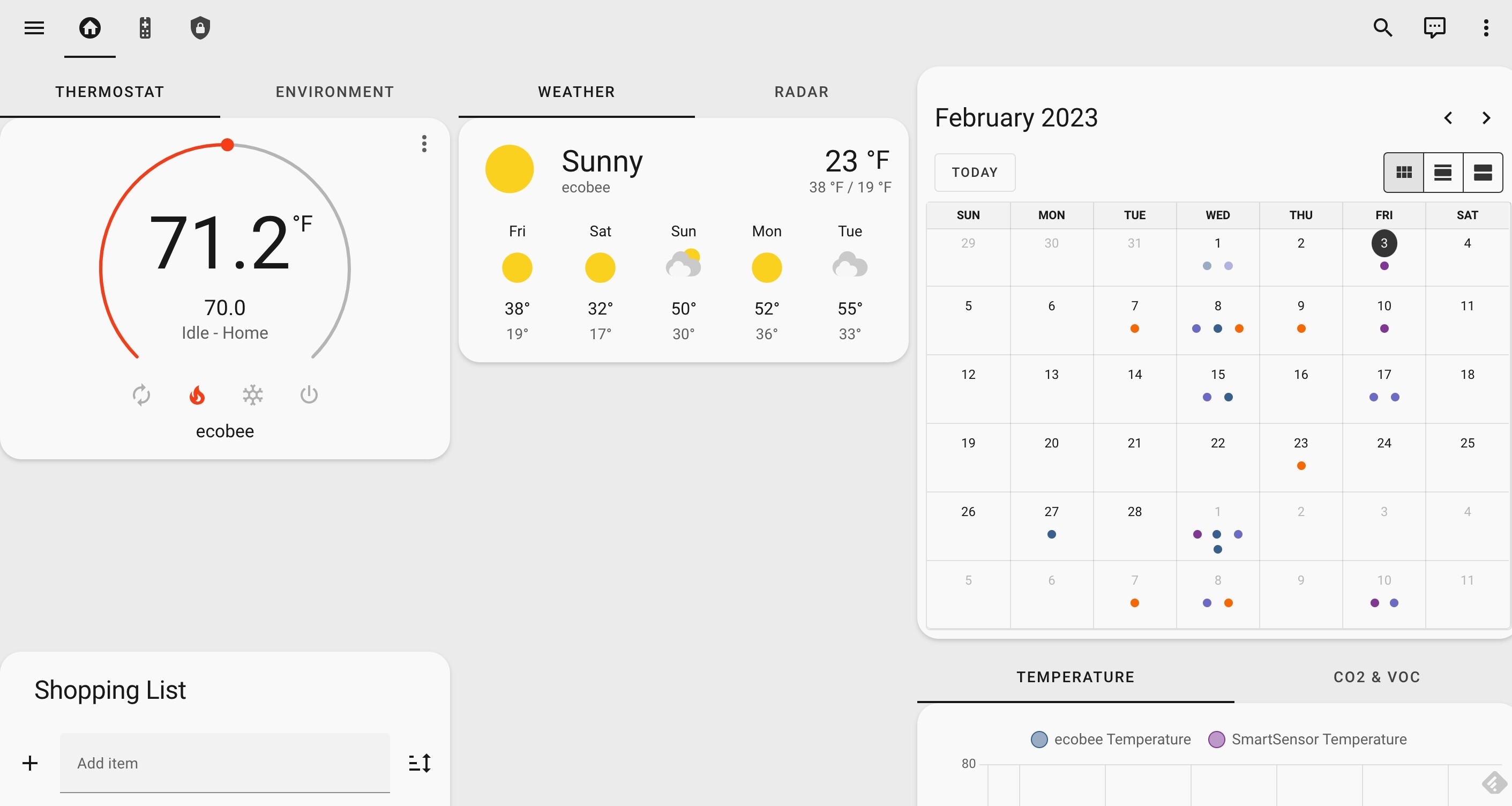
Simple dashboard but can’t seem to figure out how to clean up the card heights. Would like col1 and col2 to include “short” cards while col3 has a taller card. In my current layout the first and second columns are “forced” to the height of the third column card. I’ve tried a lot of examples in both the dashboard YAML and individual cards (things like row-height, stretch, grid-template-rows, etc.) and can’t seem to get the first two columns to be shorter.
Dashboard
theme: mushroom
icon: mdi:home-circle
path: default_view
type: custom:grid-layout
layout:
  grid-template-rows: auto auto auto
  grid-template-columns: 30% 30% 40%
  grid-template-areas: |
    "col1 col2 col3"
    "col4 col5 col6"
    "col7 col8 col9"
Thermostat card
type: custom:tabbed-card
options: {}
view_layout:
  grid-area: col1
  place-self: auto
tabs:
  - card:
      type: thermostat
      entity: climate.ecobee
    attributes:
      label: thermostat
  - card:
      type: entities
      entities:
        - entity: sensor.ecobee_air_quality_index
        - entity: sensor.ecobee_co2
        - entity: sensor.ecobee_voc
        - entity: sensor.ecobee_humidity
        - entity: sensor.smartsensor_temperature
    attributes:
      label: Environment
Calendar
initial_view: dayGridMonth
type: calendar
entities:
  - calendar.cal1
  - calendar.cal2
  - calendar.cal3
  - calendar.cal4
  - calendar.cal5
  - calendar.cal6
view_layout:
  grid-area: col3
End state:

I know some stock cards (like media-player) will auto-adjust height but I can’t figure this one out and getting frustrated. Feel like I need to nest card types in each column but starting to lose momentum.
Any help?


