rockas
December 19, 2020, 10:59am
1
Hi Folks,
I’m recent on HA although have been enjoying the ride
I’m looking for a war to have 2 entities within same button, per example a sonoff(switch) and door sensor.
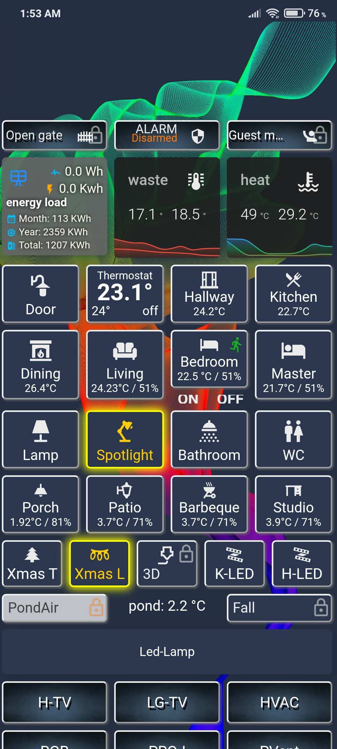
And looking for building something similar to below but with color state (great @petro )
Any help would be great and help me having a much hygiene frontend.
Thanks.
1 Like
maybe this will help. it also have a motion blinking icon
entity: switch.livingroom
icon: 'mdi:sofa'
type: 'custom:button-card'
aspect_ratio: 2/1.8
name: Living
state:
  - styles:
      card:
        - box-shadow: 0px 0px 10px 2px yellow
        - border: solid 2px yellow
      icon:
        - color: 'rgb(255,204,0)'
      name:
        - color: 'rgb(255,204,0)'
      state:
        - color: 'rgb(255,204,0)'
      label:
        - color: 'rgb(255,204,0)'
        - font-size: 13px
        - padding-top: 5px
      custom_fields:
        temp:
          - color: 'rgb(255,204,0)'
    value: 'on'
  - styles:
      label:
        - color: '#adadb7'
        - font-size: 13px
        - padding-top: 5px
    value: 'off'
  - styles:
      label:
        - font-size: 13px
        - padding-top: 5px
      icon:
        - color: white
      card:
        - border: solid 2px red
        - background-color: red
    value: unavailable
styles:
  lock:
    - '-webkit-animation-duration': 2s
    - animation-duration: 2s
    - '-webkit-animation-fill-mode': both
    - animation-fill-mode: both
    - margin: '-3px'
    - color: ivory
  name:
    - font-size: 16px
    - align-self: middle
  icon:
    - width: 35%
  grid:
    - grid-template-areas: '"i icon" "n n" "temp temp"'
    - grid-template-columns: 1fr
    - grid-template-rows: 1fr
  card:
    - box-shadow: '1px 1px 1px 1px rgba(100, 100, 100, 0.5)'
    - border-radius: 5px
    - border: outset 2px
  custom_fields:
    icon:
      - position: absolute
      - margin-left: 75%
    temp:
      - font-size: 12px
custom_fields:
  icon: >
    [[[ if (states['binary_sensor.fgms001_motion_sensor_sensor_3'].state ==
    'on') return "<div style='text-align: start; color: lime; animation: blink
    0.7s ease infinite;'><ha-icon icon='mdi:run' style='color: lime; width:
    20px; height: 20px;'></ha-icon></div>"; ]]]
  temp: >
    [[[ return states['sensor.ir_livingroom_temperature'].state + '°C / '+
    states['sensor.ir_livingroom_humidity'].state [0] + [1] + '%'  ]]]
lock:
  enabled: >
    [[[ if (states['alarm_control_panel.home_alarm'].state == 'armed_away')
    return "true"; ]]]
and have also a lock function/icon, when alarm is activated… but you have to install custom button card
rockas
December 21, 2020, 7:59pm
3
have changed those entities to mine, remove lock, but seems not working well :\ and have custom button card installed.
@robert.access can you show image of would be expected?
what exactly doesn’t work?
if you don’t want lock, try to remove only:
from styles:
  lock:
    - '-webkit-animation-duration': 2s
    - animation-duration: 2s
    - '-webkit-animation-fill-mode': both
    - animation-fill-mode: both
    - margin: '-3px'
    - color: ivory
and at the end:
lock:
  enabled: >
    [[[ if (states['alarm_control_panel.home_alarm'].state == 'armed_away')
    return "true"; ]]]
rockas
December 22, 2020, 7:26pm
6
even after your advise still having same picture, colors seems not be reflected on button card.
the card appearance is here (as on / off / unavailable)
robert.access:
state:
  - styles:
in
styles:
is your card settings and general colors.
box-shadow: '1px 1px 1px 1px rgba(100, 100, 100, 0.5)'
0.5 is shadow transparency 0 = total transparent and 1= non transpartent
but wait…
maybe yo have to install: