Creative Button Card Templates for Lovelace Dashboards

cbc-samples-animated

Examples above are shown in the default dark theme however they should work with most themes.

So a couple of my good friends kept seeing my Home Assistant dashboards and asking:

“What card are you using for that? I want to use it on mine.”

However I had custom developed my cards using the absolutely awesome Button Card by @RomRider and I knew they did not have the appetite to be writing Javascript or complex YAML for theirs. So, I made my cards into templates which require as little configuration as possible. Now I’m posting them here to share with you.

They’re not as detailed as Minimalist or as slick as Mushroom Cards (yet) but they are an alternative that can be used with whatever theme you choose.

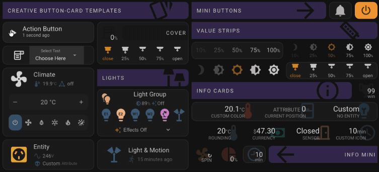
Try Creative Button Card Templates

Example

View one of my dashboards made with Creative Button Card Templates...

This one has quite a lot going on so it’s a bit busy but it shows you a lot of possibilities. I’m using the excellent Noctis theme, Button Card (obviously), Lovelace Layout Card, Lovelace Card Mod and Mini Graph Card, amongst other more specific custom cards, to make the magic happen.

Templates and Features

  • Designed to work with most themes

  • Least amount of configuration possible

  • Interactive hover effects on desktop browser

  • Pre-defined tap actions support haptic on iOS

  • Reduced size and opacity when entity is unavailable

  • Can be customised with any of the Button Card features

  • Resizable, customisable and extendable with helpful features

  • Compatible with YAML or Storage (UI) Lovelace modes

  • Clear, detailed documentation

Title

  • Optional icon

  • Customise Colors

  • Dynamic width

  • Mirror (right-to-left)

Action Button

  • Run any Automation, Script or Timer

  • Shows last run time

  • Animated icon while running

  • Customise icons and names for idle and running

  • Timer shows remaining time

  • Add timer for a script which starts a timer and get the best of both

Device

  • Any entity which toggles

  • Display up to 2 attributes with custom icons and units of measurement

  • Hides attributes when device is off

Smart Plug

  • For Smart Plugs/Sockets with energy monitoring

  • Displays current and voltage attributes while on

Mini Button

  • An icon only button. Put one in a horizontal stack next to your title for example.

  • Add a symbol overlay for extra identification

Light

  • Any light entity

  • Icon color mimics light color

  • Displays Effect name while light is running an effect

  • Displays Brightness percentage

  • Displays color temperature in Kelvin or RGB automatically based on light settings

  • Hides extra information when light is off

Motion-Activated Light

  • All the features of the Light card

  • Shows when motion is or was last activated
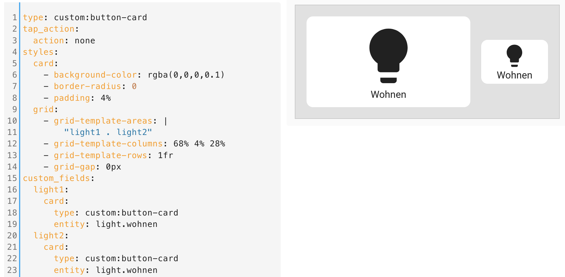
Light Group

  • Automagically builds a card of up to 6 lights from any light group

  • OR you can detail a list of up to 6 light items with custom names, icons and symbols for identification

  • Main card operates the group and each light has it’s own embedded mini button

  • Tap actions on the group and each light individually

  • Displays brightness and color information for the group when on

Value Strip

  • Quick control of 5 options for any numeric state/attribute

  • Zero-Config options for brightness (lights) and cover (blinds, curtains, garage doors)

  • Display values, icons or both

  • Fade from lowest to highest value

  • Completely customise icons, values and units

Info Card

  • Display up to 4 entities or attributes (great for sensors)

  • Custom icons, colors, units and layouts

  • Decimals (rounding) and currency support

Info Mini

  • Display the icon and state of any entity or attribute

  • Layout value and units as stack or inline

  • Customise color, value, units and spin

Addons

  • Easily add to just about any template with some included in certain templates already

  • transparent - Make the background of any card transparent

  • dynamic_icons - Custom icons for on, off or unavailable states by just specifying in variables

  • actions - Adds tap to toggle, double tap or hold for more-info with haptic success for iOS

  • no_actions - Remove all actions from the template

  • resizable - Resize the card using height and width variables

Advanced Features

  • Debug addon to get relevant info in console.debug()

  • Entity detail template to see all properties and attributes of an entity

  • There’s a bunch that are a little too complex or more suited to my specific use case for things like Adaptive Lighting. If people want to know them then let me know and I’ll post some details.

They still require the use of YAML, however I’ve tried to reduce the required effort to get excellent results, some only require you to add the type, template, and entity but produce a card with plenty of information and features. Options are set through variables and are detailed comprehensively in the documentation.

Because they’re new, be prepared for breaking changes in updates (I’ll try to call them out). I can’t promise they will be maintained long-term as I’ve started looking into building my own custom cards with UI configuration which will replace them. However, this will take some time so until then, if you like the templates then please utilise them and your feedback is welcome.

Enjoy and be Creative.

View one of my dashboards made with Creative Button Card Templates...

This one has quite a lot going on so it’s a bit busy but it shows you a lot of possibilities. I’m using the excellent Noctis theme, Button Card (obviously), Lovelace Layout Card, Lovelace Card Mod and Mini Graph Card, amongst other more specific custom cards, to make the magic happen.

Gratitude

A massive thank you to @RomRider and everyone who contributed to Button Card. These templates wouldn’t even be possible without it.

4 Likes

Hey,

great work, thanks for sharing your templates. At first i’m trying to get some simple buttons to show up like this:

screen0

… still without any templates. But i am failing just at the beginning with the aspect_ratio:

As you can see, the buttons are not equal in height which is caused by the grip-gap. Without any margin the aspect_ratio is calculated correctly and both buttons are equal in size.

I’m looking for a way to put some buttons of different sizes next to each other in multiple rows. All buttons should scale to the size of the grey box. The Size of the box may vary depending on the screen size. So i do not want to give every button a fix width and height.

I have also tried playing around with some slightly different aspect_ratio settings of e.g. “2/1.1”. This way the buttons could be made nearly equal in size (at least so you cannot see it anymore) but only for the current scale. If the size changes the slightly difference grows and is visible again.

Maybe you can help me with this? Maybe there is another solution for this. I also tried to use layout_card instead of a button-card as layout container, but the button-card behaves the same.

Thanks @Kanecaine,

I feel as though your questions would be far better suited to this topic on button-card however seem as you’re here you could try this:

Rather than use grid_gap you could change the grid-template-columns property to use percentages rather than fractions and change the grid-template-areas to have a blank section, you shouldn’t need to use the aspect_ratio as the card contents should size appropriately for the width. For example:

grid:
  - grid-template-areas: |
      "light1 . light2"
  - grid-template-columns: 68% 4% 28%
  - grid-template-rows: 1fr
# ...

Or change those percentages for whatever works for you. You could also just use a margin in the styles for both custom fields and have the areas set to 70% 30% and let CSS figure it out. Disclaimer: I haven’t tested that code but in theory it should work.

That said, if you are only doing this for layout and the main button doesn’t have a function then why not use a horizontal-stack and set the width of one of the cards with a percentage?

Or just use my light_group template and let it figure it out for you. :wink:

Thank you very much @wjf ,

you are right, my question would be better in the thread you mentioned. To be honest i thought, there are so many people and the chance is quite low that the one reads my post who can solve this. Than i found your templates and i thought “wow, this guy must have an idea”.

I already tried so much but the problem is not that trivial. I am still looking for the one key that solves all this problems. It has to be out there, somewhere :slight_smile:

Unfortunatly all your suggestions do not work so far.

As you said the card sizes approbiately for the width, but not for the height. That is the most common problem i have with it. I had no luck setting the height of the card to 100%. Same with the 70/30 idea.

By using margin all the things get more worse, i dont’t even understand what it renders in this case. Of course this was the first thing i tried after row-gap.

I found a solution or better to say a workaroud: as the difference in height is slightly low you only see it at the borders of the background. So i simply removed the background color of the card an added a custom_field only for the background color. I positioned it absolutly with space on top, right, bottom and left. So the problem is apparently solved:

type: custom:button-card
name: Wohnen
tap_action:
  action: none
styles:
  card:
    - background-color: rgba(0,0,0,0.1)
    - border-radius: 0
    - padding: 3px
    - pointer-events: inherit
  grid:
    - grid-template-areas: |
        "n n n"
        "light1 light1 light2"
        "light3 light4 light4"
        "light3 light4 light4"
        "light5 light5 light5"
    - grid-template-columns: 1fr 1fr 1fr
    - grid-template-rows: 30px 1fr 1fr 1fr 1fr
    - grid-gap: 0px
  name:
    - place-self: center start
    - font-weight: bold
    - margin: 0 6px
custom_fields:
  light1:
    card:
      type: custom:button-card
      entity: light.wohnen
      aspect_ratio: 2/1
      tap_action:
        action: none
      hold_action:
        action: more-info
      custom_fields:
        background: ' '
      styles:
        grid:
          - grid-template-areas: |
              "i"
              "n"
          - grid-template-columns: 1fr
          - grid-template-rows: 1fr 1fr
        card:
          - margin: 0px
          - padding: 0px
          - background-color: transparent
          - border: 0px solid red
          - border-radius: 0
          - z-index: 0
        icon:
          - height: 60%
          - z-index: 3
        img_cell:
          - border: 0px solid blue
          - width: 100%
          - z-index: 3
        name:
          - z-index: 3
          - border: 0px solid red
          - background-color: seagreen
          - width: 100%
        custom_fields:
          background:
            - top: 6px
            - left: 6px
            - right: 6px
            - bottom: 6px
            - position: absolute
            - width: auto
            - height: auto
            - background-color: white
            - filter: opacity(90%)
            - border-radius: 12px
            - z-index: 1
  light2:
    card:
      type: custom:button-card
      entity: light.wohnen
      aspect_ratio: 1/1
      custom_fields:
        background: ' '
      styles:
        grid:
          - grid-template-areas: |
              "i"
              "n"
          - grid-template-columns: 1fr
          - grid-template-rows: 1fr 1fr
        card:
          - margin: 0px
          - padding: 0px
          - background-color: transparent
          - border: 0px solid red
          - border-radius: 0
          - z-index: 0
        icon:
          - height: 60%
          - z-index: 3
        img_cell:
          - border: 0px solid blue
          - width: 100%
          - z-index: 3
        name:
          - z-index: 3
          - border: 0px solid red
          - background-color: darkorange
          - width: 100%
        custom_fields:
          background:
            - top: 6px
            - left: 6px
            - right: 6px
            - bottom: 6px
            - position: absolute
            - width: auto
            - height: auto
            - background-color: white
            - border-radius: 12px
            - z-index: 1
  light3:
    card:
      type: custom:button-card
      entity: light.wohnen
      aspect_ratio: 1/2
      custom_fields:
        background: ' '
      styles:
        grid:
          - grid-template-areas: |
              "i"
              "n"
          - grid-template-columns: 1fr
          - grid-template-rows: 1fr 1fr
        card:
          - margin: 0px
          - padding: 0px
          - background-color: transparent
          - border: 0px solid red
          - border-radius: 0
          - z-index: 0
        icon:
          - height: 60%
          - z-index: 3
        img_cell:
          - border: 0px solid blue
          - width: 100%
          - z-index: 3
        name:
          - z-index: 3
          - border: 0px solid red
          - background-color: darkorange
          - width: 100%
        custom_fields:
          background:
            - top: 6px
            - left: 6px
            - right: 6px
            - bottom: 6px
            - position: absolute
            - width: auto
            - height: auto
            - background-color: white
            - border-radius: 12px
            - z-index: 1
  light4:
    card:
      type: custom:button-card
      entity: light.wohnen
      aspect_ratio: 2/2
      custom_fields:
        background: ' '
      styles:
        grid:
          - grid-template-areas: |
              "i"
              "n"
          - grid-template-columns: 1fr
          - grid-template-rows: 1fr 1fr
        card:
          - margin: 0px
          - padding: 0px
          - background-color: transparent
          - border: 0px solid red
          - border-radius: 0
          - z-index: 0
        icon:
          - height: 60%
          - z-index: 3
        img_cell:
          - border: 0px solid blue
          - width: 100%
          - z-index: 3
        name:
          - z-index: 3
          - border: 0px solid red
          - background-color: seagreen
          - width: 100%
        custom_fields:
          background:
            - top: 6px
            - left: 6px
            - right: 6px
            - bottom: 6px
            - position: absolute
            - width: auto
            - height: auto
            - background-color: white
            - border-radius: 12px
            - z-index: 1
  light5:
    card:
      type: custom:button-card
      entity: light.wohnen
      aspect_ratio: 3/1
      custom_fields:
        background: ' '
      styles:
        grid:
          - grid-template-areas: |
              "i"
              "n"
          - grid-template-columns: 1fr
          - grid-template-rows: 1fr 1fr
        card:
          - margin: 0px
          - padding: 0px
          - background-color: transparent
          - border: 0px solid red
          - border-radius: 0
          - z-index: 0
        icon:
          - height: 60%
          - z-index: 3
        img_cell:
          - border: 0px solid blue
          - width: 100%
          - z-index: 3
        name:
          - z-index: 3
          - border: 0px solid red
          - background-color: seagreen
          - width: 100%
        custom_fields:
          background:
            - top: 6px
            - left: 6px
            - right: 6px
            - bottom: 6px
            - position: absolute
            - width: auto
            - height: auto
            - background-color: white
            - border-radius: 12px
            - z-index: 1

The sizing is perfectly with this, no matter which screen size i use. I can put all the config in a template and the only thing i have to do is setting the desired aspect_ratio in the ui config. The only little thing is that the buttons ripple effect is hidden by my background-layer. That’s not so nice especially on touch screens … it’s frustrating me :frowning:

Last: as you can see in the last example i used button-card for the container because i want to place some more things like a title for the group of buttons.

Do you have one more suggestion to me? Thanks in advance!

Ok, as i wrote the last post the solution came to my mind: i simply had to put the background layer under the card button by swapping the z-index. Thank god, now it works. So the ripple effect overflows but i can live with that.

But if there would be a simpler solution i would be happy to know. So sorry for spamming you’re thread and again: good work!

edit: ok, i can’t live with that and here is the solution for the overflowing ripple effect in case someone ran into the same:

      card_mod:
        style: |
          ha-card #ripple {
            overflow: hidden;
            top: 6px;
            left: 6px;
            right: 6px;
            bottom: 6px;
            width: auto;
            height: auto;
            border-radius: 12px;
          }

In short: gave the ripple layer the same properties as the background layer so that they match exactly.

@Kanecaine Glad you got it sorted. The only other suggestion I have would be to use the CSS pseudo elements ::before or ::after applied with card_mod for the background on each card.

Looks like you’re building some decent custom cards there, post a shot of your dashboard and If you do end up using any of the templates let me know what you think.

1 Like

Hello, I have not been able to install these templates, I am using Storage (UI) Mode, and I cannot find the cbc.yml file, could you help me.
They are very good cards