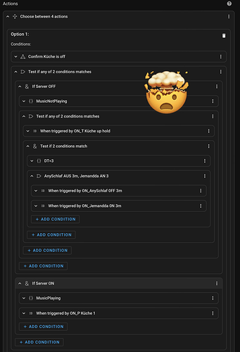
Hi! 6 months have passed since I switched to Home Assistant and by now I feel at home with the system.
However, two things are still bothering me. Here I would like to talk about the interface of the automation editor. My home in the Smarthome is not the dashboard. It is the automations editor. And unfortunately, I keep losing track of what’s going on. I have two suggestions for the developers.
It would be great to introduce contrasts or color changes when using blocks in other blocks. For example if you use a “case” in an “action” and then maybe “and/or” in which you also use “if/else”. If you dive deep enough, it is sometimes hard to decide quickly in which level you are. In the following a small example if it becomes confusing.
My second concern is the unused space in the editor. We all sit in front of wide screens, but the editor is rather narrow, which leads to constant scrolling. Up, down, up, down. Furthermore, depending on the automation, the focus sometimes falls on the “Trigger”, sometimes on the “Conditions” and then again on “Actions”.
Wouldn’t it be great if you could work with two columns and then arrange them individually like the Lovelace Dashboard. For example, if I have an automation with lots of “Actions”, I would use full screen height for “Actions” and “Triggers+Conditions” next to it on top of each other. Something like this:

