Custom Button Card: Templates vs. Lovelace-Gen

I’ve just converted all my custom buttons from using templates to using the quite brilliant lovelace-gen as I thought that would give me more flexibilty. And in some ways it does.

But there is a big drawback in that you can’t pass any states into the button whereas in templates you can access them in the template itself.

It wasn’t a big task to change them so it’s not a big deal to change them back but before I do I just wondered what the panel thought?

Templates or lovelace-gen?

2 Likes

I just switched to lovelace gen. I have no idea what limitation you are talking about. I don’t see any limitations like that. Can you elaborate more, I’d bet there’s a solution.

EDIT: Just to say, I made a button card last night that you can feed it a state, domain, icon, group, and group name. It will count the items at that state and display it in the upper right corner. All using a lovelace button card template and lovelace-gen.

image image

EDIT: gotta work on the state color of the main icon… never noticed that. Always something to do…

EDIT: Well not exactly an edit as I haven’t posted it yet but I typed in all that comes below and realised my dilemma is not really between lovelace-gen and templates at all. I think that if I use both that might be a solution. If you can bear to follow my ramblings below I’d be interested if you have a way to do this.


Hang on…
Are you using all three? custom-button-card based on a template and lovelace-gen?

One specific thing I want to do is…
I have a set of zones, and each one for example has an input_number of the format input_number.zone_X

I’d like to be able to define the name they appear with in the UI dynamically so each one also has an input_text in the form input_text.zone_X_name

My button needs to be based on the input_number but I want the text shown to be the input_text

There are 8 zones (and three cycles so actually 24 zones) so instead of repeating the Lovelace code 8 (24) times I do it using includes. I can’t find a way to pass the state of the input_text into the button using lovelace-gen

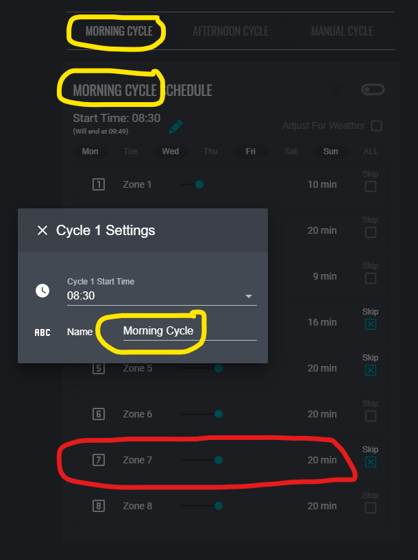
I hope this is making sense… maybe a picture will help. (This is currently based on actual entities rather than buttons but the principle still holds - I think)

  irrigation_cycle1_zone1_duration: 
    name: Cycle 1 Zone1 Duration
    min: 0
    max: 60
    unit_of_measurement: min
    icon: mdi:numeric-1-box-outline
irrigation_cycle1_name:
    name: Cycle 1 Name
    min: 1
    max: 20
                - type: custom:hui-entities-card
                  entities:
                
                    #=== Zone 1
                    - !include
                      - includes/irrigation/zone_duration_line.yaml
                      - cycle: 1
                        zone: 1

I would like the text to be the state of the input_text

Yah, assuming it’s name, use a button template: So you provide input_number.zone_X to the entity…

put this in your button card

name: |
  [[[
     if (!entity)
       return "No Entity!";
     var [domain, object_id] = entity.entity_id.split('.');
     if (domain !== 'input_number')
       return "Not Input Number!";
     var items = object_id.split('_');
     if (items.length > 2)
       return "Bad Entity ID!";

     var entity_id = `input_text.zone_${items[1]}_name`;
     return states[entity_id].state;
  ]]]

That’s great thanks. It works well.

I can set the Cycle Names to anything I like in my pop-up and the correct text displays on the heading using buttons.

Now I just want to find a way to do the same thing with the Zone input_number which is displayed as an entity.

Any ideas :wink: ?

I don’t follow you. Can you post the card in question? With a few example entity_id’s, preferably circling crap.

Ok… Here goes…

input_number:
  irrigation_cycle1_zone1_duration: 
    name: Cycle 1 Zone1 Duration
    min: 0
    max: 60
    unit_of_measurement: min
    icon: mdi:numeric-1-box-outline
input_text:
  irrigation_zone1_name:
    name: Zone 1 Name
    min: 1
    max: 20

The zone duration lines:
image
are generated by these:

                - type: custom:hui-entities-card
                  entities:
                
                    #=== Zone 1
                    - !include
                      - includes/irrigation/zone_duration_line.yaml
                      - cycle: 1
                        zone: 1

                    #=== Zone 2
                    - !include
                      - includes/irrigation/zone_duration_line.yaml
                      - cycle: 1
                        zone: 2

Here is includes/irrigation/zone_duration_line.yaml

#==============================================================
#===  A line for each zone showing duration and skip check-box
#==============================================================
type: custom:mod-card
style: |
  ha-card {
    border: 1px solid var(--primary-background-color);
  }
card:

  type: custom:hui-horizontal-stack-card
  cards:

    - type: entities
      show_header_toggle: false
      entities:
        - entity: input_number.irrigation_cycle{{ cycle }}_zone{{ zone }}_duration
          name: Zone {{ zone }}
          tap_action:
            action: call-service
            service: browser_mod.popup
            service_data:
              title: Zone Names
              card:
                type: entities
                entities:
                  - entity: input_text.irrigation_zone1_name
                    name: ' '
                    icon: mdi:numeric-1-box-outline
                  - entity: input_text.irrigation_zone2_name
                    name: ' '
                    icon: mdi:numeric-2-box-outline
                  - entity: input_text.irrigation_zone3_name
                    name: ' '
                    icon: mdi:numeric-3-box-outline
                  - entity: input_text.irrigation_zone4_name
                    name: ' '
                    icon: mdi:numeric-4-box-outline
                  - entity: input_text.irrigation_zone5_name
                    name: ' '
                    icon: mdi:numeric-5-box-outline
                  - entity: input_text.irrigation_zone6_name
                    name: ' '
                    icon: mdi:numeric-6-box-outline
                  - entity: input_text.irrigation_zone7_name
                    name: ' '
                    icon: mdi:numeric-7-box-outline
                  - entity: input_text.irrigation_zone8_name
                    name: ' '
                    icon: mdi:numeric-8-box-outline
      style: |
        #states {
          padding: 0px 16px;
        }

    #=== Skip Zone
    - !include
      - ../button_boolean_check_box.yaml
      - entity: input_boolean.irrigation_cycle{{ cycle }}_zone{{ zone }}_skip
        layout: name_over_icon
        name: Skip
        on_icon: mdi:close-box-outline
        card_width: 50px
        card_margin_top: 1.4em
        card_height: 40px
        card_font_size: 12px
        grid_template_areas: >
          "l" "n" "i" "s"
        grid_template_columns: 1fr
        grid_template_rows: min-content min-content 1fr min-content
        name_justify_self: auto
        vertical_shift: -12px

This is the relevent bit

    - type: entities
      show_header_toggle: false
      entities:
        - entity: input_number.irrigation_cycle{{ cycle }}_zone{{ zone }}_duration
          name: Zone {{ zone }}

I’d like the name to be the state of input_text.zone{{ zone }}_name

If you think this is possible but need more info, ask me any questions!
Thanks!

1 Like

Ah, I see. Use the template card provided by @iantrich. It will work with this. It’s a js template card instead of jinja so it shouldn’t get confused with @thomasloven’s lovelace-gen functionality.

I haven’t done this yet but I will be in the next few days during my move towards lovelace-gen. Anyways, this is what it would generally look like.

#==============================================================
#===  A line for each zone showing duration and skip check-box
#==============================================================
type: custom:mod-card
style: |
  ha-card {
    border: 1px solid var(--primary-background-color);
  }
card:

  type: custom:hui-horizontal-stack-card
  cards:
    - type: custom:config-template-card
      variables:
        - states['input_text.irrigation_zone{{ zone }}_name'].state
      entities:
        - input_text.irrigation_zone{{ zone }}_name
      card:
        type: entities
        show_header_toggle: false
        entities:
          - entity: input_number.irrigation_cycle{{ cycle }}_zone{{ zone }}_duration
            name: "${ var[0] }"
        ... etc ....

EDIT: I forgot that I don’t need to terminate or use the word return in single line templates for that card.

1 Like

Brilliant again!
Thankyou!

(One small typo name: "${ var[0] }" should be name: "${ vars[0] }". Took me ages to spot it!)

1 Like

I stared at that for 10 minutes thinking “WTF are you talking about?”… then I saw it.

1 Like

One more quick question on this. The three big cycle buttons across the top act as radio buttons i.e. only one should be on at the same time, and they control what is displayed below. Simple automations ensure only one is on at a time but I need the tap action to be none when the button is on else if it is toggled whilst on then all the buttons would be off messing up the whole ui.

To make the template generic so it can also be used as a non-radio select button I want to pass it a parameter to indicate this behaviour is required:

- !include
  - includes/button_boolean_select.yaml
  - entity: input_boolean.irrigation_show_cycle1
    name: "[[[ var entity_id = 'input_text.irrigation_cycle1_name'; return states[entity_id].state.toUpperCase(); ]]]"
    card_font_size: 16px
    card_font_family: Oswald
    radio_button: true        #  <<<----

I can’t find the right syntax for the tap_action in the template (if radio_button is true and the button is on then tap_action should be none):

#==========================
#=== Boolean Select Button
#==========================
type: custom:button-card
entity: {{ entity }}
show_icon: false
name: >
  {{ name }}
lock:
  enabled: {{ lock_enabled | default('false') }}
styles:
  lock:
    - color: {{ lock_color | default('red') }}
  card:
    - font-size: {{ card_font_size | default('12px') }}
    - font-family: {{ card_font_family | default('var(--primary-font-family)') }}
    - border-radius: {{ card_border_radius | default('10px') }}
    - border: 1px solid var(--primary-background-color)
tap_action:
  action: "[[[ if ({{ radio_button }} == 'true') && (entity.state == 'on') return 'none'; else return '' ]]]"
state:
  - value: 'on'
    styles:
      card:
        - color: {{ on_color | default('var(--primary-text-color)') }}
        - background-color: var(--primary-background-color)
        - opacity: 100%
  - value: 'off'
    styles:
      card:
        - color: {{ off_color | default('var(--secondary-text-color)') }}
        - opacity: 50%

try

 "[[[ if ('{{ radio_button }}' == 'true' && entity.state == 'on') return 'none'; else return '' ]]]"

Close…
It seems that ‘toggle’ has to be explicitly returned because this,

action: "[[[ if ('{{ radio_button }}' == 'true' && entity.state == 'on') return 'none'; else return 'toggle' ]]]"

will always toggle, which is an improvement on it always doing nothing.

So, the condition syntax doesn’t seem to be working. It doesn’t seem to like the

  '{{ radio_button }}' == 'true'

(or any variation of it that I have tried) because if I do this:

action: "[[[ if (entity.state == 'on') return 'none'; else return 'toggle' ]]]"

It ‘works’, albeit without the flexibility of having that behaviour optional.
(And yes, I use that template elsewhere for buttons that are not ‘radio buttons’ so I’d really like it!)


EDIT: I think I have it…

  action: "[[[ if (('{{ radio_button }}' == 'true') && (entity.state == 'on')) return 'none'; else return 'toggle' ]]]"

Your quotes around {{ radio_button }} and brackets around both conditions…

EDIT 2 I found a better solution allowing it to default to off:

  action: "[[[ var radio_button = '{{ radio_button }}'; if (radio_button && (entity.state == 'on')) return 'none'; else return 'toggle' ]]]"

Thanks for all your help getting there…

radio button was probably already a string so you’d just need to remove the qutoes from my original comment.

"[[[ if ({{ radio_button }} == 'true' && entity.state == 'on') return 'none'; else return '' ]]]"

I’m afraid that doesn’t work with or without ‘toggle’ explicitly defined and neither does,

  action: "[[[ if ({{ radio_button }} && (entity.state == 'on')) return 'none'; else return 'toggle' ]]]"

The button in all cases shows the shadow indicating it was pressed but doesn’t toggle.

Is this your own card? Or is this something available? It looks really good, I’m not sure I would trust HA to run my sprinkler system (what if it crashes while a zone is on?) but I do have it linked to my rachio account so that I can mess with the zones, which worked well for when I installed sod last year.

That card is a piece meal card. He’s using a series of cards to configure that. It’s not a single custom card that you can install, if that’s what you’re asking.

Indeed it is a bit of a Frankenstein.

As for letting HA run your irrigation, I have been doing it for two years (summers only :slight_smile: ) with no problem. In fact it is probably why I found HA, and stayed.

Search for garden irrigation on here and you’ll find plenty of people doing it. You might even find my effort which I’m currently re doing. Hence the new UI.

And there are ways to mitigate for disaster :wink:

Could you share how you created this card ? I would like to use something similar to schedule the blinds and maybe also for garden irrigation too.

It doesn’t lend itself to reuse by copy and pasting but by all means take it and Frankenstein it even more.
Look here