Hi, thanks! If I don’t use input_datetime, how can I get the input value from the them when calling the script to create calendar event?
I know I can get the value {{value}} within the custom feature, but if the service call is defined for the button, can I somehow refer to the inputs and get their values?
You need to store the value somewhere, that somewhere being a helper entity, preferably an input_datetime helper entity. The feature value is the state or attribute of an entity. The individual features are separate and you cannot easily access each other’s values. The value is stored as an attribute on the feature and can be accessed within the Evaluate JS action but it’s better and easier to use a helper entity.
1 Like
Thanks! Will use the helper entities to handle the values, and a script that handles the logic.
For simple validations, is there an easy way to check input2 must be after input1?
Use the range fields with templates to reference the values of the other input datetime helper.
range:
  - '{{ states("input_datetime.event_start") }}'
  - '9999-12-31 23:59:59'
...
range:
  - '0001-01-01 00:00:00'
  - '{{ states("input_datetime.event_end") }}'
Thanks a lot! Can confirm it works great for the purpose!
Maybe a stupid question: the template code with states works but can’t seem to make the below template to work:
'{{ (now() + timedelta(months=1)).strftime("%Y-%m-%d") }}'
Is it because frontend can’t support more complex template?
It can, but the syntax of ha-nunjucks can sometimes be different than the Home Assistant built in templating system. See this section of the ha-nunjucks README along with the ts-py-datetime README.
{{ ((now() + dt.timedelta(months=1)) | as_datetime).strftime("%Y-%m-%d") }}
1 Like
Thank you! It works great!
1 Like
HI all. Can you help me how to add Label before, not inside spinbox? To achieve something like this

Hello,
I am using Custom Card Features for my roller shutters and so far it’s working great:
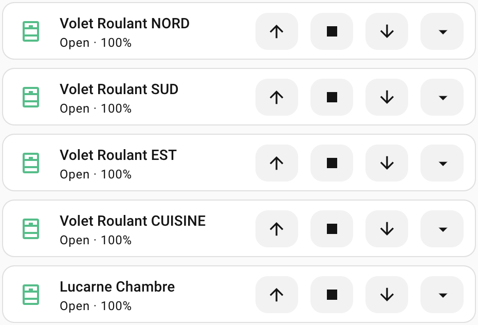
However I noticed a few days ago that when the shutters are fully opened (or closed) the Open (or Close) button is not greyed out as compared to the covers I’ve declared:
So I’ve tried to improve the behavior by using the Appearance feature and I kind of succeded:
The code:
type: tile
grid_options:
  columns: 15
  rows: 1
entity: cover.volet_roulant_chambre_camille
name: Volet Roulant Camille
vertical: false
icon_tap_action:
  action: perform-action
  perform_action: cover.set_cover_position
  target:
    entity_id: cover.volet_roulant_chambre_camille
  data:
    position: 50
icon_hold_action:
  action: perform-action
  perform_action: cover.set_cover_position
  target:
    entity_id: cover.volet_roulant_chambre_camille
  data:
    position: 10
icon_double_tap_action:
  action: perform-action
  perform_action: cover.set_cover_position
  target:
    entity_id: cover.volet_roulant_chambre_camille
  data:
    position: 20
features:
  - type: custom:service-call
    entries:
      - type: button
        entity_id: cover.volet_roulant_chambre_camille
        icon: mdi:arrow-up
        tap_action:
          action: perform-action
          perform_action: cover.open_cover
          target:
            entity_id:
              - cover.volet_roulant_chambre_camille
          data: {}
        styles: |-
          :host {
            {% if is_state("cover.volet_roulant_chambre_camille", "open") %}
            pointer-events: none;
            cursor: not-allowed;
            --icon-color: #bdbdbd;
            {% elif is_state("cover.volet_roulant_chambre_camille", "closed") %}
            pointer-events: auto;
            --icon-color: black;
            {% else %}
            pointer-events: auto;
            --icon-color: black;
            {% endif %}
          }
      - type: button
        entity_id: cover.volet_roulant_chambre_camille
        icon: mdi:stop
        tap_action:
          action: perform-action
          perform_action: cover.stop_cover
          target:
            entity_id:
              - cover.volet_roulant_chambre_camille
          data: {}
      - type: button
        entity_id: cover.volet_roulant_chambre_camille
        icon: mdi:arrow-down
        tap_action:
          action: perform-action
          perform_action: cover.close_cover
          target:
            entity_id:
              - cover.volet_roulant_chambre_camille
          data: {}
        styles: |-
          :host {
            {% if is_state("cover.volet_roulant_chambre_camille", "closed") %}
            pointer-events: none;
            cursor: not-allowed;
            --icon-color: #bdbdbd;
            {% elif is_state("cover.volet_roulant_chambre_camille", "open") %}
            pointer-events: auto;
            --icon-color: black;
            {% else %}
            pointer-events: auto;
            --icon-color: black;
            {% endif %}
          }
      - type: dropdown
        entity_id: cover.volet_roulant_chambre_camille
        options:
          - entity_id: cover.volet_roulant_chambre_camille
            tap_action:
              action: perform-action
              perform_action: cover.set_cover_position
              target:
                entity_id:
                  - cover.volet_roulant_chambre_camille
              data:
                position: 100
            icon: ""
            label: 100%
          - entity_id: cover.volet_roulant_chambre_camille
            tap_action:
              action: perform-action
              perform_action: cover.set_cover_position
              target:
                entity_id:
                  - cover.volet_roulant_chambre_camille
              data:
                position: 75
            icon: ""
            label: 75%
          - entity_id: cover.volet_roulant_chambre_camille
            tap_action:
              action: perform-action
              perform_action: cover.set_cover_position
              target:
                entity_id:
                  - cover.volet_roulant_chambre_camille
              data:
                position: 50
            icon: ""
            label: 50%
          - entity_id: cover.volet_roulant_chambre_camille
            tap_action:
              action: perform-action
              perform_action: cover.set_cover_position
              target:
                entity_id:
                  - cover.volet_roulant_chambre_camille
              data:
                position: 25
            icon: ""
            label: 25%
features_position: inline
card_mod:
  style: |
    ha-card {
      {% if ((state_attr('cover.volet_roulant_chambre_camille', 'current_position') == 100) or (state_attr('cover.volet_roulant_chambre_camille', 'current_position') == 0)) %}
        --tile-color: #50BE87 !important;
      {% else %}
        --tile-color: #FF7900 !important;
      {% endif %}
    }
    ha-tile-icon {
      --tile-icon-opacity: 0 !important;
    }
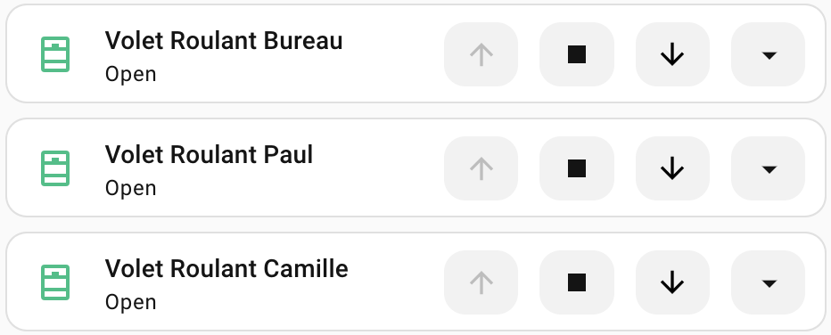
But while working on this improvement, I’ve noticed that the shutter state is not always correctly reflected in the UI. For example, I’ve closed the upstairs shutters using the global cover and their state is still seen as Open:
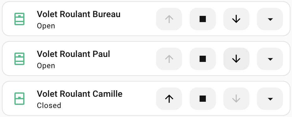
If I click on the Close button, it immediately detects that the shutter is closed and it’s state is updated, for example on the 3rd one:
Is there a way to improve this?
Note: the code is identical for all shutters, I’ve copy/pasted it and just changed the cover IDs.
Thanks!
Use a separate button with appearance transparent. Use these button styles to align it to the left:
:host {
  flex-basis: 300%;
  align-items: flex-start;
}
.label {
  width: fit-content;
}
Whenever the frontend hass object updates it should update all of the templates of the features, including those used in styles. You can see in the tile card secondary information row that the tile cards themselves are not up to date, so this sounds like a Home Assistant bug. I’m not sure what you mean by the global cover, maybe the bug is with that?
Right, it wasn’t really clear 
By global clover I was refering to the cover I have created to group the 1st floor shutters:
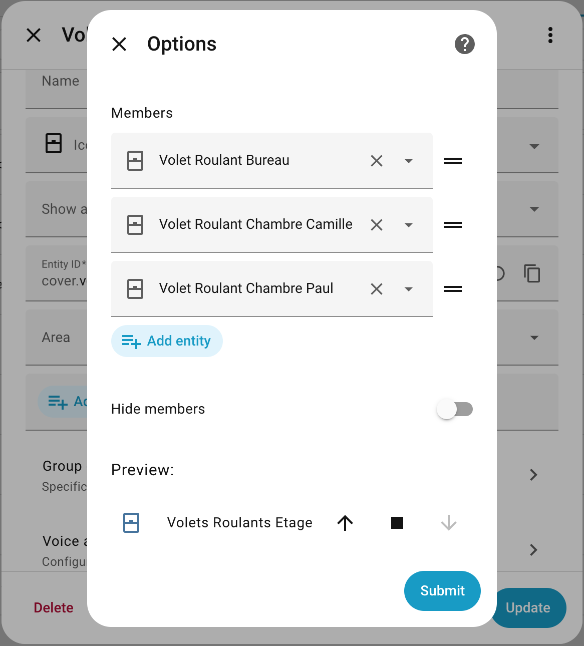
I have added it to my main dashboard:
type: tile
grid_options:
  columns: 10
  rows: 1
entity: cover.volets_roulants_etage
name: Etage
vertical: false
features:
  - type: cover-open-close
features_position: inline
card_mod:
  style: |
    ha-card {
      {% if ((state_attr('cover.volets_roulants_etage', 'current_position') == 100) or (state_attr('cover.volets_roulants_etage', 'current_position') == 0)) %}
        --tile-color: #50BE87 !important;
      {% else %}
        --tile-color: #FF7900 !important;
      {% endif %}
    }
I use it to open/close the shutters all at once manually or through automations.
There is a bug in Slider if you remove the icon, it still shows the default icon of the entity. If you replace icon with ‘none’, icon disapears but the place for the icon is still there
By the way, do you know if it’s possible to set the cursor to the “not allowed” one when the action is not possible (like for group covers)?

I’ve tried to set it in the styles using the cursor property but it has no effect:
cursor: not-allowed;
Try:
cursor: not-allowed !important;
Not a bug. Autofill now also autofills the default icon for the feature entity. Disable autofill to prevent this.
The style preprocessor automatically adds the !important keyword so it isn’t that. Maybe it’s what you’re setting the cursor style on? For buttons it should be the button element itself.
button {
  cursor: not-allowed;
}
Aha, OK. Understand. Even the icon is deleted it is autofilled. Thank you for explanation.
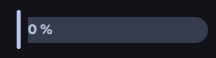
Currenty I’m trying to put some left padding to slider value, if the value is low. But without success yet.
It worked, thanks!
I’ve also successfully disabled the open/closed button click when the shutter is already opened/closed using the .background class.
Here is the complete code:
type: tile
grid_options:
  columns: 15
  rows: 1
entity: cover.volet_roulant_nord
vertical: false
icon_tap_action:
  action: perform-action
  perform_action: cover.set_cover_position
  target:
    entity_id: cover.volet_roulant_nord
  data:
    position: 50
icon_hold_action:
  action: perform-action
  perform_action: cover.set_cover_position
  target:
    entity_id: cover.volet_roulant_nord
  data:
    position: 10
icon_double_tap_action:
  action: perform-action
  perform_action: cover.set_cover_position
  target:
    entity_id: cover.volet_roulant_nord
  data:
    position: 20
features:
  - type: custom:service-call
    entries:
      - type: button
        entity_id: cover.volet_roulant_nord
        icon: mdi:arrow-up
        tap_action:
          action: perform-action
          perform_action: cover.open_cover
          target:
            entity_id:
              - cover.volet_roulant_nord
          data: {}
        styles: |-
          {% if is_state("cover.volet_roulant_nord", "open") %}
            :host {
              --icon-color: #bdbdbd;
            }
            .background {
              --ha-ripple-color: #bdbdbd;
              --md-ripple-pressed-color: #bdbdbd;
              --md-ripple-hover-color: #bdbdbd;
              --md-ripple-pressed-opacity: .2;
              --md-ripple-hover-opacity: .2;
            }
            .background:active {
              pointer-events: none;
              --icon-color: #bdbdbd;
              background-color: #bdbdbd;
              opacity: .2;
            }
            button {
              cursor: not-allowed;
            }
            :hover {
              background-color: #bdbdbd;
              opacity: .2;
            }
          {% elif is_state("cover.volet_roulant_nord", "closed") %}
            :host {
              --icon-color: black;
            }
            button {
              cursor: pointer;
            }
          {% else %}
            :host {
              --icon-color: black;
            }
            button {
              cursor: pointer;
            }
          {% endif %}
      - type: button
        entity_id: cover.volet_roulant_nord
        icon: mdi:stop
        tap_action:
          action: perform-action
          perform_action: cover.stop_cover
          target:
            entity_id:
              - cover.volet_roulant_nord
          data: {}
      - type: button
        entity_id: cover.volet_roulant_nord
        icon: mdi:arrow-down
        tap_action:
          action: perform-action
          perform_action: cover.close_cover
          target:
            entity_id:
              - cover.volet_roulant_nord
          data: {}
        styles: |-
          {% if is_state("cover.volet_roulant_nord", "closed") %}
            :host {
              --icon-color: #bdbdbd;
            }
            .background {
              --ha-ripple-color: #bdbdbd;
              --md-ripple-pressed-color: #bdbdbd;
              --md-ripple-hover-color: #bdbdbd;
              --md-ripple-pressed-opacity: .2;
              --md-ripple-hover-opacity: .2;
            }
            .background:active {
              pointer-events: none;
              --icon-color: #bdbdbd;
              background-color: #bdbdbd;
              opacity: .2;
            }
            button {
              cursor: not-allowed;
              --icon-color: #bdbdbd;
            }
            :hover {
              background-color: #bdbdbd;
              opacity: .2;
            }
          {% elif is_state("cover.volet_roulant_nord", "open") %}
            :host {
              --icon-color: black;
            }
            button {
              cursor: pointer;
            }
          {% else %}
            :host {
              --icon-color: black;
            }
            button {
              cursor: pointer;
            }
          {% endif %}
      - type: dropdown
        entity_id: cover.volet_roulant_nord
        options:
          - entity_id: cover.volet_roulant_nord
            tap_action:
              action: perform-action
              perform_action: cover.set_cover_position
              target:
                entity_id:
                  - cover.volet_roulant_nord
              data:
                position: 100
            icon: ""
            label: 100%
          - entity_id: cover.volet_roulant_nord
            tap_action:
              action: perform-action
              perform_action: cover.set_cover_position
              target:
                entity_id:
                  - cover.volet_roulant_nord
              data:
                position: 75
            icon: ""
            label: 75%
          - entity_id: cover.volet_roulant_nord
            tap_action:
              action: perform-action
              perform_action: cover.set_cover_position
              target:
                entity_id:
                  - cover.volet_roulant_nord
              data:
                position: 50
            icon: ""
            label: 50%
          - entity_id: cover.volet_roulant_nord
            tap_action:
              action: perform-action
              perform_action: cover.set_cover_position
              target:
                entity_id:
                  - cover.volet_roulant_nord
              data:
                position: 25
            icon: ""
            label: 25%
features_position: inline
card_mod:
  style: |
    ha-card {
      {% if ((state_attr('cover.volet_roulant_nord', 'current_position') == 100) or (state_attr('cover.volet_roulant_nord', 'current_position') == 0)) %}
        --tile-color: #50BE87 !important;
      {% else %}
        --tile-color: #FF7900 !important;
      {% endif %}
    }
    ha-tile-icon {
      --tile-icon-opacity: 0 !important;
    }
Is there a way how to switch input time in Input Feature from AM/PM mode to 24hours mode?