First, I’d like to thank @DBuit for his fantastic piece of work and commitment to develop it according to user’s needs, I was looking for something exactly like this for years
Second, the puzzle pieces slowly start to fall in their places, but I’d like to ask for some help and advices for a couple of things.
2 specific things are driving me nuts, please help me solve the riddle:
make a scene button state depend on the included devices COMBINED state:
currently, for scenes the states displayed are “Scening”, this is the default state for scenes. For instance I have a scene to open all my gates, and one to close them. To fake icon states I use now different offstates, but the best would be to mimic the original homekit scene button behavior, so the scene button should only be “on”, when all devices have “on” state (or in this case, since they are gates, “open” or “closed” for off state). For this purpose, I created a group, that should behave exactly how I wish: the group’s state will only be “on”, when all devices in the group are “on” at the same time.
If I reference this group entity in the scene button, the only thing that happens is a circle appearing in the upper right corner with the group’s state, but at the bottom the original scene state is still visible, and the button state is still based on the scene’s state, which is quite useless. So basically: can I replace the watched state of a button to a completely different entity’s state, so the button will start listen to the other entity’s state, and turn on and off according to this other entity?
would it be possible to have scrolling possibility only for one ROW?
To me - based on the github description - it felt that the horizontal scrolling is a global parameter, but I’d only like to scroll certain rows, for instance the scene buttons row in the above example. Can I achieve this somehow?
I’m still putting together my ONE-ABOVE-ALL dashboard, so I’ll have some questions later, for sure
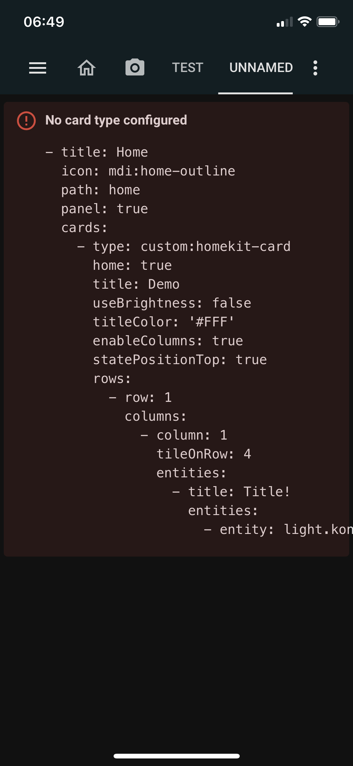
Hello together, i’m quite new to the customication of home assistant cards, and i wanted to change some css values that aren’t in the variables list of the card. Can someone help me and tell me what i have to do to change for example the “.button padding” or the “.card-title padding”? Would be really nice and sorry if its a dumb question
So I have started redoing my screen in homekit style and love it but I don’t completely understand how to do popups. here is my code what am I doing wrong?
Hi all, I am problems putting a custom media player onto my dashboard. I’m not really sure where I am going wrong. For now I am not interested in popups.
Not directly but, if you add a switch to a scene that goes on for a few sec than you got add
“conditionalClass” on the tile and add some css for that custom class that changes the color.
Is there any way I can remove the state (Off / On) at the yellow arrow? I’d like to just track state by colour of the button but haven’t figured out how to remove Off & On from displaying and it’s getting in the way of the entity names that I’d like displayed.
Also is there any way I can shift the panel over to the left towards the green bar to size up my buttons with the camera feed above on the UI?
Is there a simple way to reduce the padding below my 2nd row (Spare Bedroom etc) of buttons so “Living Room” & those buttons (Floor Lamp, Table Lamp etc) are closer to that 2nd row?