Hello.
i use custom:slider-button-card in compact mode but the name of the entity doesn’t show completely, is there a way to edit the padding of the button so it will show more of the name?

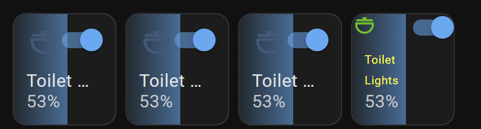
Hello.
i use custom:slider-button-card in compact mode but the name of the entity doesn’t show completely, is there a way to edit the padding of the button so it will show more of the name?
You can remove the padding, but I believe you’ll need additional adjustments to shrink multiple components of the slider button layout.
type: custom:slider-button-card
    entity: light.toilet_lights
    slider:
      direction: left-right
      background: gradient
      use_state_color: true
      use_percentage_bg_opacity: false
      show_track: false
      toggle_on_click: false
      force_square: false
      show_attribute: false
    show_name: true
    show_state: true
    compact: false
    icon:
      show: true
      use_state_color: true
      tap_action:
        action: more-info
    action_button:
      mode: toggle
      icon: mdi:power
      show: true
      show_spinner: true
      tap_action:
        action: toggle
    card_mod:
      style: |
        .button{
          --icon-color: lime !important;
         font-size: 10px;
          padding: 0px !important;
           }
        .name {
         white-space: wrap !important;
        font-size: 10px;
         color: yellow !important;
                   }